isaiah40 wrote:Okay aon, that will be enough. Please stop this at once!
I think enough would be letting "Atmospheric noise" seeing this "map-making" process.
cheers
Moderator: Cartographers

isaiah40 wrote:Okay aon, that will be enough. Please stop this at once!


Yes, the bribe is in the mail...natty dread wrote:Vicfontaine knows what he needs to do to get the map moved on, let's leave him to it, unless you have something to say about the map itself.
I don't think you should scale the image. Rather you should crop it, there's lots of empty space around the playable area that you can get rid of. It might require some reorganization, moving things around a bit... let me do a quick mock-up.VicFontaine wrote:the map, I'm sure, will be moved as soon as we replace the Elvis image and scale it down. I'm still highly suspicious that gameplay will suffer if the map is smaller, but that's debatable, so we're going to give it a whirl.

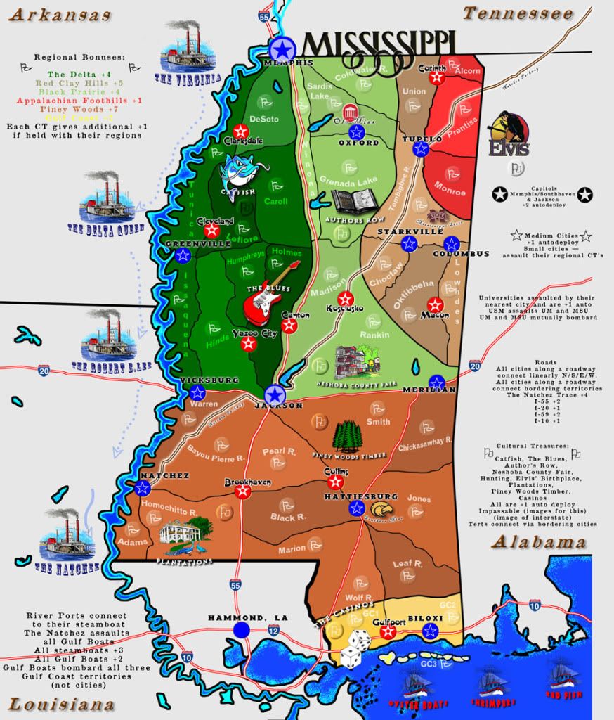

Because there are a myriad of bonuses, the fonts correspond to particular bonuses. Some of them certainly need tweaking, but the number of fonts really isn't a problem when you understand they make the bonuses easier to identify.natty dread wrote:In general, there's way too many fonts on the image.


Man after my CC die I see. INDEED! Talked to someone about Camp Shelby today. The military is a major cultural part of Mississippi. Always has been. I really wanted to include it somehow, but I don't think we could. Exact same thing with the Mound and with the Petrified Forest. We have discussed finding a good pic of the mound and making it a ghost image for Piney Woods region or a place like that (to aid the colorblind in IDing regional bonuses).WILLIAMS5232 wrote:the only fonts i see that need changing are those boat names. i do think the bonuses and legend needs to be larger. you have plenty of room to do that so it shouldn't be a problem.
also, the colors could be better as far as in sync with the geography. ( green = pine belt, a shade of white = cotton belt, etc... )
some other items you may or may not care to use;
walter anderson art
emerald mound
petrified forest
camp shelby

Very glad you like it. Thanks for the kind words. Thanks again, everyone, for your patience as we await the Mighty Designer's return to the States to his magical dungeon where he speaks incantations and I post them for you to critique.Industrial Helix wrote:This map has a nice feel to it, and its a part of the world not really represented well on CC, so moved.
We aim to please. Thank you! (Yes, it does need some work. We're on "holiday hiatus" for another 2 1/2 weeks. Then Designer returns and he starts the magic again.)army of nobunaga wrote:Congratz man.. I think it needs some gameplay work, but a lot of weaker gameplay maps made it through in the last 4 months when I was gone.
lol. It's a great place with a rich history. There is no state in the Union without a dark past, and every state in the Union has contributed much to human culture and beauty. Mississippi has a unique and well-known combination of both.army of nobunaga wrote:Cheers and when it hits gameplay Ill chime in more. looks like a winner so far even though its an evil evil state.

May she grow up quickly.ViperOverLord wrote:Glad to see this baby finally moved to the drafting room.
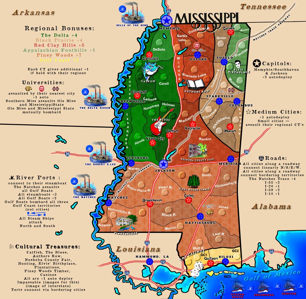

Yep.nolefan5311 wrote:I really like the new update, particularly you getting rid of a lot of the empty space in the legend areas.
No. And I agree. It'll be done in one of the future updates, just not sure which one.nolefan5311 wrote:Is there a reason why the legend symbols are different colors than the regions on the map, i.e. why the colors of the Capitals and Medium Cities aren't blue on the legend? I think that would clear up a little confusion.
We're concerned with cluttering it unnecessarily. Having the I-XX at both northern and southern, or eastern and western termini would be sufficient, I think, rather than in the interior of the map. Good eye, though; it's something we, too, noticed.nolefan5311 wrote:You also might want to add the Interstate numbers somewhere along the roads in places other than outside the actual state. Having I-12 on there is also confusing.
Size: it's a constant discussion. The map will definitely need supersizing. That doesn't mean it can't be continually tweaked to find the perfect fit. We'll keep working on it.mountain1024 wrote:Hi guys, thanks for a good looking future map. I have a problem with its size though - it barely fits on my laptop screen. Could you for instance fit all the map legend on one side to make it fit on smaller screens? Also I agree about the readability of smaller fonts.
mountain1024 wrote:Good job, looking forward for the beta.


