
I think the feet are kinda fun - in keeping with other fun elements on the map. They may be a bit dark, and they could be confused as a one-way attack.
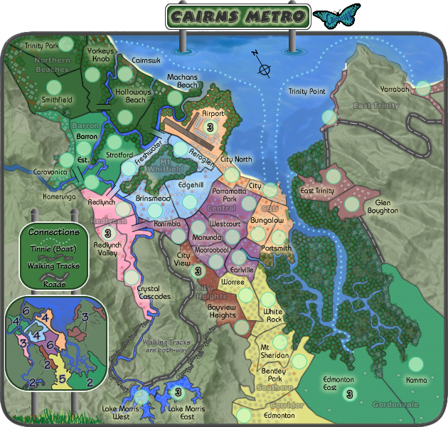
I'm not sure if you've reworked the bonuses lately, but regardless I'll make another argument for East Trinity being a +3, or even a +2... it's the same size as Redlynch but even easier to hold with one less enemy at it's gates than Redlynch, and it's linear layout makes it easier to take in stages. Couple it with Gordonvale and you have a 6 terit, 3 border +6. Given that all of the bonuses tend a bit high (which is fine) I'd say +3 - this would give it the same combo bonus as Lake Morris (no region title?) plus Redlynch: +5, six territories, 3 borders to hold. It's one less than Northern Beaches, which is the same size, but with Northern Beaches you get nothing until you wrap up the entire thing.
There doesn't seem to be a region name for the region on the water, with the Airport. I was going to say that it could be the same bonus as Corridor Southern, which starts with the benefit of having a neutral protecting its rear border. With all of those water attack routes, that nameless region is going to be the map's punching bag.
edit: I just saw the CBD... kinda gets lost.
Cairns Metro [Quenched]
Moderator: Cartographers
Forum rules
Please read the Community Guidelines before posting.
Please read the Community Guidelines before posting.

Re: Cairns Metro V11(P7) [D]
NICE.cairnswk wrote:Those are simply the geogrphic plates from google with two transparencies over the top.yeti_c wrote:Love the mountains/hills bottom left - but they're not as good on the right...
C.
Please refresh your browser, i have fix those mountains.
C.

Highest score : 2297

Re: Cairns Metro V13
Version 13.oaktown wrote:I think the feet are kinda fun - in keeping with other fun elements on the map. They may be a bit dark, and they could be confused as a one-way attack.
I'm not sure if you've reworked the bonuses lately, but regardless I'll make another argument for East Trinity being a +3, ...
edit: I just saw the CBD... kinda gets lost.
1. Fixed the above concerns from Oaktown.
2. finished the housing down south
3. reworked the bridges to be the same as Cairns Coral Coast.

- Click image to enlarge.


* Pearl Harbour * Waterloo * Forbidden City * Jamaica * Pot Mosbi
Re: Cairns Metro V11(P7) [D]
The "Walking Tracks" has washed out in comparison to the other text in there - can you fix that?
C.
C.
Highest score : 2297
Re: Cairns Metro V11(P7) [D]
Fixed, please refresh your browseryeti_c wrote:The "Walking Tracks" has washed out in comparison to the other text in there - can you fix that?
C.
* Pearl Harbour * Waterloo * Forbidden City * Jamaica * Pot Mosbi
Re: Cairns Metro V11(P7) [D]
Done.cairnswk wrote:Fixed, please refresh your browseryeti_c wrote:The "Walking Tracks" has washed out in comparison to the other text in there - can you fix that?
C.
C.
Highest score : 2297
Re: Cairns Metro V13
Current Version 13
- Click image to enlarge.
* Pearl Harbour * Waterloo * Forbidden City * Jamaica * Pot Mosbi
-
Juan_Bottom

- Posts: 1110
- Joined: Mon May 19, 2008 4:59 pm
- Location: USA RULES! WHOOO!!!!
Re: Cairns Metro V13(P7) [D]
I can't fully see it, cause it's taking forever to load, but the water ripples are still messed up and driving me crazy. The perspective is waaayy off.
Re: Cairns Metro V13(P7) [D]
Juan,,,i don't mean to be glib but does it really matterJuan_Bottom wrote:I can't fully see it, cause it's taking forever to load, but the water ripples are still messed up and driving me crazy. The perspective is waaayy off.
* Pearl Harbour * Waterloo * Forbidden City * Jamaica * Pot Mosbi
-
Juan_Bottom
- Posts: 1110
- Joined: Mon May 19, 2008 4:59 pm
- Location: USA RULES! WHOOO!!!!
Re: Cairns Metro V13(P7) [D]
For some reason it drives me nuts. I don't know if it bothers anyone else.cairnswk wrote:Juan,,,i don't mean to be glib but does it really matterJuan_Bottom wrote:I can't fully see it, cause it's taking forever to load, but the water ripples are still messed up and driving me crazy. The perspective is waaayy off.
Re: Cairns Metro V13(P7) [D]
I love how your doing a small aussie town. The tinnie routes to bungalow are slightly confusing, at first look i thought that east trinity connected to edmonton east.
The trees around Mt Whitfield also look a bit confusing, why are they only around the edge? Also why is it called Cairns metro, why not just cairns? or is it to match sydney metro?
The trees around Mt Whitfield also look a bit confusing, why are they only around the edge? Also why is it called Cairns metro, why not just cairns? or is it to match sydney metro?
Re: Cairns Metro V13(P7) [D]
Yes to match sydney metro!gho wrote:I love how your doing a small aussie town. The tinnie routes to bungalow are slightly confusing, at first look i thought that east trinity connected to edmonton east.
The trees around Mt Whitfield also look a bit confusing, why are they only around the edge? Also why is it called Cairns metro, why not just cairns? or is it to match sydney metro?
trees around mt whitefield are left off in the middle so that the name can be seen.
i'll see what i can do about the rest.
* Pearl Harbour * Waterloo * Forbidden City * Jamaica * Pot Mosbi
Re: Cairns Metro V13(P7) [D]
Anything happening here?
* Pearl Harbour * Waterloo * Forbidden City * Jamaica * Pot Mosbi
Re: Cairns Metro V13(P7) [D]
I didn't notice this until Juan pointed it out, and now I can't stop looking at it. And no, it doesn't matter... at least not for my stamp.Juan_Bottom wrote:I can't fully see it, cause it's taking forever to load, but the water ripples are still messed up and driving me crazy. The perspective is waaayy off.
That and the extra-heavy border that, oddly, goes completely around Cairnswk.
I'm sure this was discussed earlier, but what's the logic behind making Cairnsk a starting neutral? Perhaps Redlynch Valley would be a better choice?
And my apologies for screwing up my evaluation of the bonuses earlier - I'd said that Redlynch and East Trinity were the same size, but they aren't. I guess I was reading all of the lines on it incorrectly - now that the region is cleaner it is obviously only 3 territories. But I still like East Trinity better as a +3, since it is so linear.
One little colorblind thing... two regions that are close for me are East Trinity and Gordonvale. The small map erases any other colorblind issues on this map, but since East Trinity is broken up somebody could think that part of Eat Trinity actually goes with Gordonvale. You could change a color up, or you could somehow better indicate which territories go with the 3 on the small map.
Not that anybody will confuse this for anybody else's work, but no butterfly sig?
Re: Cairns Metro V15
The perspective will most likely be way off since the map is flat with the mini-map signage, but the title is 3D concept.oaktown wrote:I didn't notice this until Juan pointed it out, and now I can't stop looking at it. And no, it doesn't matter... at least not for my stamp.Juan_Bottom wrote:I can't fully see it, cause it's taking forever to load, but the water ripples are still messed up and driving me crazy. The perspective is waaayy off.
I think the water-rings are fine...they are perfect recplicas of each other.
Border fixed, and neutral removed to Redlynch Valley.That and the extra-heavy border that, oddly, goes completely around Cairnswk.
I'm sure this was discussed earlier, but what's the logic behind making Cairnsk a starting neutral? Perhaps Redlynch Valley would be a better choice?
Thanks for apology but not needed.And my apologies for screwing up my evaluation of the bonuses earlier - I'd said that Redlynch and East Trinity were the same size, but they aren't. I guess I was reading all of the lines on it incorrectly - now that the region is cleaner it is obviously only 3 territories. But I still like East Trinity better as a +3, since it is so linear.
LIne indicators placed on mini-map, does that assist?One little colorblind thing... two regions that are close for me are East Trinity and Gordonvale. The small map erases any other colorblind issues on this map, but since East Trinity is broken up somebody could think that part of Eat Trinity actually goes with Gordonvale. You could change a color up, or you could somehow better indicate which territories go with the 3 on the small map.
Sig addedNot that anybody will confuse this for anybody else's work, but no butterfly sig?
Version 15
* Pearl Harbour * Waterloo * Forbidden City * Jamaica * Pot Mosbi
Re: Cairns Metro V15(P8) [D]
I don't see anything else and nothing seems to be coming up, so I was stalling for time and waiting for the butterfly. Now that you've added it...


Re: Cairns Metro V15(P8) [D,Gp]
Thanks oaktownoaktown wrote:I don't see anything else and nothing seems to be coming up, so I was stalling for time and waiting for the butterfly. Now that you've added it...
and C.yeti_c wrote:Nice work Cairns!!
C.
* Pearl Harbour * Waterloo * Forbidden City * Jamaica * Pot Mosbi
Re: Cairns Metro V15(P8) [D,Gp]
And calling Gimil again....
* Pearl Harbour * Waterloo * Forbidden City * Jamaica * Pot Mosbi

Re: Cairns Metro V15(P8) [D,Gp]
Could you fix up the grass in the bottom left? I still think it looks off. I think the problem is the sharp contrast between the light and dark grass portions.
Re: Cairns Metro V15(P8) [D,Gp]
i think it looks fine given there is a certain "modern naivety" to the style of the mapZeakCytho wrote:Could you fix up the grass in the bottom left? I still think it looks off. I think the problem is the sharp contrast between the light and dark grass portions.
* Pearl Harbour * Waterloo * Forbidden City * Jamaica * Pot Mosbi
Re: Cairns Metro V15
Version 15
- Click image to enlarge.
* Pearl Harbour * Waterloo * Forbidden City * Jamaica * Pot Mosbi

Re: Cairns Metro V15(P8) [D,Gp]
fantastic Map..i really like the attention to detail you have given it 
[img]http://img801.imageshack.us/img801/9761/41922610151374166770386.jpg[/mg]
Re: Cairns Metro V16
Thanks Hulmey, pleased you like.hulmey wrote:fantastic Map..i really like the attention to detail you have given it
Below is version 16 with a decent hand drawn compass

And xml testing taking place.

* Pearl Harbour * Waterloo * Forbidden City * Jamaica * Pot Mosbi
Re: Cairns Metro V15(P8) [D,Gp]
and on this one also.
* Pearl Harbour * Waterloo * Forbidden City * Jamaica * Pot Mosbi