Yeah, how about a few more words. Like, what exactly, is not legible.yeti_c wrote:1 word - Legibility.
C.
Reconquista
Moderator: Cartographers
Forum rules
Please read the Community Guidelines before posting.
Please read the Community Guidelines before posting.
-
porkenbeans

- Posts: 2546
- Joined: Mon Sep 10, 2007 4:06 pm
Re: Reconquista


Re: Reconquista
gorgeous!

Re: Reconquista
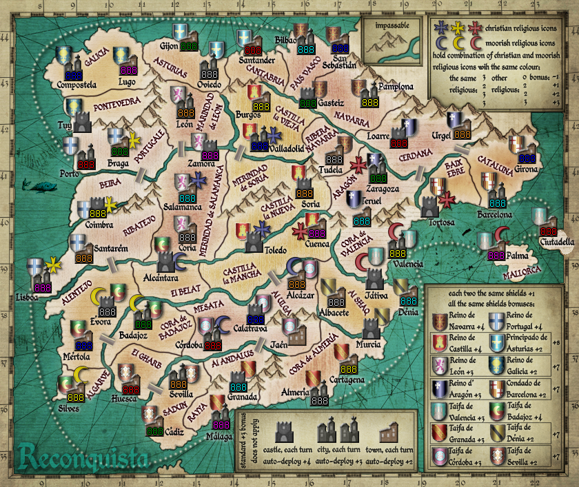
Well, the bridges into this one seem better, but navarra and aragon are with almost same color. Also, the christian religious yelow icon is weird at lisboa.
-
porkenbeans
- Posts: 2546
- Joined: Mon Sep 10, 2007 4:06 pm
Re: Reconquista
As Bast said, the region's colors are not meant for any bonuses, so, the slight shade variations are only for aesthetics.Rih0 wrote:Well, the bridges into this one seem better, but navarra and aragon are with almost same color. Also, the christian religious yelow icon is weird at lisboa.
The yellow christian icon at Lisboa is the same as the others. Maybe it is because, it is partially over the dark water, that it seems different to you.
-
porkenbeans
- Posts: 2546
- Joined: Mon Sep 10, 2007 4:06 pm
Re: Reconquista
mibi wrote:gorgeous!
-
natty dread

- Posts: 12876
- Joined: Fri Feb 08, 2008 8:58 pm
- Location: just plain fucked
Re: Reconquista
Just remove the colour, I'm thinking the map could look much nicer with just plain grey for the land area... It would give a nice contrast to the brightly coloured ocean & rivers. Light & unsaturated land vs. saturated & dark ocean, should work.As Bast said, the region's colors are not meant for any bonuses, so, the slight shade variations are only for aesthetics.
You also need to make the mountains stand out more. They kinda fade to the background now...
Also, you know I think this a terrific looking map, but yeti has a point about legibility... The map looks kinda cluttered, in such a way that it's hard to figure out what attacks where - I like the maps where you can just take a glance and instantly tell what borders what. Which is what you should be aiming for.
I think the main problem here is the size of the icons. You have so many of them, that when they are this large they kinda clutter the map. I'd advise shrinking the icons somewhat (castles, towns etc).
Also, your territories are darker on the inside, with light edges... While this creates a nice effect of an old and faded map, it kinda makes the territory borders less clear. Try it the other way around perhaps, with lighter insides and darker edges?


Re: Reconquista
i dunno natty, i like the colors now IMO of course.
But i do agree the boarders are hard to tell what attacks what if you have no clue whats going on, first time i looked at this newer better version of this map.
Great idea tho. Hope it makes it, a whole map A.D is awesome.
great work on the graphics pork.
-griff
But i do agree the boarders are hard to tell what attacks what if you have no clue whats going on, first time i looked at this newer better version of this map.
Great idea tho. Hope it makes it, a whole map A.D is awesome.
great work on the graphics pork.
-griff

-
porkenbeans
- Posts: 2546
- Joined: Mon Sep 10, 2007 4:06 pm
-
theBastard

- Posts: 994
- Joined: Sat Jan 09, 2010 9:05 am
Re: Reconquista
I totaly agree with removing the colours of regions. and also with mountains.natty_dread wrote: Just remove the colour, I'm thinking the map could look much nicer with just plain grey for the land area... It would give a nice contrast to the brightly coloured ocean & rivers. Light & unsaturated land vs. saturated & dark ocean, should work.
You also need to make the mountains stand out more. They kinda fade to the background now...
maybe you are on 50% right. I think that removng the colour of regions will helps a little. also it is needed to "play" with positions of icons and shieds.natty_dread wrote: Also, you know I think this a terrific looking map, but yeti has a point about legibility... The map looks kinda cluttered, in such a way that it's hard to figure out what attacks where - I like the maps where you can just take a glance and instantly tell what borders what. Which is what you should be aiming for.
as I said upper, maybe a better positions if icons will help. I do not assured if shrinking icons will works on the small version of map.natty_dread wrote: I think the main problem here is the size of the icons. You have so many of them, that when they are this large they kinda clutter the map. I'd advise shrinking the icons somewhat (castles, towns etc).
[/quote]natty_dread wrote: Also, your territories are darker on the inside, with light edges... While this creates a nice effect of an old and faded map, it kinda makes the territory borders less clear. Try it the other way around perhaps, with lighter insides and darker edges?
pork, maybe what I did on this map, but ofcourse with your great graphics
Spoiler
- Click image to enlarge.


Re: Reconquista
Well - Most of the text... which leads me onto my next point - I assume this is the large which is already hard to see - the small is going to be eye strainingly impossible.porkenbeans wrote:Yeah, how about a few more words. Like, what exactly, is not legible.yeti_c wrote:1 word - Legibility.
C.
Part of the problem is that there are loads of icons very close to borders and text and it's all very cluttered... this will only get worse when you downsize.
C.

Highest score : 2297
-
porkenbeans
- Posts: 2546
- Joined: Mon Sep 10, 2007 4:06 pm
Re: Reconquista
Is it only the red text, or is there a prob with the black as well ?yeti_c wrote:Well - Most of the text... which leads me onto my next point - I assume this is the large which is already hard to see - the small is going to be eye strainingly impossible.porkenbeans wrote:Yeah, how about a few more words. Like, what exactly, is not legible.yeti_c wrote:1 word - Legibility.
C.
Part of the problem is that there are loads of icons very close to borders and text and it's all very cluttered... this will only get worse when you downsize.
C.
The red text I had to adjust some kerning and rotation.This was performed through pixel manipulation because I do not have the font set.
The icons are supposed to be straddling the borders in some areas. The shields and religious icons could be scaled down, but the small map might become illegible. If this map were changed to a standard game play, the clutter could be eliminated, but Bast is trying to do something different with the gameplay. I am afraid that this means, a more cluttered look is inevitable. I would love to hear some suggestions as to how we can pull it off without the clutter.
-
natty dread
- Posts: 12876
- Joined: Fri Feb 08, 2008 8:58 pm
- Location: just plain fucked
Re: Reconquista
I gave you some a couple of posts ago...I would love to hear some suggestions as to how we can pull it off without the clutter.
-
porkenbeans
- Posts: 2546
- Joined: Mon Sep 10, 2007 4:06 pm
Re: Reconquista
Thanx nat,natty_dread wrote:I gave you some a couple of posts ago...I would love to hear some suggestions as to how we can pull it off without the clutter.
I have been working on the next version. I have included some of your suggestions, and I hope to have it up soon.
-
porkenbeans
- Posts: 2546
- Joined: Mon Sep 10, 2007 4:06 pm
Re: Reconquista
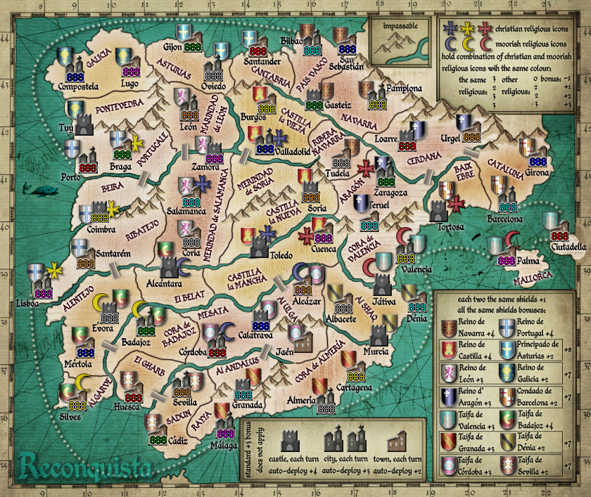
I have been doing some experimenting and trying to see what I could do to make the map appear less cluttered. First I decreased the size of the shields and religious icons, then I faded the map out.
This does two things I hope.
1.) it makes the map look more authentic.
2.) it helps the icons contrast a bit more, and less "lost" in all of the clutter.
This does two things I hope.
1.) it makes the map look more authentic.
2.) it helps the icons contrast a bit more, and less "lost" in all of the clutter.
- Click image to enlarge.

-
the.killing.44

- Posts: 4724
- Joined: Thu Oct 23, 2008 7:43 pm
- Gender: Male
- Location: now tell me what got two gums and knows how to spit rhymes
- Contact:
Re: Reconquista
Two things:
(a) the shields' and buildings' treatment (namely the bevel / lighting effects, esp. on the shields) doesn't really fit the authentic feel of the rest of the map
(b) the watermark title isn't noticeable enough, why don't you try doing some exquisite ornamental thing with it.
(c) the mountains are awesome, but the way they transition into the land with the evident border doesn't work
-
porkenbeans
- Posts: 2546
- Joined: Mon Sep 10, 2007 4:06 pm
Re: Reconquista
a.) I am trying to make the icons look more like game pieces on a board. I need for them to sort of stand apart from the map. Otherwise they are just so many of them, that the map becomes way too cluttered looking.the.killing.44 wrote:Two things:
(a) the shields' and buildings' treatment (namely the bevel / lighting effects, esp. on the shields) doesn't really fit the authentic feel of the rest of the map
(b) the watermark title isn't noticeable enough, why don't you try doing some exquisite ornamental thing with it.
(c) the mountains are awesome, but the way they transition into the land with the evident border doesn't work
b.) That is a very GOOD idea. I have been using the current one for a stand-in at the moment. If it is OK with Bast., I would be interested in acknowledging someone on the map if they were to come up with a kick-ass title. I think that something exquisite as you suggest, would be perfect for this map.
c.) Yes, as I stated earlier, the mountains blend much better with the glow reversed to an outside on the territs. the earlier versions are done this way. I like it better, but I was getting calls to do it the other way. Once I get the style nailed down to a popular consensus, then maybe I could run a poll on this topic. If this faded out version is received well, I will put up 2 versions. One with the inside glow, and on with the outside glow.
-
theBastard
- Posts: 994
- Joined: Sat Jan 09, 2010 9:05 am
Re: Reconquista
pork, the map is awesome and so near to my dreams as it is possible. realy great work 
now about points:
a, maybe forgot the shield now, when map has no more colours (see upper picture). the settlements need a less plastic effect, I think.
b, if here is mentioned title Reconquista, I have some medieval ornamental font, but will it fit with the rest text?
c, the upper line of mountains does not looks fine to me...
pork, what you think about like this? this is only quick attempt. I think when settlements will be less plastic it shoud works. and than we can also a little move with text on the map, because withuot shields there will be more place.
- Click image to enlarge.

-
natty dread
- Posts: 12876
- Joined: Fri Feb 08, 2008 8:58 pm
- Location: just plain fucked
Re: Reconquista
Hm. I agree with t.k. about the shields & other icons not really fitting the style...
I suggest making them look hand-drawn, perhaps in the same style as the mountains.
I might give a shot at the title, later...
I suggest making them look hand-drawn, perhaps in the same style as the mountains.
I might give a shot at the title, later...
-
Industrial Helix

- Posts: 3462
- Joined: Mon Jul 14, 2008 6:49 pm
- Gender: Female
- Location: Ohio
Re: Reconquista
I've got a few graphics crits.
1) Blend the mountains into the land better, just get rid of the lower line on the map.
2) The castles and towns look awful with the fake bevel look. They're clashing with the antique style of the map real bad. I'd suggest something along the lines as the style of castles and towns used in Baltic Crusades (since they're part of a series it makes sense to me). Same for the dotted lines on the sea connections, lose the drop shadow.
Sketchblog [Update 07/25/11]: http://indyhelixsketch.blogspot.com/
Living in Japan [Update 07/17/11]: http://mirrorcountryih.blogspot.com/
Russian Revolution map for ConquerClub [07/20/11]: http://www.conquerclub.com/forum/viewto ... 1&t=116575
Living in Japan [Update 07/17/11]: http://mirrorcountryih.blogspot.com/
Russian Revolution map for ConquerClub [07/20/11]: http://www.conquerclub.com/forum/viewto ... 1&t=116575
-
theBastard
- Posts: 994
- Joined: Sat Jan 09, 2010 9:05 am
Re: Reconquista
I totaly agree with Helix.Industrial Helix wrote:I've got a few graphics crits.
1) Blend the mountains into the land better, just get rid of the lower line on the map.
also agree. Helix what do you think (when pork add style of settlements as in Baltic Crusades) about kick off the shields and colorize settlements? or better is go with the same colour for settlements and with shields?Industrial Helix wrote: 2) The castles and towns look awful with the fake bevel look. They're clashing with the antique style of the map real bad. I'd suggest something along the lines as the style of castles and towns used in Baltic Crusades (since they're part of a series it makes sense to me). Same for the dotted lines on the sea connections, lose the drop shadow.
pork here is WinRAR version of borders around settlements. I hope it will helps you when you will go by Helix´s advices...
http://www.2shared.com/file/12446623/ee ... towns.html
and here is PNG file if you will have any problems with WinRAR
Spoiler
- Click image to enlarge.

-
Industrial Helix
- Posts: 3462
- Joined: Mon Jul 14, 2008 6:49 pm
- Gender: Female
- Location: Ohio
Re: Reconquista
Hmm... the shields are cool but I think colorized regions would work better for clarity's sake. Keep the shields int he legends though?
Sketchblog [Update 07/25/11]: http://indyhelixsketch.blogspot.com/
Living in Japan [Update 07/17/11]: http://mirrorcountryih.blogspot.com/
Russian Revolution map for ConquerClub [07/20/11]: http://www.conquerclub.com/forum/viewto ... 1&t=116575
Living in Japan [Update 07/17/11]: http://mirrorcountryih.blogspot.com/
Russian Revolution map for ConquerClub [07/20/11]: http://www.conquerclub.com/forum/viewto ... 1&t=116575
-
theBastard
- Posts: 994
- Joined: Sat Jan 09, 2010 9:05 am
Re: Reconquista
the colorized regions should not be the best way for me. regions are realy not part of any bonuses. I more like to add colour only by borders, if any colour is needed.
yes. the shield will be in legend. please try look at my upper post with map image - there is idea (only quick work...)
I like shields on map, realy, but there are many notices that shields cluttered map...
yes. the shield will be in legend. please try look at my upper post with map image - there is idea (only quick work...)
I like shields on map, realy, but there are many notices that shields cluttered map...
-
porkenbeans
- Posts: 2546
- Joined: Mon Sep 10, 2007 4:06 pm
Re: Reconquista
I can keep on working on the graphics, but the powers that be want the GP worked out and stamped first. I would like to see that stamp before I post anymore graphics.
Bast., Talk to thenobodies, and find out about getting that stamp.
Bast., Talk to thenobodies, and find out about getting that stamp.
-
MarshalNey
- Posts: 781
- Joined: Mon Sep 28, 2009 9:02 pm
- Gender: Male
- Location: St. Louis, MO
Re: Reconquista
Well, you'll need to get into the Gameplay Workshop in order to get the stamp.
Considering how developed the idea is, the mods will hopefully be commenting on this map soon.
Considering how developed the idea is, the mods will hopefully be commenting on this map soon.
-
theBastard
- Posts: 994
- Joined: Sat Jan 09, 2010 9:05 am
Re: Reconquista
pork, I do not know anything about army numbers. as MarshalNey said, I hope mods will help us in Gameplay Workshop...