
I think the Airport needs to look more like an airport...
C.
Das Schloß [QUENCHED #2]
Moderator: Cartographers
Forum rules
Please read the Community Guidelines before posting.
Please read the Community Guidelines before posting.

Runway - needs to be long and thin...cairnswk wrote:Mmmm...that might be a bit hardyeti_c wrote:I think the Airport needs to look more like an airport...
C.given there is not a lot of space there...
What do you consider woudl be the most important aspects to change Yeti_c?
C.

Highest score : 2297

Add a runway to the runway? Make K1 to K4 look like structures along with the tower? Then make the circles a transparent watermark instead of a solid color?
Oh, and the escape aircraft could actually be an aircraft. Guard in and Guard out could have those neat little black/yellow or black/orange bars that go up and down with tiny huts.
You know, we just want graphics.
Oh, and the escape aircraft could actually be an aircraft. Guard in and Guard out could have those neat little black/yellow or black/orange bars that go up and down with tiny huts.
You know, we just want graphics.
Warning: You may be reading a really old topic.

Yes edbeard I'd like to get the gameplay discussed before I go making heaps of changes to the graphics....but i guess we can't expect players to comment on my maps as they all seem to find it too difficult.edbeard wrote:I think gameplay discussion is what this map needs now.
Cairnswk knows my position, but unless we hear from other people, there's nothing much that can be done.
Poor Cherubs.

* Pearl Harbour * Waterloo * Forbidden City * Jamaica * Pot Mosbi
-
Qwert
- SoC Training Adviser
- Posts: 9262
- Joined: Tue Nov 07, 2006 5:07 pm
- Location: VOJVODINA
- Contact:
Coleman Posted: 16 Dec 2007 21:15 Post subject:
--------------------------------------------------------------------------------
Add a runway to the runway? Make K1 to K4 look like structures along with the tower? Then make the circles a transparent watermark instead of a solid color?
Oh, and the escape aircraft could actually be an aircraft. Guard in and Guard out could have those neat little black/yellow or black/orange bars that go up and down with tiny huts.
You know, we just want graphics.

Out of vacation...a fix for for the start xml is available.
Lanayrds will be doing the xml for this map also. Thanks lanyards.
This is how to write that code for the start positions.
Lanayrds will be doing the xml for this map also. Thanks lanyards.
This is how to write that code for the start positions.
<position> <!-- Start player 1-->
<territory start="3">Kirby</territory>
<territory start="3">K1</territory>
<territory start="3">Bahnhof</territory>
</position>
<position> <!-- Start player 2-->
<territory start="3">Jones</territory>
<territory start="3">K2</territory>
<territory start="3">Pvt. Karl</territory>
</position>
etc. through to 8th player ?
* Pearl Harbour * Waterloo * Forbidden City * Jamaica * Pot Mosbi
Wow. Just read through this. A few random thoughts (OK, more than a few):
I keep seeing it from the starting point of the lower left. I'm racing against the guy next to me to get through the Check Point, because the last one there's a rotten egg. (well, he loses bonuses, anyway). However, I could take AA, AB or AC to blow up my own guys at the check point so I don't loose bonus because of that. However, if I do that, then the +4 I'm earning for those initial 2 territs are just stockpiling and unusable until I decide to blast through the check point again. (I'm assuming it goes neutral if I kill off myself there?) Otherwise, I hold the check point and only get a +3. I think.
Once I've passed the check point conundrum, I've got to fight my way along the edge of town to get to Kontrol 1 tower and pick a route. If I can make it here with enough troops, I think I might be able to hold this area for a turn or two to build up some reinforcements.
After a quick swing up the cable cars I start working on the castle. I'd go Soldaten... -> Quad B -> Haupstiltz -> Munitions & Funk. I'd pause, catch my breath, move troops up there to hold those areas and continue.
Note that all this is happening with no regard to what's happening at the airport or in the NE side of town - there's only one way for those armies to get to the castle, and that's through Comm Willy. I'd think that whoever gets there 1st is going to stockpile to hold an objective.
This is also going to require at least chained, and preferable unlimited fortifications. Normal makes the bonuses at x1 & x2 nearly useless.
In town, the 2 players who get dropped north of the river on Pvts. Dax & Wes have an advantage since they have a direct shot to an objective - Com Willy. Pvts. Gus & Max have some advantage, since they're close to Willy, but they still have a player fighting them off, not just some neutrals to go through. Anyone dropped south of the river totally looses that advantage - they've just got a bit of a head start on Kontrol 1. Maybe rework the territs north of the river a bit so that Willy is surrounded by neutrals & each player will have to go through one neutral territ to get there?
At the airport, Guard Out and Parade Ground have an advantage - they have only one neutral territ to go through to get to the escape craft. Tower & K1-K4 all have to go through a player at the Parade Ground to get there, and Guard In has to go through 2 (starting) neutrals to get to the aircraft. (Side note: Just realized you have K1-K4 at the airport, and K1 & K2 as part of Kirby's attack route to the Check Point 1 - rename Kirby or use English at the airport?)
All in all, I really like the objective based play, and I think it's a really unique set up. I know I'll never get eliminated, since I'll have a permanent +4 each round, so even if I'm getting trounced in town, at the castle & at the airport, so long as there's a battle going on there, I can regroup at the parachute zone, and make another run at it. I say that if you can balance the town & airport starts a little, you've got a real winner on your hands!
Version 10
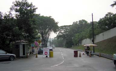
Well, at long last here is update on the airport/Flughafen.
To make it fair (my version) of everyone getting in and out, the new layout means everyone has to fight each other either side of their startsing postion to get anywhere.
Also added some request to make it look more like a small airport.
I am wokring the xml this arvo, so that everyone can examine the gameplay starting postions.
* Pearl Harbour * Waterloo * Forbidden City * Jamaica * Pot Mosbi

I darkened those instructions Tieryn...F5 to view them in the map above.Tieryn wrote:I didn't see the instructions at the bottom of the map until I went looking for these checkpoints. They need to be less grey and invisible, Make them more prevalent and stand out more. Definitely the words need to be a black or darker colour, they blend in too much at the moment
* Pearl Harbour * Waterloo * Forbidden City * Jamaica * Pot Mosbi
-
gimil

- Posts: 8599
- Joined: Sat Mar 03, 2007 12:42 pm
- Gender: Male
- Location: United Kingdom (Scotland)
"Kom. Willy" is spelt "com. willy" in the objectives line.
Also would you consider making the objectives line a good standing out color? like red, and make all the terr names of objective terrs red so that they stand out a little better.
Also would you consider making the objectives line a good standing out color? like red, and make all the terr names of objective terrs red so that they stand out a little better.
What do you know about map making, bitch?
Top Score:2403natty_dread wrote:I was wrong
Fixed Gimil in Version 11 below...the names of terts in Violet, not red, red stands out too much on the map and doesn't compliments the overall colour scheme.gimil wrote:"Kom. Willy" is spelt "com. willy" in the objectives line.
Also would you consider making the objectives line a good standing out color? like red, and make all the terr names of objective terrs red so that they stand out a little better.

* Pearl Harbour * Waterloo * Forbidden City * Jamaica * Pot Mosbi