Page 6 of 12
Re: Sydney Metro V19 (P8) [I] - Bus Attack Routes added
Posted: Tue May 06, 2008 8:53 pm
by oaktown
I agree - the bus depot thing is confusing. Can the Bondi bus attack the Northbridge bus depot? Is that a freeway between them, or a bridge? Or both? And if it's a crossable bridge, why can't Opera House use it to cross and attack the Zoo?
If bus depots can attack other bus depots, it should just say that - don't add a level of confusion trying to figure out if Bondi is along the same freeway as Revesby.
Opera House... you shoudl totally add it, since that's what most non-Australians think of when they think of Sydney. After you've done that, could you add some Koala bears climbing eucalyptus trees, kangaroos wearing boxing gloves, and Crocodile Dundee drinking a Fosters?

If this is supposed to be a tourist map, add it. But I think this is supposed to be a transit system map, which doesn't need the opera house.
Re: Sydney Metro V17 (P7) [I] - Further Comments?
Posted: Wed May 07, 2008 1:17 pm
by cairnswk
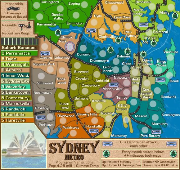
Current version

[/quote]
Re: Sydney Metro V19 (P8) [I] - Bus Attack Routes added
Posted: Wed May 07, 2008 1:39 pm
by TaCktiX
Sorry, the addition of "by the freeways" made it seem like it had a bigger stipulation than "can attack any." My fault for misinterpretation.
Re: Sydney Metro V19 (P8) [I] - Bus Attack Routes added
Posted: Wed May 07, 2008 1:44 pm
by t-o-m
TaCktiX wrote:Sorry, the addition of "by the freeways" made it seem like it had a bigger stipulation than "can attack any." My fault for misinterpretation.
QFT
thats what i was about to say

yea the mentioning the freeway will confuse people, they will look for the freeway connections and may get confused, less confused than my sugg. though

Re: Sydney Metro V19 (P8) [I] - Bus Attack Routes added
Posted: Wed May 07, 2008 1:49 pm
by cairnswk
oaktown wrote:I agree - the bus depot thing is confusing. Can the Bondi bus attack the Northbridge bus depot?
Yes
Is that a freeway between them, or a bridge? Or both? And if it's a crossable bridge, why can't Opera House use it to cross and attack the Zoo?
Opera House can't attack Northbridge or Zoo because they have no bus depots, read the impassable instructions on the map, that's what they are there for.

Surely i don't have to tell you that.
If bus depots can attack other bus depots, it should just say that - don't add a level of confusion trying to figure out if Bondi is along the same freeway as Revesby.
It doesn't matter if they are on the same Freeway, what matters is that the instructions say Bus Depots can attack each other via the Freeways as in Freeways being a utility to get around.
At some point in this whole discussion, and i believe you were included in that, there was discussion about the use of the freeways and bridges....i added the bus depots to validate the use of the freeways & bridges and made it so they could attack each other. I think Oaktown it is you who confuses yourself sometimes by questioning things at a higher level that what it written. Simply accept that the Impassables say freeways are out of bounds to most attacks except the buses, and then connect the dots via the bus depots being able to use the freeways to attack each other. It really is that simple. You don't have to take it extraordinary lengths of interpretation.
Opera House... you should totally add it, since that's what most non-Australians think of when they think of Sydney. After you've done that, could you add some Koala bears climbing eucalyptus trees, kangaroos wearing boxing gloves, and Crocodile Dundee drinking a Fosters?
If this is supposed to be a tourist map, add it. But I think this is supposed to be a transit system map, which doesn't need the opera house.
Now that's a level of sarcasim (my interpretation) i don't like from you in particular. i would have thought you know better than that.
It is not just a transit map, but a map of the layout of Sydney Metro, same as NYC is layout of the map of NY but it still uses the rail system on that map to make gameplay.I choose to use the freeways and ferries on this map. Most people world-over associate that Opera House with Sydney so why not use it. I could have used Macquarie Tower, or the Olympic Stadium, or Bondi Beach, or Central Station or Circular Quay or Kirribili House, and most player would question "what's that?" Same on the Valley of the Kings map, i used the Sphinx and Pyramid.
I think the Opera House plays on perfect image association myself. So it stays.
Re: Sydney Metro V19 (P8) [I] - Bus Attack Routes added
Posted: Wed May 07, 2008 1:53 pm
by cairnswk
TaCktiX wrote:Sorry, the addition of "by the freeways" made it seem like it had a bigger stipulation than "can attack any." My fault for misinterpretation.
TaCktiX wrote:Sorry, the addition of "by the freeways" made it seem like it had a bigger stipulation than "can attack any." My fault for misinterpretation.
Then "via the Freeways" will be removed if it too confusing. But don't ask me in further discussions to justify the use of the bridges or freeways re any questions about the bus depots.
Re: Sydney Metro V19 (P8) [I] - Bus Attack Routes added
Posted: Thu May 08, 2008 3:45 pm
by cairnswk
Interesting history....at the dentist in Northbridge yesterday i came across a history of the North shore of sydney.
Chatswood was named after some bloke's wife whose name was Chatty, and there was a "woods" or small forest if you like close by his acreage that his wife used to enjoy walking in, so he called that place "Chatty's Wood". Nice.
Re: Sydney Metro V19 (P8) [I] - Bus Attack Routes added
Posted: Sun May 11, 2008 8:58 am
by bryguy
1) I like how you cleaned up the water by adding ferry attack routes, but could u make the symbol like 5 pixels bigger? if not, then thats ok
2) I really like the busses
3) You cant see all of the name Monterav, sorry if its already been noted
4) Maybe increase the bonus for waverly since it now has 8 borders?
Re: Sydney Metro V20 Small and Large
Posted: Sun May 11, 2008 12:52 pm
by cairnswk
bryguy wrote:1) I like how you cleaned up the water by adding ferry attack routes, but could u make the symbol like 5 pixels bigger? if not, then thats ok
2) I really like the busses
3) You cant see all of the name Monterav, sorry if its already been noted
4) Maybe increase the bonus for waverly since it now has 8 borders?
All done...in version 20 below, bonuses increased by 1 per suburb that has a bus depot.

- Click image to enlarge.

Re: Sydney Metro V20 (P9) [I] - Small and Large
Posted: Sun May 11, 2008 7:30 pm
by gimil
The color scheme on this one is probably one of my favourites currently in the foundry. Its different from most maps that go through here. However I do have 1 or 2 minor concerns. Firstly I dont like the traffic light crossing they are too untidy and some of them are miscoloured. I little rework shouldnt be to much for a man of your calibar and experience
My next concern is the square dotes used to line the roads. There rather inconsistant and I feel lines would work better.
Oh, and Parramatta isnt formated thet same as the other terr names and is caught under its army circles
Re: Sydney Metro V20 (P9) [I] - Small and Large
Posted: Sun May 11, 2008 8:02 pm
by cairnswk
gimil wrote:The color scheme on this one is probably one of my favourites currently in the foundry. Its different from most maps that go through here. However I do have 1 or 2 minor concerns. Firstly I dont like the traffic light crossing they are too untidy and some of them are miscoloured. I little rework shouldnt be to much for a man of your calibar and experience
That's not a prob, but i don't think they are miscoloured, since they're all a copy of the original.
Can you identify the lights that are untidy please, as i'm not calling the shots on that one.
My next concern is the square dotes used to line the roads. There rather inconsistant and I feel lines would work better.
Mmmmm...i think the dots are better indicators for this purpose and are more to scale. Some of them fall over each other, so i will try and adjust those.
Oh, and Parramatta isnt formated thet same as the other terr names and is caught under its army circles
Oops, don't know what happened there but will fix.
Re: Sydney Metro V20 (P9) [I] - Small and Large
Posted: Sun May 11, 2008 8:07 pm
by gimil
cairns ill get back to you in the morning. Its sleepy time for me.
Re: Sydney Metro V21
Posted: Mon May 12, 2008 2:20 pm
by cairnswk
gimil wrote:cairns ill get back to you in the morning. Its sleepy time for me.
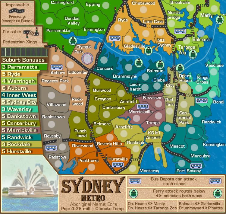
Here's Version 21
Changes:
1. Fixed traffic lights by removing the bottom leg on them...it was making stick-out thingys look ugly!
2. Re-positioned traffic lights for better placement
3. Changed some pedestrian crossings so that they diagonalled across the road as per previous request.
4. Fixed the joins of the dots in the road so they are tidier.
5. Fixed Parrammatta text on large map.

- Click image to enlarge.

Re: Sydney Metro V21 (P10) [I] - Small and Large
Posted: Tue May 13, 2008 5:30 am
by TaCktiX
In the midst of some of your repainting, some text got painted over:
- Opera House
- Concord
Also, I think that the traffic lights are a little TOO close to the freeway, it's making them blend in in some places:
- Rookwood/Burwood
- Peakhurst/Hurstville
- Rockdale/Monteray
- Ryde/Epping
You've got plenty of space at those crossings to move the traffic lights a little bit away from the road. Do the same with the legend description.
Since you're going to keep the bothways description for routes (which I still disagree with), perhaps PhotoShop in a 1px line to make them look like arrows instead of the caret symbols? And bothways should be two words, not one.
As I'm sure you noticed, these are really minor points, I think this map is getting close to some stamping action.
Re: Sydney Metro V22
Posted: Tue May 13, 2008 6:41 am
by cairnswk
TaCktiX wrote:In the midst of some of your repainting, some text got painted over:
- Opera House
- Concord
Fixed
Also, I think that the traffic lights are a little TOO close to the freeway, it's making them blend in in some places:
- Rookwood/Burwood
- Peakhurst/Hurstville
- Rockdale/Monteray
- Ryde/Epping
You've got plenty of space at those crossings to move the traffic lights a little bit away from the road. Do the same with the legend description.
Fixed, plus moved some others.
Since you're going to keep the bothways description for routes (which I still disagree with), perhaps PhotoShop in a 1px line to make them look like arrows instead of the caret symbols? And bothways should be two words, not one.
I've added small triangles instead of 1px lines...didn't like that idea...bothways fixed.
As I'm sure you noticed, these are really minor points, I think this map is getting close to some stamping action.
[/quote][/quote]
Minor points make a polished map, thanks TaCktiX
Version 22 below...

- Click image to enlarge.

Re: Sydney Metro V21 (P10) [I] - Small and Large
Posted: Tue May 13, 2008 6:45 am
by TaCktiX
Ver goot. I say throw a gameplay and graphics stamp on it and sticky the sucker, but why would anybody listen to me?

Re: Sydney Metro V21 (P10) [I] - Small and Large
Posted: Tue May 13, 2008 3:23 pm
by cairnswk
Re: Sydney Metro V21 (P10) [I] - Small and Large
Posted: Tue May 13, 2008 11:27 pm
by oaktown
Alright, let's stamp this sucker.

And my apologies for the Opera House comment - I honestly didn't see that you had added it, and I thought Andy was asking for it!

And I kind of agree that it doesn't fit the look of the map, but I don't know that redrawing it would be worth the effort.
Re: Sydney Metro V21 (P10) [I] - Small and Large
Posted: Wed May 14, 2008 3:58 am
by cairnswk
oaktown wrote:Alright, let's stamp this sucker.
And my apologies for the Opera House comment - I honestly didn't see that you had added it, and I thought Andy was asking for it!
And I kind of agree that it doesn't fit the look of the map, but I don't know that redrawing it would be worth the effort.
Thanks oaktown.
No worries about the Opera House comment. I'll see what i can do to tackle it though.
Re: Sydney Metro V23
Posted: Thu May 15, 2008 7:23 am
by cairnswk
Version 22. A hand-painted Opera House...very freestyle and naive....simplicity.

Re: Sydney Metro V23 (P10) [I,Gp] - Painted Opera House
Posted: Thu May 15, 2008 2:26 pm
by TaCktiX
Well, it looks like a hand-painted Opera House, and since that's what you were going for, good job. I'd say my only lingering concern is the hefty hyphenation: Cen-ten-nial Park. Is there ANY way to change that so it doesn't look so...separated?
Re: Sydney Metro V23 (P10) [I,Gp] - Painted Opera House
Posted: Thu May 15, 2008 2:39 pm
by cairnswk
TaCktiX wrote:Well, it looks like a hand-painted Opera House, and since that's what you were going for, good job. I'd say my only lingering concern is the hefty hyphenation: Cen-ten-nial Park. Is there ANY way to change that so it doesn't look so...separated?
If i removed most of the hyphenation, i would have to move the name over the freeway and into the city area, which i thought would cause some confusion. so i thought while it doesn't look the best as it is, at least it stays within its boundaries. But i'll have another look at it to see if i have exhausted all the alternatives.
EDIT* That sounds like BS
Re: Sydney Metro V24 L&S
Posted: Thu May 15, 2008 3:45 pm
by cairnswk
Version 24.
Changes.
1. Hyphenation on Centennial Park diminished.
2. two new suburbs added; Redfern in City, and Glebe to Inner West.
3. Bonuses on all terits adjusted.
4. Gladesville ferry icon placement adjusted.
5. Leichhardt placement adjusted.
- Click image to enlarge.
Re: Sydney Metro V24 (P10) [I,Gp] - Bonuses adjusted
Posted: Thu May 15, 2008 3:51 pm
by t-o-m
opera house looks good hand-painted, couldnt you have gotten the same effect by using a filter on the layer or something?
Re: Sydney Metro V24 (P10) [I,Gp] - Bonuses adjusted
Posted: Thu May 15, 2008 3:52 pm
by cairnswk
t-o-m wrote:opera house looks good hand-painted, couldnt you have gotten the same effect by using a filter on the layer or something?
not in fireworks CS3.