AOS: Orient Express 1883 [quench'd]
Moderator: Cartographers
Forum rules
Please read the Community Guidelines before posting.
Please read the Community Guidelines before posting.
-
theBastard

- Posts: 994
- Joined: Sat Jan 09, 2010 9:05 am
Re: Orient Express 1883 <v6> p1,10 - new poll!
why so long name - "Orient Expres 1883: Paris - Constantinople"? if you will made maps pack of old famous railways what about name - "Steam Age - Orient Expres", "Steam Age - Transiberian Railway" and so on...?
-
natty dread

- Posts: 12877
- Joined: Fri Feb 08, 2008 8:58 pm
- Location: just plain fucked
Re: Orient Express 1883 <v6> p1,10 - new poll!
Firstly, I want the year to be specified in the title. It goes a long way creating mood for the map - it gives a point of reference and tells the players they are not playing in the present, but in the past.
The second part, about the route of the railway, could probably be omitted.
The second part, about the route of the railway, could probably be omitted.

-
natty dread
- Posts: 12877
- Joined: Fri Feb 08, 2008 8:58 pm
- Location: just plain fucked
Re: Orient Express 1883 <v6> p1,10 - new poll!
Ok so I changed Moravia -> Slovakia. Also changed the font of land territories, I think this looks better...
- Click image to enlarge.

-
theBastard
- Posts: 994
- Joined: Sat Jan 09, 2010 9:05 am
Re: Orient Express 1883 <v6> p1,10 - new poll!
I think font should be another. maybe something like on this picture?

-
natty dread
- Posts: 12877
- Joined: Fri Feb 08, 2008 8:58 pm
- Location: just plain fucked
Re: Orient Express 1883 <v6> p1,10 - new poll!
I'm already using a similar font for the title. I doubt it would work for territory names - the font for territory names needs to be compact yet easily legible and the current one is both while somewhat fitting the visual style.theBastard wrote:I think font should be another. maybe something like on this picture?
Also look at the small red text at the very top edge of that picture - it looks quite similar to the territory font I have now, I think.
-
theBastard
- Posts: 994
- Joined: Sat Jan 09, 2010 9:05 am
Re: Orient Express 1883 <v6> p1,10 - new poll!
I can not find something better and yes they are fine.
-
natty dread
- Posts: 12877
- Joined: Fri Feb 08, 2008 8:58 pm
- Location: just plain fucked
-
MarshalNey

- Posts: 781
- Joined: Mon Sep 28, 2009 9:02 pm
- Gender: Male
- Location: St. Louis, MO
Re: Orient Express 1883 <v6> p1,10 - new poll!
Map pack names will make it easier for people to find them on the browser, though. When the list is upwards of 150 maps, it's easy to miss some. Players might never know a sequel existed to Orient Express otherwise, until maybe months later. Who knows? Maybe, if they'd known there was another "Orient Express" map out there, they might have stayed on CC, but instead they got bored and left... 
Anyway, I think "Age of..." is overdone and "The Steam Age:" would work, while taking out the route subtitles.
"The Steam Age: Orient Express 1888". Not that long at all. Perfect, in fact.
Anyway, I think "Age of..." is overdone and "The Steam Age:" would work, while taking out the route subtitles.
"The Steam Age: Orient Express 1888". Not that long at all. Perfect, in fact.
-
natty dread
- Posts: 12877
- Joined: Fri Feb 08, 2008 8:58 pm
- Location: just plain fucked
Re: Orient Express 1883 <v6> p1,10 - new poll!
Hm. Not bad...MarshalNey wrote:
"The Steam Age: Orient Express 1888". Not that long at all. Perfect, in fact.
-
Evil DIMwit

- Posts: 1616
- Joined: Thu Mar 22, 2007 1:47 pm
- Gender: Male
- Location: Philadelphia, NJ
Re: Orient Express 1883 <v6> p1,10 - new poll!
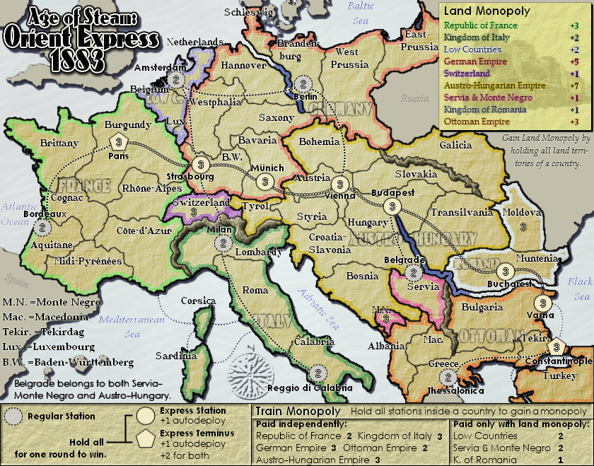
1. It'd be nice if you clarified somewhere on the map what Belgrade belongs to and where it connects to.
2. It looks really strange the Germany and Austria-Hungary's colored borders continue along their internal rivers rather than sticking to the actual national border. Ditto for the mountains between Macedonia and Bulagria.
That's really all for now. Some of the bonuses I'm not quite sure about -- like the Low Countries' 4/4/4 and Servia & Monte Negro's 3/3/3 -- but if it looks fair to you then I'm not complaining.


-
The Bison King

- Posts: 1957
- Joined: Thu Aug 27, 2009 5:06 pm
- Location: the Mid-Westeros
Re: Orient Express 1883 <v6> p1,10 - new poll!
When are we going to get a look at the Pacific Railway?
-
natty dread
- Posts: 12877
- Joined: Fri Feb 08, 2008 8:58 pm
- Location: just plain fucked
Re: Orient Express 1883 <v6> p1,10 - new poll!
I agree, and I'm planning to.Evil DIMwit wrote:1. It'd be nice if you clarified somewhere on the map what Belgrade belongs to and where it connects to.
Ditto.2. It looks really strange the Germany and Austria-Hungary's colored borders continue along their internal rivers rather than sticking to the actual national border. Ditto for the mountains between Macedonia and Bulagria.
What would you suggest instead? I've found the average between territory count & border count to be a fairly good quick formula, but often they will require some tweaking... (yes I know bonus sheets and yes I'm lazy)That's really all for now. Some of the bonuses I'm not quite sure about -- like the Low Countries' 4/4/4 and Servia & Monte Negro's 3/3/3 -- but if it looks fair to you then I'm not complaining.
Soon... It's been tough since - being an European - I know next to zero about US geography & history. Fortunately Marshal has been kind enough to assist on that front. I still have some territory borders to figure out, and some tweaking to do, but I'll try to get some work done on it tomorrow. At the very least I'm hoping to have the first draft posted in the next few days.The Bison King wrote:When are we going to get a look at the Pacific Railway?
-
natty dread
- Posts: 12877
- Joined: Fri Feb 08, 2008 8:58 pm
- Location: just plain fucked
Re: Orient Express 1883 <v6> p1,10 - new poll!
v7
fixed the colour borders, and added text about belgrade. Also title
for the record I haven't had the chance to work on the pacific rail, I've been too busy with the maps that are actually in production. But I'll get it posted eventually...
- Click image to enlarge.

for the record I haven't had the chance to work on the pacific rail, I've been too busy with the maps that are actually in production. But I'll get it posted eventually...
-
theBastard
- Posts: 994
- Joined: Sat Jan 09, 2010 9:05 am
Re: Orient Express 1883 <v6> p1,10 - new poll!
maybe you could write notice in legend about Belgrade with the same font (strong) as others. at the firts look I can not find it...
-
natty dread
- Posts: 12877
- Joined: Fri Feb 08, 2008 8:58 pm
- Location: just plain fucked
Re: Orient Express 1883 <v7> p1,11 - new poll!
I can try but I'm not sure if I can fit the text in the actual legend. However I can make the text bolded so it stands out better.
-
porkenbeans

- Posts: 2546
- Joined: Mon Sep 10, 2007 4:06 pm
Re: Orient Express 1883 <v7> p1,11 - new poll!
I have not been able to look in on this map in a while, and It looks like some positive advances have been made. I am honestly shocked. 
This map is on the verge of beauty. Natty, this is the best thing that I have seen from you graphically. It is in a whole different league than moon map, and even the NC map for that matter.
I do not know where to start, with the positives of this map.
The first thing I will mention is the train station circles. I would lobby to have all the maps with train stations circles, to be upgraded to this standard.
I will be the first person to tell you how much I hate maps, with more than one territory name within the same border. Maps like Iraq drive me nuts. And since I do not have map inspector anymore, I rarely play games of that type.
Games that have rail lines or roads are the exception, as they are not to difficult to visualize.
These "neon" circles that you have incorporated only on the train stations is "brilliant". (pun intended).
I will save the rest of the nice things going on, for future comment, and get to the suggestion portion, of my feedback.
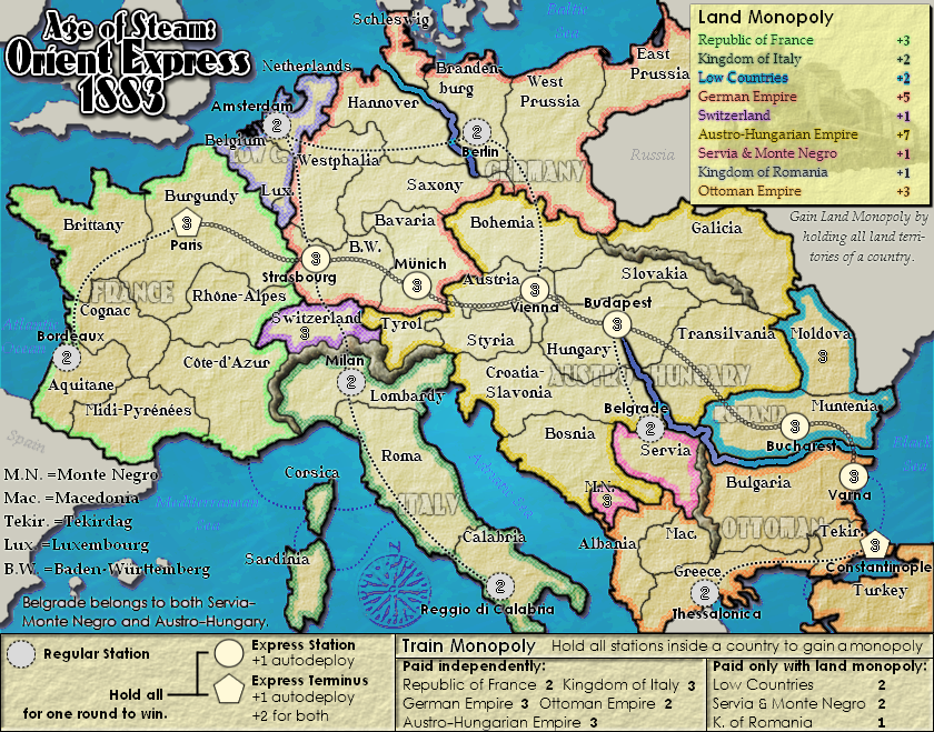
Like on Nordic, my advise is the same. Look at the contrast between the foreground (land), and the background (water). This is the first, really critical step, as you begin to lay out the graphics. You need to create some kind of contrast, by using one or more techniques, such as texture, color, brightness etc...
Nordic went with the light, dark back. I suggest that you go the opposite on this one. You will loose the drop shadow from the foreground if you make the background dark. So just lighten it way up to an off blu/wht. This will also do wonders for that blue text over the water.
One last thing , Do not under any circumstances, start throwing any bevel on this map. If you want to experiment with something, try playing around with some gradients. (on the back ground).
So basically, make the water have the same contrast, that the train circles have, with the land.
This map is on the verge of beauty. Natty, this is the best thing that I have seen from you graphically. It is in a whole different league than moon map, and even the NC map for that matter.
I do not know where to start, with the positives of this map.
The first thing I will mention is the train station circles. I would lobby to have all the maps with train stations circles, to be upgraded to this standard.
I will be the first person to tell you how much I hate maps, with more than one territory name within the same border. Maps like Iraq drive me nuts. And since I do not have map inspector anymore, I rarely play games of that type.
Games that have rail lines or roads are the exception, as they are not to difficult to visualize.
These "neon" circles that you have incorporated only on the train stations is "brilliant". (pun intended).
I will save the rest of the nice things going on, for future comment, and get to the suggestion portion, of my feedback.
Like on Nordic, my advise is the same. Look at the contrast between the foreground (land), and the background (water). This is the first, really critical step, as you begin to lay out the graphics. You need to create some kind of contrast, by using one or more techniques, such as texture, color, brightness etc...
Nordic went with the light, dark back. I suggest that you go the opposite on this one. You will loose the drop shadow from the foreground if you make the background dark. So just lighten it way up to an off blu/wht. This will also do wonders for that blue text over the water.
One last thing , Do not under any circumstances, start throwing any bevel on this map. If you want to experiment with something, try playing around with some gradients. (on the back ground).
So basically, make the water have the same contrast, that the train circles have, with the land.

-
natty dread
- Posts: 12877
- Joined: Fri Feb 08, 2008 8:58 pm
- Location: just plain fucked
Re: Orient Express 1883 <v7> p1,11 - new poll!
Thanks for your kind words, pork. I'm glad you like it, I'm also very fond of this map.
As for the water contrast... I'm using 2 types of contrast: opposite colour contrast (blue water - yellow/brown land, opposite colours in the RGB scheme) and sharpness contrast (land sharper than water, more in focus). I could lighten the water somewhat, but not much... the water text doesn't worry me too much, it is in no way relevant to the gameplay and is strictly decorative.
Don't worry, I do not intend to add any bevel to this map...
-
porkenbeans
- Posts: 2546
- Joined: Mon Sep 10, 2007 4:06 pm
Re: Orient Express 1883 <v7> p1,11 - new poll!
Yes, you can play with the lightness of the water it needs to be either lighter or darker than the land. right now it is too close in brightness. the color saturation is also very close to each other. I would hue it out and make it more of a very light grey/blue. this will Give the land the richest saturation on the map. The blue against yellow is in fact one of the good things that I failed to mention. There are also some other things that I want to talk about. But that will wait for another time.natty_dread wrote:Thanks for your kind words, pork. I'm glad you like it, I'm also very fond of this map.
As for the water contrast... I'm using 2 types of contrast: opposite colour contrast (blue water - yellow/brown land, opposite colours in the RGB scheme) and sharpness contrast (land sharper than water, more in focus). I could lighten the water somewhat, but not much... the water text doesn't worry me too much, it is in no way relevant to the gameplay and is strictly decorative.
Don't worry, I do not intend to add any bevel to this map...
-
natty dread
- Posts: 12877
- Joined: Fri Feb 08, 2008 8:58 pm
- Location: just plain fucked
-
porkenbeans
- Posts: 2546
- Joined: Mon Sep 10, 2007 4:06 pm
-
natty dread
- Posts: 12877
- Joined: Fri Feb 08, 2008 8:58 pm
- Location: just plain fucked
Re: Orient Express 1883 <v7> p1,11 - new poll!
No and no.
Forgive me for being blunt, but both look horrible.
Forgive me for being blunt, but both look horrible.

Re: Orient Express 1883 <v7> p1,11 - new poll!
Well, I'm not big on the white sea, but the blue is okay. That being said, I still don't like it better than yours, natty.
-
natty dread
- Posts: 12877
- Joined: Fri Feb 08, 2008 8:58 pm
- Location: just plain fucked
Re: Orient Express 1883 <v7> p1,11 - new poll!
Ok then...
Original
Lightened
Is it an improvement?
Original
- Click image to enlarge.
- Click image to enlarge.

-
theBastard
- Posts: 994
- Joined: Sat Jan 09, 2010 9:05 am
Re: Orient Express 1883 <v7> p1,11 - new poll!
for me lightened looks better. natty, why you can not do notice about Belgrad with the same font as others (M.N. = Monte Negro, Mac. = Macedonia...)? it should looks better I think...
-
natty dread
- Posts: 12877
- Joined: Fri Feb 08, 2008 8:58 pm
- Location: just plain fucked
Re: Orient Express 1883 <v7> p1,11 - new poll!
The belgrade thing is information about the map so I'm using the legend font for that.