Cairns Coral Coast [Quenched] - Loaded!
Moderator: Cartographers
Forum rules
Please read the Community Guidelines before posting.
Please read the Community Guidelines before posting.
-
Ruben Cassar

- Posts: 2160
- Joined: Thu Nov 16, 2006 6:04 am
- Gender: Male
- Location: Civitas Invicta, Melita, Evropa


-
DiM

- Posts: 10415
- Joined: Wed Feb 14, 2007 6:20 pm
- Gender: Male
- Location: making maps for scooby snacks
if you put both wood and stone bridges don't put them randomly. i'd suggest putting wooden bridges on the coastline and stone ones inside the land. 
“In the beginning God said, the four-dimensional divergence of an antisymmetric, second rank tensor equals zero, and there was light, and it was good. And on the seventh day he rested.”- Michio Kaku


-
spinwizard
- Posts: 5016
- Joined: Sun Dec 10, 2006 9:52 am


Heh, it's not just Wisse, it's pretty much the entire foundry that is very direct about what they don't like. Haven't you ever seen when people post really bad ideas? Now THAT is brutal.spinwizard wrote:do u do anything other than complain?Wisse wrote:the bridges looks bad and the rivers are not the same style as the map is
But it is what it is, just compare the maps now in Final Forge to half the maps currently in play like Montreal and Brazil. The system works. It's not for the overly sensitive, but a bunch of pats on the back aren't going to help you make your map better.

-
Ruben Cassar
- Posts: 2160
- Joined: Thu Nov 16, 2006 6:04 am
- Gender: Male
- Location: Civitas Invicta, Melita, Evropa
Agreed. I think that should solve it, although the old bridges were not bad either.Samus wrote:The white lines make it look like you can only cross if you're Spider-Man. Ditch those and I think you're in business.
You should not have changes them just because Wisse said so. There must be more than one person complaining about them. And Wisse can be a pain in the a$$ and he knows it. :p Hehe.


Version 22 - Bridges with Sharp colour definition
Thank you guys, however, in fairness to Wisse I think he was the catalyst for changing them. I recall someone in another thread saying how good it was that ideas are challenged for the best result in the maps.Ruben Cassar wrote:Agreed. I think that should solve it, although the old bridges were not bad either.Samus wrote:The white lines make it look like you can only cross if you're Spider-Man. Ditch those and I think you're in business.
You should not have changes them just because Wisse said so. There must be more than one person complaining about them. And Wisse can be a pain in the a$$ and he knows it. :p Hehe.
I wasn't really happy with either the stone or wooden versions, but am very happy with these. They:
* blend with the colour of the territories
* maintain the style of the map
* are unobtrusive and don't stand out like dogs ##lls
* are subtle but can still be seen clearly.
Hope these are acceptable.

Last edited by cairnswk on Mon Mar 26, 2007 8:12 pm, edited 1 time in total.

* Pearl Harbour * Waterloo * Forbidden City * Jamaica * Pot Mosbi
-
Ruben Cassar
- Posts: 2160
- Joined: Thu Nov 16, 2006 6:04 am
- Gender: Male
- Location: Civitas Invicta, Melita, Evropa
-
Ruben Cassar
- Posts: 2160
- Joined: Thu Nov 16, 2006 6:04 am
- Gender: Male
- Location: Civitas Invicta, Melita, Evropa
There's no need to defend yourself. Good ideas are used throughout different maps by different map makers. There's nothing wrong with using the same style. I think it works so don't change the bridges anymore.cairnswk wrote:Guys...in my defense.....I had not seen the Netherlands map until after Ruben and Boberz mentioned it. But I agree, they work, and are easy on the eyes....so why not use this style.
-
Contrickster
- Posts: 261
- Joined: Tue Jan 23, 2007 7:24 pm
This map has a nice relaxed feeling and detail which does not seem out of place on a map of such specific location. I prefer the crosshatch bridges because they add detail. With the colour only bridges you move to a simplistic style which is against the theme of "manageable detail" you have already set down - palm trees, many mountains, lakes etc. So go with crosshatch bridges, makes the map interesting, fits in with the detail already present.
Overall the first thing I notice is the perspective. The Swamp and The Beaches look flat while Agate Hills and Fruit Pickers look verticle. Perhaps something can be done with the river inbetween to make the effect less jarring.
Overall the first thing I notice is the perspective. The Swamp and The Beaches look flat while Agate Hills and Fruit Pickers look verticle. Perhaps something can be done with the river inbetween to make the effect less jarring.
Thanks Contrickster for your feedback!
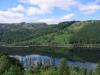
With regard to the perspective and your perceptions of some territories looking flat and vertical, this is simply illusion created by the natural run of the mountains, and this interaction with the coast and rivers. This IS how the mountain run in this area of the world. And the rivers also run on these routes.
This is a REAL (not imaginary) geographic map of this area in Queensland Australia. I did this map because the features of the mountains, rivers, dam, swamps, islands and tableland rises make up a set of appealing natural style barriers between regions. Fortunately, we can pass over the tableland rises and bridges which are almost in the same place as actual real bridges.
Actually, after having implemented your suggestion, the cross hatch bridges ruin the effect of the bridges blending with the territories. I feel there is already enough aspects on this very compact map and cross-hatch bridges add further unnecessary aspects to concentrate on.Contrickster wrote:So go with crosshatch bridges, makes the map interesting, fits in with the detail already present.
Overall the first thing I notice is the perspective. The Swamp and The Beaches look flat while Agate Hills and Fruit Pickers look verticle. Perhaps something can be done with the river inbetween to make the effect less jarring.
With regard to the perspective and your perceptions of some territories looking flat and vertical, this is simply illusion created by the natural run of the mountains, and this interaction with the coast and rivers. This IS how the mountain run in this area of the world. And the rivers also run on these routes.
This is a REAL (not imaginary) geographic map of this area in Queensland Australia. I did this map because the features of the mountains, rivers, dam, swamps, islands and tableland rises make up a set of appealing natural style barriers between regions. Fortunately, we can pass over the tableland rises and bridges which are almost in the same place as actual real bridges.
* Pearl Harbour * Waterloo * Forbidden City * Jamaica * Pot Mosbi
Version23 Bridges with faded colour
As requested. Samus.Samus wrote:Would it be possible to do more of a gradual blend of the colors across the bridges?

Last edited by cairnswk on Mon Mar 26, 2007 8:10 pm, edited 1 time in total.
* Pearl Harbour * Waterloo * Forbidden City * Jamaica * Pot Mosbi