Posted: Fri Aug 03, 2007 8:51 am
Could you move the Sextus text left a little?
Conquer Club, a free online multiplayer variation of a popular world domination board game.
https://conquerclub.com/forum/
Done Coleman....and fixed a couple small names in the process. ThanksColeman wrote:Could you move the Sextus text left a little?

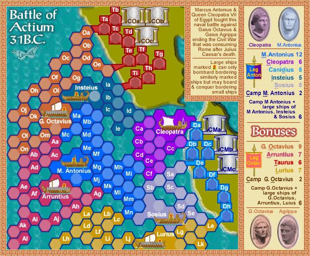
Keredrex...care to show what u mean?Keredrex wrote:I must admit at first glance .. I was turned off a bit.. But after really looking at the map and the possible game play... I am interested....Personally I feel the colors could be toned down a bit... Maybe even instead of Colored Hexes.. Make them all one color of the Water... and Have a Colored Line Border surrounding the Appropriate Group Of Hexes per terrritory (instead of the Blue line)......Then Again It really isn't that big a deal if you can't Change it... Otherwise the Map is becoming more interesting
unriggable wrote:I think its great. Just make the army circles a bit less transparent.
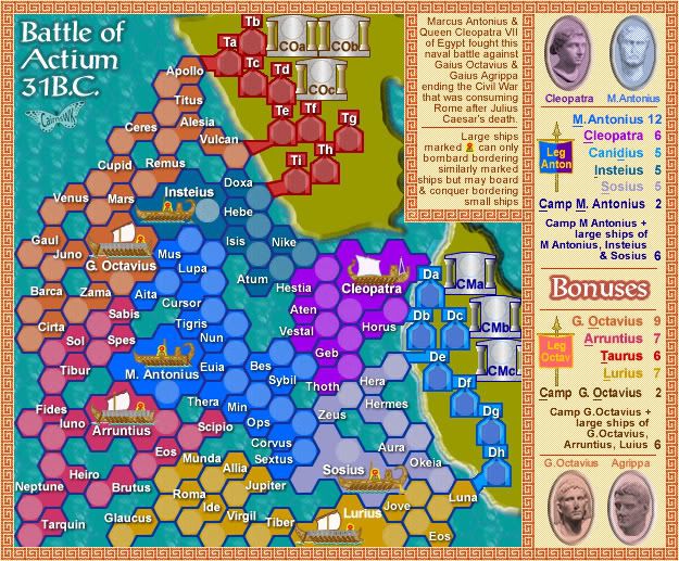
Uh Uh. thanks WM for your observation. I am still in the juryroom on this one. and no the underlines won't stay if these new names stay, but it is an inetersting exercise even just to see what it looks like. It is difficult to get short names for these size terts, which is how your observation applies. So iguess the old names kind of do apply better. I wanted to try this in refercne to someone's posting way back about "not another map like Chinese Checkers with two coordinate names"WidowMakers wrote:I personally liked the other names. They helped keep everything into a particular group. With all of the new names, you really need to hunt and search for where they are.
But if you choose to stay with these, do you need to keep the underlined letter in the legend?
WM
Sure If you want I can Email it to u or Just put an image here but I have'nt posted images in the forums yetcairnswk wrote: Keredrex...care to show what u mean?
OK. Keredrex. I see what you mean....it won't take long to do a version like that, so i'll proceed and see what it looks like. Thanks.Keredrex wrote:Sure If you want I can Email it to u or Just put an image here but I have'nt posted images in the forums yetcairnswk wrote: Keredrex...care to show what u mean?
Keredrex, below is i hope what you were talking about. What do you think?Keredrex wrote:Sure If you want I can Email it to u or Just put an image here but I have'nt posted images in the forums yetcairnswk wrote: Keredrex...care to show what u mean?

Keredrex....here is the change the you asked for re the transparency on the water, and i finished the drop shadows of the names. But if have to say, IMHO this really doesn't work on this map.Keredrex wrote:It is but I figured the color inside the hexes to be the same as the water..and you need to finish the drop shadow some of the names..
Yes d.gishman...thats a very good idea. Something liked.gishman wrote:Since there are so many different ship names, in the XML, it might help to indicate which army it belongs to then say the ship names (I like the ship names, more exciting than the previous names)
yes i've thaken that into account, but i don't think the transparent version will go forward at this stage, unless the whole forum wants it....I certainly prefer the stronger colours with all the ships colour filled in with a strong border.For the more transparent version, Sosius ships should have a darker outline, and Lurius is hard to see as well
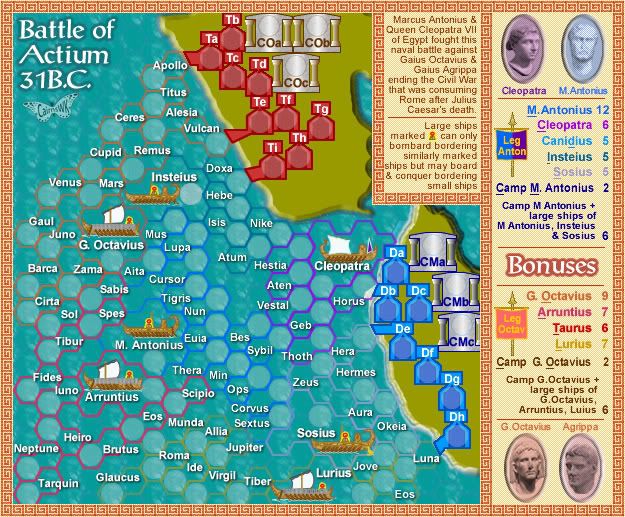
I myself prefer the #1 map at the top of page 11....its bold and bright but at least one can see where the ships borders are and the ships are different colours from the water.d.gishman wrote:To cairnswk: yeah, "C Horus" and so forth would be good.
I would prefer either #1 or #2, but not #3, because i dont think the hexes should be the same colour as the water
Andy this is the small version of the solid colour map.AndyDufresne wrote:Hm, I think the best option is still the solid color. Second would maybe be the bubble white, but the last option of just sea color is just bad, or at least I think so.
Could we have a look at the other version of the map? (Is it the large or small you are working on?)
--Andy
That's OK Keredrex....good exercise in options.Keredrex wrote:...I agree I just wanted to see how it looked but the original is better.... However... in th original you have a blue line around ALL the hexes... Try going back to that version but make the entire hex the same color except for army circle... Or maybe if the Hex is Red then the Border of the hex is Dark red or Light Red... You Know??
Andy below are two versions.AndyDufresne wrote:Hm, I think the best option is still the solid color. Second would maybe be the bubble white, but the last option of just sea color is just bad, or at least I think so.
Could we have a look at the other version of the map? (Is it the large or small you are working on?)
--Andy
onbekende...they are meant to look like stone figures.onbekende wrote:Those current images are stone figures
try to find az good foto iof Cleopatra, I dare you