Madagascar [Quenched]
Moderator: Cartographers
Forum rules
Please read the Community Guidelines before posting.
Please read the Community Guidelines before posting.

Re: Madagascar-LASTEST VERSION PAGE 10. JUST UPDATED
your army circles may actually make it harder to read the army counts... those circles may require a re-think.

Re: Madagascar-LASTEST VERSION PAGE 10. JUST UPDATED
thanks, and yeh ill look around.hulmey wrote:Congrats tom, this map really looks good and i love everything about it apart the colours. They appear drab and boring.
Also your impassables could be improved alot more. scour the foundry and see other peoples impassables and then if u like one try and contact them for help
yes i agree, i will try some other things out and re-post the draftoaktown wrote:your army circles may actually make it harder to read the army counts... those circles may require a re-think.
Re: Madagascar-LASTEST VERSION PAGE 11. Version 6.8
ok here we go, ive made the army cirlces have less contrast so theyre more of one colur, which i then brightened so theyre more white - i hope they look ok
i generally touched up (sounds dirty )...touch up a few areas
  like on the colours where the colour didnt continue right to the end because of the sea bevel - most noticeable on the orange cont.
im trying out some new forests, so tell me what you think - (if im going in the right direction or not) and the new mountains arent staying - theyre just there for the sake of being there lol...
anyway what do you think and please give some critisism!
EDIT:
oak, is it ok to have differing ocpacities on army circles, e.g have a different ocpacity on the brown cont to the pinkish/redish cont. to make them look equal or make the army #'s more readable?
i generally touched up (sounds dirty
im trying out some new forests, so tell me what you think - (if im going in the right direction or not) and the new mountains arent staying - theyre just there for the sake of being there lol...
anyway what do you think and please give some critisism!
- Click image to enlarge.

oak, is it ok to have differing ocpacities on army circles, e.g have a different ocpacity on the brown cont to the pinkish/redish cont. to make them look equal or make the army #'s more readable?
Re: Madagascar-V. 6.8 Page 11 NEW Forests
any comments?
trees?
forests?
jungle!?
trees?
forests?
jungle!?

Re: Madagascar-V. 6.8 Page 11 NEW Forests
Boo on trees and mountainst-o-m wrote:any comments?
trees?
forests?
jungle!?
Where are my knots?
Re: Madagascar-V. 6.8 Page 11 NEW Forests
ZeakCytho wrote: Where are my knots?
in photoshop
i'll get onto them soon but i dont know where to start! i think it'll have to be made out of many layers coz they need to have different effects on them in my mind??
-
steve monkey
- Posts: 490
- Joined: Sat May 13, 2006 5:25 pm
- Location: London
Re: Madagascar-V. 6.8 Page 11 NEW Forests
I've just read through the thread, the map's coming on well. Before you get too focussed on making the forests more 'foresty' I suggest you look again at the bonuses you've allocated. This has been brought up on a number of occasions but has still not been adressed. However, 'pretty' a map may be, it's popularity or lack thereof, is going to come down to its playability.
I think you have the bonuses wrong.
Fianarantsoa - all 5 territories border, this is going to be very difficult to defend. Your 3 bonus is too low, it should be at least 4 for holding such a difficult continent.
Toliara - Only has 3 borders to defend. Your 4 bonus is too high, it should be 3
Antananarivo - Has 3 borders to defend and being in the centre of the island is likely to be used as a 'crossroads', could be problematic to hold. Your 2 bonus is too low, it should be 3
Toamasina - Has 3 borders to defend, but only 3 in total. Your bonus of 2 is about right.
Mahajanga - Has only 2 borders to defend. Your 3 bonus is too high, it should be 2.
Antisiranana - Has 2 borders to defend, but only 2 in total. Your bonus of 1 is right.
I hope this helps.

May the dice gods shine favourably upon you.
-
Ruben Cassar

- Posts: 2160
- Joined: Thu Nov 16, 2006 6:04 am
- Gender: Male
- Location: Civitas Invicta, Melita, Evropa
Re: Madagascar-V. 6.8 Page 11 NEW Forests
There's a lot of work to do on this one so this is going to be a long list. Hope it helps.
1. The colour scheme you chose is very difficult for me to read and honestly is a bit dull. Try to change some colours.
2. The font needs to be changed and that stroke makes it look ugly. It is also confusing to see the name of a territory overlap in another territory.
3. I would remove the background image and just use an image of the sea.
4. Add some textures to the regions...they look too flat and dull.
5. The impassable objects are not good either. Perhaps someone can help you make them better?
6. I would just put the mini map in the lower right corner and remove the legend with the names. There's no need for both of them, just merge them into one.
7. The army circles are not making it any easier to read the number of armies. You need to change those.
Good luck!


Re: Madagascar-V. 6.8 Page 11 NEW Forests
yes i said that ide look into them when i had more time. LoVo suggested some and i havnt even had time to look at them! sorry LoVosteve monkey wrote:I've just read through the thread, the map's coming on well. Before you get too focussed on making the forests more 'foresty' I suggest you look again at the bonuses you've allocated. This has been brought up on a number of occasions but has still not been adressed. However, 'pretty' a map may be, it's popularity or lack thereof, is going to come down to its playability.
I think you have the bonuses wrong.
i agree 4 it is. BUT the reason it was so low is because its only a small terit map, and having a higher bonus would make it easier to dominate, but ill change it.steve monkey wrote:Fianarantsoa - all 5 territories border, this is going to be very difficult to defend. Your 3 bonus is too low, it should be at least 4 for holding such a difficult continent.
4 terits, 3 defending terits, 5 ajacent terits, 3 ajacent conts. it has 5 ajacent terits and 3 defending terits; so i went for 4!steve monkey wrote:Toliara - Only has 3 borders to defend. Your 4 bonus is too high, it should be 3
anyway i need discussion on that cont!
3 for holding 3 terits?steve monkey wrote:Antananarivo - Has 3 borders to defend and being in the centre of the island is likely to be used as a 'crossroads', could be problematic to hold. Your 2 bonus is too low, it should be 3
need discussion on these bonuses lol i think i see what you mean about cross-roads, so 3 it is
yepsteve monkey wrote:Toamasina - Has 3 borders to defend, but only 3 in total. Your bonus of 2 is about right.
4 terits, 2 defending terits, 3 ajacent terits, 2 it is.steve monkey wrote:Mahajanga - Has only 2 borders to defend. Your 3 bonus is too high, it should be 2.
steve monkey wrote:Antisiranana - Has 2 borders to defend, but only 2 in total. Your bonus of 1 is right.
lol
thanks, ill look into all of thesesteve monkey wrote:I hope this helps.
Re: Madagascar-V. 6.8 Page 11 NEW Forests
in what way shall i change it? brighter? darker? less colour? more colour? more contrast between colours?Ruben Cassar wrote: 1. The colour scheme you chose is very difficult for me to read and honestly is a bit dull. Try to change some colours.
just need some colours ideas
i will try other strokes and see if it looks better with it taken off,Ruben Cassar wrote: 2. The font needs to be changed and that stroke makes it look ugly. It is also confusing to see the name of a territory overlap in another territory.
yes i agree with the terit names, shall i make them smaller? put a line indicating the terit name? use initials: A-M for Aloatra-Mangoro
?
use an image of the sea, or just improve the sea?Ruben Cassar wrote: 3. I would remove the background image and just use an image of the sea.
will doRuben Cassar wrote: 4. Add some textures to the regions...they look too flat and dull.
yes theyre one of the main priorities, im looking into it now.Ruben Cassar wrote: 5. The impassable objects are not good either. Perhaps someone can help you make them better?
hmm...i dont know, i quite like it as it is now; lets see what otehrs think.Ruben Cassar wrote: 6. I would just put the mini map in the lower right corner and remove the legend with the names. There's no need for both of them, just merge them into one.
yesRuben Cassar wrote: 7. The army circles are not making it any easier to read the number of armies. You need to change those.
thanksRuben Cassar wrote: Good luck!
and thanks for all of your comments i will try to address all of them soon
--tom
-
Balsiefen

- Posts: 2299
- Joined: Wed Aug 30, 2006 6:15 am
- Gender: Male
- Location: The Ford of the Aldar in the East of the Kingdom of Lindissi
- Contact:
Re: Madagascar-V. 6.8 Page 11 NEW Forests
The coastline, while nice in the east, looks very strange in the west, you may want to take a look into that.
Re: Madagascar-V. 6.8 Page 11 NEW Forests
its because of the bevel on the sea, i could see if i could get rid of that glowy thing lolBalsiefen wrote:The coastline, while nice in the east, looks very strange in the west, you may want to take a look into that.
Re: Madagascar-LASTEST VERSION PAGE 11. Version 6.8
Sure, but I don't think that's the problem with these circles. In my opinion army circles make the counts easier to read because theyt-o-m wrote:oak, is it ok to have differing ocpacities on army circles, e.g have a different ocpacity on the brown cont to the pinkish/redish cont. to make them look equal or make the army #'s more readable?
1) provide a background color that contrasts with the color of the count, and
2) provide a clean background with lines or elements that interfere with one's reading of the count.
Since you're using a graphic for the army circle rather than a simple, filled circle, the circles actually add lines and shadows that make the number harder to read (see #2 above).
As for the bonuses, I'd suggest coming up with a formula and running all of your regions through it just to be sure you are assigning bonuses in a consistent way. There are three excel spreadsheets with different formulas to choose from here at:
http://www.conquerclub.com/forum/viewto ... 470#p17470
And on small maps I would tell mapmakers to err on the side of making bonuses too low. If you make one clearly advantageous starting position a game on an unbalanced small map could be over by round 3.
Re: Madagascar-V. 6.8 Page 11 NEW Forests
I like the idea, I like Madagascar, I like the gameplay, and I’m one hundred percent behind you on getting the map made. But…
The graphics suck, concentrated in these three areas: Ocean, forests, mountains. I like the colours of the land and ocean, and how the tone of the lands match each other but contrast the sea, although I’m not sure about the pink territory (it looks like regurgitated red Jell-O). But as for the problem bits…
The ocean: This is the biggest problem for me. It’s a lovely colour. I like the colour, and I think you oughtn’t to change it. But as of right now, to me it looks like it’s poised as a massive tsunami just waiting to spill over the land and crush all the poor lemurs.
I personally think if you made the outlines of the island look something like this >link<, it might be good. Or the equivalent idea on rocky coast. Maybe just make it look like surf is rolling in from an aerial point of view instead of bevelling. It’s a lot more work, but I think it would look better. It could be achieved by taking a very large hard round brush and setting it to 5 or so percent opacity and then swiping it around underneath the land layers a lot of times.
The forest: It looks like you stuck a couple of inchworms on the map. It does! I swear! One’s even inching along! This one might be fixed by having rather more massive forests. You could have the troop dots be clearings in it. That, however, might obscure some territory colours—so you might want to try and see if it looks good to have the forests “match” the land, being slightly darker than it. Possibly they might also look less out of place if you scattered rocks about other areas, or added some other small geographical features.
The mountains: They’re better than the earthworm mountains, but now it looks like a snake. Sorry! I think it's because they're so thin that they look odd. Also (and this is probably an idiot question revealing my lack of geographical knowledge about Madagascar, but…) does Madagascar have mountains in those areas?
I haven’t got the time right now, but I could tell you how I make slightly more realistic mountains sometime, if you want.
That’s all I have to offer. Sorry if it wasn’t helpful.
Reputation cleared.  Never let it be said that Team CC don't investigate fairly.
Although they take bloody forever to do it...
Although they take bloody forever to do it...
Re: Madagascar-V. 6.8 Page 11 NEW Forests
thank youMjinga wrote:I like the idea, I like Madagascar, I like the gameplay, and I’m one hundred percent behind you on getting the map made. But…
i agreeMjinga wrote: The graphics suck, concentrated in these three areas: Ocean, forests, mountains. I like the colours of the land and ocean, and how the tone of the lands match each other but contrast the sea, although I’m not sure about the pink territory (it looks like regurgitated red Jell-O). But as for the problem bits…
Mjinga wrote: The ocean: This is the biggest problem for me. It’s a lovely colour. I like the colour, and I think you oughtn’t to change it. But as of right now, to me it looks like it’s poised as a massive tsunami just waiting to spill over the land and crush all the poor lemurs.
i will try this, but this will be lower priority - im trying to get the amin things out of the way then go into smaller detailMjinga wrote: I personally think if you made the outlines of the island look something like this >link<, it might be good. Or the equivalent idea on rocky coast. Maybe just make it look like surf is rolling in from an aerial point of view instead of bevelling. It’s a lot more work, but I think it would look better. It could be achieved by taking a very large hard round brush and setting it to 5 or so percent opacity and then swiping it around underneath the land layers a lot of times.
yes - im still trying desperately to find the right sort of forest/tree area that will fit in with the colour scheme of the map and the theme of itMjinga wrote: The forest: It looks like you stuck a couple of inchworms on the map. It does! I swear! One’s even inching along! This one might be fixed by having rather more massive forests. You could have the troop dots be clearings in it. That, however, might obscure some territory colours—so you might want to try and see if it looks good to have the forests “match” the land, being slightly darker than it. Possibly they might also look less out of place if you scattered rocks about other areas, or added some other small geographical features.
the mountains are not staying for DEFINITE!Mjinga wrote: The mountains: They’re better than the earthworm mountains, but now it looks like a snake. Sorry! I think it's because they're so thin that they look odd. Also (and this is probably an idiot question revealing my lack of geographical knowledge about Madagascar, but…) does Madagascar have mountains in those areas?
theyre just there to show people where the mountains will be
and yes- there are mountains there but there are mountains in a lot of places in madagascar but i havnt included them all
thanksMjinga wrote: I haven’t got the time right now, but I could tell you how I make slightly more realistic mountains sometime, if you want.
Mjinga wrote:That’s all I have to offer. Sorry if it wasn’t helpful.
Re: Madagascar-V. 6.8 Page 11 NEW Forests
thanks, ive actually scrapped the picture as the circles because you coupldnt really see them anywayoaktown wrote:Sure, but I don't think that's the problem with these circles. In my opinion army circles make the counts easier to read because they
1) provide a background color that contrasts with the color of the count, and
2) provide a clean background with lines or elements that interfere with one's reading of the count.
oh how ill miss my little lemur friends
those spreadsheets stress me out!oaktown wrote:As for the bonuses, I'd suggest coming up with a formula and running all of your regions through it just to be sure you are assigning bonuses in a consistent way. There are three excel spreadsheets with different formulas to choose from here at:
viewtopic.php?f=10&t=1410&p=17470#p17470
each time ive used them they dont give very accurate readings, but i think they're just meant to give a rough idea on what to use.
yes i agree, thats what i was trying to say earlier in the thread - ide quote myself but i cbaoaktown wrote: And on small maps I would tell mapmakers to err on the side of making bonuses too low. If you make one clearly advantageous starting position a game on an unbalanced small map could be over by round 3.
anyway - new version out in the next 2hours or so
thanks for the comments everyone
Re: Madagascar-V. 7 Page 12 Filters Added!
ok - fixed the sea abit, arhh damn, i meant to add a little bit of a filter to the sea but i forgot 
i added 2 filters to the cont colours, although i think i overdid it with the second one - but dont worry - i made a copy of the un-altered one
i turned te ocpacity down on the cont colours to take the edge off, i think the title needs darkening,
looking at it from here though makes me think that it looks dirty!
so ill turn the cont colour ocpacity up a bit more, and reduce the second filter on the cont colours
so anyway - what you think??
also i updated the bonuses
EDIT:
it looks most dirty on the lighter colours, so i might just reduce those ones..?
i added 2 filters to the cont colours, although i think i overdid it with the second one - but dont worry - i made a copy of the un-altered one
i turned te ocpacity down on the cont colours to take the edge off, i think the title needs darkening,
- Click image to enlarge.

so ill turn the cont colour ocpacity up a bit more, and reduce the second filter on the cont colours
so anyway - what you think??
also i updated the bonuses
EDIT:
it looks most dirty on the lighter colours, so i might just reduce those ones..?

Re: Madagascar-V. 7 Page 12 Filters Added!
6. I would just put the mini map in the lower right corner and remove the legend with the names. There's no need for both of them, just merge them into one.Dont change the mini map its wicked.
Also i noticed u changed teh background image and just left it as sea...Change it back
Also i noticed u changed teh background image and just left it as sea...Change it back
[img]http://img801.imageshack.us/img801/9761/41922610151374166770386.jpg[/mg]
Re: Madagascar-V. 7 Page 12 Filters Added!
yayyyy i like the mini map where it is! it needs darkening though!hulmey wrote:6. I would just put the mini map in the lower right corner and remove the legend with the names. There's no need for both of them, just merge them into one.Dont change the mini map its wicked.
lol - im trying to come away from the cartoony colourful things, but i think i went too far - it looks DIRTY!!hulmey wrote: Also i noticed u changed teh background image and just left it as sea...Change it back
what do you think of the dirtyness?
-
Ruben Cassar
- Posts: 2160
- Joined: Thu Nov 16, 2006 6:04 am
- Gender: Male
- Location: Civitas Invicta, Melita, Evropa
Re: Madagascar-V. 7 Page 12 Filters Added!
About the mini map...I don't think you need the legend in the lower right corner. Just adding the regions' names to the mini map would do the job. That's why I asked you to move the mini map. However if you can add the region names to the mini map in its present location it would do the job.t-o-m wrote:yayyyy i like the mini map where it is! it needs darkening though!hulmey wrote:6. I would just put the mini map in the lower right corner and remove the legend with the names. There's no need for both of them, just merge them into one.Dont change the mini map its wicked.lol - im trying to come away from the cartoony colourful things, but i think i went too far - it looks DIRTY!!hulmey wrote: Also i noticed u changed teh background image and just left it as sea...Change it back
what do you think of the dirtyness?
About the background...just add some waves or ripples, especially near the coast line. It will make the sea look more real. Forget what hulmey said, you're on the right track by removing the background picture (sorry hulmey!).
About the colours...they are very dull and some of them are a bit problematic to distinguish. I would try to go for a radical change using more lively and bright colours perhaps, colours that differ more from each other.
Army circles. Good job. These are much better.
Fonts...still not there and you have to do something to solve that territory names overlapping especially in Alaotra Mangoro region.
Good luck.
Re: Madagascar-V. 7 Page 12 Filters Added!
what i want to know is is the map looking dirty from the filters i just added? espeicially in the green centre region
-
AndyDufresne

- Posts: 24919
- Joined: Fri Mar 03, 2006 8:22 pm
- Location: A Banana Palm in Zihuatanejo
- Contact:
Re: Madagascar-V. 7 Page 12 Filters Added!
Keeping the continent names somewhere on this map is probably a good thing. Combine them with the mini-map, or leave them standalone like now, but I'd make sure to keep them...they will most certainly help in player communication due to the lack of distinct colors on the map.
--Andy
--Andy
Re: Madagascar-V. 7 Page 12 Filters Added!
i nagree - i want to keep them in the same place.AndyDufresne wrote:Keeping the continent names somewhere on this map is probably a good thing. Combine them with the mini-map, or leave them standalone like now, but I'd make sure to keep them...they will most certainly help in player communication due to the lack of distinct colors on the map.
--Andy
a final update before i go to bed...sea updaetd and the title/mini-map background made darker/more yellow:

i dont think the title background fits in
Re: Madagascar-V. 7 Page 12 Filters Added!
Those army circles are much better.
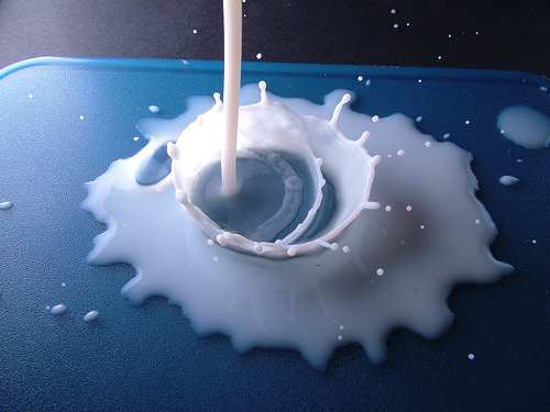
But your ocean looks like you >dropped yogurt on it< or like the >edges of this mill spill<. I don't think the bevel is gonna work.
But your ocean looks like you >dropped yogurt on it< or like the >edges of this mill spill<. I don't think the bevel is gonna work.
Reputation cleared. Never let it be said that Team CC don't investigate fairly.
Although they take bloody forever to do it...
Although they take bloody forever to do it...
-
Ruben Cassar
- Posts: 2160
- Joined: Thu Nov 16, 2006 6:04 am
- Gender: Male
- Location: Civitas Invicta, Melita, Evropa
Re: Madagascar-V. 7 Page 12 Filters Added!
Sorry but the colours definitely need to be changed. They are too hard too distinguish from one another.