ROME: CIVIL WAR v31
Moderator: Cartographers
Forum rules
Please read the Community Guidelines before posting.
Please read the Community Guidelines before posting.
-
Minister X

- Posts: 424
- Joined: Tue Nov 11, 2008 4:45 pm
Re: ROME [3/8/2011] V 20 pg 12
DiM: Your images didn't come through in your post and without them I'm a bit at a loss regarding those items. I'll address the others (except the walls) as best I can.

Re: ROME [3/8/2011] V 20 pg 12
you can probably always find pixel flaws when you enlarge to 1000% but who sits during a game and do that? then you are not completely sane. when I look at Seamus map (in Normal 100%) I thought that standart is close as most newer map at cc. when i say close its only some cornors in terrirorys ( in the middel my eye spotted  ) that need painting.
Terms of Ancient Rome as well, missing perhaps some were signs that says, we are in Rome, Spanish Steps, Colloserum ect. but otherwise I think its a beautiful map you have made.
Terms of Ancient Rome as well, missing perhaps some were signs that says, we are in Rome, Spanish Steps, Colloserum ect. but otherwise I think its a beautiful map you have made.

-
DiM

- Posts: 10415
- Joined: Wed Feb 14, 2007 6:20 pm
- Gender: Male
- Location: making maps for scooby snacks
Re: ROME [3/8/2011] V 20 pg 12
i don't blow images 1000% to find flaws. i see them with the naked eye and then blow up the images so that others can clearly see what i'm talking about.
non pixelated, same size, flowy borders have been a standard in every map since 2007. this map fails at this very basic request.
i'm actually very surprised to see people asking for a graphical badge when this map is (in my opinion) well bellow the standard of the foundry.
the artistic part of a map is largely debatable, for example i think this should scream rome while andy thinks it shouldn't.
but the technical side of every map is actually an exact science. every technical aspect can be measured and assessed.
a flowy line is clearly different than a jagged one. fully filling with colour within the borders of a terit is again a very clear task which can be finely measured.
these are among the most basic requests when it comes to the standards of any map.
“In the beginning God said, the four-dimensional divergence of an antisymmetric, second rank tensor equals zero, and there was light, and it was good. And on the seventh day he rested.”- Michio Kaku
Re: ROME [3/8/2011] V 20 pg 12
That is visible also for me, what i also pointed out. Map making are a new task for me and i dont you guys so well yet, it just sounded kind of prissy to look for errors in a magnifying glass, I know now that you dident and I apologize if I sounded grumpy.DiM wrote:
fully filling with colour within the borders of a terit is again a very clear task which can be finely measured.
-
gimil

- Posts: 8599
- Joined: Sat Mar 03, 2007 12:42 pm
- Gender: Male
- Location: United Kingdom (Scotland)
Re: ROME [3/8/2011] V 20 pg 12
Hi minister x,
This one is coming along nicely. Glad I have finally come around to saying something about your map.
I have noticed the same concerns that DiM brought up, although they are minor I would also like to see them sorted just to improve the already good standard of this map. The main issue I have just now is with the title/legends text. Right now none of the information around the map feel like they are utilizing the real estate efficiently. If look at the image I have produced below, information I feel should be aligned with the red boxes, while yours currently sit in the yellow boxes. If you tweek the positioning and use of space I feel your map have stability around the outside, something that it is currently missing.
Keep up the good work mate.
gimil
What do you know about map making, bitch?
Top Score:2403natty_dread wrote:I was wrong
-
Victor Sullivan

- Posts: 6010
- Joined: Mon Feb 08, 2010 8:17 pm
- Gender: Male
- Location: Columbus, OH
- Contact:
Re: ROME [3/8/2011] V 20 pg 12
Aside from the lack of cowbell, I must say, I like your style, Minister X, though I agree largely with DiM and gimil's suggestions (mainly the positioning gimil mentioned above, and the dagger thingy DiM pointed out).
-Sully
-Sully
Beckytheblondie: "Don't give us the dispatch, give us a mustache ride."
Scaling back on my CC involvement...
Scaling back on my CC involvement...
-
lostatlimbo

- Posts: 1386
- Joined: Wed Mar 28, 2007 3:56 pm
- Location: Portland, OR
Re: ROME [3/8/2011] V 20 pg 12
While I have lower standards than DiM, I have to agree with these two points - both things I've brought up before and you addressed in some measure, but not quite solving the problem.DiM wrote:4. the icons on the map don't work well together. you have the guys in toga who are bright white, 2d, with pixely black contours. then you have the theatre masks who are also 2d but the contours are more blurry and they are grey. and then you have the other 3 images (swords, vase, temple) which are all grey and in 3d. you need consistency. decide on one style and make all the icons the same.
but aside from all the points above, i feel like the map has one major flaw. it simply does not do this wonderful city any justice. i've visited rome this year and i've been impressed. it's gorgeous. when i look at your map i honestly can't even tell it's rome. i have to read the terit names to realise it. normally it should scream ancient rome at me. i should be able to recognize it in the first milliseconds.
For me it doesn't make or break the map, but the toga guys do still stand out (in a bad way). I think the others are okay though.
And while the colors have been toned down a bit, I still don't think yellow, pink and blue belong on an ancient roman map. I don't think they are needed for clarity and they just don't fit.
That said, I would still play it and I think it looks better than a lot of maps on CC.
-
Minister X
- Posts: 424
- Joined: Tue Nov 11, 2008 4:45 pm
Re: ROME [3/8/2011] V 20 pg 12
Draft #21
EDIT: Color in top right legend is a mistake. Consider it removed as per the previous draft.
Changes:
• Bridges (yet again!) - now four identical and not hand-drawn
• Shading problems: completely fixed
• Border line problems fixed - now all same strength and no more jaggies
• Title "blurriness" fixed
• Walls reduced to 88% opacity so they're not so overpowering
• Theatrical masks icons replaced with more "photographic" version. Nice, huh?
• tones and colors altered very slightly
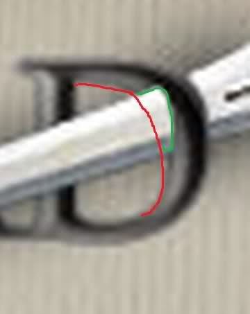
• Dagger changed. I cannot see the sample image DiM posted (or thought he did) but made a change based on a guess and an idea. I'm not sure I like it better.
Changes not made:
• Guys in togas: I'm not an artist and I can't find better non-copyrighted images to use. I tried making this poor little fella look more photographic but only managed to make him look like his toga had gotten dirty. If you can supply me with a better image (30x40 pixels including shadows) I'll certainly be grateful.
• "utilizing the real estate efficiently": frankly I was very surprised to see this suggestion made and seconded. One of the main errors made by novice graphic artists is to give in to the urge to utilize every bit of white space on a page. I urge Gimil and Sully (and I know you guys aren't novice mapmakers) and others to thoroughly peruse all the maps at CC and notice how much unused space there is on each. In my opinion those with the most white space are generally the most attractive; they are certainly the least stressful to look at and work with. If I could comfortably increase the amount of white space in my map I gladly do so.
• Making the Roman-ness of the map more striking: I'd love to and I'm open to specific suggestions. [At one point (on draft 7) I had the whole map enclosed within a columned facade.] The best way to fix this would be to show a large image of the current state of the Colosseum. That's the iconic image of Rome. However, I have no room to display a recognizable image, and showing the ruins would be anachronistic versus the rest of the map, which is a reconstruction of the living city. I have just browsed the NYC map, the San Francisco map, Charleston, Chicago, Berlin, Montreal, Sydney, and Portland map. I find none that do much more than mine to give a feel for the city. The shape of Rome is not recognizable like the shape of Manhattan or San Francisco. If I lose the paragraph of mood-setting description/intro I would have room to display something like this:

or a centurion's helmet or some other such image, but then the premise of the game is lost. Alternatively, the name of the game could be changed, from Caesar is Dead to Rome: Civil War. But that means losing the image of the dead guy in the toga and losing the gladius. I'm not sure it would be an improvement in the screaming department.
I regret the map doesn't meet the standards of some critical specialists whose opinions I respect. I won't become suicidal if it's rejected for the graphics stamp and relegated to the dead pile. Truly. I am, however, open to any specific suggestions and I expect and look forward to more nit-picking of little graphic flaws. I'm too close to the map to see them all.
EDIT: Color in top right legend is a mistake. Consider it removed as per the previous draft.
Changes:
• Bridges (yet again!) - now four identical and not hand-drawn
• Shading problems: completely fixed
• Border line problems fixed - now all same strength and no more jaggies
• Title "blurriness" fixed
• Walls reduced to 88% opacity so they're not so overpowering
• Theatrical masks icons replaced with more "photographic" version. Nice, huh?
• tones and colors altered very slightly
• Dagger changed. I cannot see the sample image DiM posted (or thought he did) but made a change based on a guess and an idea. I'm not sure I like it better.
Changes not made:
• Guys in togas: I'm not an artist and I can't find better non-copyrighted images to use. I tried making this poor little fella look more photographic but only managed to make him look like his toga had gotten dirty. If you can supply me with a better image (30x40 pixels including shadows) I'll certainly be grateful.
• "utilizing the real estate efficiently": frankly I was very surprised to see this suggestion made and seconded. One of the main errors made by novice graphic artists is to give in to the urge to utilize every bit of white space on a page. I urge Gimil and Sully (and I know you guys aren't novice mapmakers) and others to thoroughly peruse all the maps at CC and notice how much unused space there is on each. In my opinion those with the most white space are generally the most attractive; they are certainly the least stressful to look at and work with. If I could comfortably increase the amount of white space in my map I gladly do so.
• Making the Roman-ness of the map more striking: I'd love to and I'm open to specific suggestions. [At one point (on draft 7) I had the whole map enclosed within a columned facade.] The best way to fix this would be to show a large image of the current state of the Colosseum. That's the iconic image of Rome. However, I have no room to display a recognizable image, and showing the ruins would be anachronistic versus the rest of the map, which is a reconstruction of the living city. I have just browsed the NYC map, the San Francisco map, Charleston, Chicago, Berlin, Montreal, Sydney, and Portland map. I find none that do much more than mine to give a feel for the city. The shape of Rome is not recognizable like the shape of Manhattan or San Francisco. If I lose the paragraph of mood-setting description/intro I would have room to display something like this:
or a centurion's helmet or some other such image, but then the premise of the game is lost. Alternatively, the name of the game could be changed, from Caesar is Dead to Rome: Civil War. But that means losing the image of the dead guy in the toga and losing the gladius. I'm not sure it would be an improvement in the screaming department.
I regret the map doesn't meet the standards of some critical specialists whose opinions I respect. I won't become suicidal if it's rejected for the graphics stamp and relegated to the dead pile. Truly. I am, however, open to any specific suggestions and I expect and look forward to more nit-picking of little graphic flaws. I'm too close to the map to see them all.
Spoiler
- Click image to enlarge.

Spoiler
- Click image to enlarge.

Last edited by Minister X on Tue Oct 18, 2011 10:52 am, edited 2 times in total.
-
gimil
- Posts: 8599
- Joined: Sat Mar 03, 2007 12:42 pm
- Gender: Male
- Location: United Kingdom (Scotland)
Re: ROME [3/8/2011] V 21 pg 13
By saying you are not utilising your space efficiently is not the same as saying you need to use more of it. Right now your map is rather liberal in using right angles. In this case the you plug your right angles with information about the map. But this information is placed uneven, lop sided or off center.• "utilizing the real estate efficiently": frankly I was very surprised to see this suggestion made and seconded. One of the main errors made by novice graphic artists is to give in to the urge to utilize every bit of white space on a page. I urge Gimil and Sully (and I know you guys aren't novice mapmakers) and others to thoroughly peruse all the maps at CC and notice how much unused space there is on each. In my opinion those with the most white space are generally the most attractive; they are certainly the least stressful to look at and work with. If I could comfortably increase the amount of white space in my map I gladly do so.
I am well aware that sometimes 'less is more' (to quote an old hippo, oaktown) but the rest of your map is so busy that leaving all those (uneven) gaps in the legends simply doesn't look nice.
What do you know about map making, bitch?
Top Score:2403natty_dread wrote:I was wrong
-
DiM
- Posts: 10415
- Joined: Wed Feb 14, 2007 6:20 pm
- Gender: Male
- Location: making maps for scooby snacks
Re: ROME [3/8/2011] V 21 pg 13
uploaded the dagger image to another host:
“In the beginning God said, the four-dimensional divergence of an antisymmetric, second rank tensor equals zero, and there was light, and it was good. And on the seventh day he rested.”- Michio Kaku
Re: ROME [3/8/2011] V 21 pg 13
Hi Minister
In my opinion, the bridges are not an improvement but a decline, it does not look good that they go in the same direction all together, the ones you had before was more authentic and dident look so artificial. Masks and toga guy, got to much clipart over him and he dont match in tone with the jars and tempels/forum, the gray tone gives a more merged appearance, it is too white and sharp, I know I previously pointed out to remove colors from the bonuses would be a shame, with which you pointed out that one should wait and see before one could value it, it was actually better without color (sorry)
Im still huge fan of your map
Last edited by Flapcake on Wed Oct 12, 2011 4:36 am, edited 1 time in total.

Re: ROME [3/8/2011] V 21 pg 13
why do you get a bonus for holding three penguins?
This old hippo thinks that graphic needs a redo.
This old hippo thinks that graphic needs a redo.

-
Minister X
- Posts: 424
- Joined: Tue Nov 11, 2008 4:45 pm
Re: ROME [3/8/2011] V 21 pg 13
VOTE!
Which toga'd senator do you like best? Not that it matters very much, but note that only the last three are proper togas. The others are some other form of white sheet with trim sold by Halloween costume shops.

I'm serious about the voting. And don't ask to see them larger - this is the size they'll be on the large map. After the voting we'll get a chance to see the winner on the map itself before final acceptance of the change.
Which toga'd senator do you like best? Not that it matters very much, but note that only the last three are proper togas. The others are some other form of white sheet with trim sold by Halloween costume shops.
I'm serious about the voting. And don't ask to see them larger - this is the size they'll be on the large map. After the voting we'll get a chance to see the winner on the map itself before final acceptance of the change.

Re: ROME [3/8/2011] V 21 pg 13
TOGA! I'd vote for Bluto, but seriously I'd go C or H Or you can do more than 1, they all don't have to be identical, as long as we can identify them as senators.


-
Victor Sullivan
- Posts: 6010
- Joined: Mon Feb 08, 2010 8:17 pm
- Gender: Male
- Location: Columbus, OH
- Contact:
Re: ROME [3/8/2011] V 21 pg 13
C looks good to me.
-Sully
-Sully
Beckytheblondie: "Don't give us the dispatch, give us a mustache ride."
Scaling back on my CC involvement...
Scaling back on my CC involvement...
Re: ROME [3/8/2011] V 21 pg 13
C looks like he says Hail Cesar Me like him
-
gimil
- Posts: 8599
- Joined: Sat Mar 03, 2007 12:42 pm
- Gender: Male
- Location: United Kingdom (Scotland)
Re: ROME [3/8/2011] V 21 pg 13
mate, I believe my response has not yet been addressed.
gimil wrote:By saying you are not utilising your space efficiently is not the same as saying you need to use more of it. Right now your map is rather liberal in using right angles. In this case the you plug your right angles with information about the map. But this information is placed uneven, lop sided or off center.• "utilizing the real estate efficiently": frankly I was very surprised to see this suggestion made and seconded. One of the main errors made by novice graphic artists is to give in to the urge to utilize every bit of white space on a page. I urge Gimil and Sully (and I know you guys aren't novice mapmakers) and others to thoroughly peruse all the maps at CC and notice how much unused space there is on each. In my opinion those with the most white space are generally the most attractive; they are certainly the least stressful to look at and work with. If I could comfortably increase the amount of white space in my map I gladly do so.
I am well aware that sometimes 'less is more' (to quote an old hippo, oaktown) but the rest of your map is so busy that leaving all those (uneven) gaps in the legends simply doesn't look nice.
What do you know about map making, bitch?
Top Score:2403natty_dread wrote:I was wrong
-
AndyDufresne

- Posts: 24919
- Joined: Fri Mar 03, 2006 8:22 pm
- Location: A Banana Palm in Zihuatanejo
- Contact:
Re: ROME [3/8/2011] V 21 pg 13
What is your critique about his legend areas exactly? I just want to be clear.gimil wrote:mate, I believe my response has not yet been addressed.
gimil wrote:By saying you are not utilising your space efficiently is not the same as saying you need to use more of it. Right now your map is rather liberal in using right angles. In this case the you plug your right angles with information about the map. But this information is placed uneven, lop sided or off center.• "utilizing the real estate efficiently": frankly I was very surprised to see this suggestion made and seconded. One of the main errors made by novice graphic artists is to give in to the urge to utilize every bit of white space on a page. I urge Gimil and Sully (and I know you guys aren't novice mapmakers) and others to thoroughly peruse all the maps at CC and notice how much unused space there is on each. In my opinion those with the most white space are generally the most attractive; they are certainly the least stressful to look at and work with. If I could comfortably increase the amount of white space in my map I gladly do so.
I am well aware that sometimes 'less is more' (to quote an old hippo, oaktown) but the rest of your map is so busy that leaving all those (uneven) gaps in the legends simply doesn't look nice.
--Andy

Re: ROME [3/8/2011] V 21 pg 13
Liked it more a couple of updates ago.
-
Minister X
- Posts: 424
- Joined: Tue Nov 11, 2008 4:45 pm
Re: ROME [3/8/2011] V 21 pg 13
Draft #22
Guys in togas changed as per voting results.
Gladius in title fixed.
Guys in togas changed as per voting results.
Gladius in title fixed.
Spoiler
- Click image to enlarge.

Spoiler
- Click image to enlarge.

Last edited by Minister X on Mon Nov 28, 2011 8:23 pm, edited 1 time in total.
Re: ROME [3/8/2011] V 22 pg 13
yes, I like the toga guys more now  !
!
-
Teflon Kris

- Posts: 4236
- Joined: Sun Jul 13, 2008 4:39 pm
- Gender: Male
- Location: Lancashire, United Kingdom
Re: ROME [3/8/2011] V 22 pg 13
Just going back to the bridge at Cornelian Gate - it might be a more obvious connection if the bridge went beyond the wall?
Re: ROME [3/8/2011] V 22 pg 13
There's been some discussion kinda recently on this so I won't bin it outright.... but there hasn't been a true update in forever, where are we at here?

Re: ROME [3/8/2011] V 22 pg 13
hi very nice map here
I know I'm dropping out of nowhere
but wouldn't it be nice if the names on the map were in Latin ?
I know I'm dropping out of nowhere
but wouldn't it be nice if the names on the map were in Latin ?
De gueules à la tour d'argent ouverte, crénelée de trois pièces, sommée d'un donjon ajouré, crénelé de deux pièces
Gules an open tower silver, crenellated three parts, topped by a apertured turret, crenellated two parts
Gules an open tower silver, crenellated three parts, topped by a apertured turret, crenellated two parts
-
Minister X
- Posts: 424
- Joined: Tue Nov 11, 2008 4:45 pm
Re: ROME [3/8/2011] V 22 pg 13
I'll summarize in detail all matters relating to the status quo...RedBaron0 wrote:There's been some discussion kinda recently on this so I won't bin it outright.... but there hasn't been a true update in forever, where are we at here?
• pamoa earlier today asked if it wouldn't be nice if the names on the map were in Latin. I feel that if I did this the 99.99% of people who couldn't read Latin would be less able to relate to names like "Baths of Caracalla" or "Market of Livia".
• DJ Teflon made a suggestion about one bridge (which I'd not follow - and explain why).
These are the only "outstanding" or "current" issues. Older matters that might be considered unresolved:
• I have struggled to get bridges everyone likes. The most recent bridges (from one version back) were criticized by Flapcake. He says, "the bridges are not an improvement but a decline, it does not look good that they go in the same direction all together, the ones you had before was more authentic and dident look so artificial." But the previous ones were more heavily criticized and those earlier critics have not renewed any complaints, so I assume they're now satisfied.
• on October 7th Gimil posted a diagram showing how he wanted me to expand the legend info to fill rectangles larger than their current boundaries. Victor Sullivan concurred. I feel this is an awful idea and explained why when posting the next version (draft #21) on October 9th. Later on the 9th Gimil restated his objection but I wasn't sure exactly what he was looking for. I worked on the toga guy but didn't respond to Gimil. On the 14th he complained that I'd not addressed his complaint. Later that day AndyDufresne quoted him and asked, "What is your critique about his legend areas exactly? I just want to be clear." I feel this question speaks for me as well. So far Gimil has not responded. On the 18th I posted version #22 with all other issues (beside the one bridge complaint) met. Gimil has still not responded to the request for clarification.
• on October 7th DiM wrote: "i feel like the map has one major flaw. it simply does not do this wonderful city any justice. i've visited rome this year and i've been impressed. it's gorgeous. when i look at your map i honestly can't even tell it's rome. i have to read the terit names to realise it. normally it should scream ancient rome at me. i should be able to recognize it in the first milliseconds." AndyDufresne immediately responded: "you are entitled to your opinion, but I think the overall graphics are fine. I don't feel like every map has to 'scream.'" Later Dim posted: "...the artistic part of a map is largely debatable, for example i think this should scream rome while andy thinks it shouldn't." It seemed he was conceding that it's a matter of taste. On the 8th lostatlimbo seconded DiM's complaint. On the 9th I posted version #21 and in that post replied to the "screaming" issue at length, revieweing and rejecting some possibilities and saying that while I'd love to increase the "Romanness" of the map I need specific suggestions. None have been made.
• Gillipig, just before the most recent version: "Liked it more a couple of updates ago." Lacking more specificity, I can't do much with this suggestion.
In addition to all these, I've learned something technical about army number placement recently that leads me to believe I'll have to change the location of some labels. Hardly anyone will notice the changes if/when made.
I don't know what to do. It seems this map meets the standards of some who've posted here, and they'd like to see it get a graphics stamp and move forward. Others seem to be unhappy with it but I don't know how to make them happy. The forum guidelines say mapmakers should not post simply to bump their threads, so I've refrained from asking twice for specific suggestions or clarifications.
On a personal note, while I appreciate the high standards set for maps, the desire for some sort of consensus, and the good intent of nearly all posters, this process of map refinement is, while rewarding in some ways, quite painful in some others. I believe I take criticism well. I've responded in good faith to every single comment through 22 versions and as a result the map has improved tremendously. That's rewarding. But on the other hand I'm torn between 1) being a drone who simply reacts to each and every comment, 2) being a creative agent with the duty to apply my own standards of taste and common sense, and 3) trying to manage the process (along with the administrators) to move things along. It's a fine line to walk, and the uncertainties make me upset. My patience, which I believe was admirable for a long time, has begun to wear thin. As a result, my motivation has declined. This is my personality; I don't apologize for it but I recognize that it may not be suited for the task at hand. I won't complain if this project is shelved.
That's where things are.