Portugal [Quenched]
Moderator: Cartographers
Forum rules
Please read the Community Guidelines before posting.
Please read the Community Guidelines before posting.


Hi gimil,
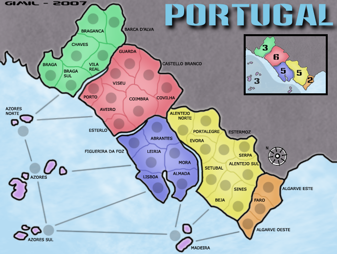
Please don't take any of the following recommendations as things that you have to do. They are merely suggestions that I think would help a few elements match the rest of your beautiful map.
And while I certainly don't speak for KEYOGI, I suspect that he had the same sentiment in mind when he carefully worded this:
2) I know that several people have mentioned that they prefer the straight lines, but they might change their minds when they see the smoother curves I propose below. I'm not sure what application you are using to create your map, but based on the look, I suspect you have access to vector drawing tools (in contrast to bitmap painting tools). If so, you might try using the Bezier curves (the pen tool in Photoshop) to get smooth lines. Obviously I'm biased, but I think the results below look nice and match the style of your map.
3) Also related to the sea-connection lines, I think it would look nice if they were all consistently pointing to the land or all pointing to the army circles, instead of some of each. And since you are always pointing at land on the mainland side, I'd suggest that for the islands, too. Again, I have illustrated this below.

Thank you for considering my suggestions.
~Sparqs
Please don't take any of the following recommendations as things that you have to do. They are merely suggestions that I think would help a few elements match the rest of your beautiful map.
And while I certainly don't speak for KEYOGI, I suspect that he had the same sentiment in mind when he carefully worded this:
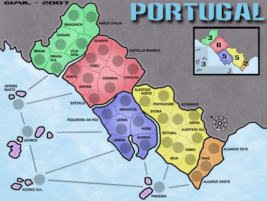
1) I made this suggestion before, but either I wasn't very clear in my explanation or you didn't like the look:KEYOGI wrote:Could you perhaps make the sea connections with a bit of a curve to them? The sharp straight lines kind of clash a bit, especially with the soft colours you have throughout the map.
In case I was unclear before, I have included an example of the puddle shape that I suggest you use to indicate the island-continent on the inset bonus-value map. Please ignore my color choice.Sparqs wrote:I mean that the grey highlight area might look better if it looked more like a puddle, instead of having sharp 90-degree corners and straight edges.gimil wrote:what do you mean?Sparqs wrote: Haoala's suggestion may be better. I think the grey highlight region would look good with a rounded, free-flowing shape.
2) I know that several people have mentioned that they prefer the straight lines, but they might change their minds when they see the smoother curves I propose below. I'm not sure what application you are using to create your map, but based on the look, I suspect you have access to vector drawing tools (in contrast to bitmap painting tools). If so, you might try using the Bezier curves (the pen tool in Photoshop) to get smooth lines. Obviously I'm biased, but I think the results below look nice and match the style of your map.
3) Also related to the sea-connection lines, I think it would look nice if they were all consistently pointing to the land or all pointing to the army circles, instead of some of each. And since you are always pointing at land on the mainland side, I'd suggest that for the islands, too. Again, I have illustrated this below.
Thank you for considering my suggestions.
~Sparqs


-
ParadiceCity9
- Posts: 4239
- Joined: Thu Feb 15, 2007 4:10 pm
Somo map Changes that could be done
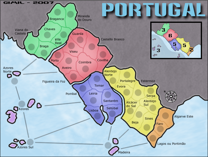
Braga -> Viana do Castelo
Braga Sul -> Braga
Barca D'Alva -> Miranda do Douro
Esterlo -> Figueira da Foz
Figueira da Foz -> Pombal
Abrantes -> Tomar (não é bem naquela zona, mas está mais perto que Abrantes)
Mora -> Santarém
Almada -> Setúbal
Setúbal -> Alcácer do Sal
Alentejo Sul -> Beja
Beja -> Sines
Sines -> Odemira
Algarve Oeste -> Lagos ou Portimão
Trocar Açores Norte e Sul por Ocidental e Oriental ou Este e Oeste que é a designação destes.. Açores North and South by West and East, because it´s there name)
-
gimil

- Posts: 8599
- Joined: Sat Mar 03, 2007 12:42 pm
- Gender: Male
- Location: United Kingdom (Scotland)
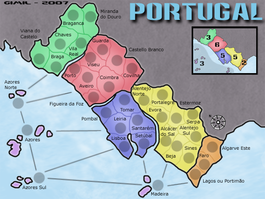
Done the names changes. Ive left some of the changes out becasue theres is problems fittign tehm in the territories
But i think andy should have a look at this
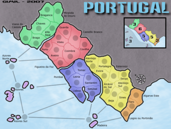
EDIT: anyone understan why this i happing to the large map?
What do you know about map making, bitch?
Top Score:2403natty_dread wrote:I was wrong
-
DiM

- Posts: 10415
- Joined: Wed Feb 14, 2007 6:20 pm
- Gender: Male
- Location: making maps for scooby snacks
what's up with the tiny map?? 
the changes look good though and i think once gimil reverts to the normal sizes this is ready for FF.
PS: can't stop laughing at the tiny map. i need a magnifying glass to look at it
the changes look good though and i think once gimil reverts to the normal sizes this is ready for FF.
PS: can't stop laughing at the tiny map.
“In the beginning God said, the four-dimensional divergence of an antisymmetric, second rank tensor equals zero, and there was light, and it was good. And on the seventh day he rested.”- Michio Kaku
-
gimil
- Posts: 8599
- Joined: Sat Mar 03, 2007 12:42 pm
- Gender: Male
- Location: United Kingdom (Scotland)
teh tiny onwes suppsoe to be the large imageDiM wrote:what's up with the tiny map??
the changes look good though and i think once gimil reverts to the normal sizes this is ready for FF.
PS: can't stop laughing at the tiny map.
photobuckets arese it up and it keeps doign teh same everytime i re upload it
What do you know about map making, bitch?
Top Score:2403natty_dread wrote:I was wrong
-
Ruben Cassar

- Posts: 2160
- Joined: Thu Nov 16, 2006 6:04 am
- Gender: Male
- Location: Civitas Invicta, Melita, Evropa


-
Ruben Cassar
- Posts: 2160
- Joined: Thu Nov 16, 2006 6:04 am
- Gender: Male
- Location: Civitas Invicta, Melita, Evropa
-
gimil
- Posts: 8599
- Joined: Sat Mar 03, 2007 12:42 pm
- Gender: Male
- Location: United Kingdom (Scotland)
what? scared in case i beat you again:PRuben Cassar wrote:Hehe. Better get that score of yours up before we play a 1vs1 mate! :pgimil wrote:Ruben Cassar i want to paly my 1st
team game
and
1v1
to thanks you for all your help.
And beat you for 50 points again
What do you know about map making, bitch?
Top Score:2403natty_dread wrote:I was wrong
-
Vace Cooper

- Posts: 537
- Joined: Wed Feb 14, 2007 12:12 pm
- Location: MN