cairnswk wrote:Guys, i'm pretty happy with this title font where and as it is now...i've grown accustomed to it.
I think you should experiment anyway. I'd be surprised if you didn't find something you like better.
-Sully
Moderator: Cartographers

cairnswk wrote:Guys, i'm pretty happy with this title font where and as it is now...i've grown accustomed to it.

Tut tut cairns...you know better than that. If a reasonable concern has come up you have to address it. Simply claiming 'I like it and don't want to change it' doesn't workGuys, i'm pretty happy with this title font where and as it is now...i've grown accustomed to it.
I don't want it curved, i don't want to put fireworks on it, i want it as is.
Top Score:2403natty_dread wrote:I was wrong
gimil, i don't care what you say about tut tut...I have to forgive your absence simply because there is a snow storm in scotland and you have shit internet connections.gimil wrote:Tut tut cairns...you know better than that. If a reasonable concern has come up you have to address it. Simply claiming 'I like it and don't want to change it' doesn't workGuys, i'm pretty happy with this title font where and as it is now...i've grown accustomed to it.
I don't want it curved, i don't want to put fireworks on it, i want it as is.

Aw shuks sully, i didn't know you cared...good ole Nat. Actually i prefer Rex's version from the movie. In fact if it were possible i'd do a Pygmalion map.Victor Sullivan wrote:...
I think you should experiment anyway. I'd be surprised if you didn't find something you like better.
-Sully
Lol, yes, good ol' Natcairnswk wrote:Aw shuks sully, i didn't know you cared...good ole Nat. Actually i prefer Rex's version from the movie. In fact if it were possible i'd do a Pygmalion map.Victor Sullivan wrote:...
I think you should experiment anyway. I'd be surprised if you didn't find something you like better.
-Sully
Stet. i still prefer the current title!
All of this map is yours, cairns; don't let anyone tell you any different - including yourself!cairnswk wrote:So after addressing absolutely everything else in this map, i want 5% of it for myself and that is this title.
Sully, i was referring to the fact that you can do a map but after everyone puts their two-bobs worth in,it is no longer you're design after changing everything to accommodate what everyone wants or suggets.Victor Sullivan wrote:Lol, yes, good ol' Natcairnswk wrote:Aw shuks sully, i didn't know you cared...good ole Nat. Actually i prefer Rex's version from the movie. In fact if it were possible i'd do a Pygmalion map.Victor Sullivan wrote:...
I think you should experiment anyway. I'd be surprised if you didn't find something you like better.
-Sully
Stet. i still prefer the current title!One of the consistent substitute teachers at the school I work at is related to him
Anyway, I think it's erroneous thinking to say:All of this map is yours, cairns; don't let anyone tell you any different - including yourself!cairnswk wrote:So after addressing absolutely everything else in this map, i want 5% of it for myself and that is this title.
-Sully


I still disagree. Everything on this map says "cairnswk" to me. You should look at early drafts of koontz's Rorke's Drift or 1982. Drastically different from what they are now, but there is no less "koontz" in those maps. On the contrary, I'd say there's more of him in them now!cairnswk wrote:Sully, i was referring to the fact that you can do a map but after everyone puts their two-bobs worth in,it is no longer you're design after changing everything to accommodate what everyone wants or suggets.Victor Sullivan wrote:Lol, yes, good ol' Natcairnswk wrote:Aw shuks sully, i didn't know you cared...good ole Nat. Actually i prefer Rex's version from the movie. In fact if it were possible i'd do a Pygmalion map.Victor Sullivan wrote:...
I think you should experiment anyway. I'd be surprised if you didn't find something you like better.
-Sully
Stet. i still prefer the current title!
Anyway, I think it's erroneous thinking to say:All of this map is yours, cairns; don't let anyone tell you any different - including yourself!cairnswk wrote:So after addressing absolutely everything else in this map, i want 5% of it for myself and that is this title.
-Sully
If there is an element that i wish to be on the map, then i'll stick by it regardless of what policy guidelines gimil throws at me.
So you get to ignore foundry policies and guidelines, and if the foundry mods don't like it they can just bin your map?cairnswk wrote:If there is an element that i wish to be on the map, then i'll stick by it regardless of what policy guidelines gimil throws at me.
You should also know by now that this is no excuse. That some crappy map got through at some point doesn't mean we should let every map be crappy... If standards were lower in the past, it doesn't mean that we shouldn't enforce higher standards now.cairnswk wrote:There are many maps in this foundry that have gone through to Quench that have had far less graphical standards on them that this one.
And you who have dished up minimalist attempts at Yugoslavia and London can shout all you like ...natty_dread wrote:Hey, wow! We mapmakers can do this now?
I'll just go over all my map threads and say "I'm not going to change this, now stamp this or this goes in the bin!"
Wow! Progress to the foundry process at last!
Yes and so there should be, it was me who went through the tiresome process almost tearing my hair out with koontz1973 to get him to basically get this legend in Rorke's Drift correct and legible. And yes he has come a long way.Victor Sullivan wrote:....
I still disagree. Everything on this map says "cairnswk" to me. You should look at early drafts of koontz's Rorke's Drift or 1982. Drastically different from what they are now, but there is no less "koontz" in those maps. On the contrary, I'd say there's more of him in them now!
-Sully
Really Cairns?cairnswk wrote:Afterall, i get the same thing from you on some of my suggestions which is why i don't bnother commenting on your maps anymore.
Got the picture sunshine.
Addressed above.natty_dread wrote:Cairns, you know I only mean well to you, I love a lot of your maps (and hate some of them) and we all get frustrated at the mapmaking process sometimes.
But I think what you're doing now is a bit unfair. If you have a reasonable counter to a feedback, then it's ok to debate your point, but just saying "I want this to be like this, end of discussion" is really not how the foundry process is supposed to work. Every other mapmaker here has to abide by the guidelines, everyone here has to address all feedback in a reasonable manner. You should know by now how the foundry works, you've been here for a while now...
Furthermore, just because you accept advice and/or feedback from others doesn't make your map any less your map. Now, several people have pointed out that they have issues with the title, and you should try to do something to get those issues addressed. Maybe you'll be surprised, maybe you'll find something that even you will think is much better than what you have now. But it's never a good idea to dig in your heels and refuse to work further. That's just detrimental to the entire mapmaking process.
Guys, i'm pretty happy with this title font where and as it is now...i've grown accustomed to it.
I don't want it curved, i don't want to put fireworks on it, i want it as is.
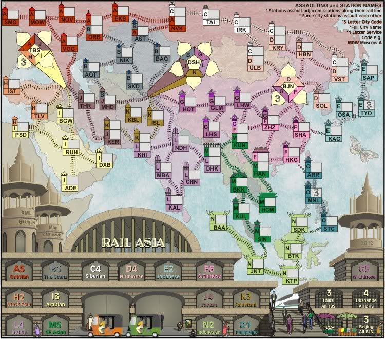
I would have thought that the reasons supplied in these feedbacks were suitable enough...happy with it, accustomed to it, don't want it curved, don't want it with fireworks, it isn't blurry, it isn't out of place, it isn't illegiible, and oops does identify what the map is.It does what it does, i like the font used and the way it is. I don't see it as being a reasonable concern either. It isn't as though it is blurry, out of place, illegible, and doesn't identify what the map is.
Response taken to PMnatty_dread wrote:And besides: no, you don't get "the same thing" from me on my map threads. I never turn down feedback on the grounds of "I want it this way", if I disagree with a suggestion I always give a good reason for it and am willing to debate the point, but I never just say "this is how I want it and if it's not good enough you can bin it".

Because his font works better larger, and besides my name is on the map twice including the butterflykoontz1973 wrote:Why is your sig smaller than gilligans? He got the easy part.
Thanks for your opinion natty.natty_dread wrote:The title needs work. It doesn't fit in with the rest of the map and looks out of place.

I agree, that's one font i won't be downloading. Sorry Natty.koontz1973 wrote:Looks worse.
