Would anyone play it?
Moderator: Cartographers

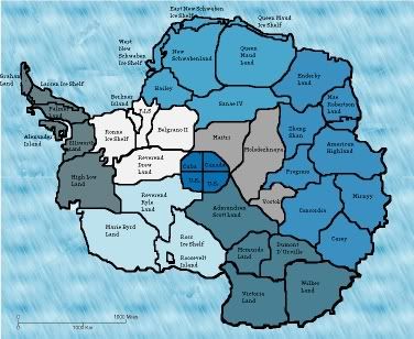
Well, i tried to make it really blue to go with the icy feeling of antarctica, if others dont think thats a good idea then i'l lchange it.Bozo wrote:Its Starting to look like a real map just a suggestion with all the blue its kinda looking all 'splotchy' So maybee get some different colors or change the backround
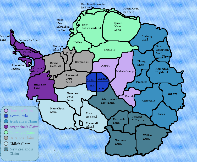
should i type its name in black like i did with chile?garionoldwolf wrote:personally I think it looks okay, but the legend needs some work, for me I'm partially color blind so colors that are quite close(like dark blue and black) I can't tell teh difference between, and the color you have for teh top continent in your legend is too close to the background and thus I can't read it.
yea the black text is easy to seereverend_kyle wrote:should i type its name in black like i did with chile?garionoldwolf wrote:personally I think it looks okay, but the legend needs some work, for me I'm partially color blind so colors that are quite close(like dark blue and black) I can't tell teh difference between, and the color you have for teh top continent in your legend is too close to the background and thus I can't read it.

Given that one of them is called reverend kyle land, I think he may have made some of them up.Jota wrote: Nice country names, overall. Are those straight from the reference materials, or did you make some of them up yourself?
why abuse the map? if you don't like it, don't play it, no one is forcing you. the more maps the better for me.Haydena wrote:Wow... A map of antartica...
And a suggestion for names of countries, much like your France map kyle, try not to make them up, some people don't like it.
How many maps have you got on the go now? 3? Maybe you should make up your mind and just focus on one of the maps...
I wasn't abusing it... I like new maps, I'm all for it, if I wasn't, I wouldn't be creating my map of Japan would I? I just think that reverand_kyle seems to be getting bored of each project quickly and is not putting much effort into them.Phobia wrote:why abuse the map? if you don't like it, don't play it, no one is forcing you. the more maps the better for me.Haydena wrote:Wow... A map of antartica...
And a suggestion for names of countries, much like your France map kyle, try not to make them up, some people don't like it.
How many maps have you got on the go now? 3? Maybe you should make up your mind and just focus on one of the maps...
First off, the text idea is a really good idea, I like it.Jota wrote:This looks like a pretty good start. For the legend, I'd recommend making most if not all of the names black for the sake of legibility, with the color appearing just in the dot and maybe in some kind of background/highlight behind the text if you wanted.
Nice country names, overall. Are those straight from the reference materials, or did you make some of them up yourself? There do seem to be a lot of them ending in "-land", but if that's what they're really called, then that's not something you can really help. Also, the continent names might sound better without "'s Claim" tacked on: I figure most folks would understand that "New Zealand" means "the part of Antarctica claimed by New Zealand" in this context. (Although at the pole, I might actually call those four countries "Cuban Quarter", "Canadian Quarter", etc. But that's probably just me being silly and inconsistent.)
I think it's safe to say that you'll need some kind of artificial boundary work for this map, since there's very little to separate the continents right now. I'm looking for countries that aren't borders (i.e. ones that don't touch a foreign continent), and it looks like five of your continents have either none at all or just one. Given that there isn't a strong thematic differentiation between the continents, I think differentiating them with geographical boundaries is going to be especially important on this map.
Graphically, I think it might look nicer if some of the lines were a bit smoother. Also, the font used for labelling the countries looks almost typewritten; something more natural would be better, IMO. Also, as for the ice texture, have you considered importing a photograph of ice or snow and layering it behind your continent colors?
Well, i was thinking of doing something interesting for the icesheets, im not quite sure what yet. Like maybe making them easier or harder to take.Darklord001 wrote:First: cudos map looks good - though definitely needs some artificial boundaries
second - any way to do penalties? armies that aren't used (on defence) for more than one turn start to freeze and fade away?
just an abstract thought.
Why not, say, Kylia and Revedrew? Or Derkyle and Drewmanta? Or Werd and Elyk? Or... well, the creative possibilities are endless. (And this isn't even getting into looking into works of fiction set in or involving Antacrtica that might mention possible location names, or working off of some kind of ice/snow/cold wordplay, or even just polling the Foundry...)reverend_kyle wrote:there were 2 areas that just didnt have any names in them so i went with Reverend Kyle and Reverend Drew land, reverend kyle being my name reverend drew being my alias.
I suppose mountains are mountains, whether they're stone or ice. Perhaps large fissures in the surface might the theme fit as well.I think for mountains I am going to use iceburgs but i'm not sure how i would work that.
Huh, that's interesting. Georgia is actually the font that I'm currently using on the blue-green hazard sign in my USApocalypse map. It was the font I was originally using for the country names as well, but everyone talked me out of it. I guess they were right :)Text i use on everything dealing with my map is "georgia" do you have a font you would prefer?