
It was just what I had in mindsempaispellcheck wrote:
I'm using GIMP, and I think what I'm going to do is redraw the map following natty's GIMP tutorial
Paris - V10 (May 28) (pgs. 1 & 9) - FEEDBACK PLEASE!!
Moderator: Cartographers
Forum rules
Please read the Community Guidelines before posting.
Please read the Community Guidelines before posting.
Re: Paris (April 2) Second draft (pg. 1) - FEEDBACK PLEASE!!

-
sempaispellcheck

- Posts: 2852
- Joined: Fri Sep 10, 2010 10:31 pm
- Gender: Male
- Location: Among the clouds and the skyscrapers, saving the world.
Re: Paris- V3 (4/17) (pgs. 1 & 2) - FEEDBACK PLEASE!!
Version 3, finally! I am sorry about the delay, and I hope you find it worth the wait!
Small:
Large:
If anyone has any advice on how I can get illustrations of my landmarks into GIMP (preferably without having to draw them out), 'twould be appreciated. 
Also, I realize now that I made the army circles too small. That will be fixed in the next update.
Small:
- Click image to enlarge.
- Click image to enlarge.
Also, I realize now that I made the army circles too small. That will be fixed in the next update.
Last edited by sempaispellcheck on Fri Jan 04, 2013 10:54 pm, edited 2 times in total.

Re: Paris- V3 (4/17) (pgs. 1 & 2) - FEEDBACK PLEASE!!
Hi sempaispellcheck
First one thing thats not about the map, whats easy for every one is that you post the images on the last page aswell as the first, you already have sayd in the headline that you have V3 at pgs 1 & 2, what is the correct way to put it then we dont have to look at both pg 1 and ---> to see what is written and the image (hope i made my self understandble)
Now your new update about the blurness, much better, its just about gone (hurray
  ) You got all seperate colors for bonuses now, thats good.
I certainly see an improvement in you map but you have some things you need to sort out.
The outer border, its very rough and pixilated, did you use a pencil tool ? use a brush ( 3 pix for outerborders) I have my brush for borderlines set with 90% transparency, it gives a softer look. ofcourse it depend on how the image appears (soft vs. hard)
The armycirkles, same rough and pixilated, I think you can skip the cirkles in the territories and keep the ones for Ligne, but they are also rough and pixilated.
Innerborder from Montmartre/Gare du nord to La villette, delete the littel piece that crosses over
The flag for bagground is much better, the "red" side just seems kind of "pink" to me
I like your improvements and you are on track for a very nice map, keep it up
Flap
First one thing thats not about the map, whats easy for every one is that you post the images on the last page aswell as the first, you already have sayd in the headline that you have V3 at pgs 1 & 2, what is the correct way to put it
Now your new update
I certainly see an improvement in you map but you have some things you need to sort out.
The outer border, its very rough and pixilated, did you use a pencil tool ? use a brush ( 3 pix for outerborders) I have my brush for borderlines set with 90% transparency, it gives a softer look. ofcourse it depend on how the image appears (soft vs. hard)
The armycirkles, same rough and pixilated, I think you can skip the cirkles in the territories and keep the ones for Ligne, but they are also rough and pixilated.
Innerborder from Montmartre/Gare du nord to La villette, delete the littel piece that crosses over
The flag for bagground is much better, the "red" side just seems kind of "pink" to me
I like your improvements and you are on track for a very nice map, keep it up
Flap

Re: Paris- V3 (4/17) (pgs. 1 & 2) - FEEDBACK PLEASE!!


Here are some graphics I found. I searched :
Code: Select all
sacre-couer paris icon░▒▒▓▓▓▒▒░
-
sempaispellcheck
- Posts: 2852
- Joined: Fri Sep 10, 2010 10:31 pm
- Gender: Male
- Location: Among the clouds and the skyscrapers, saving the world.
Re: Paris- V3 (4/17) (pgs. 1 & 2) - FEEDBACK PLEASE!!
Done.Flapcake wrote:whats easy for every one is that you post the images on the last page aswell as the first
Thank you. I worked hard on this update, and I'm glad to hear that it shows.Flapcake wrote:Now your new update
I certainly see an improvement in you map
Of course.That's why it's in the Drafting Room.Flapcake wrote:but you have some things you need to sort out.
I did use a brush - 9 px fuzzy circle at 0.50 scale, as natty suggests in his tutorial. I'll try a smaller brush for my next version and see how it works.Flapcake wrote:The outer border, its very rough and pixilated, did you use a pencil tool ? use a brush ( 3 pix for outerborders) I have my brush for borderlines set with 90% transparency, it gives a softer look. ofcourse it depend on how the image appears (soft vs. hard)
If you think I can skip them, I probably will - that way the XML won't give me as much of a headache with centering and all that. I'll work on the ones for the Métro - maybe use a smaller brush or something. I have to make them larger anyway, so that might help.Flapcake wrote:The armycirkles, same rough and pixilated, I think you can skip the cirkles in the territories and keep the ones for Ligne, but they are also rough and pixilated.
Sure. That's an easy fix.Flapcake wrote:Innerborder from Montmartre/Gare du nord to La villette, delete the littel piece that crosses over
To me, too. I'll fix that.Flapcake wrote:The flag for bagground is much better, the "red" side just seems kind of "pink" to me
Thank you!! And thanks for all the feedback, it really helps.Flapcake wrote:I like your improvements and you are on track for a very nice map, keep it up
Flap
Last edited by sempaispellcheck on Thu Apr 19, 2012 1:00 pm, edited 1 time in total.
-
sempaispellcheck
- Posts: 2852
- Joined: Fri Sep 10, 2010 10:31 pm
- Gender: Male
- Location: Among the clouds and the skyscrapers, saving the world.
Re: Paris- V3 (4/17) (pgs. 1 & 2) - FEEDBACK PLEASE!!
DoomYoshi -
You are amazing. That is EXACTLY what I'm looking for. Thank you so much.
You are amazing. That is EXACTLY what I'm looking for. Thank you so much.
-
sempaispellcheck
- Posts: 2852
- Joined: Fri Sep 10, 2010 10:31 pm
- Gender: Male
- Location: Among the clouds and the skyscrapers, saving the world.
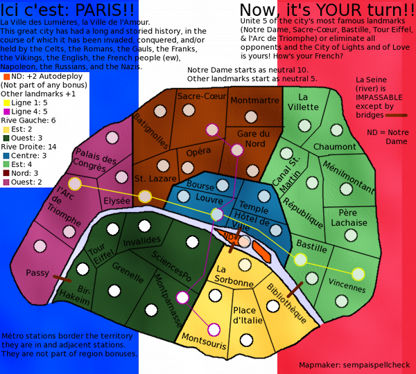
Re: Paris - V4 (4/23) (pgs. 1 & 3) - FEEDBACK PLEASE!!
OK - Here it is: Version 4.
Small
Large
Changes: Fixed flag background so red didn't look pink, redid bonus borders and removed outlines on army circles to fix pixelation, and FINALLY figured out how to add landmark illustrations - many thanks to DoomYoshi for that last.
Small
- Click image to enlarge.
- Click image to enlarge.
Last edited by sempaispellcheck on Fri Jan 04, 2013 10:54 pm, edited 1 time in total.
-
nolefan5311
- Posts: 1768
- Joined: Mon Nov 22, 2010 11:51 am
- Gender: Male
- Location: Florida
Re: Paris - V4 (4/23) (pgs. 1 & 3) - FEEDBACK PLEASE!!
Have you thought about making the background look more like a waving flag, like  ?
?
I think it adds a nice little touch to it.
I think it adds a nice little touch to it.
-
sempaispellcheck
- Posts: 2852
- Joined: Fri Sep 10, 2010 10:31 pm
- Gender: Male
- Location: Among the clouds and the skyscrapers, saving the world.
Re: Paris - V4 (4/23) (pgs. 1 & 3) - FEEDBACK PLEASE!!
I have, actually, but I went about it the wrong way when I tried it, so I gave up.
Now that I think I know how to do it, I'll try again.
V4.1 to be posted shortly.
Now that I think I know how to do it, I'll try again.
V4.1 to be posted shortly.
-
sempaispellcheck
- Posts: 2852
- Joined: Fri Sep 10, 2010 10:31 pm
- Gender: Male
- Location: Among the clouds and the skyscrapers, saving the world.
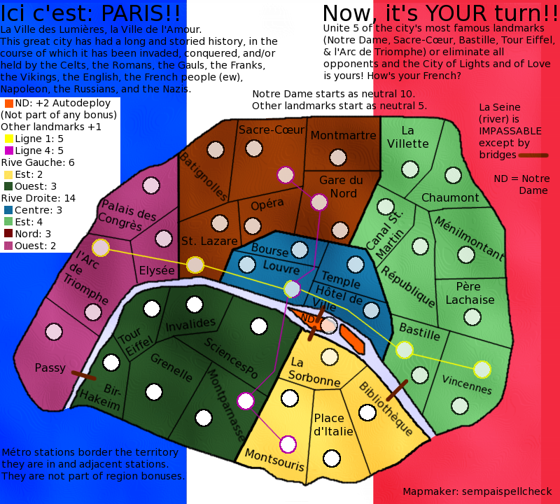
Re: Paris - V4.1 (4/24) (pgs. 1 & 3) - FEEDBACK PLEASE!!
HERE we go.
Version 4.1:
Small
Large
Changes: Replaced flag background with WAVING flag background.
Version 4.1:
Small
- Click image to enlarge.
- Click image to enlarge.
Last edited by sempaispellcheck on Fri Jan 04, 2013 10:55 pm, edited 1 time in total.
-
sempaispellcheck
- Posts: 2852
- Joined: Fri Sep 10, 2010 10:31 pm
- Gender: Male
- Location: Among the clouds and the skyscrapers, saving the world.
Re: Paris - V4.1 (4/24) (pgs. 1 & 3) - FEEDBACK PLEASE!!
At the risk of sounding impatient (which I am ), about how far is this map from its Draft stamp?
-
sempaispellcheck
- Posts: 2852
- Joined: Fri Sep 10, 2010 10:31 pm
- Gender: Male
- Location: Among the clouds and the skyscrapers, saving the world.
Re: Paris - V4.1 (4/24) (pgs. 1 & 3) - FEEDBACK PLEASE!!
My whole idea has been that the French flag would be the background for the map. I can't use water like Flap does - Paris is landlocked, and it's not like a country or a state where it borders 4 or 5 other places - Paris has a LOT of suburbs, and they all have fairly long names (Issy-les-Moulineaux, for example).
-
koontz1973

- Posts: 6960
- Joined: Thu Jan 01, 2009 10:57 am
Re: Paris - V4.1 (4/24) (pgs. 1 & 3) - FEEDBACK PLEASE!!
I think the three big issues right now for me are these...
The current flag background is not very nice, isaiah40 idea of using the same thing as Flapcake on Denmark should really bring the map to life.Not with the water or on a small scale, but covering the whole of the maps background. (Look at the style)
The images you have for the landmarks are so so. None of them fit the map as it is, all of them have different orientations and all are drawn different ways.
The amount of text for such a small map is overbearing. Try to cut some if not half out. Should be able to do that simply.
koontz

-
sempaispellcheck
- Posts: 2852
- Joined: Fri Sep 10, 2010 10:31 pm
- Gender: Male
- Location: Among the clouds and the skyscrapers, saving the world.
Re: Paris - V4.1 (4/24) (pgs. 1 & 3) - FEEDBACK PLEASE!!
Oh! My apologies, isaiah, I misunderstood you. I'll find a better flag.
The images were the best I could find. I'll look some more and find better ones.
I'm assuming you mean the text at the top? Aw, I liked it. I thought it was funny. Oh well. I can cut it.
The images were the best I could find. I'll look some more and find better ones.
I'm assuming you mean the text at the top? Aw, I liked it. I thought it was funny.
Re: Paris - V4.1 (4/24) (pgs. 1 & 3) - FEEDBACK PLEASE!!
No, I meant on the small scale like on Denmark. If you do have it covering the whole background, then you will need to subdue it so that it is barely visible. Just enough that you can see it, and just enough that it doesn't detract from the playable area.koontz1973 wrote:isaiah40 idea of using the same thing as Flapcake on Denmark should really bring the map to life.Not with the water or on a small scale, but covering the whole of the maps background. (Look at the style)
-
koontz1973
- Posts: 6960
- Joined: Thu Jan 01, 2009 10:57 am
Re: Paris - V4.1 (4/24) (pgs. 1 & 3) - FEEDBACK PLEASE!!
Look below.sempaispellcheck wrote:Oh! My apologies, isaiah, I misunderstood you. I'll find a better flag.
Why not draw them yourself. That way you do not have copyright to deal with.The images were the best I could find. I'll look some more and find better ones.
Thats right, the text. Some of it can stay and some you will need, but see what can be cut without losing the flavour.I'm assuming you mean the text at the top? Aw, I liked it. I thought it was funny.
Did not mean to put words into your mouth. But you are right. A barely there map would be best. Why not something like nattys London with an image as well?isaiah40 wrote:No, I meant on the small scale like on Denmark. If you do have it covering the whole background, then you will need to subdue it so that it is barely visible. Just enough that you can see it, and just enough that it doesn't detract from the playable area.koontz1973 wrote:isaiah40 idea of using the same thing as Flapcake on Denmark should really bring the map to life.Not with the water or on a small scale, but covering the whole of the maps background. (Look at the style)
-
sempaispellcheck
- Posts: 2852
- Joined: Fri Sep 10, 2010 10:31 pm
- Gender: Male
- Location: Among the clouds and the skyscrapers, saving the world.
Re: Paris - V4.1 (4/24) (pgs. 1 & 3) - FEEDBACK PLEASE!!
Because I can't really draw. I could try, but they would be barely recognizable, if at all.koontz1973 wrote:Why not draw them yourself. That way you do not have copyright to deal with.
Meaning reduce the opacity? I can do that.isaiah40 wrote:If you do have it covering the whole background, then you will need to subdue it so that it is barely visible. Just enough that you can see it, and just enough that it doesn't detract from the playable area.
-
sempaispellcheck
- Posts: 2852
- Joined: Fri Sep 10, 2010 10:31 pm
- Gender: Male
- Location: Among the clouds and the skyscrapers, saving the world.
Re: Paris - V4.1 (4/24) (pgs. 1 & 3) - FEEDBACK PLEASE!!
Because it would make the landmark illustrations redundant.koontz1973 wrote:Why not something like nattys London with an image as well?
Or should I scrap the landmark illustrations and go with that?
Last edited by sempaispellcheck on Wed Apr 25, 2012 9:17 pm, edited 1 time in total.
-
happy2seeyou

- Posts: 4022
- Joined: Mon Jan 22, 2007 2:59 pm
- Gender: Female
- Location: A state that is in the shape of a mitten!
- Contact:
Re: Paris - V4.1 (4/24) (pgs. 1 & 3) - FEEDBACK PLEASE!!
I like the layout, not sure about the flag in the back gound when there are random bright colors on the map. Also, the wording on the top is hard to pay attention to. Maybe the flag could be lighter, like the state flags in the "Great Lakes" map (flags are more muted but still seen). Also, maybe fix the legend on the side a lil. Great job so far though

-
sempaispellcheck
- Posts: 2852
- Joined: Fri Sep 10, 2010 10:31 pm
- Gender: Male
- Location: Among the clouds and the skyscrapers, saving the world.
Re: Paris - V4.1 (4/24) (pgs. 1 & 3) - FEEDBACK PLEASE!!
Yeah, I've cut a lot of it. I put it in because I thought it was funny, but it's not really necessary.happy2seeyou wrote:the wording on the top is hard to pay attention to.
I'll try that in my next update.happy2seeyou wrote:Maybe the flag could be lighter, like the state flags in the "Great Lakes" map (flags are more muted but still seen).
How? Can you be a bit more specific?happy2seeyou wrote:Also, maybe fix the legend on the side a lil.
Thanks!happy2seeyou wrote:Great job so far though
-
happy2seeyou
- Posts: 4022
- Joined: Mon Jan 22, 2007 2:59 pm
- Gender: Female
- Location: A state that is in the shape of a mitten!
- Contact:
Re: Paris - V4.1 (4/24) (pgs. 1 & 3) - FEEDBACK PLEASE!!
ND with the auto bonus doesn't need to be explained that it is not apart of any other bonus. If you figure out your background flag, you can have the legend without an eyesore of a large white box. Also, you could make their fonts in the legend more bold with the font being the appropriate color of each bonus (Africa, London, Montreal, San Francisco..) OR... have a mini diagram with the bonus numbers large on them (Japan, Kingdom of Denmark, Land and Sea..)sempaispellcheck wrote:How? Can you be a bit more specific?happy2seeyou wrote:Also, maybe fix the legend on the side a lil.
Make the fonts less like you are typing a paper for a report.
Do something cool with your name on the bottom and get rid of the "mapmaker:", if your name is on it, they know who made it.
Do you really have to state what places start as a neutral?
Try making the bridges better, instead of a straight line use a thicker curve.
I'll leave you alone for now.
-
sempaispellcheck
- Posts: 2852
- Joined: Fri Sep 10, 2010 10:31 pm
- Gender: Male
- Location: Among the clouds and the skyscrapers, saving the world.
Re: Paris - V4.1 (4/24) (pgs. 1 & 3) - FEEDBACK PLEASE!!
happy2seeyou wrote:ND with the auto bonus doesn't need to be explained that it is not apart of any other bonus.
I did that so that people in the foundry would know, but I guess I can just put that stuff in the first post.happy2seeyou wrote:Do you really have to state what places start as a neutral?
Good suggestions, man. Thank you for those - I should have some fun working on them.
-
happy2seeyou
- Posts: 4022
- Joined: Mon Jan 22, 2007 2:59 pm
- Gender: Female
- Location: A state that is in the shape of a mitten!
- Contact:
Re: Paris - V4.1 (4/24) (pgs. 1 & 3) - FEEDBACK PLEASE!!
Anything that doesn't really need to be on the map but you want the foundry to know can just be posted in your first post.sempaispellcheck wrote:happy2seeyou wrote:ND with the auto bonus doesn't need to be explained that it is not apart of any other bonus.I did that so that people in the foundry would know, but I guess I can just put that stuff in the first post.happy2seeyou wrote:Do you really have to state what places start as a neutral?
Good suggestions, man. Thank you for those - I should have some fun working on them.
I look forward to seeing your updates
-
sempaispellcheck
- Posts: 2852
- Joined: Fri Sep 10, 2010 10:31 pm
- Gender: Male
- Location: Among the clouds and the skyscrapers, saving the world.
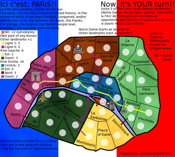
Re: Paris - V5 (4/28) (pgs. 1 & 4) - FEEDBACK PLEASE!!
Version 5:
Small - 600x540
Large - 800x720
Changes: Better flag background with reduced opacity, cut unnecessary text (even though I liked it ), revamped legend (bye bye, white box), cool new sig (people may not get it, but that's OK), and new landmark illustrations.
Still to do: Experiment with fonts (I've been using GIMP's default (Sans) for convenience, but apparently that's too academic). Any advice on this would be GREATLY appreciated.
Small - 600x540
- Click image to enlarge.

- Click image to enlarge.
Still to do: Experiment with fonts (I've been using GIMP's default (Sans) for convenience, but apparently that's too academic). Any advice on this would be GREATLY appreciated.
Last edited by sempaispellcheck on Fri Jan 04, 2013 10:55 pm, edited 1 time in total.