War of the Triple Alliance
Moderator: Cartographers
Forum rules
Please read the Community Guidelines before posting.
Please read the Community Guidelines before posting.
-
Ruben Cassar

- Posts: 2160
- Joined: Thu Nov 16, 2006 6:04 am
- Gender: Male
- Location: Civitas Invicta, Melita, Evropa


Re: War of the Triple Alliance... version 4, pg. 2
ugh, always the mountains!Ruben Cassar wrote:The mountains are looking a bit weird oak.
Re: War of the Triple Alliance... pg. 2
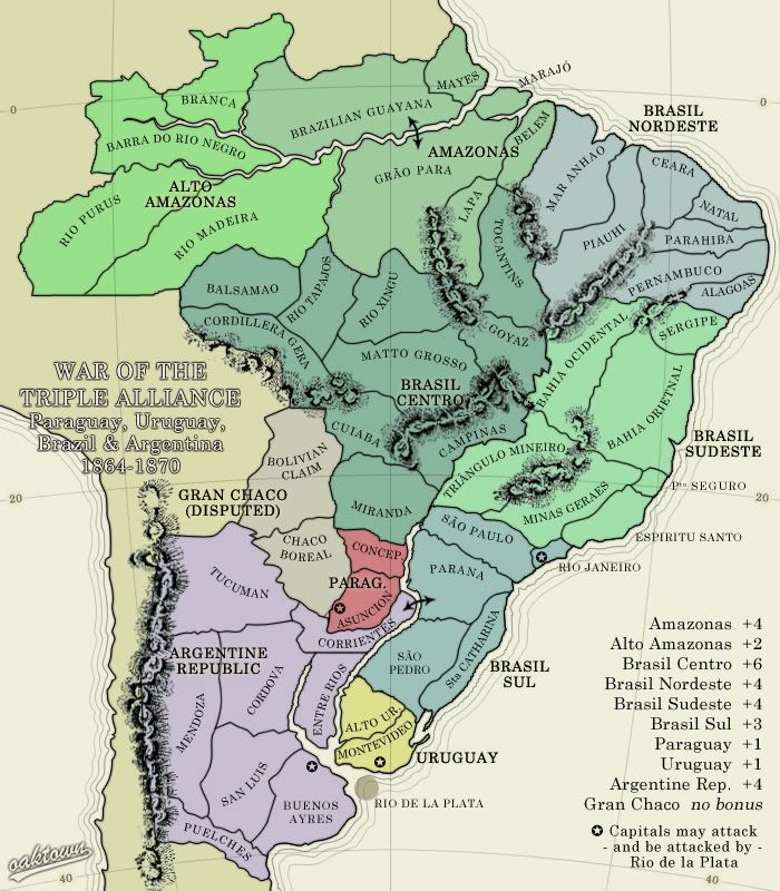
This makes sense to me. Rio Mad has 3 points of contact so and that removes the bottleneck bonus. And yes, I like how it is now watershed based.oaktown wrote:I think what I may end up doing is flipping the regions so that instead of having North and South Amazons I have Upper and Lower Amazons. This actually makes more sense geographically, and it means Upper is four territories (RIo Mad, Alto, Barra, Branca) with two borders, just as it is now, and lower is an easier to hold six territories with three borders.
Re: War of the Triple Alliance... version 4, pg. 2
here it is with the regions shifted... the mountains I'll deal with later. I'll simplify the mountain issue, though someday I intend to get this type of mountain right.
And for the record, that's three updates on one page.
And for the record, that's three updates on one page.
- Click image to enlarge.
-
dittoeevee8888

- Posts: 1107
- Joined: Tue Jan 29, 2008 6:06 pm
- Gender: Female
Re: War of the Triple Alliance... version 4, pg. 2
I dislike the mountains as well. They kind of look odd compared to the rest of the colours on the map. As well, they don't look like mountains to me. On the topic of mountains, I don't like how it kind of continues downward near Puelches while the actual game territory kind of cuts off before the mountians end.
I can't read the text under "brasil sudeste", as well.
I can't read the text under "brasil sudeste", as well.
Re: War of the Triple Alliance... version 4, pg. 2
I posted in the wrong thread.... too many tabs...dittoeevee8888 wrote:I dislike the mountains as well. They kind of look odd compared to the rest of the colours on the map. As well, they don't look like mountains to me. On the topic of mountains, I don't like how it kind of continues downward near Puelches while the actual game territory kind of cuts off before the mountians end.
I can't read the text under "brasil sudeste", as well.
Last edited by seamusk on Sat Jun 28, 2008 5:42 pm, edited 1 time in total.

Re: War of the Triple Alliance... version 4, pg. 2
The mountains look more like ropes than mountains
I feel like the sea color could use a hint of blue. Don't make it fully blue colored, but just add a tiny bit. Also, I'd move the latitude/longitude line layer under the South America continent layer but over the ocean, so you can see them over the ocean but they don't distract from the actual playable map.
I feel like the sea color could use a hint of blue. Don't make it fully blue colored, but just add a tiny bit. Also, I'd move the latitude/longitude line layer under the South America continent layer but over the ocean, so you can see them over the ocean but they don't distract from the actual playable map.
-
AndyDufresne

- Posts: 24919
- Joined: Fri Mar 03, 2006 8:22 pm
- Location: A Banana Palm in Zihuatanejo
- Contact:
Re: War of the Triple Alliance... version 4, pg. 2
I understand the idea was born out of the Brazil REVAMP, but the northern areas just feel too out of touch with the hot contention of the south. I'd rather see a more closer look at that south, as it looks like a hot bed of action and fun. (Hm, a hot bed of action and fun? What am I writing about?!)
--Andy
--Andy
-
Qwert

- SoC Training Adviser
- Posts: 9262
- Joined: Tue Nov 07, 2006 5:07 pm
- Location: VOJVODINA
- Contact:
Re: War of the Triple Alliance... version 4, pg. 2
i dont see any water colourby ZeakCytho on Sun Jun 29, 2008 12:30 am
The mountains look more like ropes than mountains
I feel like the sea color could use a hint of blue. Don't make it fully blue colored, but just add a tiny bit. Also, I'd move the latitude/longitude line layer under the South America continent layer but over the ocean, so you can see them over the ocean but they don't distract from the actual playable map.
Any way,do you have in plan to put Army circle on map?

Re: War of the Triple Alliance... version 4, pg. 2
- Click image to enlarge.
I'm not ignoring you, Andy, just thinking about what will happen if we cut the Amazon regions.
First let's see if this map ever makes it out of Ideas.qwert wrote:Any way,do you have in plan to put Army circle on map?
-
AndyDufresne
- Posts: 24919
- Joined: Fri Mar 03, 2006 8:22 pm
- Location: A Banana Palm in Zihuatanejo
- Contact:
Re: War of the Triple Alliance... version 4, pg. 2
No worries, I didn't think you were ignorning me! I know you wouldn't dare. 
I like the addition of the History. But the inclusion of the bonuses at the bottom of it almost makes it seem too long and...well...unfriendly to read, you know?
Solution? Get rid of some of the northern territories of course! More space for history.
Anyways, I'll wander back in and comment again soon.
--Andy
I like the addition of the History. But the inclusion of the bonuses at the bottom of it almost makes it seem too long and...well...unfriendly to read, you know?
Solution? Get rid of some of the northern territories of course!
Anyways, I'll wander back in and comment again soon.
--Andy
-
dittoeevee8888
- Posts: 1107
- Joined: Tue Jan 29, 2008 6:06 pm
- Gender: Female
Re: War of the Triple Alliance... version 4, pg. 2
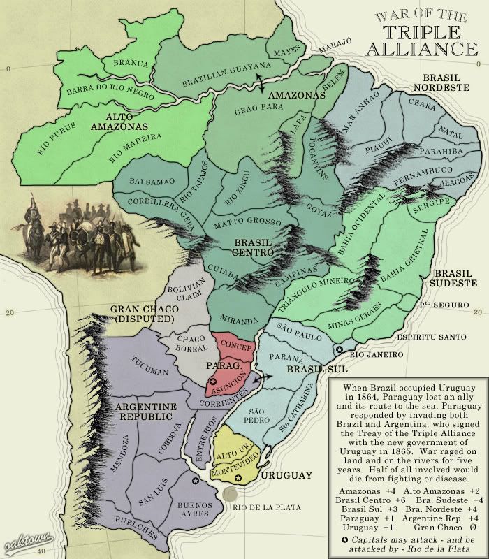
I like these mountains a lot better.
Also, in the box where you were describing the war, you spelt treaty wrong.
Also, in the box where you were describing the war, you spelt treaty wrong.
Re: War of the Triple Alliance... version 4, pg. 2
- Click image to enlarge.
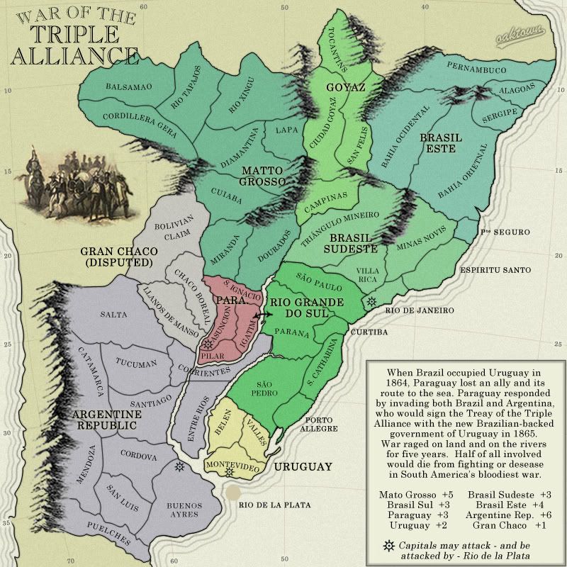
The above image cuts out the north of brazil, as Andy suggested, and represents only the areas which would have seen some action during this war. It does NOT reflect what the map wold ultimately look like in terms of size of regions and number of territories - I'd probably have to add a region, and add territories to the other to bring it up to the size I'd like to make this.
Pros: it is more historically accurate, and I can make Paraguay and Uruguay bigger.
I'm probably going to make this change, I just feel better hearing you all tell me to do so.
Re: War of the Triple Alliance; see first post for Poll please
- Click image to enlarge.
Re: War of the Triple Alliance; see first post for Poll please
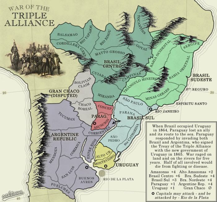
I voted option 1, but the urge to vote option 3 was incredible...I can't believe I didn't!

Re: War of the Triple Alliance; see first post for Poll please
Where's the image for number 3?
C.
C.

Highest score : 2297
Re: War of the Triple Alliance; see first post for Poll please
Oh, sorry, here it is...yeti_c wrote:Where's the image for number 3?

Re: War of the Triple Alliance; see first post for Poll please
- Click image to enlarge.
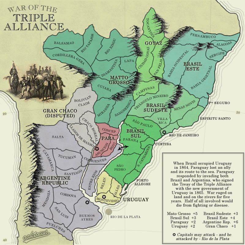
I've got this to 52 territories, which works for me just fine. Right now the starts look like this:
8 players: 6 terits, 4 neut
7 players: 7 starts, 3 neut
6 players: 8 terits, 4 neut
5 players: 10 starts, 2 neut
4 players: 13 starts, 0 neut
2/3 players: 17 starts, 1 neut.
I put the rivers in the right place around Paraguay... had to look more closely at the map. It's better this way, as it creates a nice protective barrier around Paraguay.
Added a territory to Paraguay. They started this war, so they should be more important on the map. Historically it's nice to give them a larger bonus as well.
Re: War of the Triple Alliance; Poll p.1, update p.3
Poll results... since nobody is posting in this thread anyway.
What geographical region should be represented in this map?
Option 1: show only those regions actually affected by the war you are representing. 12; 70%
Option 2: show all of Brazil. 5; 29%
Option 3: I never take these poll seriously and always choose the smart-ass answer. 0, No votes
What geographical region should be represented in this map?
Option 1: show only those regions actually affected by the war you are representing. 12; 70%
Option 2: show all of Brazil. 5; 29%
Option 3: I never take these poll seriously and always choose the smart-ass answer. 0, No votes


-
AndyDufresne
- Posts: 24919
- Joined: Fri Mar 03, 2006 8:22 pm
- Location: A Banana Palm in Zihuatanejo
- Contact:
Re: War of the Triple Alliance; Poll p.1, update p.3
I'm surprised this received zero votes. There really must be no one looking at the map... (Kidding of course.oaktown wrote: Option 3: I never take these poll seriously and always choose the smart-ass answer. 0, No votes
I like the look of the map, and I am always a fan of Standard game play. Keep up the work.
--Andy
-
gimil

- Posts: 8599
- Joined: Sat Mar 03, 2007 12:42 pm
- Gender: Male
- Location: United Kingdom (Scotland)
Re: War of the Triple Alliance; ver. 9 on pg. 3
[ADV. IDEA]
Oak youve become the map machine lately.
Oak youve become the map machine lately.
What do you know about map making, bitch?
Top Score:2403natty_dread wrote:I was wrong

Re: War of the Triple Alliance; ver. 9 on pg. 3
Um. It says Treay of the Triple Alliance in the map description. Small typo.

Re: War of the Triple Alliance; ver. 9 on pg. 3
I think the bonus legend should have some basic color designation.
Re: War of the Triple Alliance; ver. 9 on pg. 3
- Click image to enlarge.
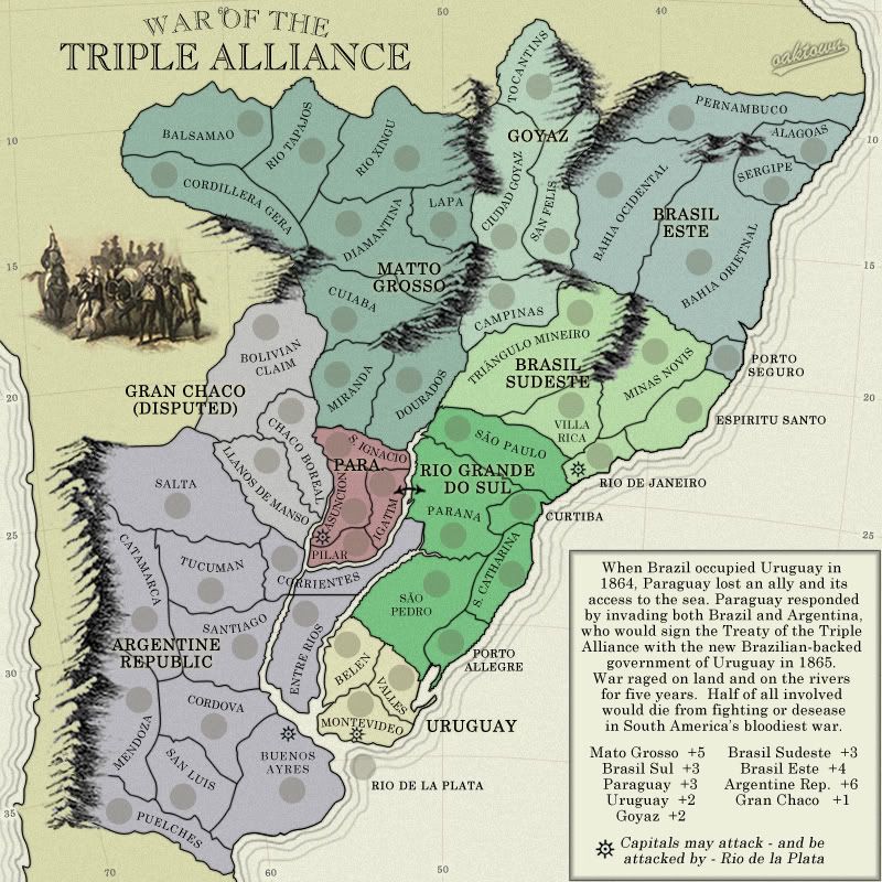
bonuses: I've added Goyaz to the legend, which I somehow overlooked when I cut the map down. It's the same size as Paraguay, but historically it's not as important so I'm thinking I'd like to leave it as a +2. Plus, if somebody wants to go for that region they'll be relatively unmolested as more early action will probably take place in the south.
legend: I'll come up with a way to indicate color... preferably not with a minimap. I would like to do the entire legend up right, but let's get this out of Ideas first, shall we?