Knights
Moderator: Cartographers
Forum rules
Please read the Community Guidelines before posting.
Please read the Community Guidelines before posting.
-
natty dread

- Posts: 12876
- Joined: Fri Feb 08, 2008 8:58 pm
- Location: just plain fucked
Re: Knights [16/01] Page 1 & 17 Anything else?
Flip the other stairs around to get a nice rotational symmetry.

-
koontz1973
- Posts: 6960
- Joined: Thu Jan 01, 2009 10:57 am
Re: Knights [16/01] Page 1 & 17 Anything else?
Will do the top one so it is clockwise.natty_dread wrote:Flip the other stairs around to get a nice rotational symmetry.

-
natty dread
- Posts: 12876
- Joined: Fri Feb 08, 2008 8:58 pm
- Location: just plain fucked
Re: Knights [16/01] Page 1 & 17 Anything else?
Actually if you want it clockwise I think you should flip the bottom one... if you consider going up the stairs to be the direction of the clock.
Wow, out of context that sentence makes no sense whatsoever...
Wow, out of context that sentence makes no sense whatsoever...
-
koontz1973
- Posts: 6960
- Joined: Thu Jan 01, 2009 10:57 am
Re: Knights [16/01] Page 1 & 17 Anything else?
Stairs turned around.
Small brought up to date.
Large.
Small.
Small brought up to date.
Large.
- Click image to enlarge.

- Click image to enlarge.

-
koontz1973
- Posts: 6960
- Joined: Thu Jan 01, 2009 10:57 am
Re: Knights [17/01] Page 1 & 17 Graphics finished?
Just moved the stairs a tad as the bottom one was in the text.
Large.
Small.
Any chance of a mod look over please?
Large.
- Click image to enlarge.

- Click image to enlarge.

-
koontz1973
- Posts: 6960
- Joined: Thu Jan 01, 2009 10:57 am
Re: Knights [18/01] Page 1 & 17 Graphics finished?
Just made damn sure the shields are centred. The small maps shields are to the left by one pixel, this is to make sure the 88s are centred in them and do not go over the territ border when 888's.
Large.
Small.
Large.
- Click image to enlarge.

- Click image to enlarge.

images with 88s
If are wondering about the white 88's it is because the xml will be easier to write this way in the xml tool.

http://img440.imageshack.us/img440/807/nklxml.png

http://img811.imageshack.us/img811/807/nklxml.png
http://img440.imageshack.us/img440/807/nklxml.png
http://img811.imageshack.us/img811/807/nklxml.png
-
natty dread
- Posts: 12876
- Joined: Fri Feb 08, 2008 8:58 pm
- Location: just plain fucked
Re: Knights [18/01] Page 1 & 17 Graphics finished?
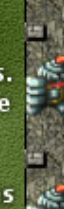
One thing... the knights on the wall look like they're drawn from a bird's eye perspective, while the wall itself and the ramparts and stairs are drawn in the top-down perspective. This is most noticeable in the knight in the top-right corner, which looks kinda really weird, being "under" the ramparts like that...
-
koontz1973
- Posts: 6960
- Joined: Thu Jan 01, 2009 10:57 am
Re: Knights [18/01] Page 1 & 17 Graphics finished?
The knights stay as they are of I will take them off. They where just decoration and had taken them of a couple of versions ago till DiM said he wanted them back. A top down knight would be awful to look at as well. Sure most people can forgive me over the double perspective. And before you ask, no, I will not change the look of the map to match the knights.natty_dread wrote:One thing... the knights on the wall look like they're drawn from a bird's eye perspective, while the wall itself and the ramparts and stairs are drawn in the top-down perspective. This is most noticeable in the knight in the top-right corner, which looks kinda really weird, being "under" the ramparts like that...
EDIT: Forgot the smilie.
-
natty dread
- Posts: 12876
- Joined: Fri Feb 08, 2008 8:58 pm
- Location: just plain fucked
Re: Knights [18/01] Page 1 & 17 Graphics finished?
Fine, take them off, what do I care?koontz1973 wrote:The knights stay as they are of I will take them off.
The thing is, you could probably get away with the double perspective, if it wasn't for the knights that overlap with the ramparts. The knights on the sides that go neatly between the blocks are fine. The ones on the top & bottom edges, the ones that overlap with the blocks, are not.
Firstly, look at the knights at the bottom edge. There, the knights are on top of the blocks, which makes it look like the blocks are almost flat, like they're just stepping stones or something. Then at the top edge, you have the blocks on top of the knights, which makes it look like parts of the kights are missing, or that the knights are lying on their side on top of the wall...
-
DiM

- Posts: 10415
- Joined: Wed Feb 14, 2007 6:20 pm
- Gender: Male
- Location: making maps for scooby snacks
Re: Knights [18/01] Page 1 & 17 Graphics finished?
top wall you have a portion where the black line stops:
http://gyazo.com/d83cc85cd6060c8f0c2589 ... 1326901908
the black line stops on the right side on each rampart:
http://gyazo.com/41e1906afee1f054c4f540 ... 1326901408
and here the black line has a weird bend:
http://gyazo.com/f3c7a557393103546c2b18 ... 1326901943
the black line stops on the ramparts in the lower side also, plus the ramparts are not aligned:
http://gyazo.com/1e18b552749c1275b2196a ... 1326901974
you brushed a little black here:
http://gyazo.com/fe3ac53502fd5784573414 ... 1326901473
“In the beginning God said, the four-dimensional divergence of an antisymmetric, second rank tensor equals zero, and there was light, and it was good. And on the seventh day he rested.”- Michio Kaku
-
koontz1973
- Posts: 6960
- Joined: Thu Jan 01, 2009 10:57 am
Re: Knights [18/01] Page 1 & 17 Graphics finished?
As I said natty, I am sure I can be forgiven the double perspective. They are only there for decoration, nothing else. If you and others want them of then of they will come. But as soon as they come of, others will say to put them back. I cannot please everyone. I will go back over the top knights and put back in the missing pieces so both ends look more equal (as you pointed out).
And who is to say the knights might be completely drunk and passed out.
DiM, you posted just before me so no quote. Cannot open you links for some reason but have been having problems all day with everything. As soon as I can see what you mean, I will take care of it at the same time as the knights.
-
natty dread
- Posts: 12876
- Joined: Fri Feb 08, 2008 8:58 pm
- Location: just plain fucked
Re: Knights [18/01] Page 1 & 17 Graphics finished?
Right, but that doesn't excuse sloppy work... I could draw my next map's background full of smiling dicks, and tell people "they're only there for decoration"... and that would be that?koontz1973 wrote:They are only there for decoration, nothing else.
Nah, just make it so that none of the knights overlap with the ramparts. Make them go between them like they do on the sides. Problem solved.koontz1973 wrote:I will go back over the top knights and put back in the missing pieces so both ends look more equal (as you pointed out).
-
koontz1973
- Posts: 6960
- Joined: Thu Jan 01, 2009 10:57 am
Re: Knights [18/01] Page 1 & 17 Graphics finished?


Will do natty.
These are dims errors. Will sort them out now and hope I can post the images tonight.
-
koontz1973
- Posts: 6960
- Joined: Thu Jan 01, 2009 10:57 am
Re: Knights [18/01] Page 1 & 17 Graphics finished?
That should take care of nattys knights and DiMs found problems.
Large.
Small.
Large.
- Click image to enlarge.

- Click image to enlarge.


Re: Knights [18/01] Page 1 & 17 Graphics finished?
Cool, I reckon we have the graphics and gameplay down pat. Can I ask one stupid question and I apologise if I have skimmed and missed this. But where are the starting positions? Or will it just be random? Or something else? For instance, there could be a starting position of knights where they belong but that would only work for two player. You can have them in a row at the bottom or top (will allow up to 16 players  ). But seriously, I was just wanting to get a feel for how the game would start. The gameplay would be terrific (IMHO) if the starting points were random (but obviously not on the sweet spots).
Re: Knights [18/01] Page 1 & 17 Graphics finished?
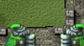
Except for the two corner green knights. They need to be moved more towards the corners as they still look like they are overlapping the ramparts. 

-
koontz1973
- Posts: 6960
- Joined: Thu Jan 01, 2009 10:57 am
Re: Knights [18/01] Page 1 & 17 Graphics finished?
Done isaiah. 
Large.
Small.
hippo, first post explains the GP. There are only 2 starting positions programmed only. In a 2 player game both sides will get 16 troops 1/2-A/H and 7/8-A/H. All other territs in the middle are neutral 1s. In any game larger than 2 players, the 32 territs that make up the starting positions will be given equally between the players with any left over being a neutral.
Large.
- Click image to enlarge.

- Click image to enlarge.

Re: Knights [19/01] Page 1 & 17 Graphics finished?
Thanks Koontz ... I missed that but that's great.
-
koontz1973
- Posts: 6960
- Joined: Thu Jan 01, 2009 10:57 am
-
DiM
- Posts: 10415
- Joined: Wed Feb 14, 2007 6:20 pm
- Gender: Male
- Location: making maps for scooby snacks
Re: Knights [19/01] Page 1 & 17 Graphics finished?
his welcome?koontz1973 wrote:Your welcome.
“In the beginning God said, the four-dimensional divergence of an antisymmetric, second rank tensor equals zero, and there was light, and it was good. And on the seventh day he rested.”- Michio Kaku
-
koontz1973
- Posts: 6960
- Joined: Thu Jan 01, 2009 10:57 am
Re: Knights [19/01] Page 1 & 17 Graphics finished?
Any chance for a mod look over?
A sticky might be nice way to go.
A sticky might be nice way to go.
Re: Knights [19/01] Page 1 & 17 Graphics finished?
koontz, this is a little think - could you darken the yellow shield in the bonus description on the small map? It's really shiny and really different from the yellow shield used on board (and on the large version).
-
koontz1973
- Posts: 6960
- Joined: Thu Jan 01, 2009 10:57 am
Re: Knights [19/01] Page 1 & 17 Graphics finished?
Done.J_Indr wrote:koontz, this is a little think - could you darken the yellow shield in the bonus description on the small map? It's really shiny and really different from the yellow shield used on board (and on the large version).
Large.
- Click image to enlarge.
- Click image to enlarge.

Re: Knights [21/01] Page 1 & 19 Graphics finished?
Last Call
If anyone has any other comments on gameplay, now is the time to speak up! If there are no other concerns within the next couple of days, this map will be moved to the Final Forge!
isaiah40
If anyone has any other comments on gameplay, now is the time to speak up! If there are no other concerns within the next couple of days, this map will be moved to the Final Forge!
isaiah40
-
koontz1973
- Posts: 6960
- Joined: Thu Jan 01, 2009 10:57 am
Re: Knights [21/01] Page 1 & 19 Graphics finished?
Thanks isaiah. Was hoping to get this moving along.