Portugal [Quenched]
Moderator: Cartographers
Forum rules
Please read the Community Guidelines before posting.
Please read the Community Guidelines before posting.

-
gimil

- Posts: 8599
- Joined: Sat Mar 03, 2007 12:42 pm
- Gender: Male
- Location: United Kingdom (Scotland)
NEVERmind lol ill get to it. Ive got WM PNG that has the centered coodnitaes on itColeman wrote:They all seem to be 23.gimil wrote:im sure i had the army circles 22 px.
Thanks alot coleman for your work its much appreciated
What do you know about map making, bitch?
Top Score:2403natty_dread wrote:I was wrong
-
gimil
- Posts: 8599
- Joined: Sat Mar 03, 2007 12:42 pm
- Gender: Male
- Location: United Kingdom (Scotland)
LARGE:
http://i25.photobucket.com/albums/c64/G ... ARGE-1.png
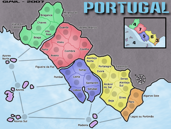
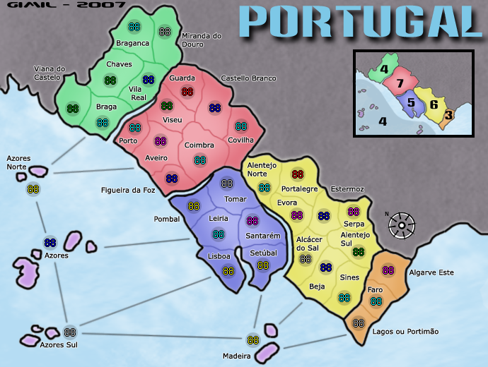
SMALL:
http://i25.photobucket.com/albums/c64/G ... MALL-1.png
XML:
http://members.cox.net/gyrigo/CC/Portugal.xml
http://i25.photobucket.com/albums/c64/G ... ARGE-1.png
SMALL:
http://i25.photobucket.com/albums/c64/G ... MALL-1.png
XML:
http://members.cox.net/gyrigo/CC/Portugal.xml
What do you know about map making, bitch?
Top Score:2403natty_dread wrote:I was wrong

-
gimil
- Posts: 8599
- Joined: Sat Mar 03, 2007 12:42 pm
- Gender: Male
- Location: United Kingdom (Scotland)
I dont understand what you mean. All boarders are visable and havent been complained about throught the whole process of this map.qwert wrote: 1.In map you have some country who have very bright terittory borders.
ive been through this ENTIRE thread and you havent posted once. Never the less i am keeping the background a simple textured grey. My reasoning is becasue:qwert wrote: 2.I put post before yours map been forged,with question of yours background who is gray dead,and you nothing do with these.
1. There is nothning i COULD add to make the map more undestandable
2. Adding any image ETC would make hte map to busy which is not the look im after.
What do you know about map making, bitch?
Top Score:2403natty_dread wrote:I was wrong
-
DiM

- Posts: 10415
- Joined: Wed Feb 14, 2007 6:20 pm
- Gender: Male
- Location: making maps for scooby snacks
i really don't see the bright borders you're talking about.qwert wrote:well i look maps,and i see several issue:
1.In map you have some country who have very bright terittory borders.
i look at the outside borders and they all look the same shade of black.
i look at the inside borders and they all have the same intensity. perhaps because they have the color of their continents? yes the inside borders in yellow continent may seem brighter than those in blue but that's just because the borders have different colors. the intensity is the same. but maybe i'm missing something. care to show us exactly what borders you're talking about??
the background is supposed to be neutral. i would not want it changed. it has a nice color and texture that fits perfectly with the simple crisp style of the map. if gimil puts a picture or something else there then the dead background would catch the eye more than the continents would and that's not good.qwert wrote: 2.I put post before yours map been forged,with question of yours background who is gray dead,and you nothing do with these.
“In the beginning God said, the four-dimensional divergence of an antisymmetric, second rank tensor equals zero, and there was light, and it was good. And on the seventh day he rested.”- Michio Kaku
That's your opinion and qwert has his. I support qwert here, it was something I mentioned on page 8. The dead territory takes up such a large portion of the map, I really think it could use something.DiM wrote:the background is supposed to be neutral. i would not want it changed. it has a nice color and texture that fits perfectly with the simple crisp style of the map. if gimil puts a picture or something else there then the dead background would catch the eye more than the continents would and that's not good.
Nothing has really changed since then, the map still has that bland/washed out feel to it. More so now actually than what it did on page 8.KEYOGI wrote:Add some imagery to the dead territory like in the Mongol Empire map or something else to try and just liven up the map a bit. It feels a bit washed out and drab at the moment.
I'm not sure the glow on the text is doing anything for you. With an effect on the text it would give you the opportunity to move some of your territory labels into a better position, but I think this is an area that still needs some tweaking.
Sea routes are still bad in my opinion. They do nothing to reflect a sea route. I would seriously consider some other options here, your map would benefit from it.
-
gimil
- Posts: 8599
- Joined: Sat Mar 03, 2007 12:42 pm
- Gender: Male
- Location: United Kingdom (Scotland)
KEYOGI wrote: That's your opinion and qwert has his. I support qwert here, it was something I mentioned on page 8. The dead territory takes up such a large portion of the map, I really think it could use something.
Im open to suggestions but like i already said any pictures will just contrast with the soft flowing image i currently have.KEYOGI wrote:Add some imagery to the dead territory like in the Mongol Empire map or something else to try and just liven up the map a bit. It feels a bit washed out and drab at the moment.
I dont see what you mean by bland and washed out. I feel its pleasant and easy to look at. but THATS just my opinionKEYOGI wrote: Nothing has really changed since then, the map still has that bland/washed out feel to it. More so now actually than what it did on page 8.
Without the glow the terr names look flat. That was something i was always unhappy with. now im more satified with them. I dont feel it makes it better or worst. Just a matter of opinion.KEYOGI wrote:I'm not sure the glow on the text is doing anything for you. With an effect on the text it would give you the opportunity to move some of your territory labels into a better position, but I think this is an area that still needs some tweaking.
KEYOGI wrote: Sea routes are still bad in my opinion. They do nothing to reflect a sea route. I would seriously consider some other options here, your map would benefit from it.
We had this discussion and opinion was pritty split between straight and curved. I decided to stick with the straight. There definetly not as bad as your making them out to be.
What do you know about map making, bitch?
Top Score:2403natty_dread wrote:I was wrong
I like the classic feel of the map and don't want to see this map turn to crap, so I respectfully agree with DiM.KEYOGI wrote:That's your opinion and qwert has his. I support qwert here, it was something I mentioned on page 8. The dead territory takes up such a large portion of the map, I really think it could use something.DiM wrote:the background is supposed to be neutral. i would not want it changed. it has a nice color and texture that fits perfectly with the simple crisp style of the map. if gimil puts a picture or something else there then the dead background would catch the eye more than the continents would and that's not good.
I actually preferred the text without the glow effect myself. But I don't think anything is wrong with the territory labels as they are now.KEYOGI wrote:I'm not sure the glow on the text is doing anything for you. With an effect on the text it would give you the opportunity to move some of your territory labels into a better position, but I think this is an area that still needs some tweaking.
Really? They aren't in mine.KEYOGI wrote:Sea routes are still bad in my opinion.
How so?KEYOGI wrote:They do nothing to reflect a sea route.
I wouldn't. They're fine.KEYOGI wrote:I would seriously consider some other options here, your map would benefit from it.
Edit: Gimil fast posted me... lol.
Warning: You may be reading a really old topic.
-
DiM
- Posts: 10415
- Joined: Wed Feb 14, 2007 6:20 pm
- Gender: Male
- Location: making maps for scooby snacks
KEYOGI wrote:That's your opinion and qwert has his. I support qwert here, it was something I mentioned on page 8. The dead territory takes up such a large portion of the map, I really think it could use something.DiM wrote:the background is supposed to be neutral. i would not want it changed. it has a nice color and texture that fits perfectly with the simple crisp style of the map. if gimil puts a picture or something else there then the dead background would catch the eye more than the continents would and that's not good.
Nothing has really changed since then, the map still has that bland/washed out feel to it. More so now actually than what it did on page 8.KEYOGI wrote:Add some imagery to the dead territory like in the Mongol Empire map or something else to try and just liven up the map a bit. It feels a bit washed out and drab at the moment.
maybe it could use something but certainly not an image. it would spoil the feeling of the map. remember this is not a texture heavy map. the effects are barely visible throughout the whole image. adding something so blunt as an image would draw attention to the dead terit rather than the playing ones. if anything was to be done i'd vote for a bigger legend in the large map, to cover more dead area. but that's all.
the glowy text is the best by far. it's discrete and functional. basically those are the 2 words that define this map. functionality and discretion.KEYOGI wrote:I'm not sure the glow on the text is doing anything for you. With an effect on the text it would give you the opportunity to move some of your territory labels into a better position, but I think this is an area that still needs some tweaking.
and what would reflect a sea route? i think any line dotted or continuous, wavy or straight could be a sea route. it all depends on the style of the map. look at the sea lines in AoM. wavy dotted and washed. that's the style best suited for that map. i think what gimil has now is best suited for this map. there's no standard sea route that must be used.KEYOGI wrote:Sea routes are still bad in my opinion. They do nothing to reflect a sea route. I would seriously consider some other options here, your map would benefit from it.
“In the beginning God said, the four-dimensional divergence of an antisymmetric, second rank tensor equals zero, and there was light, and it was good. And on the seventh day he rested.”- Michio Kaku
-
gimil
- Posts: 8599
- Joined: Sat Mar 03, 2007 12:42 pm
- Gender: Male
- Location: United Kingdom (Scotland)
I don't see why disagreeing with you is a problem.Developmental maps will be discussed in length in the various Foundry forums, in their respective topics. Cartographers must be open to any advice and suggestions. Be sure that if you do not implement said advice you must have logical reason for doing so. This rebuttal must be stated either by you, or argued by another Foundry poster who sees the drawbacks or shortcomings in said advice. There will be no rebuttals of ‘It’s my map, let me do it my way.’ Waiting for feedback on your map is the one of the most important parts of development.
What do you know about map making, bitch?
Top Score:2403natty_dread wrote:I was wrong
-
WidowMakers
- Posts: 2774
- Joined: Mon Nov 20, 2006 9:25 am
- Gender: Male
- Location: Detroit, MI
I am gonna agree with keyogi a bit on this one.
1)When i first look at this map it seems to be missing something. The bonus regions are just a color. If I hold red I hold red. Big deal. What is the region of red called. I would make the legend better by adding names for the regions. That way players can associate with each territory.
2)Also I know the map is a texture light map. But it is too light in my opinion. It looks boring. Spice it up a bit. You want people to look at the map and say WOW this looks cool. Add some Portuguese culture to the map. A flag a motto. Maybe each region of the country is know for a particular product or natural resource.
3)The sea attack routs are too harsh and straight. They should be more flowing and organic.
Make the map come alive so that people enjoy looking at it as art and not just a map to play.
Your map is coming along but still needs something to put it over the top.
When I am making a map I try to think to myself.
"What can I do to make others question how i did that"
I want people to ask, how did you do that. Or say, that is really cool.
Don't limit yourself to plain colors and inner glows . Think outside the box and let the imagination flow. You would be surprised what you come up with when you just try some things and see what happens.
Keep up the good work.


-
DiM
- Posts: 10415
- Joined: Wed Feb 14, 2007 6:20 pm
- Gender: Male
- Location: making maps for scooby snacks
it's clear we have 2 sides. the ones that like the simple nature of the map and the ones that would love some spicy textures.
as i said in wm's great lakes i'm not such a big fan of images in the background. in fact i stated many times in great lakes that the flags would spoil the feeling. but that's just me.
anyway regarding the names, if i remember correctly (and i know i do) this map initially had names in the legend but then gimil proposed the current legend and people liked it better than the simple column of names.
maybe if he adds the column of names and also keeps the current legend he can fill more of the dead space.
something like great lakes.
PS: i just realized why i like this map. it reminds me of australia (one of my favs) the same simple layout with crisp colors and no fancy shmancy textures and images.
imagine australia with a koala in queensland a kangaroo in western and some palm trees or eucalyptus trees on the other continents. horrible.
“In the beginning God said, the four-dimensional divergence of an antisymmetric, second rank tensor equals zero, and there was light, and it was good. And on the seventh day he rested.”- Michio Kaku
DiM, if you actually pay attention to the Australia map, you'll see that there are images in the background. Not to mention the obvious texture on the map. The australia map, unlike the portugal map fills the background very well with the legend & title.
Also, for one of your favourite maps DiM, you havent played it much.
Also, for one of your favourite maps DiM, you havent played it much.
-
DiM
- Posts: 10415
- Joined: Wed Feb 14, 2007 6:20 pm
- Gender: Male
- Location: making maps for scooby snacks
i know there are images in the background but not in the territories and the texture is the same everywhere just like gimil's gradient. it does not differentiate the various continents.Teya wrote:DiM, if you actually pay attention to the Australia map, you'll see that there are images in the background. Not to mention the obvious texture on the map. The australia map, unlike the portugal map fills the background very well with the legend & title.
Also, for one of your favourite maps DiM, you havent played it much.
about filling the dead land i already said an option would be to have the column of continents and the pic like legend.
regarding the number of games played on australia, i said it's one of my favorites not my most favorite.
if i were to put them in order i'd say it's AoM, classic, british isles and australia. and if you have the time to look in my games i bet you'll see that reflects the number of games i've played on each.
“In the beginning God said, the four-dimensional divergence of an antisymmetric, second rank tensor equals zero, and there was light, and it was good. And on the seventh day he rested.”- Michio Kaku
-
WidowMakers
- Posts: 2774
- Joined: Mon Nov 20, 2006 9:25 am
- Gender: Male
- Location: Detroit, MI
DiM. I am not just saying to add textures for the sake of textures. I am saying make a map that others can't.DiM wrote:it's clear we have 2 sides. the ones that like the simple nature of the map and the ones that would love some spicy textures.
Anyone who knows photoshop can make the current Portugal map.
-It is several layers of different colored masses.
-Each of them have an inner glow of black with an opacity of around 75% and are feathered.
-The sea is just a blue background with a little texture.
These are very simple things.
All I was trying to say was:
WidowMakers wrote: "What can I do to make others question how i did that"
I want people to ask, how did you do that. Or say, that is really cool.
Don't limit yourself to plain colors and inner glows . Think outside the box and let the imagination flow. You would be surprised what you come up with when you just try some things and see what happens.
Do you want the map to be OK or GREAT?
Any map can be OK. To make a map great it needs character. Make it stand out!
WM
-
Qwert

- SoC Training Adviser
- Posts: 9262
- Joined: Tue Nov 07, 2006 5:07 pm
- Location: VOJVODINA
- Contact:
I just say mine opinion,i like when map have filed background,and filed neutral country(no playabile terittory),these how i work,and every mine map have filed background who in good way give map some autentical look.If he dont want to change then ok.the background is supposed to be neutral. i would not want it changed. it has a nice color and texture that fits perfectly with the simple crisp style of the map. if gimil puts a picture or something else there then the dead background would catch the eye more than the continents would and that's not good.
_________________
Age of Merchants was just the beginning of a long journey. A journey about demons, survival and evolution. A journey that never ends....
-
DiM
- Posts: 10415
- Joined: Wed Feb 14, 2007 6:20 pm
- Gender: Male
- Location: making maps for scooby snacks
well it certainly stands out due to it's simplicity. compare it to recent maps. it's like a breath of fresh air. this and revamp of montreal. they both look old skoolWidowMakers wrote:DiM. I am not just saying to add textures for the sake of textures. I am saying make a map that others can't.DiM wrote:it's clear we have 2 sides. the ones that like the simple nature of the map and the ones that would love some spicy textures.
Anyone who knows photoshop can make the current Portugal map.
-It is several layers of different colored masses.
-Each of them have an inner glow of black with an opacity of around 75% and are feathered.
-The sea is just a blue background with a little texture.
These are very simple things.
All I was trying to say was:WidowMakers wrote: "What can I do to make others question how i did that"
I want people to ask, how did you do that. Or say, that is really cool.
Don't limit yourself to plain colors and inner glows . Think outside the box and let the imagination flow. You would be surprised what you come up with when you just try some things and see what happens.
Do you want the map to be OK or GREAT?
Any map can be OK. To make a map great it needs character. Make it stand out!
WM
anyone that knows photoshop can make portugal, yes. but anyone that knows photoshop can make any map.
the key is not in the degree of difficulty of the image editing it's in the feelings it gives to the viewers. to me it's a clean comfortable simple feeling. to you it a feeling of it could have been better. perhaps we're both right because both of us have our own way of looking at maps.
“In the beginning God said, the four-dimensional divergence of an antisymmetric, second rank tensor equals zero, and there was light, and it was good. And on the seventh day he rested.”- Michio Kaku

gimil...congrats on FF (even though its a bit down the track)
I want to say that if you're happy with the map the way it is, then you'll convince the forum of this. If not, you'll change the map with some graphics or symbols or other stuff that will give the map some soul or appeal of its own and make it stand out amongst the crowd. Whatever you do, know that it is right for you. To me it already stands out because it has a fresh, very clean cut appeal to it.
I want to say that if you're happy with the map the way it is, then you'll convince the forum of this. If not, you'll change the map with some graphics or symbols or other stuff that will give the map some soul or appeal of its own and make it stand out amongst the crowd. Whatever you do, know that it is right for you. To me it already stands out because it has a fresh, very clean cut appeal to it.

* Pearl Harbour * Waterloo * Forbidden City * Jamaica * Pot Mosbi
-
AndyDufresne

- Posts: 24932
- Joined: Fri Mar 03, 2006 8:22 pm
- Location: A Banana Palm in Zihuatanejo
- Contact:
Regarding some of the latest discussion, naming the regional bonus areas would be nice, but I am not sure how exactly that could be done with the choice of legend currently. I usually like to know what region I am conquering, but perhaps this map doesn't need it. Just a personal preference of myself usually.
As for the general 'simpleness/lacklusterness' (depending on which side you lean) I don't mind the...hm...I'd use the word 'cleanliness' of this map. Sometimes maps with too many things going on, textures, images, wild colors, just distract my eye and hurt. I wouldn't be opposed to a light texture for the nonplayable area, but it should be something...not too intrusive.
Also the text without the glow looks like by far the best option.
On the small map, near the Azores islands...near the largest to be specific, is that little white line between it and the smaller island, actually part of the water background, or is it a line? I can't be sure.
Also on the small map, the top line of the legend looks to be slightly thicker than the rest, but it doesn't seem to be the case on the large map. Is it my eyes?
Lastly, I think your compass may be a tad bit to small. I'd maybe even consider a different style of compass...this one...hm...just feels a little odd.
--Andy
-
gimil
- Posts: 8599
- Joined: Sat Mar 03, 2007 12:42 pm
- Gender: Male
- Location: United Kingdom (Scotland)
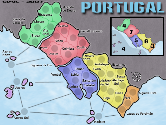
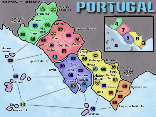
Ive inserted the continent names with there regions colors to fill some on the dead area.AndyDufresne wrote:Regarding some of the latest discussion, naming the regional bonus areas would be nice, but I am not sure how exactly that could be done with the choice of legend currently.
That exactly what ive doneAndyDufresne wrote: I wouldn't be opposed to a light texture for the nonplayable area, but it should be something...not too intrusive.
I really feel the glow stops the letters looking so flat and boring. Ill change it back if theres some stong feelings on this subject.AndyDufresne wrote: Also the text without the glow looks like by far the best option.
I see it, it must be an area that the select tool never picked up and i never noticed because it was so subtle.AndyDufresne wrote: On the small map, near the Azores islands...near the largest to be specific, is that little white line between it and the smaller island, actually part of the water background, or is it a line? I can't be sure.
I see it to, the opacity must be a little high ill sort it out.AndyDufresne wrote: Also on the small map, the top line of the legend looks to be slightly thicker than the rest, but it doesn't seem to be the case on the large map. Is it my eyes?
Ive never really liked the compass, the only reason it was there was because i had to have the map at this odd angle. But ill see what i can do.AndyDufresne wrote: Lastly, I think your compass may be a tad bit to small. I'd maybe even consider a different style of compass...this one...hm...just feels a little odd.
no making any promises but ill try and get a new draft up tomoorow.
What do you know about map making, bitch?
Top Score:2403natty_dread wrote:I was wrong