
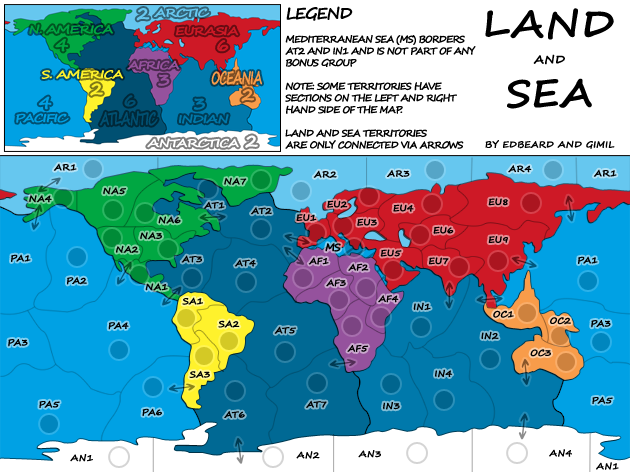
AF5 - AT7 is the best IMO
C.
Land and Sea [Quenched]
Moderator: Cartographers
Forum rules
Please read the Community Guidelines before posting.
Please read the Community Guidelines before posting.
Re: Land And Sea v10p13 S&L

Highest score : 2297

Re: Land And Sea v10p13 S&L
No, perhaps something similar to the other sea connection bridges might be an option also.gimil wrote:...
Three different arrow ideas there, anything tickling anyones fancy?

* Pearl Harbour * Waterloo * Forbidden City * Jamaica * Pot Mosbi

Re: Land And Sea v10p13 S&L
those territories ARE all connected. perhaps a legend note should be addedAndyDufresne wrote: Game play-esque questions...EU1 and AF1 are not land connected, yes? Does EU5 border AF4?
We can do a section in the legend that says something like...
Territory Connections That Might Not Be Apparent
MS-AT2, MS-IN1, AF1-EU1, AF4-EU5
well not to be a jerk but we don't really have to convince you. arrows are what's happening. either of the two singular arrows are fine by me. the double one-way ones don't look good to meoaktown wrote: Arrows... not a fan. Any graphic will be fine if it is noted in the legend. But I understand that they may be the most clear option, so you might be able to convince me with the right arrow.
I don't think that's needed and will just clutter things. We have a legend note. We have territory labels on both sides. That's all that's needed really.oaktown wrote: territories that cross the map divide: what about some graphic that runs across the edges to help indicate the connection? Chain links between each pair of like territory names?
Sea bridges ARE NOT going to happen. sorry to spoil anyone's thoughts on this and I realise this goes against what I said about giving gimil full control but the ones connecting PA4-AT3 and PA1-IN2 are going away. As I've said before, there's no point in having multiple ways to show that territories connect. this just clutters the map. one style/way to do it is all that's needed. Plus they don't look good anyway.
I deleted the quote but I think Andy is correct. downgrading the dark Atlantic colour slightly seems like a good idea.
-
gimil

- Posts: 8599
- Joined: Sat Mar 03, 2007 12:42 pm
- Gender: Male
- Location: United Kingdom (Scotland)
Re: Land And Sea v10p13 S&L
The Med is already outlined in the legends, for AF1-EU1 and AF4-EU4 I can jsut move everything closer together so it looks more connected. Better than cluttering up the legends some more.those territories ARE all connected. perhaps a legend note should be added
We can do a section in the legend that says something like...
Territory Connections That Might Not Be Apparent
MS-AT2, MS-IN1, AF1-EU1, AF4-EU5
What do you know about map making, bitch?
Top Score:2403natty_dread wrote:I was wrong
-
gimil
- Posts: 8599
- Joined: Sat Mar 03, 2007 12:42 pm
- Gender: Male
- Location: United Kingdom (Scotland)
Re: Land And Sea v10p13 S&L
Ok let me put together a todo:
-Reduce Atlantic Colour
-Add new arrows for land sea and use arrows for sea sea connections (the ones in africa seems to be the most supported so far)
-Make legends feel less cramped?
-Move AF1 and EU1 + AF4 and AF2 closer to make connection more noticable
-"Land and Sea Territories are only connected via arrows"
What do you know about map making, bitch?
Top Score:2403natty_dread wrote:I was wrong
Re: Land And Sea v10p13 S&L
uhh. no? where'd you find that?gimil wrote:Ok let me put together a todo:
-Remove AF4 and AF2 connection (We still doing this?)
AF4-EU5 same thing as AF1-EU1 just make the connection a little bigger
-
gimil
- Posts: 8599
- Joined: Sat Mar 03, 2007 12:42 pm
- Gender: Male
- Location: United Kingdom (Scotland)
Re: Land And Sea v10p13 S&L
not really sure! Fixed...edbeard wrote:uhh. no? where'd you find that?gimil wrote:Ok let me put together a todo:
-Remove AF4 and AF2 connection (We still doing this?)
AF4-EU5 same thing as AF1-EU1 just make the connection a little bigger
What do you know about map making, bitch?
Top Score:2403natty_dread wrote:I was wrong
-
gimil
- Posts: 8599
- Joined: Sat Mar 03, 2007 12:42 pm
- Gender: Male
- Location: United Kingdom (Scotland)
Re: Land And Sea v10p13 S&L
Ok I will make a bug update tomorrow. Please no one tugg my balls on any issues until that update 
What do you know about map making, bitch?
Top Score:2403natty_dread wrote:I was wrong
-
gimil
- Posts: 8599
- Joined: Sat Mar 03, 2007 12:42 pm
- Gender: Male
- Location: United Kingdom (Scotland)
Re: Land And Sea v10p13 S&L
What do we think of these?
- Click image to enlarge.

- Click image to enlarge.
What do you know about map making, bitch?
Top Score:2403natty_dread wrote:I was wrong


Re: Land And Sea v10p13 S&L
the only thing I'm concerned about is the length of the arrows that connect PA4-AT3 and IN2-PA1
I wish the thin bit was longer so the pointy bits were a bit more evident
I wish the thin bit was longer so the pointy bits were a bit more evident
-
gimil
- Posts: 8599
- Joined: Sat Mar 03, 2007 12:42 pm
- Gender: Male
- Location: United Kingdom (Scotland)
Re: Land And Sea v10p13 S&L
Easily fixed.edbeard wrote:the only thing I'm concerned about is the length of the arrows that connect PA4-AT3 and IN2-PA1
I wish the thin bit was longer so the pointy bits were a bit more evident
What do you know about map making, bitch?
Top Score:2403natty_dread wrote:I was wrong
-
gimil
- Posts: 8599
- Joined: Sat Mar 03, 2007 12:42 pm
- Gender: Male
- Location: United Kingdom (Scotland)
Re: Land And Sea v10p13 S&L
This any better ed?
- Click image to enlarge.

- Click image to enlarge.
What do you know about map making, bitch?
Top Score:2403natty_dread wrote:I was wrong
Re: Land And Sea v10p13 S&L
perfect
the first image screwed me up for second though
edit: wait wait. you didn't change the Atlantic colour on the legend. you probably realise this and were just waiting for approval but I'm saying it so I don't forget
the first image screwed me up for second though
edit: wait wait. you didn't change the Atlantic colour on the legend. you probably realise this and were just waiting for approval but I'm saying it so I don't forget
Re: Land And Sea v10p13 S&L
Question:
The original plan was for the XML to be done like this...
NA2 (Western US)
EU5 (Middle East)
SA2 (Brazil)
OC3 (Australia)
etc
should I go with that plan or just scrap it?
I ask because in some cases (oceans and antarctica) it'll be filled with redundancies like (West Antarctica), (Central Antarctica) etc. unless I name them after whose claim it is. And oceans I'm not sure what I'd do. And, I ask because if people don't like the idea then there's no point in me doing it.
-
gimil
- Posts: 8599
- Joined: Sat Mar 03, 2007 12:42 pm
- Gender: Male
- Location: United Kingdom (Scotland)
Re: Land And Sea v10p13 S&L
Why not go with:
North America 1
North America 2
Atlantic 1
etc etc
This is most likely to cause the lesat overall confusion, what do you think?
North America 1
North America 2
Atlantic 1
etc etc
This is most likely to cause the lesat overall confusion, what do you think?
What do you know about map making, bitch?
Top Score:2403natty_dread wrote:I was wrong
Re: Land And Sea v10p13 S&L
gimil wrote:Why not go with:
North America 1
North America 2
Atlantic 1
etc etc
This is most likely to cause the lesat overall confusion, what do you think?
uhh. no. they need to be exactly the same as the map itself. hence having the
NA4 (Alaska) or AF2 (Egypt)
so either they should just be
NA4
AF2
AT5
or they should have the additional description at the end like SA1 (Columbia), NA1 (Central America), AF5 (South Africa)
-
gimil
- Posts: 8599
- Joined: Sat Mar 03, 2007 12:42 pm
- Gender: Male
- Location: United Kingdom (Scotland)
Re: Land And Sea v10p13 S&L
Well how about 'North America 1 (NA1)'. What your suggestion can lead to all sorts of confusion. You won't get many thou that are going to argue that they dodn't know where north america is and even if you do its on the minimap to confim.
What do you know about map making, bitch?
Top Score:2403natty_dread wrote:I was wrong
Re: Land And Sea v10p13 S&L
gimil wrote:Well how about 'North America 1 (NA1)'. What your suggestion can lead to all sorts of confusion. You won't get many thou that are going to argue that they dodn't know where north america is and even if you do its on the minimap to confim.
no dude. you need whatever is ON the map to be the first part of the name so they can find it on the drop down. I'm just asking people if they want the second part EU5 (Egypt) or that they don't care. It's really only a character detail.
I don't know what you're talking about in the last sentence because we have a mini-map.
-
gimil
- Posts: 8599
- Joined: Sat Mar 03, 2007 12:42 pm
- Gender: Male
- Location: United Kingdom (Scotland)
Re: Land And Sea v10p13 S&L
I think I am making myself sound like a twat, let me try and expleain better.
With our setup the drop down will look like this:
NA1
NA2
NA3
AF1
AF2
AF3
AL1
AL2
AL3
ETC
ETC
That is much, much more likely to cause confusion than is we lay it out like this:
North America 1 (NA1)
North America 2 (NA2)
North America 3 (NA3)
Africa 1 (AF1)
Africa 2 (AF2)
Africa 3 (AF3)
Atlantic 1 (AL1)
Atlantic 2 (AL2)
Atlantic 3 (AL3)
Now on a normal day I would agree that what is on the map should generally appear on the XML. I nthis case thou I think we would be safe to go with the way I suggested. AL1 & AF1 will cause unfortuantly mistakes when listed together in a dropdown, Africa 1 (AF1) & Atlantic 1 (AL1) make this confusion much less likely, you see what I am getting at?
What do you know about map making, bitch?
Top Score:2403natty_dread wrote:I was wrong
Re: Land And Sea v10p13 S&L
I think you've come to completely the wrong conclusion. If I see a territory called AF2. I look for AF2 on the drop down. This is how the vast majority of people are going to think.
AF1 (Sudan)
and
AT1 (Hudson Bay)
can prevent the sort of confusion you're talking about, if that's a real concern. I guess you think it's a big enough concern to bring up so I'll go ahead with doing NA4 (Alaska) style instead of the plain NA4 style.
putting something other than what is on the map itself is a huge mistake.
-
gimil
- Posts: 8599
- Joined: Sat Mar 03, 2007 12:42 pm
- Gender: Male
- Location: United Kingdom (Scotland)
Re: Land And Sea v10p13 S&L
But whats on the map will be in the drop down: North America 1 (NA1)edbeard wrote:I think you've come to completely the wrong conclusion. If I see a territory called AF2. I look for AF2 on the drop down. This is how the vast majority of people are going to think.
AF1 (Sudan)
and
AT1 (Hudson Bay)
can prevent the sort of confusion you're talking about, if that's a real concern. I guess you think it's a big enough concern to bring up so I'll go ahead with doing NA4 (Alaska) style instead of the plain NA4 style.
putting something other than what is on the map itself is a huge mistake.
Suit yourself mate I trust your judgement. But Ill be sticking to my guns (opinion)
What do you know about map making, bitch?
Top Score:2403natty_dread wrote:I was wrong
-
pepperonibread

- Posts: 954
- Joined: Sun Jan 28, 2007 4:33 pm
- Location: The Former Confederacy
Re: Land And Sea v10p13 S&L
Have curved arrows been suggested yet? The straight ones seem a bit out of place to me.
And any chance of giving some additional flair to this map? Things honestly seem a bit bland in the current state. I know you want to keep with a simple style, but I'd guess that just one or two subtle changes could do a lot of good. The S. America and NYC maps are two good examples of this: Relatively plain and "flat" maps, they nevertheless work very well graphically. For SA it's the color scheme and textures that does it, for NYC the criss-crossing subways and interesting title.
It doesn't have to be eye-popping, just eye-catching... I believe in you gimil

Re: Land And Sea v10p13 S&L
^^ Second that.pepperonibread wrote:Have curved arrows been suggested yet? The straight ones seem a bit out of place to me.
And any chance of giving some additional flair to this map? Things honestly seem a bit bland in the current state. I know you want to keep with a simple style, but I'd guess that just one or two subtle changes could do a lot of good. The S. America and NYC maps are two good examples of this: Relatively plain and "flat" maps, they nevertheless work very well graphically. For SA it's the color scheme and textures that does it, for NYC the criss-crossing subways and interesting title.
It doesn't have to be eye-popping, just eye-catching... I believe in you gimil
* Pearl Harbour * Waterloo * Forbidden City * Jamaica * Pot Mosbi