Portland [Quenched]
Moderator: Cartographers
Forum rules
Please read the Community Guidelines before posting.
Please read the Community Guidelines before posting.
-
koontz1973
- Posts: 6960
- Joined: Thu Jan 01, 2009 10:57 am

-
flexmaster33
- Posts: 6547
- Joined: Wed Aug 01, 2007 12:24 pm
- Gender: Male
- Location: Portland, OR
Re: Portlandia [22 July 2011] v.36 - Signs & Stuff
I like the original Rose City (since Portland) is already highlighted in the sign.
But Portland would work fine, too.
I'd say nix the Portlandia, but it's your map, man
But Portland would work fine, too.
I'd say nix the Portlandia, but it's your map, man
Current tourneys -- 2025 High School Football, 2025 NFL season, 2025 Little League World Series, Punch Out Boxing, Down Under, 2025 MLS season, 2025 MLB season, 2025 WNBA, 4 Star Meats Best of 7.
High rank: Major. Place: 1,056. Points: 2,093
High rank: Major. Place: 1,056. Points: 2,093
Re: Portlandia [22 July 2011] v.36 - Signs & Stuff
Just stick with what you had originally. Besides it sounds better. 
-
lostatlimbo

- Posts: 1386
- Joined: Wed Mar 28, 2007 3:56 pm
- Location: Portland, OR
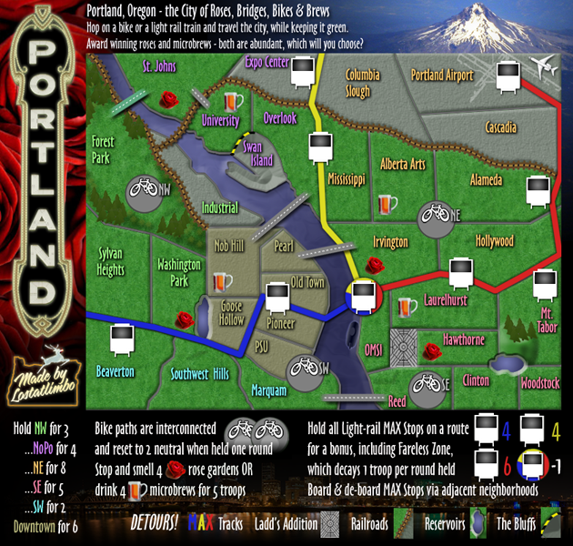
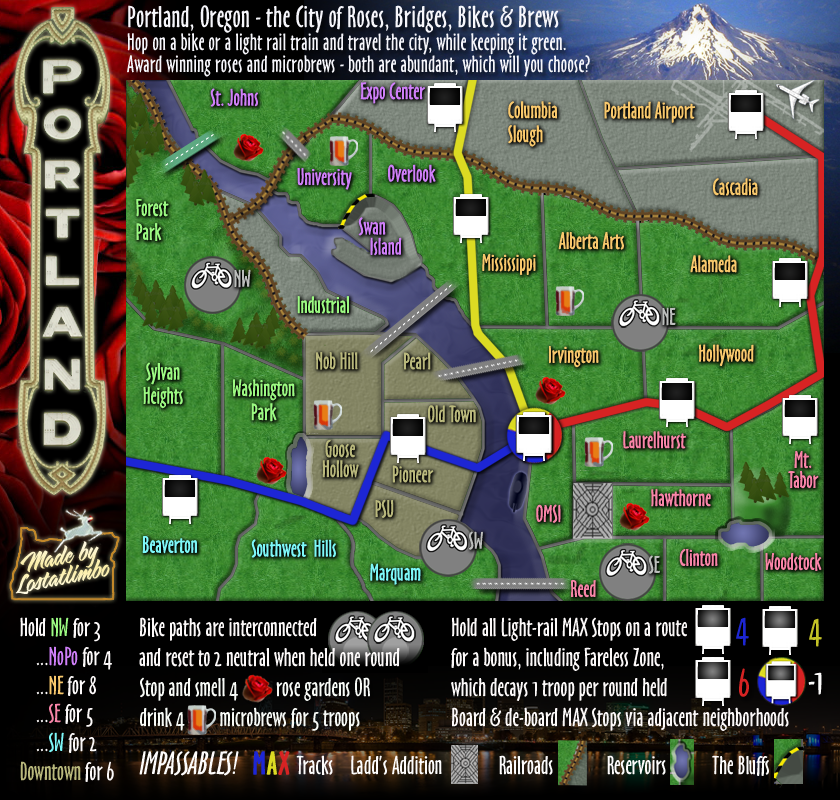
Re: Portland [22 July 2011] v.37 - Graphics stamp?
37th Draft
Okay, map will be simply "Portland".
I added some text to the header. Felt like it needed a better introduction.
Anything left with graphics?
Okay, map will be simply "Portland".
I added some text to the header. Felt like it needed a better introduction.
Anything left with graphics?
- Click image to enlarge.
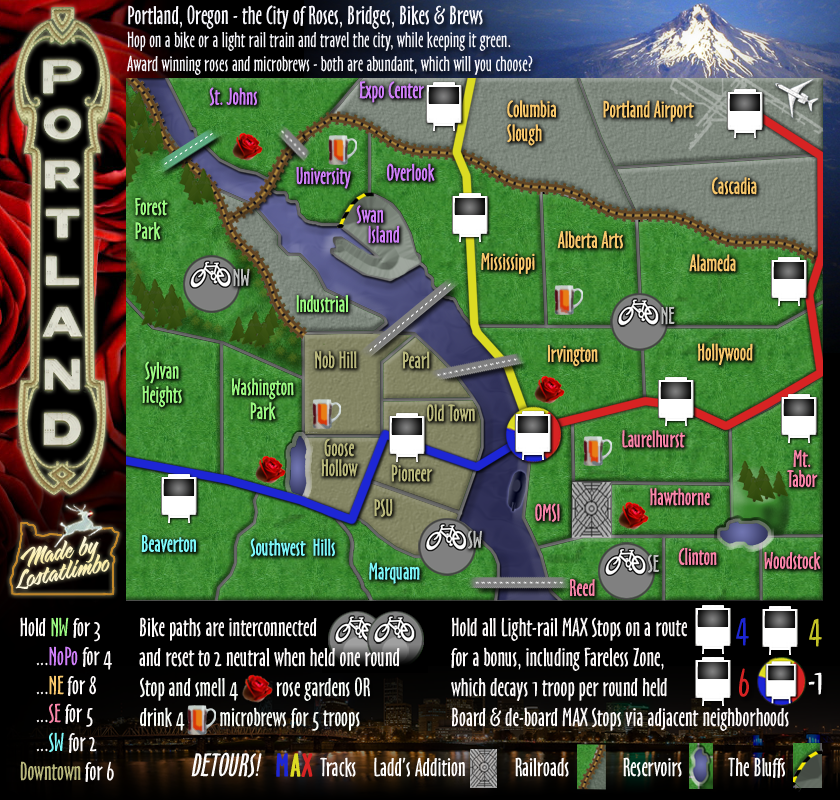
Re: Portland [22 July 2011] v.37 - Graphics stamp?
Well, I think you need to change Detours! in the legend to Impassables as some people will be confused. I read it and thought to myself that you can use them as a short cut to get somewhere else. And I've been following this map.
-
lostatlimbo
- Posts: 1386
- Joined: Wed Mar 28, 2007 3:56 pm
- Location: Portland, OR
Re: Portland [22 July 2011] v.37 - Graphics stamp?
Okay, no problem. Consider it done.
-
lostatlimbo
- Posts: 1386
- Joined: Wed Mar 28, 2007 3:56 pm
- Location: Portland, OR
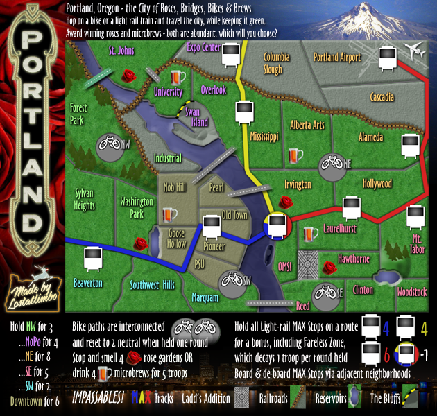
Re: Portland [24 July 2011] v.37 - Graphics stamp?
37th Draft
Changed back to Impassables
Anything left with graphics?
Changed back to Impassables
Anything left with graphics?
- Click image to enlarge.
-
Hellfire Hotties

- Posts: 19
- Joined: Sun Feb 14, 2010 12:12 am
- Gender: Female
Re: Portland [24 July 2011] v.37 - What is left for graphics
I completely agree with Flexmaster33! You've done a great job with the graphics and layout. I for one can't wait to try it out! I am a bit partial in that it is close to where I live, and I love the Rose City. Great work- Lost!!!
Now who can I message to get you that stamp?!?
p.s. Detours vs. Impassables... as long as it is clear that they are barriers what difference does it make? Players will learn after playing the map once. I know I've had many failed attempts on new maps.
Now who can I message to get you that stamp?!?
p.s. Detours vs. Impassables... as long as it is clear that they are barriers what difference does it make? Players will learn after playing the map once. I know I've had many failed attempts on new maps.
-
AndyDufresne

- Posts: 24919
- Joined: Fri Mar 03, 2006 8:22 pm
- Location: A Banana Palm in Zihuatanejo
- Contact:
Re: Portland [24 July 2011] v.37 - What is left for graphics
Everything looks pretty clear and straightforward to me. Good work,
--Andy
--Andy
-
lostatlimbo
- Posts: 1386
- Joined: Wed Mar 28, 2007 3:56 pm
- Location: Portland, OR
-
flexmaster33
- Posts: 6547
- Joined: Wed Aug 01, 2007 12:24 pm
- Gender: Male
- Location: Portland, OR
Re: Portland [24 July 2011] v.37 - What is left for graphics
All right...can't wait.
Lost gets first chance at hosting a Rose City tourney if he wants, but I'll be putting something together shortly after it jumps through the hoops!!!
Lost gets first chance at hosting a Rose City tourney if he wants, but I'll be putting something together shortly after it jumps through the hoops!!!
Current tourneys -- 2025 High School Football, 2025 NFL season, 2025 Little League World Series, Punch Out Boxing, Down Under, 2025 MLS season, 2025 MLB season, 2025 WNBA, 4 Star Meats Best of 7.
High rank: Major. Place: 1,056. Points: 2,093
High rank: Major. Place: 1,056. Points: 2,093

Re: Portland [24 July 2011] v.37 - What is left for graphics
I feel like the font on top of the small map is smashed together a bit.. almost hard to read.

Re: Portland [24 July 2011] v.37 - What is left for graphics
I was feeling this way about all the font on the map actually. It almost looks like the map used to be one way and was then stretched to meet the maximum height allowed. You don't have to be at maximum height.Tisha wrote:I feel like the font on top of the small map is smashed together a bit.. almost hard to read.
-
flexmaster33
- Posts: 6547
- Joined: Wed Aug 01, 2007 12:24 pm
- Gender: Male
- Location: Portland, OR
Re: Portland [24 July 2011] v.37 - What is left for graphics
This nit-picking is a bit much...that's a font style...I think it looks good. lost has put a ton into this map, I don't see what the hang up is. You're never going to get 100% consensus on every detail.
I say move it forward and get us to the Beta step so we can all try it out.
I say move it forward and get us to the Beta step so we can all try it out.
Current tourneys -- 2025 High School Football, 2025 NFL season, 2025 Little League World Series, Punch Out Boxing, Down Under, 2025 MLS season, 2025 MLB season, 2025 WNBA, 4 Star Meats Best of 7.
High rank: Major. Place: 1,056. Points: 2,093
High rank: Major. Place: 1,056. Points: 2,093

Re: Portland [24 July 2011] v.37 - What is left for graphics
I have to agree wiht Tisha on this one.Tisha wrote:I feel like the font on top of the small map is smashed together a bit.. almost hard to read.
Really all that needs to be done is stretch it out a fraction so that it is more legible.
Being the lead-in story it is important that players can read it (which one can do in the large map).
But i think the font on the territories are OK...i can read those on the small map.

* Pearl Harbour * Waterloo * Forbidden City * Jamaica * Pot Mosbi
Re: Portland [24 July 2011] v.37 - What is left for graphics
I agree, but there are somethings on maps that should be clearly legible.flexmaster33 wrote:.... You're never going to get 100% consensus on every detail...
* Pearl Harbour * Waterloo * Forbidden City * Jamaica * Pot Mosbi
-
natty dread

- Posts: 12876
- Joined: Fri Feb 08, 2008 8:58 pm
- Location: just plain fucked
Re: Portland [24 July 2011] v.37 - What is left for graphics
The length of time the mapmaker has worked on the map is irrelevant. We don't pass maps up just because someone "worked long and hard on them" if they have flaws.flexmaster33 wrote: lost has put a ton into this map, I don't see what the hang up is.
I agree with Tisha btw, the text on the top edge of the small map needs some adjusting - adjust the kerning / character spacing of the text so the letters aren't quite so squished together, and it should be fine...
After that is done, this can be stamped I think.

-
DiM

- Posts: 10415
- Joined: Wed Feb 14, 2007 6:20 pm
- Gender: Male
- Location: making maps for scooby snacks
Re: Portland [24 July 2011] v.37 - What is left for graphics
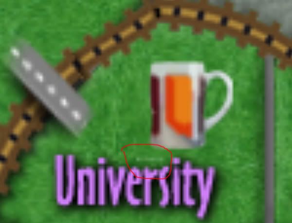
unless somebody comes and looks at the shadows. or the weird inconsistent line at the bottom. or the strange artefact on university, or some border inconsistencies, or some out of place black spots.natty_dread wrote: After that is done, this can be stamped I think.
“In the beginning God said, the four-dimensional divergence of an antisymmetric, second rank tensor equals zero, and there was light, and it was good. And on the seventh day he rested.”- Michio Kaku
-
natty dread
- Posts: 12876
- Joined: Fri Feb 08, 2008 8:58 pm
- Location: just plain fucked
Re: Portland [24 July 2011] v.37 - What is left for graphics
Dim, if you want to give feedback for the map, then do it. Tell the mapmaker about the things you think are wrong, give some suggestions how to fix them, etc. Don't just say "there's stuff that needs fixing"... it's not constructive.DiM wrote:unless somebody comes and looks at the shadows. or the weird inconsistent line at the bottom. or the strange artefact on university, or some border inconsistencies, or some out of place black spots.natty_dread wrote: After that is done, this can be stamped I think.
Anyway... sorry if this has been discussed before, but: Swan island. It looks like the light is coming from the wrong direction... On Mt. Tabor, the light comes from upper left, while on swan island, it seems to come from lower right... unless it is supposed to go inwards?
-
DiM
- Posts: 10415
- Joined: Wed Feb 14, 2007 6:20 pm
- Gender: Male
- Location: making maps for scooby snacks
Re: Portland [24 July 2011] v.37 - What is left for graphics
natty_dread wrote:Dim, if you want to give feedback for the map, then do it. Tell the mapmaker about the things you think are wrong, give some suggestions how to fix them, etc. Don't just say "there's stuff that needs fixing"... it's not constructive.DiM wrote:unless somebody comes and looks at the shadows. or the weird inconsistent line at the bottom. or the strange artefact on university, or some border inconsistencies, or some out of place black spots.natty_dread wrote: After that is done, this can be stamped I think.
i didn't say things are wrong about the map. from my point of view it's rather ok right now. but it all depends on the standards applied to the map. do we want normal decent standards or do we want absurd nitpicking ones? if a CA with a desire to point out almost invisible flaws comes along what i mentioned earlier will need to be fixed. if not, then it is fine the way it is right now
“In the beginning God said, the four-dimensional divergence of an antisymmetric, second rank tensor equals zero, and there was light, and it was good. And on the seventh day he rested.”- Michio Kaku
-
natty dread
- Posts: 12876
- Joined: Fri Feb 08, 2008 8:58 pm
- Location: just plain fucked
Re: Portland [24 July 2011] v.37 - What is left for graphics
sounds like someone has an axe to grind...DiM wrote:natty_dread wrote:Dim, if you want to give feedback for the map, then do it. Tell the mapmaker about the things you think are wrong, give some suggestions how to fix them, etc. Don't just say "there's stuff that needs fixing"... it's not constructive.DiM wrote:unless somebody comes and looks at the shadows. or the weird inconsistent line at the bottom. or the strange artefact on university, or some border inconsistencies, or some out of place black spots.natty_dread wrote: After that is done, this can be stamped I think.
i didn't say things are wrong about the map. from my point of view it's rather ok right now. but it all depends on the standards applied to the map. do we want normal decent standards or do we want absurd nitpicking ones? if a CA with a desire to point out almost invisible flaws comes along what i mentioned earlier will need to be fixed. if not, then it is fine the way it is right now
Re: Portland [24 July 2011] v.37 - What is left for graphics
lostatlimbo, once you get the story text fixed on the small, it should be good to go for the stamp.
-
natty dread
- Posts: 12876
- Joined: Fri Feb 08, 2008 8:58 pm
- Location: just plain fucked
Re: Portland [24 July 2011] v.37 - What is left for graphics
natty_dread wrote: Anyway... sorry if this has been discussed before, but: Swan island. It looks like the light is coming from the wrong direction... On Mt. Tabor, the light comes from upper left, while on swan island, it seems to come from lower right... unless it is supposed to go inwards?
-
lostatlimbo
- Posts: 1386
- Joined: Wed Mar 28, 2007 3:56 pm
- Location: Portland, OR
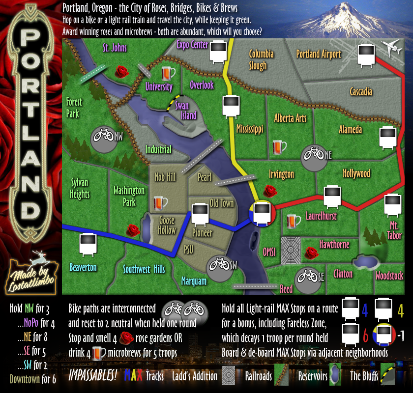
Re: Portland [6 AUG 2011] v.38 - Header fixed
38th Draft
Fixed header text & swan island
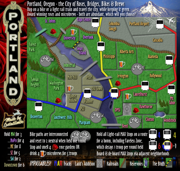
Fixed header text & swan island
- Click image to enlarge.
Last edited by lostatlimbo on Sat Aug 06, 2011 7:56 pm, edited 2 times in total.
-
DiM
- Posts: 10415
- Joined: Wed Feb 14, 2007 6:20 pm
- Gender: Male
- Location: making maps for scooby snacks
Re: Portland [6 AUG 2011] v.38 - Header fixed
some nitpicking.
some of the following things may be considered by other commenter as too minor to need fixing. if that happens i won't hold it against you for not fixing them.
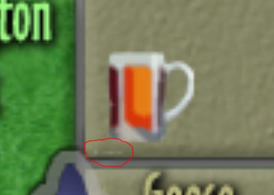
1. the beer icon on the map might be copyrighted. it's impossible to tell precisely but i think you have a link or a copyright message on that image:
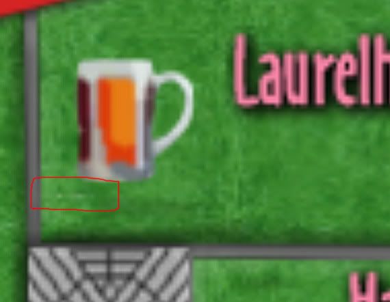
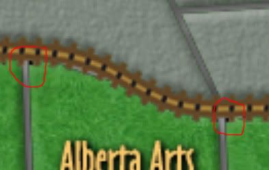
2. 2 black spots near the rail tracks:
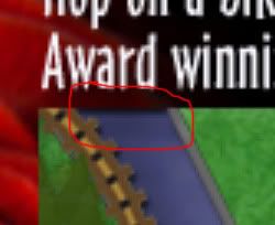
3. the outer background casting a shadow on the river looks bad.
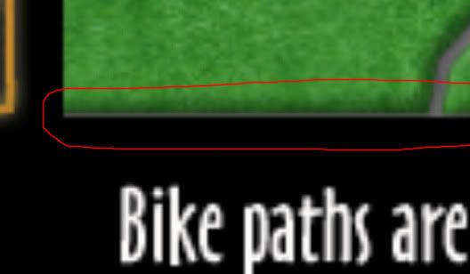
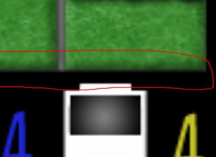
4. on the bottom part of the map you have a grey line that's very visible on the left (see first image) but not that visible on the right (see second image). perhaps making a simple 1-2 px border all over the map area might be a good idea. like a frame or something.
some of the following things may be considered by other commenter as too minor to need fixing. if that happens i won't hold it against you for not fixing them.
1. the beer icon on the map might be copyrighted. it's impossible to tell precisely but i think you have a link or a copyright message on that image:
2. 2 black spots near the rail tracks:
3. the outer background casting a shadow on the river looks bad.
4. on the bottom part of the map you have a grey line that's very visible on the left (see first image) but not that visible on the right (see second image). perhaps making a simple 1-2 px border all over the map area might be a good idea. like a frame or something.
“In the beginning God said, the four-dimensional divergence of an antisymmetric, second rank tensor equals zero, and there was light, and it was good. And on the seventh day he rested.”- Michio Kaku