Re: Jamaica [D,GP] V26 (P18)
Posted: Mon Sep 21, 2009 12:10 am
dolomite13, I'm just wondering if the latest V26.xml file could be posted please.dolomite13 wrote:OK I think I got the slave & sugar xml right... if so it should be all set.
Conquer Club, a free online multiplayer variation of a popular world domination board game.
https://conquerclub.com/forum/
dolomite13, I'm just wondering if the latest V26.xml file could be posted please.dolomite13 wrote:OK I think I got the slave & sugar xml right... if so it should be all set.
The one posted is the most recent and has the working slave and sugar code.cairnswk wrote:dolomite13, I'm just wondering if the latest V26.xml file could be posted please.dolomite13 wrote:OK I think I got the slave & sugar xml right... if so it should be all set.
Fabulous, thanks.dolomite13 wrote:The one posted is the most recent and has the working slave and sugar code.cairnswk wrote:dolomite13, I'm just wondering if the latest V26.xml file could be posted please.dolomite13 wrote:OK I think I got the slave & sugar xml right... if so it should be all set.
==D==

Thanks Mr BennMrBenn wrote:The map looks crisp and clean - the only thing that bugs me is the fuzziness of the text. It's bearable on the large map (just about), but if there's any way you could make it clearer (particularly on the small) then that would be great.
Other than that, I can't see anything holding this back from a graphics stamp....
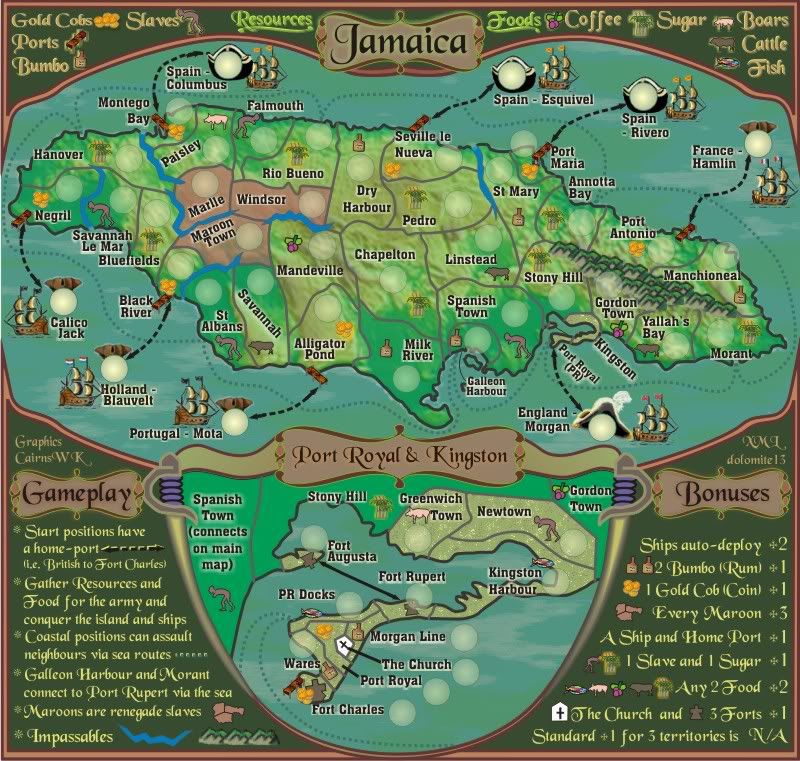
I actually didn't want to change the larger top legend text, simply because it was larger and more legible than the smaller stuff at the bottom.ender516 wrote:The legend looks much clearer to me now.But now the text above the map looks blurry by comparison.

Some days it doesn't pay to get out of bed.
Well, I did say "by comparion". If you made it clearer, that would be great for my aging lenses, but I believe it is legible enough as is.cairnswk wrote:I actually didn't want to change the larger top legend text, simply because it was larger and more legible than the smaller stuff at the bottom.ender516 wrote:The legend looks much clearer to me now.
Some days it doesn't pay to get out of bed.

Sata MrBenn SataMrBenn wrote:Sorry it's been a while - I feel like I'm being pulled in a million different directions...
From the Rasta/Patois Dictionary. retrieved from: http://niceup.com/patois.txt
SATA : to rejoice, to meditate, to give thanks and praise. (5)
Please show you reference, BTG.Beko the Great wrote:Hello!
Just a comment, Rivero is not a Portuguese name and I went investigate if he could have served the Portuguese Kingdom as corsary. But I've seen the opposite. He's a spanish pirate so you must change his nationality to Spanish
Cheers!
Hi!cairnswk wrote:Please show you reference, BTG.Beko the Great wrote:Hello!
Just a comment, Rivero is not a Portuguese name and I went investigate if he could have served the Portuguese Kingdom as corsary. But I've seen the opposite. He's a spanish pirate so you must change his nationality to Spanish
Cheers!
My sources give him as Portuguese.
This is almost like Pieces at Paces


i think they're on porkenbeans Jamaic mapnatty_dread wrote:
but... where are the rastafarians?
That's JAMAICAmon.cairnswk wrote:i think they're on porkenbeans Jamaic mapnatty_dread wrote:
but... where are the rastafarians?
porkenbeans wrote:That's JAMAICAmon.cairnswk wrote:i think they're on porkenbeans Jamaic mapnatty_dread wrote:
but... where are the rastafarians?
Yeah mon doncha know.neanderpaul14 wrote:porkenbeans wrote:That's JAMAICAmon.cairnswk wrote:i think they're on porkenbeans Jamaic mapnatty_dread wrote:
but... where are the rastafarians?
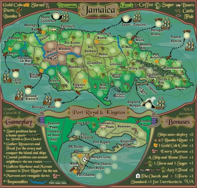
Hold all Ganja Fields for a +5 bonus.
porkenbeans wrote:...
I can make out the icons on the large version, but not so much on the small. Maybe you would consider enlarging them a bit cairns. There seems to be plenty enough room to me.
I am talking about all of the rum bottles and food stuffs and such. If you are looking at the small version, the viewer will not be able to tell just what they are. The large map it is not a problem. I suggest just changing the size of the icons to what they are on the large version. And then those on the large version can be even larger than they are now, which will add to the beauty of this map. those icons are wonderful, just make them larger so that they can be seen and appreciated more.cairnswk wrote:porkenbeans wrote:...
I can make out the icons on the large version, but not so much on the small. Maybe you would consider enlarging them a bit cairns. There seems to be plenty enough room to me.
Where exactly are you referrring to?