
XML http://www.fileden.com/files/2008/11/14 ... Final3.xml
Small 88
- Click image to enlarge.

- Click image to enlarge.

Moderator: Cartographers


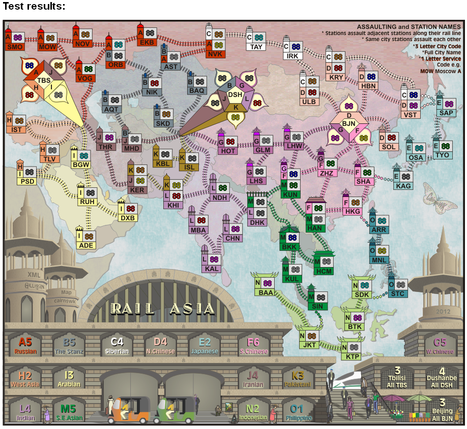
Are you talking about the centering?natty dread wrote:Actually, I think the problem is the map image itself. Seems like there's inconsistencies in the sizes of the boxes... it looks to me like they are not "hinted" properly, they don't align to the pixel grid the same way, and this causes very small inconsistencies in them and makes some coordinates look skewed...
Maybe cairns could fix this?

I think so.cairnswk wrote:Are you talking about the centering?natty dread wrote:Actually, I think the problem is the map image itself. Seems like there's inconsistencies in the sizes of the boxes... it looks to me like they are not "hinted" properly, they don't align to the pixel grid the same way, and this causes very small inconsistencies in them and makes some coordinates look skewed...
Maybe cairns could fix this?
I mean, the stations seem to be slightly different sizes on a sub-pixel level, so that the army numbers don't align with them the same way. It seems that the stations aren't "hinted", ie. they're not consistently aligned with the pixel grid.cairnswk wrote:Are you talking about the centering?
Thanks Gilligan, been waiting for this, I'm onto it.Gilligan wrote:Posting the XML as an attachment per cairns' request
yes natty. all the above 88 images are of the latest xmlnatty dread wrote:Are the coordinates already centered on that latest XML?
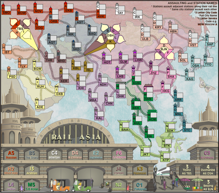
Harbin fixed in XML.natty dread wrote:Oh, one thing, sorry I forgot to mention this... Harbin is spelled as Habin on the XML. Unless there's a place called Habin that I'm not aware of...
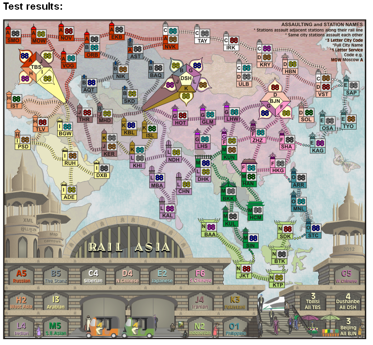
As for coordinates, the large map looks good to me. On the small there's a few fixes I can see:
HBN, SAP, OSA - all look like they should be moved to the left
Both KHI, ADE, TLV, VOG - 1 px to right?
THR, KHI K - 1 px up?


Thank you !natty dread wrote:...
Enjoy!

To start, i didn't do the graphics on Rail USA. widowmakers did. you yet make another fool of yourself.DiM wrote:i'd say this has decent graphics ... if we were in 2007
look at rail usa. you went downhill from there and i have no idea why.
hmm then it's clear why it all went downhill.cairnswk wrote:To start, i didn't do the graphics on Rail USA. widowmakers did. you yet make another fool of yourself.DiM wrote:i'd say this has decent graphics ... if we were in 2007
look at rail usa. you went downhill from there and i have no idea why.
Not even close to widowmakers graphics from 2007. This is by far a better map graphics wise.DiM wrote:good job managing to come close to widowmakers' graphics from 2007...

Wow DiM you're starting to sound like natty! (not a good thingDiM wrote:hmm then it's clear why it all went downhill.cairnswk wrote:To start, i didn't do the graphics on Rail USA. widowmakers did. you yet make another fool of yourself.DiM wrote:i'd say this has decent graphics ... if we were in 2007
look at rail usa. you went downhill from there and i have no idea why.
good job managing to come close to widowmakers' graphics from 2007... even if you're 5 years later. maybe by next year you'll finally manage to make something better. though it's doubtful since you've already admitted to going for quantity over quality.
but don't worry your pretty little head if you can't manage to improve your graphics, or even the gameplay. the standards are different for you so you'll be cut a slack once again.

this is the second or third time i heard this excuse. i've never taken it seriously but now that you mention it i'm starting to wonder.thenobodies80 wrote:About the current standard diatribe...please never forget to understand what software people use to develop a map...
having a style is not that good especially when that style is simple and spread over 30+ maps. it's ok to make a few maps share the same style especially when they're in the same series. but other than that it's actually kinda annoying to have dozens of maps that look virtually identical.thenobodies80 wrote:I'm of the opinion that cairnswk has his own style, we can recognize his maps easily, many of them have a simple graphics,
i agree with the bolded part but his creativity has dwindled a lot in the past years. there used to be a time when he was challenged to do better and better maps with better and better graphics but at some point nobody bothered to say anything and his style and technique stopped improving. and after a while when some people dared to step in and comment he had become so accustomed to being left alone he started bullying those that dared to comment negatively. and if bullying did not work he either ignored those that commented or he vacationed his maps for months until the protestors would give up and he was free to have his own way.thenobodies80 wrote:he is a creative person who produces lot of maps,

