No, you can have as many starting points as you want. They will be divided equally regardless.theBastard wrote:thanks natty.
hm, about starting points - no problem but there are 12 shields, so 4 must stay neutral than...
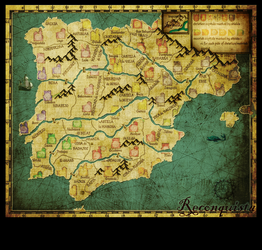
Reconquista
Moderator: Cartographers
Forum rules
Please read the Community Guidelines before posting.
Please read the Community Guidelines before posting.
-
natty dread

- Posts: 12876
- Joined: Fri Feb 08, 2008 8:58 pm
- Location: just plain fucked
Re: Reconquista

-
Evil DIMwit

- Posts: 1616
- Joined: Thu Mar 22, 2007 1:47 pm
- Gender: Male
- Location: Philadelphia, NJ
Re: Reconquista
That's not a good idea. It makes it more possible that some players will drop a pair bonus off the bat and other players won't. I think, it would be better to start the shields neutral to avoid exactly such an eventuality.natty_dread wrote:I still think the shielded territories would do well as starting positions.


-
natty dread
- Posts: 12876
- Joined: Fri Feb 08, 2008 8:58 pm
- Location: just plain fucked
Re: Reconquista
I can see 2 solutions to that.Evil DIMwit wrote:That's not a good idea. It makes it more possible that some players will drop a pair bonus off the bat and other players won't. I think, it would be better to start the shields neutral to avoid exactly such an eventuality.natty_dread wrote:I still think the shielded territories would do well as starting positions.
1) do away with the pair bonus.
2) make it so that there's 8 christian shields, or 8 moorish shields, or 8 of each. Then you could code all other territories neutral, and then code only one type of shields as starting positions and the rest as normal, that way each player will get the same amount of each shield type.
-
Evil DIMwit
- Posts: 1616
- Joined: Thu Mar 22, 2007 1:47 pm
- Gender: Male
- Location: Philadelphia, NJ
Re: Reconquista
Actually, that makes sense given the Reconquista theme -- give players the Christian shields and let the Moorish shields start neutral. You can even go back to having 8 Christian and 6 Moorish shields, as before.natty_dread wrote:2) make it so that there's 8 christian shields, or 8 moorish shields, or 8 of each. Then you could code all other territories neutral, and then code only one type of shields as starting positions and the rest as normal, that way each player will get the same amount of each shield type.
Re: Reconquista
Nice .. My first time viewing .. i like the pastel type coloring... Unique to this site. Keep up the good work... 

-
porkenbeans

- Posts: 2546
- Joined: Mon Sep 10, 2007 4:06 pm
Re: Reconquista
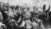
These are mrb"s last words in this thread. I would encourage the few that are helping to develop this map, to pause for a moment and slowly, and completely, read this again. Mr b has pointed out a couple of things that are NOT being fully understood. (see red highlights). I have witnessed much effort, but, I am afraid that some are just too close to the map, that they are having a hard time stepping back and trying to look at the map as a first time viewer. All of the points that mrb stated are still true. all the symbols compete for attention. There is still too much going on. In other words, THERE ARE TOO MANY ICONS ON THE MAP. As a first time viewer, you are immediately assaulted, -visually.MrBenn wrote:This is the first time I've had a proper look at this map, and it is very difficult to get a clear understanding of what is going on. I note the comparison between Waterloo in terms of complexity, although would argue that the essence of Waterloo is a lot simpler (ie there are two 'non-standard' attack-types, indicated with a clear and simple symbol) even though the attack/fortification of artillery can cause confusion. On the other hand, my concern with this map is that it is the bonus groupings which are incredibly confusing; I cannot see any easy way to tell whether or not my opponent has a bonus (without using a non-standard plug-in such as BOB).
MarshalNey (I believe) summarised my feelings when he stated that there is just too much going on, and that all the symbols compete for attention.
In addition to the confusion about bonus structures (you'll also need to find a simple way of ensuring that a minimal bonus is given out on the drop), there are several places where I have no idea where territory borders go, due to the overlapping symbols (which would look so much better without any bevel on them at all - this is supposed to be a hand-drawn map after all).
Yes, the map looks good, but in its current state it is not fit for purpose in terms of a conquerclub game board.
I would urge you to seriously consider simplifying the gameplay, so that you can declutter the map, thereby enhancing the user experience.
And while it may seem like an interesting map to play, The average first time viewer does NOT want to learn a new language to play it. CC wants maps, that appeal to the larger majority of the, "average" viewer/player.
I am reminded of the huge war maps, where the Gen's like to push their little icons around with a stick. Every detail down to telegraph lines are represented.
I think that this map is trying to be a Gen's war map, instead of a CC game map. The CC map, is, the war map, after you have brushed off all of the icons, and text. And then, only added back, the icons and text, that briefly tell the story. I think that the amount of territs are too large, for all that you are trying to do. You MUST reduce the iconic assault on the eyes, from the river of icons. Reducing the number of territs by 20% or so, will give you something like my last version. 60 territs is a good size imho.
Changing colors or resizing will not change the fact that there are just TOO many icons on the map. The biggest problem is, you are cramming 3 or more territs within the same boundary, and then adding icons as well. This is causing the lions share of the problem. It is just too hard to tell what icon belongs to what.
Each territ needs its own boundary, especially if it is to include any icons. Exceptions to this, are games that include, a rail/road attack scheme. But we do not have anything like that here. Here instead of roads or train tracks, there are invisible lines that connect territs. So, if each territ had its own boundary, you could put as many icons as you want on it.
Also, there are territs that have more than one icon. The object is to reduce the amount of icons. Why does the shield need to also have a settlement icon. And why do you need both a castle and a crested shield. Why do you need buildings to represent different types of settlements, when you already have the text for that.
These questions, may leads us to answers. And maybe a way or two, to reduce the amount of icons on this map. I have seen a few maps that end up on vacation or in the dead bin. I do not want that to happen with this one.
As the Graphics guy, I have to say that I really don't have a dog in his race. My main concern is seeing that shinny GP stamp.
I am only telling it as I see it. And, trying to offer solutions.
I have also made some templates for all of you to use. I have read all of the interesting chat about the GP development. But I have not seen any attempts to use them. Instead of trying to merely explain in words, you can scribble all over these templates. My last version was my attempt to fix the GP roadblock. So do not be shy, dig in. show us what you would do if you were king of this map.
The more ideas on this matter the better we will be able to chart the course.
My idea on this has not yielded any support thus far. (even if it is frucking awesome).
I would like to see some ideas that address mrb's comments. I could be wrong, but I don't think that, changing the color on the icons, is seriously what he had in mind.

-
theBastard

- Posts: 994
- Joined: Sat Jan 09, 2010 9:05 am
Re: Reconquista
to have 8 shields as sterting points and others 4 as neutral is not possible?
I have not power for argufy, pork. just some notices to your post:
- I do not think that settlements are problem - they are not icons, they are territories just only extra shape.
- I think when Mr.Benn or others said about too much icons it was about shields and religious icons. btw, your map has more icons as my before...
- I did not change only colours of settlements, try look at map better and you can see that also GP is more easy and there are only 12 icons/shields now.
- about borders and number of territories, maybe some territories should be kicked off, but show me where are not borders clear?
- when you asked me "why I want have settlements here and also shields" you did not understand me. as I wrote, I want to build map on auto-deploy/settlements system with NO-MAN´S TERRITORIES.
- could you show me which territory has more as one icon (do not confuse settlements by icons )
)
- only regular territories (I mean no castles or so on...)
- each territory is part of continent
- each territory borders with another and is possible to conquer it dirrect from other territory
- and too much different icons with bombardments, or attacking up two territories.
after my last editing the GP and bonuses, there are much opinions that it is good and we can go with this. I think that this map has some unique ideas.
thanks to all for feedbacks and help.
I have not power for argufy, pork. just some notices to your post:
- I do not think that settlements are problem - they are not icons, they are territories just only extra shape.
- I think when Mr.Benn or others said about too much icons it was about shields and religious icons. btw, your map has more icons as my before...
- I did not change only colours of settlements, try look at map better and you can see that also GP is more easy and there are only 12 icons/shields now.
- about borders and number of territories, maybe some territories should be kicked off, but show me where are not borders clear?
- when you asked me "why I want have settlements here and also shields" you did not understand me. as I wrote, I want to build map on auto-deploy/settlements system with NO-MAN´S TERRITORIES.
- could you show me which territory has more as one icon (do not confuse settlements by icons
as I several times wrote, I´m happy that you helping me with map. I did not dig in your work, just this is realy far of my idea. you have not settlements there and NO MAN´S TERRITORIES between them - and this is core of my GP idea. your GP looks as many others maps:porkenbeans wrote: I have also made some templates for all of you to use. I have read all of the interesting chat about the GP development. But I have not seen any attempts to use them. Instead of trying to merely explain in words, you can scribble all over these templates. My last version was my attempt to fix the GP roadblock. So do not be shy, dig in. show us what you would do if you were king of this map.
- only regular territories (I mean no castles or so on...)
- each territory is part of continent
- each territory borders with another and is possible to conquer it dirrect from other territory
- and too much different icons with bombardments, or attacking up two territories.
after my last editing the GP and bonuses, there are much opinions that it is good and we can go with this. I think that this map has some unique ideas.
thanks to all for feedbacks and help.
Spoiler
pork, I realy like you and your graphic, just I want to cherish my original idea live 
-
MarshalNey
- Posts: 781
- Joined: Mon Sep 28, 2009 9:02 pm
- Gender: Male
- Location: St. Louis, MO
Re: Reconquista
If I may, I think that although Pork perhaps comes off a little (okay maybe a lot ) too strongly, he does have some points about the visual look of the gameplay.
The comments that I made in my last post were intended to make 1 (sort of) modest change to gameplay, and to shuffle around/re-utilize the icons so that they don't crowd the map.
And that's my feeling about this map (and my own Zombie map for that matter). It looks crowded with all of those symbols. My proposal is to reduce the symbols and keep the gameplay; this has been done a bit with the Religious pairings, but it can be taken further.
Natty has echoed the idea about making the Town Icons into colored squares. My other two ideas, I don't know if they came across well in words or not. I simply don't have the time to put it out graphically this weekend, but I'll try and see about posting what I mean as a map within the next 3 or 4 days.
-
porkenbeans
- Posts: 2546
- Joined: Mon Sep 10, 2007 4:06 pm
Re: Reconquista
Bast, I am just trying to help. I can not seem to make you understand my point of view on this. To me territories are jigsaw shaped and fit together with other jigsaw pieces to make up the whole puzzle. Territories are NOT shaped like little buildings. That would be called an icon, or symbol. About what mrb and others said, I highlighted it in red. They simply felt, and so do I ,that this map has way too much going on. It has too many icons. You can call them what ever you want, but they are (for visual and aesthetic) purposes, acting like a sea of endless, confusing icons. Every square inch is packed with these icons.
I know this original gameplay idea is your baby, and you have put much time and effort into it's development. And you may even take it personal when someone criticizes it. If the big B happens to give the go on this, I will be surprised. But, I will be happy.
But I honestly I do not believe that will happen, with the GP as it is now.
If that is the case, then you will need to bite the bullet and make the needed changes, that address his issues.
It will mean that you will have to do some serious thinking on how you might be able to streamline this map.
This map should be awarded, or not awarded its GP stamp very soon. I just wished that it would happen sooner rather than later. I am very anxious to hammer out the final graphics for this project. Lets all hope that I a wrong, and the b man loves it, as it is .
-
porkenbeans
- Posts: 2546
- Joined: Mon Sep 10, 2007 4:06 pm
Re: Reconquista
While I was working on this I actually did what you suggested. I made the city's-circles, the towns-triangles, and the castles-squares. The whole thing looked hideous imo. So I scraped it, and came up with my posted attempt #1 at the GP.MarshalNey wrote:If I may, I think that although Pork perhaps comes off a little (okay maybe a lot
The comments that I made in my last post were intended to make 1 (sort of) modest change to gameplay, and to shuffle around/re-utilize the icons so that they don't crowd the map.
And that's my feeling about this map (and my own Zombie map for that matter). It looks crowded with all of those symbols. My proposal is to reduce the symbols and keep the gameplay; this has been done a bit with the Religious pairings, but it can be taken further.
Natty has echoed the idea about making the Town Icons into colored squares. My other two ideas, I don't know if they came across well in words or not. I simply don't have the time to put it out graphically this weekend, but I'll try and see about posting what I mean as a map within the next 3 or 4 days.
-
MarshalNey
- Posts: 781
- Joined: Mon Sep 28, 2009 9:02 pm
- Gender: Male
- Location: St. Louis, MO
Re: Reconquista
Hmmmm, doesn't really sound like what I was saying. I wasn't proposing to turn Reconquista into Classic Shapes (ugh).porkenbeans wrote:While I was working on this I actually did what you suggested. I made the city's-circles, the towns-triangles, and the castles-squares. The whole thing looked hideous imo. So I scraped it, and came up with my posted attempt #1 at the GP.MarshalNey wrote:If I may, I think that although Pork perhaps comes off a little (okay maybe a lot
The comments that I made in my last post were intended to make 1 (sort of) modest change to gameplay, and to shuffle around/re-utilize the icons so that they don't crowd the map.
And that's my feeling about this map (and my own Zombie map for that matter). It looks crowded with all of those symbols. My proposal is to reduce the symbols and keep the gameplay; this has been done a bit with the Religious pairings, but it can be taken further.
Natty has echoed the idea about making the Town Icons into colored squares. My other two ideas, I don't know if they came across well in words or not. I simply don't have the time to put it out graphically this weekend, but I'll try and see about posting what I mean as a map within the next 3 or 4 days.
I was hoping to keep every territory in the same place with (basically) the same function as in The Bastard's map, just moving & changing the icons. The Bastard has multiple icons for one gameplay function, and that can be reduced in several ways. Toward that end, the only gameplay change I was proposing was making every city have a religious affiliation, rather than distinguising between cities with a religious icon and those without. Thus, a city could be represented with a single prominent symbol (Christian or Muslim).
The Towns, being the most numerous and least important, could be reduced to a less eye-grabbing icon... thus a square. The Castles should keep their icon, and even put the Shields on them for flavor (makes more sense anyway, as those would be political power centers and not religious ones).
This way, the eye is drawn to the Castles first, then the Cities and then the least important gameplay-wise, the Towns.
No-Man's Lands would be *uncolored* circles. If the Castles, Cities and Towns are all colored and have a squarish shape, then the No-Man's Lands would be easily distinguisable as not a part of a bonus region.
-
theBastard
- Posts: 994
- Joined: Sat Jan 09, 2010 9:05 am
Re: Reconquista
this sounds as good idea. and when you look at cities there is cross on the top of christian´s and crescent on the muslim´s.MarshalNey wrote: Hmmmm, doesn't really sound like what I was saying. I wasn't proposing to turn Reconquista into Classic Shapes (ugh).
I was hoping to keep every territory in the same place with (basically) the same function as in The Bastard's map, just moving & changing the icons. The Bastard has multiple icons for one gameplay function, and that can be reduced in several ways. Toward that end, the only gameplay change I was proposing was making every city have a religious affiliation, rather than distinguising between cities with a religious icon and those without. Thus, a city could be represented with a single prominent symbol (Christian or Muslim).
- but this mean that cities will make bonus for holding pair, yes?
- if yes, there must be the same number of christian´s and muslim´s cities?
you mean that shields will not make bonus by holding pair of christian´s and muslim´s? I understand no, so only for holding any 2/3 (baseless if christian´s or muslim´s or combination of them) will give +1 - by this we can have 8 christian´s shields and 6 muslim´s shields, so we can use also idea that christian shields will be starting positions...MarshalNey wrote: The Towns, being the most numerous and least important, could be reduced to a less eye-grabbing icon... thus a square. The Castles should keep their icon, and even put the Shields on them for flavor (makes more sense anyway, as those would be political power centers and not religious ones).
This way, the eye is drawn to the Castles first, then the Cities and then the least important gameplay-wise, the Towns.
Marshal, you have it! this is very close to my idea and it seems as also clear and understable GP. thanks.MarshalNey wrote: No-Man's Lands would be *uncolored* circles. If the Castles, Cities and Towns are all colored and have a squarish shape, then the No-Man's Lands would be easily distinguisable as not a part of a bonus region.
pork, I have no problem with critique, it can help, I just want to save my original idea of GP so close as is possible.
-
porkenbeans
- Posts: 2546
- Joined: Mon Sep 10, 2007 4:06 pm
Re: Reconquista
The idea of having buildings represent towns and cities, is perhaps a little redundant. the text does that already. You can easily use reg. and italic to distinguish them. If you think about it, towns and cities do not really attack each other. The decision to attack, in this place and time, was made by the ruler, and the fighting was done by the Cavalry and the peones. That is why I chose the icons that I did. The idea was to trim down the number of huge icons on the board. If you just let the text do its job to represent cities and towns, you can remove much of this mess.
I know that my GP is not exactly the same as yours, but you could pretty much make it the same, if you used them in place of the current ones. I do not believe that you studied my offering very long. I think that if you would, you would see just what I am trying to get across.
I know that my GP is not exactly the same as yours, but you could pretty much make it the same, if you used them in place of the current ones. I do not believe that you studied my offering very long. I think that if you would, you would see just what I am trying to get across.
-
natty dread
- Posts: 12876
- Joined: Fri Feb 08, 2008 8:58 pm
- Location: just plain fucked
Re: Reconquista
Pork... I know you're enthusiastic about this project, but in the end it's thebastard's map, and if the bastard wants to do the gameplay his way then you should probably stand down and let him do it... Offering suggestions/feedback/opinions is one thing, but now it's starting to look like you're wanting to take over the whole project... Note, I'm not saying you intend to do so, just that the way you present your idea can very well make others see it that way.
Let bastard figure out the gameplay by himself. You've given your advice/opinion/suggestion, now let him take what he wants from it and continue designing the map. You're a very enthusiastic person when it comes to presenting ideas, which is good, but it can also feel like pressuring to some people.
Let bastard figure out the gameplay by himself. You've given your advice/opinion/suggestion, now let him take what he wants from it and continue designing the map. You're a very enthusiastic person when it comes to presenting ideas, which is good, but it can also feel like pressuring to some people.
-
porkenbeans
- Posts: 2546
- Joined: Mon Sep 10, 2007 4:06 pm
Re: Reconquista
Nat,natty_dread wrote:Pork... I know you're enthusiastic about this project, but in the end it's thebastard's map, and if the bastard wants to do the gameplay his way then you should probably stand down and let him do it... Offering suggestions/feedback/opinions is one thing, but now it's starting to look like you're wanting to take over the whole project... Note, I'm not saying you intend to do so, just that the way you present your idea can very well make others see it that way.
Let bastard figure out the gameplay by himself. You've given your advice/opinion/suggestion, now let him take what he wants from it and continue designing the map. You're a very enthusiastic person when it comes to presenting ideas, which is good, but it can also feel like pressuring to some people.
You have more posts by far, than I do concerning the GP. You have had your 2 cents all along the way. Are you telling me that my input is not proper, because it conflicts with Bast's original GP ? The word has been laid down from the top that it needs to be altered, for the stated reasons.
We should all work to that end, and not chastise each other for having ideas on this matter. If you have something to criticize about my ideas, then feel free to do so, but please do not try to stifle my voice. The Bast man can hate every suggestion that I make, and I predicted that he would before I posted the illustration. I realize that It looks a huge departure from the orig., and I know how protective one can be over his project. I know because I have felt that way myself, on occasion.
I did the best I could, to solve the GP problem. I tried to keep to the theme. I believe that while it does not look the same, it captures the essence of Reconquista. And I think the map looks fantastic. The new icons could easily be adapted to fit the orig. GP. if you wanted to do so.
My interest is helping this map move to the Graphic Workshop. If it gets there with the current GP, then I will be happy. If adding my 2 cents can help it to advance, that too, will make me happy.
I just have to say that I do not see very much progress that goes to fixing the issues that came down from above. The changes are not enough to un-clutter the map. And by subtracting certain elements of the game, it has only subtracted from the Reconquista theme.
I have done some research into Reconquista. The main elements are, as I understand them-
The feudalistic style of governance, with two religions fighting for dominance. The fighting went on for hundreds of years. It was basically between neighboring cities and towns. Even places of the same religion went to war against each other. It was in essence rulers that were acting like Football team owners. They wanted to beat everyone. It did not matter if the opponent was from their conference or not. (IE Christians/Muslims). As it turned out the Northern Conference were better ball players, and with the marriage of the Queen of Cast. to the King of Aragon, Two of the largest forces were combined. This led to the spearhead that eventually defeated the Moors. The Muslims were kicked off of the peninsula, ...and sent packing back to Baghdad.
So, my thoughts about how to capture the feel of Reconquista, was to show how Kings waged war against each other, not that towns themselves were the warmongers. The people of the towns, followed their ruler.
The town and city icons imo are redundant, and are the reason for the cluttering problem. The names can represent the city and towns. And the shields can represent the rulers. The religious icons are very important to this theme, so they should be a predominant factor.
So, castles are not needed because the shield can represent the ruler. The cities and town icons are not needed, because the text can take care of that. The peones icon is not needed, because the absence of an icon, can denote that it is a peone.
Knights can be represented by the horse, of coarse.
My system of icons works, and solves the big GP problem very well.
If it does not, then show me. I have not seen a solution that works thus far, because everyone is stuck on using the building icons.
Yes this is Bast's project. He is more than just the author though. He is the Director. He makes the decisions on who's feedback to implement. He is not unlike the King that listen's to all of his Generals. It does not lessen his authorship at all, when he adopts someone else's idea. He IS the Director, period.
I will continue, if it is alright with you, to offer my feedback as I see fit. If it is not adopted by the director, that is fine. That is his job, I am perfectly fine, with Bast running this project. I am only offering my thoughts on the status of this map, and how we may overcome the obstacle as I see it. (note, I am not a "yes" man).
BTW, I would love to see how you would solve this GP problem. The templates that I provided are yours to use. Instead of chiming in every day with your continuing dialog, maybe you could show us your idea, instead of telling me that, I should not share mine. Hell, even if I do not like your idea, I might find some kind words for the effort. and who knows maybe something will be worthy of praise.
To produce this masterpiece we must have the widest assortment of colors possible. I welcome all the colors that our team, can add to the pallet.
Finally, I do not think that I received any feedback, good or bad, about the fine tuning and detail work on the graphics. I know we are still in GP, but any feedback would allow me to go back to photoshop (where I belong). ...And get out of your hair.
Last edited by porkenbeans on Sun May 16, 2010 10:02 pm, edited 5 times in total.
Re: Reconquista
i have not read the thread . just a few points about how all the icons are confusing. From what i can tell from the brief look is that , holding a group of similar icons is equilvalent to holding a shaded map region . Since the map play area is all shaded the same, how can groups of icons be difficult to differentiate?
-
porkenbeans
- Posts: 2546
- Joined: Mon Sep 10, 2007 4:06 pm
Re: Reconquista
The main thing that was mentioned was the overall clutter. "Too much going on" was the exact words used.danfrank wrote:i have not read the thread . just a few points about how all the icons are confusing. From what i can tell from the brief look is that , holding a group of similar icons is equilvalent to holding a shaded map region . Since the map play area is all shaded the same, how can groups of icons be difficult to differentiate?
-
MarshalNey
- Posts: 781
- Joined: Mon Sep 28, 2009 9:02 pm
- Gender: Male
- Location: St. Louis, MO
Re: Reconquista
Good heavens, Pork, believe me your ideas aren't being ignored or tossed. I think there's definitely some merit there. Just have a little patience, we all have lives (I hope) outside of CC. I'm willing to show you what I'm thinking, based upon what I saw of your map, Pork, but I'm not a lightning fast graphics guy and I won't have time until tomorrow at the earliest.porkenbeans wrote:... just have to say that I do not see very much progress that goes to fixing the issues that came down from above. The changes are not enough to un-clutter the map. And by subtracting certain elements of the game, it has only subtracted from the Reconquista theme.
Natty's just saying what I've been thinking, in the nicest way while still being blunt. I know that I'm guilty of sending out long posts too, but I also know that it takes a while to adequately respond to them. If one sends a bunch of long posts on the same topic in a short time, the receipients can get overwhelmed. Just give this thing a few days to percolate, until everyone can get their minds around stuff. Have pity on us old folks
-
porkenbeans
- Posts: 2546
- Joined: Mon Sep 10, 2007 4:06 pm
Re: Reconquista
I was born in the 50's. so I think that pity we can share.MarshalNey wrote:Good heavens, Pork, believe me your ideas aren't being ignored or tossed. I think there's definitely some merit there. Just have a little patience, we all have lives (I hope) outside of CC. I'm willing to show you what I'm thinking, based upon what I saw of your map, Pork, but I'm not a lightning fast graphics guy and I won't have time until tomorrow at the earliest.porkenbeans wrote:... just have to say that I do not see very much progress that goes to fixing the issues that came down from above. The changes are not enough to un-clutter the map. And by subtracting certain elements of the game, it has only subtracted from the Reconquista theme.
Natty's just saying what I've been thinking, in the nicest way while still being blunt. I know that I'm guilty of sending out long posts too, but I also know that it takes a while to adequately respond to them. If one sends a bunch of long posts on the same topic in a short time, the receipients can get overwhelmed. Just give this thing a few days to percolate, until everyone can get their minds around stuff. Have pity on us old folks
here is a version with the new GP burned on. It will of course need some cleaning up a bit, So just add this to the pile. We should be able to hit the ground running when we hit the GFX Workshop. There are many graphic directions we can take this map, as illustrated by so many versions.
- Click image to enlarge.
- Click image to enlarge.
-
theBastard
- Posts: 994
- Joined: Sat Jan 09, 2010 9:05 am
Re: Reconquista
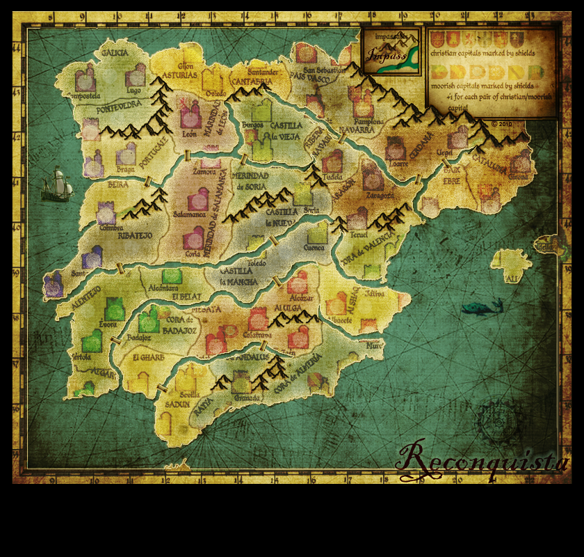
here are settlements. I made also new for towns.
- Click image to enlarge.

-
Evil DIMwit
- Posts: 1616
- Joined: Thu Mar 22, 2007 1:47 pm
- Gender: Male
- Location: Philadelphia, NJ
Re: Reconquista
Has there been any gameplay updates since the last version that's listed on the first page? I've sort of lost track, what with this thread becoming so cluttered.
-
theBastard
- Posts: 994
- Joined: Sat Jan 09, 2010 9:05 am
Re: Reconquista
my opinion, and also some skilled guys opinion is that my last version should be good. now we wait for Marshall´s map - he can describe his ideas...Evil DIMwit wrote:Has there been any gameplay updates since the last version that's listed on the first page? I've sort of lost track, what with this thread becoming so cluttered.
-
theBastard
- Posts: 994
- Joined: Sat Jan 09, 2010 9:05 am
Re: Reconquista
I´m looking forward the Marshal´s version of Reconquista map, but I think we must do next step.
so do mods, skilled guys agree with my last version of gameplay and could we go with this? when no, please post your ideas, I´m open to all, but I will be happy if you think about my core idea - no-man´s land and auto-deploy units.
this is last version:
thanks.
so do mods, skilled guys agree with my last version of gameplay and could we go with this? when no, please post your ideas, I´m open to all, but I will be happy if you think about my core idea - no-man´s land and auto-deploy units.
this is last version:
- Click image to enlarge.

-
AndyDufresne

- Posts: 24919
- Joined: Fri Mar 03, 2006 8:22 pm
- Location: A Banana Palm in Zihuatanejo
- Contact:
Re: Reconquista
I'm strangely fond of porkenbeans' aesthetic. If it isn't used for this map, it should find its way into another.
--Andy
--Andy
-
theBastard
- Posts: 994
- Joined: Sat Jan 09, 2010 9:05 am
Re: Reconquista
no problem...AndyDufresne wrote:I'm strangely fond of porkenbeans' aesthetic. If it isn't used for this map, it should find its way into another.
--Andy