Page 13 of 22
Re: Land And Sea v12p19 S&L
Posted: Fri Jan 30, 2009 8:20 pm
by edbeard
remember that these borders, which Oaktown mentioned above, have to be fixed
(NA2-NA3, AN2-AN3, and Alaska for example)
I didn't see anything else like those but another set of eyes over every border is a good idea
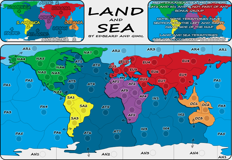
also, anybody, remember to look over my list. that's exactly how they'll appear in the XML. that part will not change. The names I gave to areas (eg: the Colombia part of SA1 could change to another country or name of the region) are up for debate though. Please make suggestions about the naming I did of regions if you care about it.
NA1 (Central America)
NA2 (Western US)
NA3 (Eastern US)
NA4 (Alaska)
NA5 (Western Canada)
NA6 (Eastern Canada)
NA7 (Greenland)
EU1 (Western Europe)
EU2 (Northern Europe)
EU3 (Eastern Europe)
EU4 (Western Russia)
EU5 (Middle East)
EU6 (Kazakhstan)
EU7 (India)
EU8 (Eastern Russia)
EU9 (China)
AF1 (West Africa)
AF2 (Egypt)
AF3 (Central Africa)
AF4 (Horn of Africa)
AF5 (Southern Africa)
SA1 (Colombia)
SA2 (Brazil)
SA3 (Argentina)
OC1 (Indonesia)
OC2 (Micronesia)
OC3 (Australia)
AN1 (Chile Claim)
AN2 (Argentina Claim)
AN3 (Norway Claim)
AN4 (Australia Claim)
AR1 (Chukchi Sea)
AR2 (Barents Sea)
AR3 (Kara Sea)
AR4 (Laptev Sea)
AT1 (Hudson Bay)
AT2 (North Atlantic)
AT3 (Caribbean Sea)
AT4 (Mid Atlantic )
AT5 (Central Atlantic)
AT6 (Southwest Atlantic)
AT7 (Southeast Atlantic)
PA1 (North Pacific)
PA2 (Gulf of Alaska)
PA3 (Coral Sea)
PA4 (Central Pacific)
PA5 (Southwest Pacific)
PA6 (Southeast Pacific)
IN1 (Arabian Sea)
IN2 (East Indian)
IN3 (West Indian)
IN4 (Southern Ocean)
Re: Land And Sea v12p19 S&L
Posted: Fri Jan 30, 2009 8:24 pm
by gimil
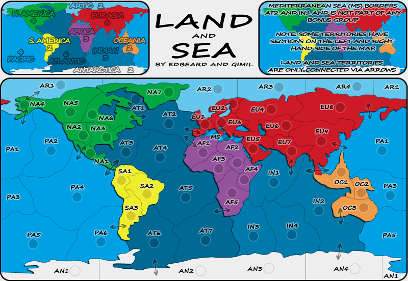
cairnswk wrote:Gimil, for me...
1. can you bring the title down into the middle of the white real estate, and perhaps bring the sigs up underneath that....i think it might looked better centered.
DONE
2. you'll need to put a transparency or similar over the right side map as it gets confused with the text...i can't read it without having to really hone in on it....the map underneath is too strong
Changed the font colour to white
3. S. America and N.America in mini-map....is there a space in there after das punkt on S. America and not N.America
Don't understand what you mean?
4. there are some harsh peaks at the top corners of your rounded edges, can you blur these or similar to remove that peak
A blur would take away from the crisp clean look of the map. I have also made the boxes using vector shapes so fixing this isn't really all that easy. I don't think the work to fix this is worth the results it will achieve.
5. can you check the names in mini-map, some seem to have bolder edges than others, or is that because of the colour?
I think your old eyes are playing tricks on you.
- Click image to enlarge.
Re: Land And Sea v12p19 S&L
Posted: Fri Jan 30, 2009 8:27 pm
by gimil
edbeard wrote:remember that these borders, which Oaktown mentioned above, have to be fixed
(NA2-NA3, AN2-AN3, and Alaska for example)
Are those the borders that are straight and right angled?
Re: Land And Sea v12p19 S&L
Posted: Fri Jan 30, 2009 8:28 pm
by edbeard
the white is worse. perhaps make the mini-maps black and white and grey except for the text on top.
Re: Land And Sea v12p19 S&L
Posted: Fri Jan 30, 2009 8:29 pm
by edbeard
gimil wrote:edbeard wrote:remember that these borders, which Oaktown mentioned above, have to be fixed
(NA2-NA3, AN2-AN3, and Alaska for example)
Are those the borders that are straight and right angled?
they are borders that go a little too far past another line leaving a dot/mark or in Alaska's case not going all the way to the other border leaving a gap.
Re: Land And Sea v12p19 S&L
Posted: Fri Jan 30, 2009 8:30 pm
by gimil
edbeard wrote:gimil wrote:edbeard wrote:remember that these borders, which Oaktown mentioned above, have to be fixed
(NA2-NA3, AN2-AN3, and Alaska for example)
Are those the borders that are straight and right angled?
they are borders that go a little too far past another line leaving a dot/mark or in Alaska's case not going all the way to the other border leaving a gap.
Oh, ok. I will give the map a once over for this in the morning.
Night!
Re: Land And Sea v12p19 S&L
Posted: Fri Jan 30, 2009 8:38 pm
by cairnswk
gimil wrote:...
cairnswk wrote:2. you'll need to put a transparency or similar over the right side map as it gets confused with the text...i can't read it without having to really hone in on it....the map underneath is too strong
Changed the font colour to white
cairnswk wrote:3. S. America and N.America in mini-map....is there a space in there after das punkt on S. America and not N.America
Don't understand what you mean?
I agree with edbeard, i think the white looks worse.
There is a small space between S. and America on the mini-map.
There is
no small space between the N. and America.
Is this simply a text thing or is there a discrepancy?
Re: Land And Sea v12p19 S&L
Posted: Sat Jan 31, 2009 12:52 am
by Incandenza
gimil wrote:cairnswk wrote:4. there are some harsh peaks at the top corners of your rounded edges, can you blur these or similar to remove that peak
A blur would take away from the crisp clean look of the map. I have also made the boxes using vector shapes so fixing this isn't really all that easy. I don't think the work to fix this is worth the results it will achieve.
They really really stick out, though, both the top and bottom rounded corners (on both the main map and various minimaps)... it might be worth at least trying to find something that looks less, well, pixelly.
Re: Land And Sea v12p19 S&L
Posted: Sat Jan 31, 2009 9:01 am
by gimil
Incandenza wrote:gimil wrote:cairnswk wrote:4. there are some harsh peaks at the top corners of your rounded edges, can you blur these or similar to remove that peak
A blur would take away from the crisp clean look of the map. I have also made the boxes using vector shapes so fixing this isn't really all that easy. I don't think the work to fix this is worth the results it will achieve.
They really really stick out, though, both the top and bottom rounded corners (on both the main map and various minimaps)... it might be worth at least trying to find something that looks less, well, pixelly.
Do they really? I don't really notice them at all. The opinions I have to try and fix them are:
-Hand draw them. This is pretty much a no go. I couldn't make something so crisp and sharp hand drawn without a billion man hours.
-Blur them. This will pretty much go against the entire theme of the map being simple and crisp.
-Reduce the opacity. I don't think this will do any justice at all, but I may be wrong.
Anyone any other ideas?
Re: Land And Sea v12p19 S&L
Posted: Sat Jan 31, 2009 12:47 pm
by ZeakCytho
gimil wrote:Incandenza wrote:gimil wrote:cairnswk wrote:4. there are some harsh peaks at the top corners of your rounded edges, can you blur these or similar to remove that peak
A blur would take away from the crisp clean look of the map. I have also made the boxes using vector shapes so fixing this isn't really all that easy. I don't think the work to fix this is worth the results it will achieve.
They really really stick out, though, both the top and bottom rounded corners (on both the main map and various minimaps)... it might be worth at least trying to find something that looks less, well, pixelly.
Do they really? I don't really notice them at all. The opinions I have to try and fix them are:
-Hand draw them. This is pretty much a no go. I couldn't make something so crisp and sharp hand drawn without a billion man hours.
-Blur them. This will pretty much go against the entire theme of the map being simple and crisp.
-Reduce the opacity. I don't think this will do any justice at all, but I may be wrong.
Anyone any other ideas?
A very slight outer glow?
Re: Land And Sea v12p19 S&L
Posted: Sat Jan 31, 2009 1:27 pm
by gimil
I could actually replace the stroke with an outer glow (that sort of looks like a stroke) but it might look smoother.
Re: Land And Sea v12p19 S&L
Posted: Sat Jan 31, 2009 1:51 pm
by oaktown
title bar looks soooo much better now... it is beginning to look as if some thought has been put into it.

I guess i missed the white version, but what if the text in the top left map was white just as is is on the top right map? You'd still have the colors on the regions of the map itself, and it would provide balance across the top of the map.
here's a though on the med... what if there was a small, simple asterisk in the style of the arrows that sat in AT2 and IN1, with the same asterisk leading off the line of text referring to the med in the legend? Ooh, or better yet, you could just extend the striping into territories AT2 and IN1 a bit, but with the normal background color... this would at least bring a player's attention to the fact that the territory borders the med.
Re: Land And Sea v12p19 S&L
Posted: Sat Jan 31, 2009 1:52 pm
by the.killing.44
Just a thought: maybe decrease the opacity of the map in the background on the right side of the key (the one where all the notes are)

? It might make the text easier to read.
.44
Re: Land And Sea v12p19 S&L
Posted: Sat Jan 31, 2009 2:52 pm
by gimil
- Click image to enlarge.
Try this for the borders. I made the text black again with a brighter stroke.
Re: Land And Sea v12p19 S&L
Posted: Sat Jan 31, 2009 5:07 pm
by cairnswk
Gimil, borders and title look great. Good job!
And you've fixed N. America.
cairnswk wrote:5. can you check the names in mini-map, some seem to have bolder edges than others, or is that because of the colour?
gimil wrote:I think your old eyes are playing tricks on you.
I still say there is a difference in colour of the black outline in N. America, Africa, Atlantic, Eruasia and Indian.
i have experimented with this on my computer on your mini-map before saying this, and my eyes are not playing tricks.
Re: Land And Sea v12p19 S&L
Posted: Sat Jan 31, 2009 5:13 pm
by gimil
cairnswk wrote:Gimil, borders and title look great. Good job!
And you've fixed N. America.
cairnswk wrote:5. can you check the names in mini-map, some seem to have bolder edges than others, or is that because of the colour?
gimil wrote:I think your old eyes are playing tricks on you.
I still say there is a difference in colour of the black outline in N. America, Africa, Atlantic, Eruasia and Indian.
i have experimented with this on my computer on your mini-map before saying this, and my eyes are not playing tricks.
Are you talking sea outlines or land? I really can't see what you are talking about carins.
Re: Land And Sea v12p19 S&L
Posted: Sat Jan 31, 2009 5:21 pm
by cairnswk
gimil wrote:cairnswk wrote:Gimil, borders and title look great. Good job!
And you've fixed N. America.
cairnswk wrote:5. can you check the names in mini-map, some seem to have bolder edges than others, or is that because of the colour?
gimil wrote:I think your old eyes are playing tricks on you.
I still say there is a difference in colour of the black outline in N. America, Africa, Atlantic, Eruasia and Indian.
i have experimented with this on my computer on your mini-map before saying this, and my eyes are not playing tricks.
Are you talking sea outlines or land? I really can't see what you are talking about carins.
It's on the text

left-side map. Some words have different colour outlines than others.
Re: Land And Sea v12p19 S&L
Posted: Sat Jan 31, 2009 5:30 pm
by gimil
Oh that? Thats just how different colours play on transparency. Darker colours give the illusion that th black outline looks darker.
Re: Land And Sea v12p19 S&L
Posted: Sat Jan 31, 2009 6:36 pm
by cairnswk
gimil wrote:Oh that? Thats just how different colours play on transparency. Darker colours give the illusion that th black outline looks darker.
That's what i thought, but can you fix it so they are all consistent?
Re: Land And Sea v12p19 S&L
Posted: Sat Jan 31, 2009 6:50 pm
by gimil
cairnswk wrote:gimil wrote:Oh that? Thats just how different colours play on transparency. Darker colours give the illusion that th black outline looks darker.
That's what i thought, but can you fix it so they are all consistent?
Not really. Some areas overlap darker and lighter colours. I really don't think this is a real issue cairns. I like it the way it is

Re: Land And Sea v12p19 S&L
Posted: Sat Jan 31, 2009 7:16 pm
by cairnswk
gimil wrote:cairnswk wrote:gimil wrote:Oh that? Thats just how different colours play on transparency. Darker colours give the illusion that th black outline looks darker.
That's what i thought, but can you fix it so they are all consistent?
Not really. Some areas overlap darker and lighter colours. I really don't think this is a real issue cairns. I like it the way it is
Gimil. If i have raised it, as i have raised other issues then to me
they are real.
If you chose not do anything about them because you like it the way it is, then that is your judgement, but i still think they can be fixed, just the same as i (and another)...
the.killing.44 wrote:Just a thought: maybe decrease the opacity of the map in the background on the right side of the key (the one where all the notes are)
? It might make the text easier to read.
.44
....think that the background on the right it too much and i can't read the text without squinting to have to read it.
I'm asking for something to be done about that also.
Gimil, i am not trying to give you a hard time,
i simply think that there are still issues with this map than can be improved and i would like to see them improved.
And next update, can you post the small version also so i can examine that please - to see how everything looks.
Re: Land And Sea v12p19 S&L
Posted: Sat Jan 31, 2009 7:32 pm
by gimil
cairnswk wrote:gimil wrote:cairnswk wrote:gimil wrote:Oh that? Thats just how different colours play on transparency. Darker colours give the illusion that th black outline looks darker.
That's what i thought, but can you fix it so they are all consistent?
Not really. Some areas overlap darker and lighter colours. I really don't think this is a real issue cairns. I like it the way it is
Gimil. If i have raised it, as i have raised other issues then to me
they are real.
If you chose not do anything about them because you like it the way it is, then that is your judgement, but i still think they can be fixed, just the same as i (and another)...
Cairns, I don't believe it needs 'fixed' I like it and it was and I made it transparent to get this effect.
the.killing.44 wrote:Just a thought: maybe decrease the opacity of the map in the background on the right side of the key (the one where all the notes are)
? It might make the text easier to read.
.44
....think that the background on the right it too much and i can't read the text without squinting to have to read it.
I'm asking for something to be done about that also.
Gimil, i am not trying to give you a hard time,
i simply think that there are still issues with this map than can be improved and i would like to see them improved.
And next update, can you post the small version also so i can examine that please - to see how everything looks.
I said I put them back to black and make the white border a little less transparent. I thought it looked clearer. If there not good enough thats fine but don't accuse me of not trying please.
Re: Land And Sea v12p19 S&L
Posted: Sat Jan 31, 2009 7:33 pm
by the.killing.44
I still think a bit less opacity would be better — 80%? 75%?
.44
Re: Land And Sea v12p19 S&L
Posted: Sat Jan 31, 2009 9:03 pm
by mibi
nice map, this one is going to be real popular I suspect.
Re: Land And Sea v12p19 S&L
Posted: Sun Feb 01, 2009 1:59 pm
by ZeakCytho
Sorry Gimil, but I'm gonna hop on the bandwagon and ask that you reduce the opacity in the top right box, at least. It's a bit hard to read the text over it.
Otherwise, this is looking really nice. Good work Ed and Gimil