Mongol Empire Map [Quenched]
Moderator: Cartographers
Forum rules
Please read the Community Guidelines before posting.
Please read the Community Guidelines before posting.

-
AndyDufresne

- Posts: 24919
- Joined: Fri Mar 03, 2006 8:22 pm
- Location: A Banana Palm in Zihuatanejo
- Contact:
-
Guiscard

- Posts: 4103
- Joined: Fri Dec 08, 2006 7:27 pm
- Location: In the bar... With my head on the bar

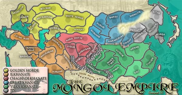
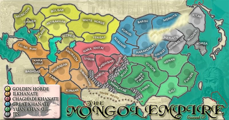
Ok hows the Gobi in this one??? Better? Worse? Get rid of the text?
Also got rid of the yellow border around the legend.
qwert wrote:Can i ask you something?What is porpose for you to open these Political topic in ConquerClub? Why you mix politic with Risk? Why you not open topic like HOT AND SEXY,or something like that.
-
Ruben Cassar

- Posts: 2160
- Joined: Thu Nov 16, 2006 6:04 am
- Gender: Male
- Location: Civitas Invicta, Melita, Evropa
-
Fireside Poet

- Posts: 2671
- Joined: Mon Apr 24, 2006 1:49 pm

-
Bad Speler
- Posts: 1027
- Joined: Fri Jun 02, 2006 8:16 pm
- Gender: Male
- Location: Ottawa
- Contact:
-
Taff
- Posts: 45
- Joined: Fri Jan 26, 2007 7:28 am
- Gender: Male
- Location: On the edge of oblivion staring into the abyss!!! And Legion of the Damned.
- Contact:
Looking forward to playing on this one. It looks good and very playable. Very well done.  Can't wait for it to appear. I will definitely set a game up as soon as it appears out of the foundry.
http://www.legion-of-the-damned.com/
I'm the lightning that strikes just before you hear the thunder. AAAWHOO! I can't stop killing you!
I'm the lightning that strikes just before you hear the thunder. AAAWHOO! I can't stop killing you!
-
Guiscard
- Posts: 4103
- Joined: Fri Dec 08, 2006 7:27 pm
- Location: In the bar... With my head on the bar
Do people think the text is actually needed or not? I'm tending towards not, as I've not labelled the mountains or wall, but what do others think?
Also, does anyone fancy giving me a hand with the Xml? I'm getting a bit stuck to be honest.
Also, does anyone fancy giving me a hand with the Xml? I'm getting a bit stuck to be honest.
qwert wrote:Can i ask you something?What is porpose for you to open these Political topic in ConquerClub? Why you mix politic with Risk? Why you not open topic like HOT AND SEXY,or something like that.

I think you should remove the text from the desert...
I think the desert still looks a tad stuck on...It should blend better witht he background image of the house that it touches in the north...and it seems to be 'above' the map...I think part of the problem is the features (dunes?) are a bit large for the scale...
that being said its a HUGE improvement, its almost there...
I can do your xml too if you want...
my new site - http://www.spritestitch.com/ - A video game craft weblog...
-
Ruben Cassar
- Posts: 2160
- Joined: Thu Nov 16, 2006 6:04 am
- Gender: Male
- Location: Civitas Invicta, Melita, Evropa
I like the text. I know it's not needed but I don't mind having it there.Guiscard wrote:Do people think the text is actually needed or not? I'm tending towards not, as I've not labelled the mountains or wall, but what do others think?
Also, does anyone fancy giving me a hand with the Xml? I'm getting a bit stuck to be honest.


You might just be right - I believe there are a few loose ends still here but it does look like a fantastic map. The amount of work left should be minimal now.hulmey wrote:the problem is occuring because the Moutanins and wall are 3D looking, i think!!
As for the text - it's your choice - I don't really care whether its there or not, so long as I know that the desert isn't a territory
Highest Score: 2437nmhunate wrote:Speak English... It is the language that God wrote the bible in.
Highest Place: 84
-
Guiscard
- Posts: 4103
- Joined: Fri Dec 08, 2006 7:27 pm
- Location: In the bar... With my head on the bar
Ok. Tiny update really. Have tinkered with the desert and moved a couple of army circles. Also I'm posting the small map as a simple downscaling to get some feedback on whether army circles need to be bigger, text is readable etc. etc.
Johloh, if you have enough time to have a crack at the xml that would be absolutely brilliant. I'm finding it hard enough to focus properly on the graphical side let alone an aspect I don't have any aptitude for Do you need anything other than the JPEGs?

Johloh, if you have enough time to have a crack at the xml that would be absolutely brilliant. I'm finding it hard enough to focus properly on the graphical side let alone an aspect I don't have any aptitude for
qwert wrote:Can i ask you something?What is porpose for you to open these Political topic in ConquerClub? Why you mix politic with Risk? Why you not open topic like HOT AND SEXY,or something like that.


-
Ruben Cassar
- Posts: 2160
- Joined: Thu Nov 16, 2006 6:04 am
- Gender: Male
- Location: Civitas Invicta, Melita, Evropa
guiscard, all i need is what youve posted...
I'll have the xml done sometime tonight when I get back home...
I'll have the xml done sometime tonight when I get back home...
my new site - http://www.spritestitch.com/ - A video game craft weblog...