(It's a joke!!!)
I think it looks even better. Awesome job!
Moderator: Cartographers

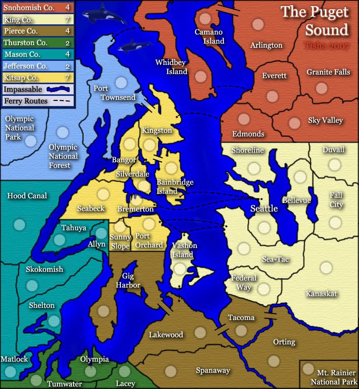
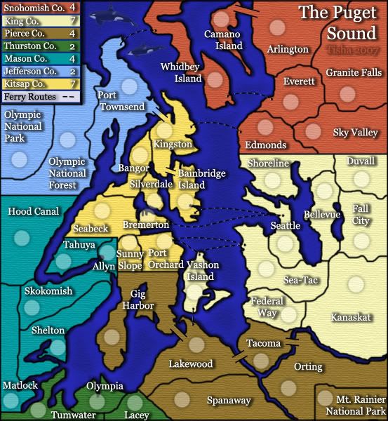
there is a glow under the ferry route because someone complained that they couldn't see the routes very well...and i would rather not change the routes to whiteoaktown wrote:wow, much much better tisha. This is coming along nicely.
three minor things from before still bother me:
• I like the glow on the water radiating from, the land, but i'm not sure why there's also glow around the ferry routes.
• love the land shadow, as I said about Mibi's draft, the shadow from the land should be just a bit tighter with the land to give the impression of shadow from land features, not shadow from land floating above the water. There are a few spots - like the Seattle territory - where it looks like the land mass is hanging over the water.
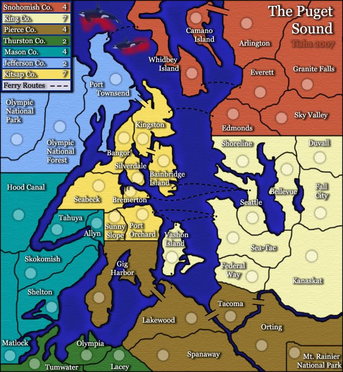
• I promise this is the last time I'll mention my distaste for the flying whales... looks like the opening sequence of the Hitchhikers' Guide movie (So Long and Thanks for All the Fish!)
And because you'll never shut me up completely, one new thing:
• does anyone think it is necessary to have the line in the legend about unpassables? Water plays the same roll in every map.
Right, that would be a problem. I just think that the water texture is good, and it's a shame it has to be interrupted. Have you considered leaving the texture as is, but putting a lighter stroke around the dashes?Tisha wrote:there is a glow under the ferry route because someone complained that they couldn't see the routes very well...and i would rather not change the routes to white
Right, whales can't fly! Silly me.Tisha wrote:and my whales are not flying..can't u see the blue over them?

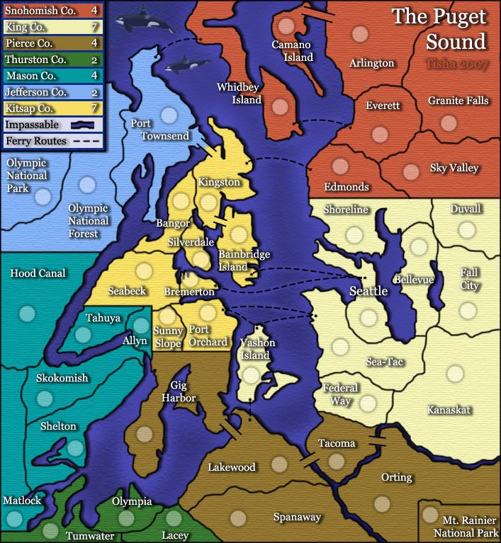
Excellent every shadow seems very consistant. In the future it might be helpful to do all the text on one layer and just adjust the pixels in between line breaks to be as far or as close as you desire. It makes it so photoshop will center them for you and you can assure everything is universal between them, but this DOES look much much better. The drop shadow on the land looks very good also, and I like how it goes into your rivers. It makes me feel like the rivers are dark and gloomy. Those are the types of rivers I wouldn't want to cross anyways.Tisha wrote:redrew all the borders...even the mt. rainier area. after i redid the borders i went all around and made sure color wasn't hanging out on the wrong side of the border anywhere
redid the drop shadow on all names
straightened the ferry routes in the legend
tried to center words and numbers better in the legend
desaturated the water a bit
i added a bit of a drop shadow to the land..but i don't like the way that it adds shadow to my rivers also

Worse than Crossword? Hong Kong? Until I looked just now I forgot those maps even existed.hulmey wrote:im sorry gonna be blunt, but if this map is quenched then iy will probably be the worst looking map on CC.

EDIT: changed can to can't and bolded itbedub1 wrote:I've read from Page 15. Here is my opinion.
Things I think should change
*I think the "Bremerton" label should be moved to the right, especially on the small map.
*I think the "Impassable" in the legend can be removed...if people can't figure out that you can't get across the river, they are stupid and should be laughed at.

I agree that there's no way as is it would be the worst, but I may be crazy, but I think hong kong is one of the prettiest.oaktown wrote:Worse than Crossword? Hong Kong? Until I looked just now I forgot those maps even existed.hulmey wrote:im sorry gonna be blunt, but if this map is quenched then iy will probably be the worst looking map on CC.
No map will be beautiful to everybody - the Berlin map probably still has more haters than this one, and Wid's ConquerMan and Canada revamp both beat this one in terms of provoking hate and anger. What's important is that it is improving, and while I think it could use some more eyes and some more little improvements it is certainly on its way.


 are registered trademarks of Backglass Heavy Industries.