Page 19 of 50
Posted: Wed Apr 18, 2007 6:26 am
by DiM
yeti_c wrote:There are a couple of graphical overlaps between the bottom continent and the rules where the 2 colours merge to make a 4th colour... can you eliminate them?
C.
done. feedback on graphics. nice. does this mean the gameplay is finalized?
Posted: Wed Apr 18, 2007 7:39 am
by mibi
selling should be changed to owning.... im sure people will be like "how do i sell something?"
Posted: Wed Apr 18, 2007 8:06 am
by yeti_c
DiM wrote:yeti_c wrote:There are a couple of graphical overlaps between the bottom continent and the rules where the 2 colours merge to make a 4th colour... can you eliminate them?
C.
done. feedback on graphics. nice. does this mean the gameplay is finalized?
I thought the gameplay was finished ages ago... it's more the presentation of the new gameplay style that is the hard part?
C.
Posted: Wed Apr 18, 2007 8:10 am
by DiM
mibi wrote:selling should be changed to owning.... im sure people will be like "how do i sell something?"
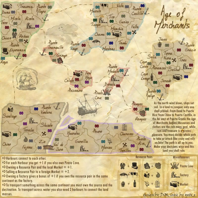
how's this? i changed owning and selling to transporting because in the last line i have the transportation explanation.
*Harbours connect to each other.
*For each Harbour you get +1 if you also own Pirate Cove.
*Transporting a Resource Pair to the local Market = +1.
*Transporting a Resource Pair to a foreign Market = +2.
*Owning a Factory gives a bonus of +1 if you own the resource pair in the same continent as the factory.
*To transport something across the same continent you must own the source and the destination. To transport across water you also need 2 harbours to connect the land masses.
Posted: Wed Apr 18, 2007 8:12 am
by DiM
yeti_c wrote:I thought the gameplay was finished ages ago... it's more the presentation of the new gameplay style that is the hard part?
C.
the gameplay also suffered some modifications because some things were too damn hard to explain

anyway the way the map is now seems pretty easy to understand. i don't think anybody could have trouble understanding the bonuses.
Posted: Wed Apr 18, 2007 8:42 am
by mibi
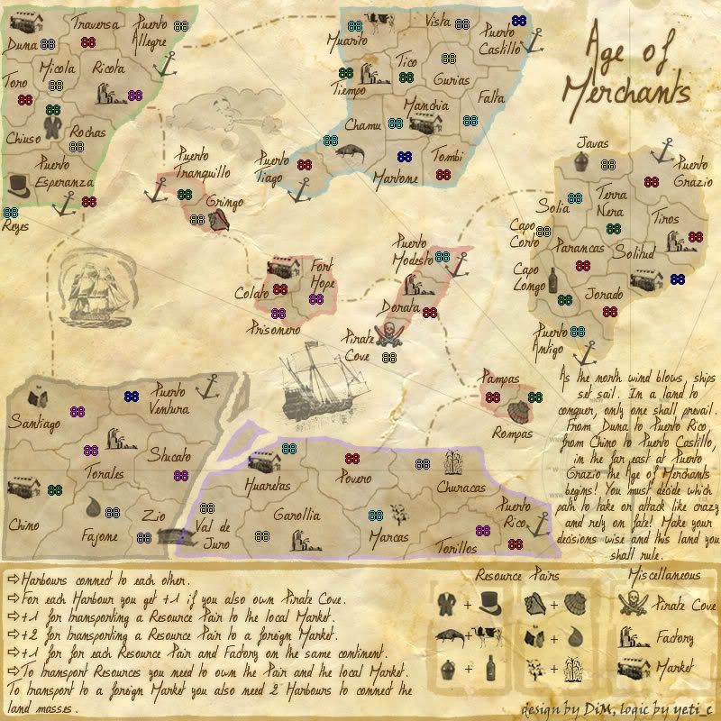
i think this is a bit more clear:
*Harbours connect to each other.
*For each Harbour you get +1 if you also own Pirate Cove.
+1 for transporting a Resource Pair to the local Market.
+2 for transporting a Resource Pair to a foreign Market.
+1 for for each resource pair AND a factory on the same continent.
*To transport resources you need to own the pair and the destination To transport across water you also need 2 harbors to connect the land masses.
just a thought.
Posted: Wed Apr 18, 2007 9:03 am
by DiM
mibi wrote:i think this is a bit more clear:
*Harbours connect to each other.
*For each Harbour you get +1 if you also own Pirate Cove.
+1 for transporting a Resource Pair to the local Market.
+2 for transporting a Resource Pair to a foreign Market.
+1 for for each resource pair AND a factory on the same continent.
*To transport resources you need to own the pair and the destination To transport across water you also need 2 harbors to connect the land masses.
just a thought.
sounds better. just one more modif to the last line. i added market instead of destination to avoid any confusion.
*To transport resources you need to own the pair and the local market. To transport to a foreign market you also need 2 harbors to connect the land masses.
now it should be clear enough.
here:

Posted: Wed Apr 18, 2007 9:08 am
by yeti_c
DiM wrote:yeti_c wrote:I thought the gameplay was finished ages ago... it's more the presentation of the new gameplay style that is the hard part?
C.
the gameplay also suffered some modifications because some things were too damn hard to explain
anyway the way the map is now seems pretty easy to understand. i don't think anybody could have trouble understanding the bonuses.
Fair enough - well let me know when it's all ready and I'll redo your bonus xml for ya...
C.
Posted: Wed Apr 18, 2007 9:18 am
by DiM
yeti_c wrote:DiM wrote:yeti_c wrote:I thought the gameplay was finished ages ago... it's more the presentation of the new gameplay style that is the hard part?
C.
the gameplay also suffered some modifications because some things were too damn hard to explain
anyway the way the map is now seems pretty easy to understand. i don't think anybody could have trouble understanding the bonuses.
Fair enough - well let me know when it's all ready and I'll redo your bonus xml for ya...
C.
you can start working if you want. the coordinates xml is on the previous page if you need it.
Posted: Wed Apr 18, 2007 9:31 am
by yeti_c
DiM wrote:yeti_c wrote:DiM wrote:yeti_c wrote:I thought the gameplay was finished ages ago... it's more the presentation of the new gameplay style that is the hard part?
C.
the gameplay also suffered some modifications because some things were too damn hard to explain
anyway the way the map is now seems pretty easy to understand. i don't think anybody could have trouble understanding the bonuses.
Fair enough - well let me know when it's all ready and I'll redo your bonus xml for ya...
C.
you can start working if you want. the coordinates xml is on the previous page if you need it.
Will do it sometime soon - but might be next week...
C.
Posted: Wed Apr 18, 2007 9:36 am
by DiM
yeti_c wrote:DiM wrote:yeti_c wrote:DiM wrote:yeti_c wrote:I thought the gameplay was finished ages ago... it's more the presentation of the new gameplay style that is the hard part?
C.
the gameplay also suffered some modifications because some things were too damn hard to explain
anyway the way the map is now seems pretty easy to understand. i don't think anybody could have trouble understanding the bonuses.
Fair enough - well let me know when it's all ready and I'll redo your bonus xml for ya...
C.
you can start working if you want. the coordinates xml is on the previous page if you need it.
Will do it sometime soon - but might be next week...
C.
don't worry, there's no hurry, i don't think it will be quenched next week

Posted: Wed Apr 18, 2007 10:06 am
by Enigma
whoa dim- ur new instructions make things a lot clearer. nice job
still complicated- but not unmanagable.
-try to make all the icons the same...transparency? im not sure if that is the right term, tho its at least related.- but some icons are a lighter grey than others. i think it would look better if they were all uniform to the darkest current grey.
-im really not a fan of the bridge icon at the bottom.
-i think i finally realized y the coloured edges look off- they look flat compared with the 3d effect on the rest of the map. maybe.... try putting a dark brown outline around the edges of the colour? that might help.
-ur territory dividers are really pixely
-i know ur sick of hearing this... but try taking the font size down 1-2 more points. the problem is that the icons
really need to be the focal points, not the names. again, the gameplay is so complicated that one has to be able to look at the map and immediatly know where everything and everyone is.
you might have to change it... again.

you need something simple that complements the title style, but doesnt overwhelm the territories. it doesnt necessarily need to match the title- can be a bit of a mix between the curvy title and the very rigid instructions.
Posted: Wed Apr 18, 2007 10:59 am
by DiM
Enigma wrote:whoa dim- ur new instructions make things a lot clearer. nice job
still complicated- but not unmanagable.
finally

Enigma wrote:-try to make all the icons the same...transparency? im not sure if that is the right term, tho its at least related.- but some icons are a lighter grey than others. i think it would look better if they were all uniform to the darkest current grey.
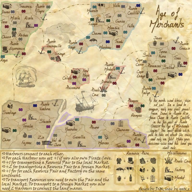
yup indeed somehow they had different transparency. maybe when i added the new icons. anyway i made them the same level. also removed the treasure icons which i forgot.
Enigma wrote:-im really not a fan of the bridge icon at the bottom.
how about the new bridge? i removed some of it's brownish colour and modified the tint parameters. it should be the same aspect as the icons.
Enigma wrote:-i think i finally realized y the coloured edges look off- they look flat compared with the 3d effect on the rest of the map. maybe.... try putting a dark brown outline around the edges of the colour? that might help.
you're talking about the continent edges? you want me to put a brown edge on the coloured edges? like making a double edge? or just add some brown colour to the coloured edges? i'm not quite sure what you mean.

Enigma wrote:-ur territory dividers are really pixely
the borders are pixely??

i've seen a lot worse but no problemo. made them less pixely. how about now?
Enigma wrote:-i know ur sick of hearing this... but try taking the font size down 1-2 more points. the problem is that the icons
really need to be the focal points, not the names. again, the gameplay is so complicated that one has to be able to look at the map and immediatly know where everything and everyone is.
you might have to change it... again.
you need something simple that complements the title style, but doesnt overwhelm the territories. it doesnt necessarily need to match the title- can be a bit of a mix between the curvy title and the very rigid instructions.
if you're talking about the territory names, the answer is no. sorry but i had a few complaints about the font being too large or to small. in the end this size seemed to be accepted by everybody. even you if i remember correctly

i think the icons stand out because they are ... ummm... icons. if you see an icon then it means something so i don't think you can really overlook it.
also the style used was previously accepted so i'm not very keen on changing it unless it's also a hand writing font. on the other hand the legend style and size could be changed if people think they should be.
here:
Posted: Wed Apr 18, 2007 11:06 am
by Contrickster
Really good feel about the map... the look is right and the logic opens up areas for other maps to follow.
I preferred the older text. Easier to read. However, the handwritten text is more in keeping with the style and when you've learned how to play the map once, you don't need to read it again.
I think you need to get clearance on whether large map size is okay before making final decision on text.
Posted: Wed Apr 18, 2007 11:17 am
by coolpsp
DiM wrote:Enigma wrote:whoa dim- ur new instructions make things a lot clearer. nice job
still complicated- but not unmanagable.
finally
Enigma wrote:-try to make all the icons the same...transparency? im not sure if that is the right term, tho its at least related.- but some icons are a lighter grey than others. i think it would look better if they were all uniform to the darkest current grey.
yup indeed somehow they had different transparency. maybe when i added the new icons. anyway i made them the same level. also removed the treasure icons which i forgot.
Enigma wrote:-im really not a fan of the bridge icon at the bottom.
how about the new bridge? i removed some of it's brownish colour and modified the tint parameters. it should be the same aspect as the icons.
Enigma wrote:-i think i finally realized y the coloured edges look off- they look flat compared with the 3d effect on the rest of the map. maybe.... try putting a dark brown outline around the edges of the colour? that might help.
you're talking about the continent edges? you want me to put a brown edge on the coloured edges? like making a double edge? or just add some brown colour to the coloured edges? i'm not quite sure what you mean.
Enigma wrote:-ur territory dividers are really pixely
the borders are pixely??
i've seen a lot worse but no problemo. made them less pixely. how about now?
Enigma wrote:-i know ur sick of hearing this... but try taking the font size down 1-2 more points. the problem is that the icons
really need to be the focal points, not the names. again, the gameplay is so complicated that one has to be able to look at the map and immediatly know where everything and everyone is.
you might have to change it... again.
you need something simple that complements the title style, but doesnt overwhelm the territories. it doesnt necessarily need to match the title- can be a bit of a mix between the curvy title and the very rigid instructions.
if you're talking about the territory names, the answer is no. sorry but i had a few complaints about the font being too large or to small. in the end this size seemed to be accepted by everybody. even you if i remember correctly
i think the icons stand out because they are ... ummm... icons. if you see an icon then it means something so i don't think you can really overlook it.
also the style used was previously accepted so i'm not very keen on changing it unless it's also a hand writing font. on the other hand the legend style and size could be changed if people think they should be.
here:
Looks great but i dislike the qriting to diffucult to read.
Posted: Wed Apr 18, 2007 11:20 am
by DiM
Contrickster wrote:Really good feel about the map... the look is right and the logic opens up areas for other maps to follow.
thanks. i'm trying to do something new here and hopefully my idea will be embraced and other maps will use this new addition. it's a shame to keep using the same bonus sistem when we have so many new possibilities.
Contrickster wrote:I preferred the older text. Easier to read. However, the handwritten text is more in keeping with the style and when you've learned how to play the map once, you don't need to read it again.
exactly. the feeling is very important because this map has no particular setting to attract people. if they have a nice feeling about it they'll keep playing and after the first few minutes you won't even look at the legend.
Contrickster wrote:I think you need to get clearance on whether large map size is okay before making final decision on text.
i know the map size is an issue but previous quenched maps show that if the reason is good the size can be bent. for this map the reason is that it needs lots of room to explain the gameplay clearly, thus the need for such a big legend. maybe in the future when people will get more aquainted with the new gameplay the other maps won't have to include such elaborate legends.
Posted: Wed Apr 18, 2007 11:32 am
by DiM
coolpsp wrote:Looks great but i dislike the qriting to diffucult to read.
i could put a standard font like times new roman, but don't you think some of the feeling will be lost?
i put some real hard work in this font trying to make like this.
i looked at several old writtings and tried to copy the the same colour, the slight loss in the colour quality and yet obtain the jaggedness of a quill writtin. i used glows and tints and shadows to make it look like the ink slightly moisted the paper around it, and also crisped it to obtain the ripping effect that a quill does to the paper.
now imagine all this work put into a standard font
Posted: Wed Apr 18, 2007 11:45 am
by mibi
sorry DiM the new font is not an improvement. You just had the text relatively clear from a concept point of view, and now its confusing from a graphic point of view. I know you wan tit to fit the theme, but you need to make your info incredibly easy to read, due to its greater than normal conceptual complexity.
Posted: Wed Apr 18, 2007 11:50 am
by DiM
mibi wrote:sorry DiM the new font is not an improvement. You just had the text relatively clear from a concept point of view, and now its confusing from a graphic point of view. I know you wan tit to fit the theme, but you need to make your info incredibly easy to read, due to its greater than normal conceptual complexity.
how about now? changed only the legend text.
Posted: Wed Apr 18, 2007 2:49 pm
by Captain Cool
AAAA
Posted: Wed Apr 18, 2007 2:49 pm
by Captain Cool
just kidding
Posted: Wed Apr 18, 2007 2:50 pm
by DiM
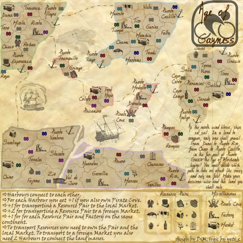
Captain Cool wrote:How about this title: The Age of Gayness
this coming from a guy that thinks cycling is the greatest sport of all times

Posted: Wed Apr 18, 2007 2:51 pm
by DiM
Captain Cool wrote:just kidding
me too

Posted: Wed Apr 18, 2007 2:55 pm
by DiM
how's this?
Posted: Wed Apr 18, 2007 3:06 pm
by freezie
DiM wrote:how's this?
It looks ok...but it doesn't seem to fit the theme to well...
Maybe make the bicycle a little more wooden...

Seriously, The new font for the legend is easy to read now, you shouldn't have any problems with it anymore. Good looking.
As for anything else...hmm...I can't see anything. I'll leave it to more experienced cartographers.