
Haha, thanks for that..cowshrptrn wrote:don't worry pope, i got ur OCD covered
And maybe you should try a black and white logo as P Gizzle suggested, altough I also like it as it is..
Moderator: Cartographers


I like this version, except that the background is too dark.. its stands out too well. You want the focus to be on the map. Take your original background image and use the Hue/Saturation adjustment, take the Lightness setting up to about +50 or +75 so that it fades the background to a lighter grey scale...cowshrptrn wrote:ok, iamde it black and white and changed the font. Its smooth tho, so it doesn't go w/ the grainy texture of the picture, if anyone know how to fix that w/ photoshop plz tell me


 Children, this is what happens to hockey players, druggies, and Hillary Clinton.

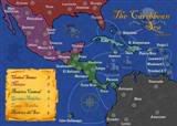 MIDDLE AMERICA MAP