Page 3 of 5
Re: Belgium 2.0! p1,3 Poll still up
Posted: Tue Jan 20, 2009 12:00 pm
by bryguy
captainwalrus wrote:MrBenn wrote:captainwalrus wrote:On the contrary, I used the actual Arrondissements but I just used curved lines instead of using the exact borders because when I tried to put them in it came out really pixelated. THe only thing that I changed from the actual Arrondissements is that I combined a few in west Vlaanders and added a territory where a city is in leige because now there is 20 territories in each province which makes it easier to do an objective gameplay.
Could you please take a closer look at the map next time instead of just assuming it is wrong. I spent a lot of time trying to make this version much more acurate.
~
Borders are more daunting to redraw than you may think... I don;t have much experience of using the pen tool, and consequently struggle to use it (which may be the problem you had with the fiddly borders?). Check out the map tricks and tutorials thread in the Foundry Discussion forum, and have a look at the advice RjBeals gave me while I was working on Europa... I found that really helpful to get clear and precise borders that weren't pixellated

Well, the problem is I didn't start in a very good program, Photoshot elements 4.0, and I was trying to avoid having to shift to GIMP midway through but I am realizing that In order to do a lot of the things suggestied I need to. I will try to do what RJ said but I noiced the link didn't work on his post. Also, what I tried to do was to put in the teritories from a map on wikipedia which didn't work out too well because of the pixelated look.
If u shift to GIMP and need some help, then let me know.
Also, if u are redoing borders in GIMP, use the pen tool, but you will need to modify some of the settings. Ill tell u later wat they would be.
Re: Belgium 2.0! p1,3 Poll still up
Posted: Sun Jan 25, 2009 5:46 pm
by captainwalrus
There hasn't been much discussion of this map latly. Besided the font what else needs to be changed?
Re: Belgium 2.0! p1,3 Poll still up
Posted: Sun Jan 25, 2009 7:38 pm
by saaimen
captainwalrus wrote:There hasn't been much discussion of this map latly. Besided the font what else needs to be changed?
Discussion isn't needed if points that have been made in the past are not followed up yet.
Here's a list of things you could get into. Sorry for being hard on you here... But the map is far from finished.
- The borders should be nicer.
- Brabant Wallon should be split up.
- Brussels still has regions with no name on them.
- You invented a river... ?
- The region names should be fit into the regions more nicely.
- There should be some texture. Maybe add something 'Belgian' aswell.
- Your legend is not very aesthetical, think about something nice.
- I still don't really like the colours...
If there's anything here you don't agree with or don't know how to change, I'm willing to argument my statements or help out with advice.
Re: Belgium 2.0! p1,3 Poll still up
Posted: Sun Jan 25, 2009 9:52 pm
by sailorseal
saaimen wrote:captainwalrus wrote:There hasn't been much discussion of this map latly. Besided the font what else needs to be changed?
Discussion isn't needed if points that have been made in the past are not followed up yet.
Here's a list of things you could get into. Sorry for being hard on you here... But the map is far from finished.
- The borders should be nicer.
- Brabant Wallon should be split up.
- Brussels still has regions with no name on them.
- You invented a river... ?
- The region names should be fit into the regions more nicely.
- There should be some texture. Maybe add something 'Belgian' aswell.
- Your legend is not very aesthetical, think about something nice.
- I still don't really like the colours...
If there's anything here you don't agree with or don't know how to change, I'm willing to argument my statements or help out with advice.
He's very right, I have been spending most of my time in the ideas sub-forum and when I come back here this map has not changed at all...
Re: Belgium 2.0! p1,3 Poll still up
Posted: Mon Jan 26, 2009 12:32 pm
by captainwalrus
saaimen wrote:captainwalrus wrote:There hasn't been much discussion of this map latly. Besided the font what else needs to be changed?
Discussion isn't needed if points that have been made in the past are not followed up yet.
Here's a list of things you could get into. Sorry for being hard on you here... But the map is far from finished.
I know but I was just looking for more advice.
- The borders should be nicer.
- Brabant Wallon should be split up. It is actualy just one adorssment I think.
- Brussels still has regions with no name on them. THe names don't fit, I asked about ways to fix that but none were provided.
- You invented a river... ? Where?
- The region names should be fit into the regions more nicely.
- There should be some texture. Maybe add something 'Belgian' aswell. What do you suggest?
- Your legend is not very aesthetical, think about something nice.
- I still don't really like the colours... I'll put a poll up. THe issue is split.
If there's anything here you don't agree with or don't know how to change, I'm willing to argument my statements or help out with advice.
Re: Belgium 2.0! p1,3 Poll still up
Posted: Mon Feb 02, 2009 3:19 pm
by captainwalrus
OK, sorry I haven't updated the things I needed to. I've been away and very busy. I will work in it soon. Can the poll be removed?
Re: Belgium 2.0! p1,3 Poll still up
Posted: Mon Feb 02, 2009 6:59 pm
by saaimen
I didn't follow up your last post, sorry man.
What's an 'adorssment'? I actually Googled it and found 1 result

... What did you mean?
For the names... You could spin them around if that helps. If not, split-
ting them up might? Or else, there's still the abbr.(eviation)
I think the blue line between Oost- and West-Vlaanderen is not a representation of an actual waterway... How did you come up with it?
For some Belgian-style graphics, I'm not the right guy

The current poll can be removed, I think. The result is pretty obvious!
Good luck on the improvements!
Re: Belgium 2.0! p1,3 Poll still up
Posted: Sat Feb 21, 2009 2:55 pm
by thenobodies80
nicer borders
colors could be less flashing?
Re: Belgium 2.0! p1,3 Poll still up
Posted: Mon Mar 02, 2009 7:19 pm
by MrBenn
[
Moved]
It would appear that development of this map has stalled. If the mapmaker wants to continue with the map, then one of the CAs will be able to help put the thread back into the Foundry system,
after an update has been made.
Re: Belgium 2.0! p1,3 Poll still up
Posted: Tue Mar 03, 2009 5:10 pm
by captainwalrus
Although this is in the reclaling bin, I might be bringing it back soon. I found out that it was easier than I thought to transfer it to GIMP so now I am working on it a bit. I will update it and it will be better. Origionaly when there was another Belgium map being made I decided to stop work, but now that that hass also stopped I regret stopping.
Re: Belgium 2.0! p1,3 Poll still up
Posted: Sat Mar 14, 2009 8:33 am
by captainwalrus
saaimen wrote:I didn't follow up your last post, sorry man.
What's an 'adorssment'? I actually Googled it and found 1 result
... What did you mean?
Arrondissements Is what I was thinking of.

Option 1
- Click image to enlarge.

Option 2 (top) and 3 (bottom)
- Click image to enlarge.

Opton 4
- Click image to enlarge.

Re: Belgium 3.? Update p1,5! (poll needs to be removed!)
Posted: Sat Mar 28, 2009 12:36 pm
by captainwalrus
I made an uptade, can this be put back in the drafts?
I'm doing it in GIMP now so I might need some help soon and not many people see things in here.
Edit: should I not be using Bitmaps? Sould I use PNGs? I tried JPGs but they were all bad graphics.
Re: Belgium 3.? Update p1,5! (poll needs to be removed!)
Posted: Sat Mar 28, 2009 4:43 pm
by LED ZEPPELINER
i like option 2, but you need lines in between the bonuses
Re: Belgium 3.? Update p1,5! (back to drafting room?)
Posted: Sun Mar 29, 2009 5:03 pm
by el-presidente
This should be back in the drafting room. I am not sure which graphics I like best but I like that you have a bunch of options. I liked the old graphics scheme but I also like some of these.
You shouldn't use BMPs because they are big and take a while to load on slow connections, but JPGs are not as good quality as PNGs.
Stavelot coult be made a little bigger cause I think you made that one up anyways, and what happened to the accsents and such on some of the names? Did you get rid of them when you were changing the font and such?
< El-presidente >
Re: Belgium
Posted: Mon Mar 30, 2009 4:14 pm
by ManBungalow
Your link doesn't work and I can't find Tips & Tricks page

Re: Belgium 3.? Update p1,5! (back to drafting room, no?)
Posted: Mon Mar 30, 2009 4:18 pm
by the.killing.44
http://www.conquerclub.com/forum/viewto ... 27&t=73566
there's the TTT
As for the map, the colors do seriously need a redo. They're still very bright — try making them all the same color, but darker. Also, I'd include a border (drawn) between the bonuses, and instead of an light inner glow/dodge, whatever you did on the inside, a dark inner glow/burn would look much better, clarify the connections, and help make the colors seem darker as weel.
Keep at it
.44
Re: Belgium 3.? Update p1,5! (new poll!)
Posted: Sun Apr 05, 2009 2:11 pm
by captainwalrus
I added in lines between all the bonuses on all the maps and sepperated the 2 parts of old version 3.2. I still would like some more disscussion before I pick one stile.
3.1
- Click image to enlarge.

3.2
- Click image to enlarge.

3.3
- Click image to enlarge.

3.4
- Click image to enlarge.

Re: Belgium 3.? Update p1,5! (new poll!)
Posted: Wed Apr 15, 2009 2:01 pm
by captainwalrus
Why is no one discussing anything? Before I had plenty of people who wanted to see a Belgium map, but now, no one comments.
Re: Belgium 3.? Update p1,5! (new poll!)
Posted: Thu Apr 16, 2009 4:17 pm
by thenobodies80
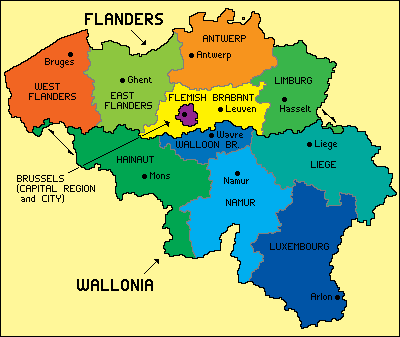
I'd like to reply to your suggestions request.
I noticed some "wrong" names
http://upload.wikimedia.org/wikipedia/c ... egProv.png
In belgium there are 3 regions:
1.
Flanders
with 5 provinces:
antwerpen
limburg (not limberg)
Oost-Vlaanderen
West-Vlaanderen
Vlaams-Brabant
2.
Wallonia
with 5 provinces:
Brabant Wallon
Namur (not namen)
Liège (not luik)
Henegouwen (not henegewin)
Luxembourg (not lexemborg)
3.
Brussels
My best concern is about graphic:
Actually you have a map with many similar colors.
The violet circles on the small map aren't very nice (violet on red?

)
Try to find a new good graphic way to follow

Keep it up
I'll be back soon...
TNBDS
Re: Belgium 3.? Update p1,5! (new poll!)
Posted: Thu Apr 16, 2009 5:16 pm
by captainwalrus
About the names, some of those are typos but also, some are because I tried to use either french or flemmish dependinf on were the territories are but I will check that.
I didn't really change that much since the beggining and before it was lighter so It showed up better.
I will have an update soon and I am now just working from version 3.2. Someone kindly offered to help me out and I greatly anticipate their changes.
~MR. Walrus
Re: Belgium 3.? Update p1,5! (new poll!)
Posted: Thu Apr 16, 2009 6:15 pm
by saaimen
Other spelling mistakes:
Mechelen
Stavelot
Gent
Bastogne
Soignies
Tournai
Brussel
Halle-Vilvoorde
Liège
Neufchâteau
Re: Belgium 3.? Update p1,5! (new poll!)
Posted: Fri Apr 17, 2009 4:20 pm
by the.killing.44
That should give you smooth, good-looking borders. This is improving!
.44
Re: Belgium 3.? Update p1,5! (new poll!)
Posted: Mon Apr 20, 2009 5:13 pm
by MrBenn
The map shows promise, and is showing definite signs of improvement

For future updates, it is only really necessary to include the most recent image in the thread, rather than every version so far
My initial thoughts are that the Brussels inset is a little confusing... perhpas you could repreent it in a similar way to the inset on the Iraq map? I'm not fully convinced that Ixelles should border Halle-Vilvoorde - that doesn;t seem entirely logical. Equally I'm not convinced the atack route between Ieper and Tourani is really necessary.
You're showing signs that the graphics will come in time - it might be worth trying to put a bit more thought/rationale into how you envisage ameplay working out, and haing a bit more of a think about any further impassables etc
Re: Belgium 3.? Update p1,5! (new poll!)
Posted: Mon Apr 20, 2009 6:15 pm
by sailorseal
I really think the colors need to be darkened, the whole map needs to be darkened, this is a rainbow now and is hard to look at at times.
I still love the lay out
Re: Belgium 3.? Update p1,5! (new poll!)
Posted: Tue Apr 21, 2009 7:18 pm
by thenobodies80
i was going around the foundry, when i found this one.
http://www.conquerclub.com/forum/viewto ... 42#p854046
It's very similar.
So,take a look, search for some good suggestions throught the posts and "use" the other errors to stay on the right way.
TNBDS