Page 3 of 6
Re: Romania map
Posted: Thu Oct 22, 2009 7:09 pm
by porkenbeans
A little fine tuning to clear up the borders a bit.
- Click image to enlarge.
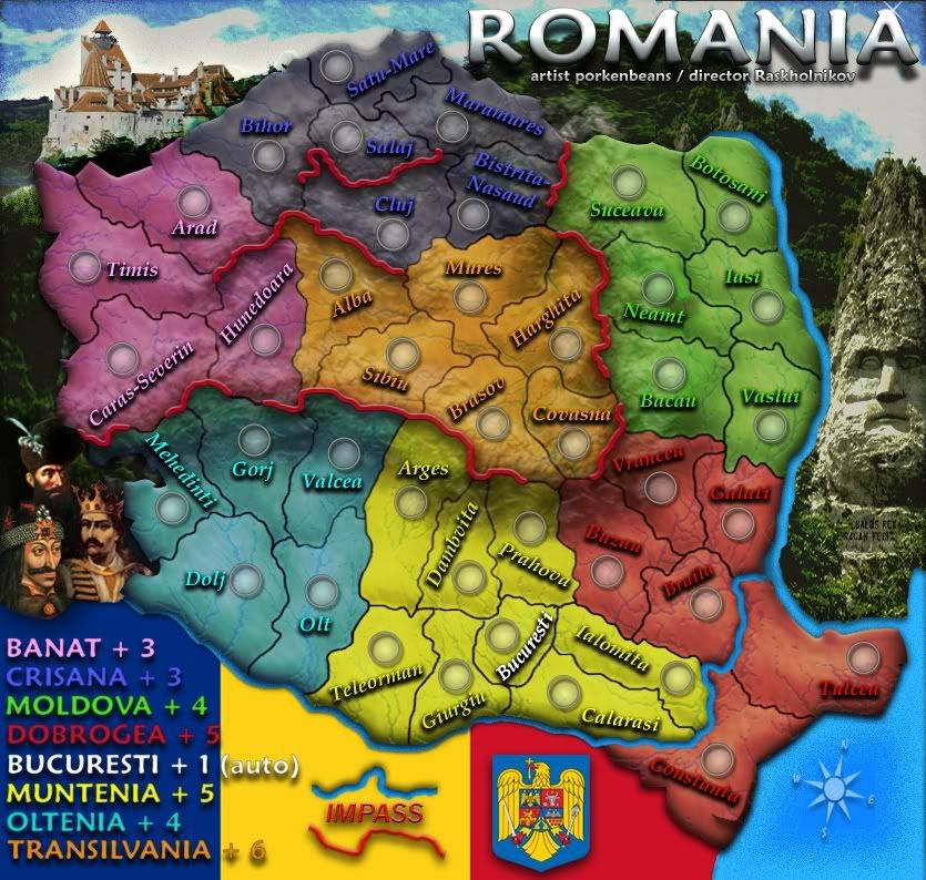
version 9
Re: Romania map
Posted: Thu Oct 22, 2009 9:24 pm
by targetman377
Re: Romania map
Posted: Fri Oct 23, 2009 7:16 am
by Raskholnikov
Re: Romania map
Posted: Fri Oct 23, 2009 4:57 pm
by porkenbeans
Added more of the crew.
added new layer with borders enhanced.
Also I just noticed a problem with the last version, it is blurry in some spots. Don't know what happened. But it is all fixed in this version 10.

- Click image to enlarge.
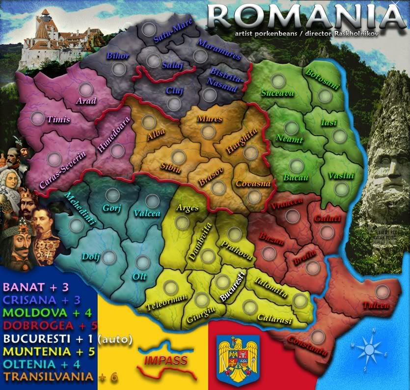
version 10
Re: Romania map
Posted: Fri Oct 23, 2009 5:13 pm
by Industrial Helix
Looking good!
The red lines, what are they representing? If its mountains or something I think it would be best to represent them with actual mountains rather than an abstract red line.
Do those army circles accommodate 3 numbers?
The sea and blue bits of the sky look a little pixelated.
Looks like you're going to need a bridge to Constanza and Tulcea.
I find it hard to read some of the names when they're at a tilt and it seems some are unnecessarily tilted. It might make the map easier to work with as a player if some of the names were level.
The coat of arms and flag seem a little flat in comparison with the other graphics, I think you could add a gradient or something to make those fit in a little better. Maybe another rendition of the coat of arms that has some bevel or something to it.
Is the Bucharesti terr. part of the yellow bonus? If not, perhaps it should be white as well.
Re: Romania map
Posted: Fri Oct 23, 2009 6:26 pm
by Raskholnikov
Helix wrote:
The red lines, what are they representing? If its mountains or something I think it would be best to represent them with actual mountains rather than an abstract red line.
Yes, they are mountains. Good idea, but that might interfere with Pork's graphics. 
Do those army circles accommodate 3 numbers?
I'm sure they do.
The sea and blue bits of the sky look a little pixelated.
Pork will have a look at that...
Looks like you're going to need a bridge to Constanza and Tulcea.
Yes. There is one between Braila and Tulcea.
I find it hard to read some of the names when they're at a tilt and it seems some are unnecessarily tilted. It might make the map easier to work with as a player if some of the names were level.
I'm not sure how much of that can be fixed and still keep each Judet's name within its borders...
The coat of arms and flag seem a little flat in comparison with the other graphics, I think you could add a gradient or something to make those fit in a little better. Maybe another rendition of the coat of arms that has some bevel or something to it.
http://stemaromaniei.files.wordpress.co ... e-buna.jpg
http://www.bfdconf2008.univagora.ro/bdf ... polrom.gif
Is the Bucharesti terr. part of the yellow bonus? If not, perhaps it should be white as well.
Yes it is. That's why it's yellow. But it also gets a +1 autodeploy, which is why the name on the map is white.
Re: Romania map
Posted: Fri Oct 23, 2009 6:48 pm
by porkenbeans
Industrial Helix wrote:Looking good!
The red lines, what are they representing? If its mountains or something I think it would be best to represent them with actual mountains rather than an abstract red line.
Do those army circles accommodate 3 numbers?
The sea and blue bits of the sky look a little pixelated.
Looks like you're going to need a bridge to Constanza and Tulcea.
I find it hard to read some of the names when they're at a tilt and it seems some are unnecessarily tilted. It might make the map easier to work with as a player if some of the names were level.
The coat of arms and flag seem a little flat in comparison with the other graphics, I think you could add a gradient or something to make those fit in a little better. Maybe another rendition of the coat of arms that has some bevel or something to it.
Is the Bucharesti terr. part of the yellow bonus? If not, perhaps it should be white as well.
1.) There ARE actual mountain ranges, and the red lines represent the impasses.
2.) The circles are larger than most other maps that I have seen.
3.) The water and sky are just about the way that I want them.
4.) Yes, I have yet to add the bridge between Tulcea and Braila.
5.) maybe you could take a few moments to read the thread from the start. I have spoke to the placement of the names. They are not exactly how they are going to be. I will play with them some more, but if you can NOT read them the way they are now, you will not be able to read the final placement, as I plan to have all the names tilted at one angle or another.
But you were just kidding about not being able to read them, right ? Aren't you the one that is making that hive map ? the one with 8-10 pixil text ?
6.) I think that I may try and give a little more relief to the flag and Coat of Arms.
Re: Romania map
Posted: Fri Oct 23, 2009 7:27 pm
by captainwalrus
Perhaps lower the opacity of the bonus region colors when it is over the mountains. I think it would give a good effect of the mountains really being there.
Re: Romania map
Posted: Sat Oct 24, 2009 10:09 am
by Industrial Helix
I'm not a fan of using lines to represent mountains when a mountain graphic can do just as well and represent the mountains better. Just a personal preference on that, it's readable as it is and if you're going to run with it then cool.
In regards to the water and sky, I'm not calling for an overhaul of the graphics or anything, i just think you can get a finer gradient without the speckles by saving it differently or perhaps redoing the gradient on the sea. It doesn't have to be different at all, its just the speckles of pixelization are not pleasing to the eye.
As for the text, I just find it hard to read foreign names in a direction different direction other than straight left to right. Personally, I think the text should be horizontal in all cases except where tilting it to fit in a territory is absolutely necessary. I think it makes the map easier to work with during a game as its easier to recognize the name and go to the drop down menu quicker. As it is your intention to tilt all the names, for graphical effect I presume, then I suppose its better to go all in one style rather than mixed styles. Obviously its your call, but I think you should reconsider.
And I'm not working on the hive map which certainly has tiny text, but its all horizontal which I think makes for easier readability.
The tops of the red letters and some of the blue, Cluj and Salaj, seem to clash with the lighter areas of the terr. colors which also hurts readability. Since you're not done with placement yet, I'd suggest keeping this in mind when moving them around.
Re: Romania map
Posted: Sun Oct 25, 2009 10:33 pm
by porkenbeans
@ I.H.,
The water is actually made that way on purpose using noise.
As for the sky, I think that I will go with a whole different one, as I too am not totaly happy with it.
The text, well I was experimenting with using the same colors as the land that they represent. I believe that this effect will make the visuals less cluttered, than to use a contrasting color, such as white or black. This way, the names tend to blend in, and have the overall effect, of showcasing the topography, rather than the overpowering text. It is a very tricky thing to do. If you think that the text needs even more shading, I can try that, but I do not want it to loose the blending in effect that I am shooting for. I want just enough shading to make it legible.
Oh, and the mountains. Well I have already textured in the mountain ranges. I don't think that drawing in little tee-pees on top of that, would be very kosher. I also wished there was a way to NOT have those red lines. I will put some more thought on it. I am sure that a solution can be found.
Re: Romania map
Posted: Sun Oct 25, 2009 11:39 pm
by isaiah40
Is there a way you could bring out the contour of the mountains and just have something showing the passable areas? Right now I can see the mountains pretty clear, but I think if you somehow made them 'pop' out a little more that may help. Then you wouldn't need those red lines.
Maybe lasso them on the original, then put them on this map and kinda of blend in the color from the bonuses? That's what I'm thinking.
Re: Romania map
Posted: Mon Oct 26, 2009 12:31 am
by porkenbeans
Thank you Isaiah,
I appreciate your input on both projects that I am working on. Rask and I have a few more in the idea stages. Hope to see you there as well when I have something up.
Yeah, I was thinking of something along those lines with the mountains. I already have 3 layers of mountain range textures built up. I guess I could just add more and see if I can build some visual peeks.

Re: Romania map
Posted: Mon Oct 26, 2009 2:02 am
by SuicidalSnowman
Peanut gallery/ crew is effing genius. Awesome portraits of some awesome Romanians.
The more you add to the map, the less I noticed the bizarre angles on the territory names. Or maybe its the new colors and topography transparency.
I am wondering, do you think you need to blue outline where Romania borders the black sea? Since you don't have any of the bordering countries shown, I think it might be extraneous. Right now its a little distracting to me.
I agree something needs to be done with mountains. I would say either make them MORE realistic and accurate, or make them more abstract. And what I mean is use the bright red solid line, but don't trace the mountain itself so accurately, just show were it is impassable and where it isn't. Take, for example, Caras-Severin and Mehedinti. Although they do have mountains, they still touch. So just remove the red line completely from between the two of them, and let the topography texture underneath show the mountains, much like with the rivers.
Does that make sense? To have the geography noted as the texture and graphics, but have the gameplay noted by the bright bold colors that you already use as a theme for the map.
Re: Romania map
Posted: Mon Oct 26, 2009 3:25 am
by porkenbeans
@ S.S.,
Yeah, I noticed that too. That line between Cara. and Mehe. is not needed. It WILL be nixed.
Thanx Snow, I am very glad to see you here. I know you to be a pretty wise nut.
and please feel free to offer any comments that you might have. Rask and I truly need the brightest minds on board.
Ya know what, I just had an idea. What if I nixed the red lines, and instead add some snow caps to represent the impasses ? That way I can work it in to the existing mountain range. Hmmmmmmmm.
Re: Romania map
Posted: Mon Oct 26, 2009 11:20 am
by isaiah40
porkenbeans wrote:@ S.S.,
Yeah, I noticed that too. That line between Cara. and Mehe. is not needed. It WILL be nixed.
Thanx Snow, I am very glad to see you here. I know you to be a pretty wise nut.
and please feel free to offer any comments that you might have. Rask and I truly need the brightest minds on board.
Ya know what, I just had an idea. What if I nixed the red lines, and instead add some snow caps to represent the impasses ? That way I can work it in to the existing mountain range. Hmmmmmmmm.
That should work as well!
Re: Romania map
Posted: Mon Oct 26, 2009 1:51 pm
by targetman377
porkenbeans wrote:Thank you Isaiah,
I appreciate your input on both projects that I am working on. Rask and I have a few more in the idea stages. Hope to see you there as well when I have something up.
Yeah, I was thinking of something along those lines with the mountains. I already have 3 layers of mountain range textures built up. I guess I could just add more and see if I can build some visual peeks.
would would make ih happy lol
on the top of your map the black regin i think is just a little too dark i am sure u were going to fix it but i like this map and that's all i really had.
Re: Romania map
Posted: Mon Oct 26, 2009 2:13 pm
by captainwalrus
As for making the mountains pop out more, there was a thread I read on another site that seemed pretty usefull, provided that you use photoshop.
http://forum.cartographersguild.com/sho ... php?t=4405
It is a great site, but you might need to register to see the attachments.
Re: Romania map
Posted: Mon Oct 26, 2009 2:16 pm
by porkenbeans
targetman377 wrote:porkenbeans wrote:Thank you Isaiah,
I appreciate your input on both projects that I am working on. Rask and I have a few more in the idea stages. Hope to see you there as well when I have something up.
Yeah, I was thinking of something along those lines with the mountains. I already have 3 layers of mountain range textures built up. I guess I could just add more and see if I can build some visual peeks.
would would make ih happy lol
on the top of your map the black regin i think is just a little too dark i am sure u were going to fix it but i like this map and that's all i really had.
Thanks targ.,
The reason for the darkness is for contrast. Since the land is so rich in color it really needs that darkness, for it to stand out. otherwise it would not have the silhouette effect that I am shooting for.
Also, I think that when I add the snow caps, I might just go ahead and eliminate the color on the land. I think that this will probably help to give it a more realistic look. Besides, I do have the colored text to denote bonus regions. After that is done, I will revisit the shading of the outside regions of the map. I just may have to go the other way and make it light in tone. We will see when we get there.

Re: Romania map
Posted: Tue Oct 27, 2009 12:16 am
by porkenbeans
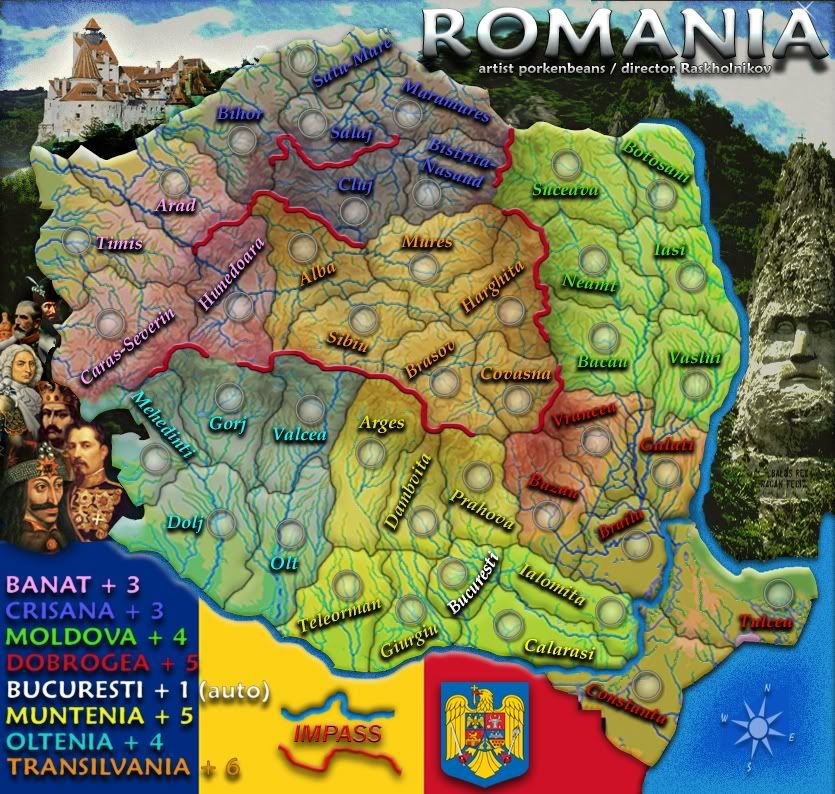
Just playin around with some color options.
- Click image to enlarge.

Re: Romania map
Posted: Tue Oct 27, 2009 8:14 am
by isaiah40
Um, no! It looks like Romania has varicose veins now
It was good the previous version!
Re: Romania map
Posted: Fri Oct 30, 2009 6:19 am
by thenobodies80
isaiah40 wrote:Um, no! It looks like Romania has varicose veins now
It was good the previous version!
Agree with isaiah40, the previous version was better.
Some quick thoughts:
- Text, it's better if you have all the text with the same orientation, now it's a bit annoying.
- Bucuresti is a part of the yellow bonus? If yes, it's better if you don't list the bucuresti autodeploy with the other bonuses (just a line somewhere)
- Again Bucuresti...it starts neutral? i think yes...
- Tulcea and Costanta, borders? How they connect with other regions?
- Bonuses look good, but if you used the bonus spreadsheet, remember that usually you have to increase a bit the value of central bonuses
- Can you keep updated your first post? It will be easier to follow your map and leave some suggestions

Have a nice day
Nobodies
Re: Romania map
Posted: Fri Oct 30, 2009 11:21 am
by AndyDufresne
The map above strangely looks like or has the feel of an organ in the human body---maybe a heart...a lung? Hm.
--Andy
Re: Romania map
Posted: Fri Oct 30, 2009 7:13 pm
by porkenbeans
I do not know why my images are getting fuzzy. This is the 3rd. time I had to go back to photobucket and re-upload.
- Click image to enlarge.
Re: Romania map
Posted: Fri Oct 30, 2009 9:10 pm
by captainwalrus
yeah, no. It was better when it was simple without the excessive rivers. It had a nice simple style before that I liked a lot.
Re: Romania map
Posted: Fri Oct 30, 2009 9:42 pm
by porkenbeans
captainwalrus wrote:yeah, no. It was better when it was simple without the excessive rivers. It had a nice simple style before that I liked a lot.
Thanx, me too, I was just messin around with the last update. Just thought I would throw up, to gauge a response or two.