I like the black best, It gives more Power to the map:D
The red is dashling into the background, but what makes the red good is bigger letters some of the black letter on the map is verry small and hard to read.
So i voted A. But i probbably would have voted none of theese if that was an option atm.
Well guys these is like president candidate for US,someon like one,someon like other,and someon dont like bouth. I dont want to start any campaing with 20-30 options,these two is good and aceptabile for map,i personaly like option 2 55% to 45% first option.
Didint mean to offend you or anything i love the map, i just think a stroke more of black will make option 1 better. I also like option but since is so dazleing into the background it will be hard to see....
Androidz wrote:Didint mean to offend you or anything i love the map, i just think a stroke more of black will make option 1 better. I also like option but since is so dazleing into the background it will be hard to see....
Well like i give you milion time reply,and also give you several map to show how i want to look,you still forcing something what not have any valid argument,these is now how Mrbeen want to be,not how i represent with valid document. I W A N T T O N A M E S B E L I K E I N T H E S E S O U R C E M A P S. Its diferent when MrBeen ignoring mine sugestion in hes topic(its hes topic and he have right to ignore me),but here i dont ignore hem,and i apply hes idea,but change to be like option B,but people vote for mine first option,and i will apply what people vote.
If you think that Mrbeen option is a best,then i think that he still have chance to create better text in hes map,who is not so good,but i dont want to comment these,because i will be ignoring like rest of mine post in hes topic.
qwert wrote:I realy dont understand you Yeti,i give valid explanation why i want to names be L I KE N O W, but its look that you want to ignore these,why?
I can accept that... in fact I think the idea is a great one...
It's the pixelisation on the S P A C E D _ O U T _ L E T T E R S that I don't like.
yeti
I can accept that... in fact I think the idea is a great one...
It's the pixelisation on the S P A C E D _ O U T _ L E T T E R S that I don't like.
C.
Ok,if you have fell that letters is pixely(i dont see that),then yours duty is to say what you do in yours map to eliminate these fell. You tell these several time ,but you not say what is solution. I must say that i dont see these.
No - it's your duty to fix it - I have no clue how to change your image for the letters to be better - I offered a suggestion above... but you ignored it... I don't know whether or not it would've fixed it - but it might have been worth a try?
No - it's your duty to fix it - I have no clue how to change your image for the letters to be better - I offered a suggestion above... but you ignored it... I don't know whether or not it would've fixed it - but it might have been worth a try?
If i understand what you say.Mine duty is to fix your fell that letters is pixely? I belive that you also use PHotoshop,and these mean that yours text font is same like mine, so if in yours map letter is not pixely,then you must tell me what you do to change these fell,what you have with mine letters. I dont have fell that letters is pixely,and that why i dont see what you see.
reply to first update
Ok,here what aim investigate.
Book Antiqua-bold italic-text size 8 and 9 and 10 -chrisp and strong.
First i must say,that its easy to put these letter size in that part of map(they have space),second its a same like mine,only dont have outer glow(well these is not importan so much) and warp efect(these is importan thing on map),so you dont show me nothing special.
reply to second update;
I dont need to upload to see what you add:
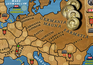
Lugdunensis,Germania(you forget to add Superior,or inferior) and Italy.
Like i say in previos post,its also same like mine but only without outer glow(and its look that is more bright then mine), these is you can se in first page (only without warp).
Do you want to tell me that map without outer glow is better?