Conqueropoly V.13 Pg 1+40 Back on track?
Moderator: Cartographers
Forum rules
Please read the Community Guidelines before posting.
Please read the Community Guidelines before posting.


-
rebelman

- Posts: 2968
- Joined: Thu Aug 02, 2007 5:24 pm
- Gender: Male
- Location: People's Republic of Cork
- Contact:
Here are my observations / suggestions on the latest one:
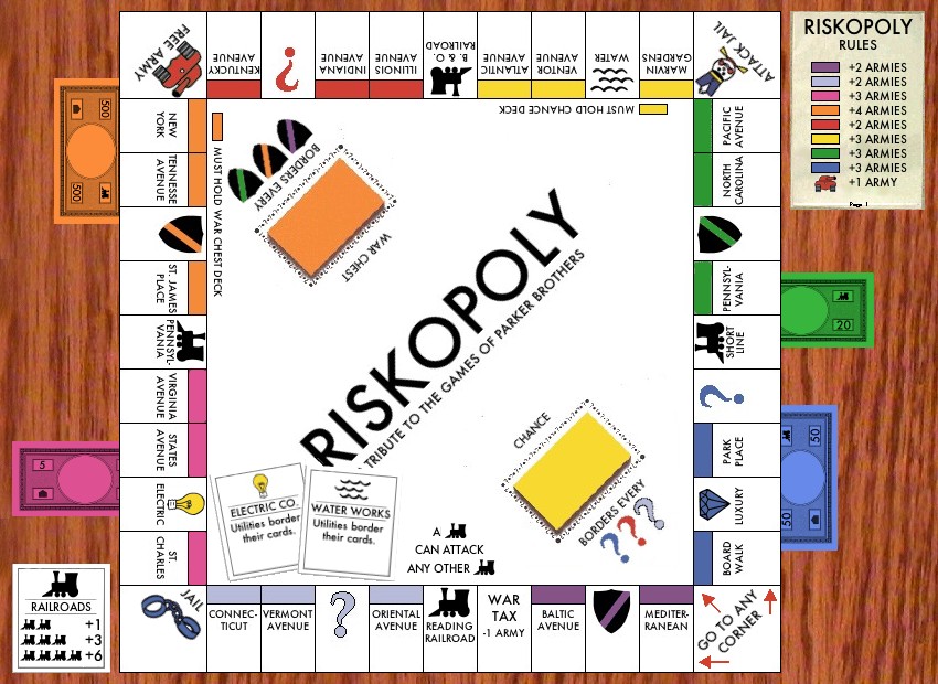
inverse the writing on the cards deck so its facing the oposite diretion
===================================================
throw some money, in the middle of the board not as a terr just for effect and maybe some dice too
==============================================
instead of "attacks can be made in both directions" can you put "all adjacent territories can attack each other" (this would be more accurate)
=================================================
Instead of card 1, 2 and 3 it would be great if these could be green card, red card and blue card this is easily achieved by swapping as follows:
Card 1 and die 1 (card 1 becomes blue card)
card 2 and die 2 (card 2 becomes red card)
card 3 and Ads (card 3 becomes green card)
==================================================
to avoid confusion i would remove the 1, 2, 3 & 4 from the battleship terrs.
==================================================
in the cc corner put the actual cc logo even if you need to change the color to be consistent
==================================================
pick a different colour for the cards deck so it those not clash with the orange terrs.
==================================================
as above for the dice deck so it does not clash with the green terr
==============================================
I think the battleships should not be part of terrs (as per the game also this will help gameplat wise as well as we try and resolve the bonuses
==============================================
Pleas lose the hyphenated words if possible
==============================================
die 3 should not be part of any terr. between this and the battleship chaznge the pink bonus would be more reasonable ie higher because of its location on the board but not impossible to hold
==============================================
remove the names from the dice terrs instead have a 1, 2 and 3 showing on the dice themselves if that makes sence seeing die written down is a bit on the weird side
=============================================
The corner cc logo should be facing over towards free army
===============================================
That graphic on ads has to change
==========================================
if you are struggling with the hyphens i am certain we could collectively come up with several cc related 8 word or less words or phrases, if this is the case let us know
=============================================
i hope all the above makes sense and helps to move this process on
==============================================
Don't now why people on here don't like being cooks, remember under siege: A former SEAL, now cook, is the only person who can stop a gang of terrorists when they sieze control of a US Navy battleship.

Hang on - why bother having this at all...rebelman wrote: instead of "attacks can be made in both directions" can you put "all adjacent territories can attack each other" (this would be more accurate)
Is it not the case that all maps you can attack the adjacent territories!?
C.

Highest score : 2297
-
rebelman
- Posts: 2968
- Joined: Thu Aug 02, 2007 5:24 pm
- Gender: Male
- Location: People's Republic of Cork
- Contact:
yeti theres a reason you are being paid the big bucksyeti_c wrote:Hang on - why bother having this at all...rebelman wrote: instead of "attacks can be made in both directions" can you put "all adjacent territories can attack each other" (this would be more accurate)
Is it not the case that all maps you can attack the adjacent territories!?
C.
Don't now why people on here don't like being cooks, remember under siege: A former SEAL, now cook, is the only person who can stop a gang of terrorists when they sieze control of a US Navy battleship.
-
rebelman
- Posts: 2968
- Joined: Thu Aug 02, 2007 5:24 pm
- Gender: Male
- Location: People's Republic of Cork
- Contact:
yes or preferably just name in the xml if you have to not on the face of the mapGilligan wrote:And name them by color?rebelman wrote:to avoid confusion i would remove the 1, 2, 3 & 4 from the battleship terrs.
Don't now why people on here don't like being cooks, remember under siege: A former SEAL, now cook, is the only person who can stop a gang of terrorists when they sieze control of a US Navy battleship.
-
Bad Speler
- Posts: 1027
- Joined: Fri Jun 02, 2006 8:16 pm
- Gender: Male
- Location: Ottawa
- Contact:
New GRAPHICS TO-DO List:
1. Make Legend look more like paper.
2. Replace Ads graphic
3. Add dice (i'm not sure about money - the monopoly money is copyright...regular money may or may not be)
4. Get rid of Attacks can be made in both directions (not sure why i put it on in the first place)
5. Instead of numbers for dice, cards and battleships, I will put colour names
6. New colours for the decks
7. Taking suggestions for words not needing a hyphen.
Things I'm not doing yet unless more people object:
- Flipping the cards deck text the other way around - i dont think people want to read partially upside down
- Changing the CC logo to actual colours in the corner, I like it to be consistent with other corners.
Gameplay tweaks will come after graphics.
Highest Score: 2532
Highest Position: 69 (a long time ago)
Highest Position: 69 (a long time ago)
-
rebelman
- Posts: 2968
- Joined: Thu Aug 02, 2007 5:24 pm
- Gender: Male
- Location: People's Republic of Cork
- Contact:
There is a whole host of upside down reading on this map but fair enoughBad Speler wrote:New GRAPHICS TO-DO List:
Things I'm not doing yet unless more people object:
- Flipping the cards deck text the other way around - i dont think people want to read partially upside down
- Changing the CC logo to actual colours in the corner, I like it to be consistent with other corners.
Gameplay tweaks will come after graphics.
And can you at least make it the cc logo but hold your colour (also the CC letters should be inversed so they face in towards the board ala the other corners)
Don't now why people on here don't like being cooks, remember under siege: A former SEAL, now cook, is the only person who can stop a gang of terrorists when they sieze control of a US Navy battleship.
-
Night Strike

- Posts: 8509
- Joined: Wed Apr 18, 2007 2:52 pm
- Gender: Male
What bugged me earlier is that I believe the small map used mixed case while the large used all Upper. Make them all mixed case and you should have a much better time.
Rebelman suggested adding money to the middle (and perhaps other places). To keep it CC style, perhaps find a way to place points or armies in the middle. Or the rank icons.
Rebelman suggested adding money to the middle (and perhaps other places). To keep it CC style, perhaps find a way to place points or armies in the middle. Or the rank icons.

-
bonobo`s son
- Posts: 420
- Joined: Thu Jan 04, 2007 11:27 am
- Location: Amsterdam - Artis


attacking adjacent territories is not correct, cause u cant attack multis except from attack multisyeti_c wrote:Hang on - why bother having this at all...rebelman wrote: instead of "attacks can be made in both directions" can you put "all adjacent territories can attack each other" (this would be more accurate)
Is it not the case that all maps you can attack the adjacent territories!?
C.
But that is said in the legend, and should be.bryguy wrote:attacking adjacent territories is not correct, cause u cant attack multis except from attack multisyeti_c wrote:Hang on - why bother having this at all...rebelman wrote: instead of "attacks can be made in both directions" can you put "all adjacent territories can attack each other" (this would be more accurate)
Is it not the case that all maps you can attack the adjacent territories!?
C.

-
Bad Speler
- Posts: 1027
- Joined: Fri Jun 02, 2006 8:16 pm
- Gender: Male
- Location: Ottawa
- Contact:

-changed dice, cards, dice names
-Replaced ad graphic with all i can think of
-Got rid of attacks can be made in both directions
-changed deck colours
Had trouble with legend and dice, are the ones i have good enough?
Still have to get around to money
Highest Score: 2532
Highest Position: 69 (a long time ago)
Highest Position: 69 (a long time ago)
-
Night Strike
- Posts: 8509
- Joined: Wed Apr 18, 2007 2:52 pm
- Gender: Male

I invite you all to take a look back at EvilOtto's old monopoly map, and tell me why it looks so much less flat than the new version.
Some things I prefer about the old one are the use of color, the better use of space, the playfulness of the trains and other images, the upside-down text at the top of the board, and the white board gives the whole thing a nice crispness. It is by no means perfect, but I think some lessons can be learned here.
Some things I prefer about the old one are the use of color, the better use of space, the playfulness of the trains and other images, the upside-down text at the top of the board, and the white board gives the whole thing a nice crispness. It is by no means perfect, but I think some lessons can be learned here.
-
rebelman
- Posts: 2968
- Joined: Thu Aug 02, 2007 5:24 pm
- Gender: Male
- Location: People's Republic of Cork
- Contact:
Many of my earlier suggestions still remain valid I believe (edits in blue)
rebelman wrote:Here are my observations / suggestions on the latest one:
inverse the writing on the cards deck so its facing the opposite direction (still a valid suggestion)
===================================================
throw some money, in the middle of the board not as a terr just for effect and maybe some dice too (still a valid suggestion)
==============================================
instead of "attacks can be made in both directions" can you put "all adjacent territories can attack each other" (this would be more accurate) sorted
=================================================
Instead of card 1, 2 and 3 it would be great if these could be green card, red card and blue card this is easily achieved by swapping as follows:
Card 1 and die 1 (card 1 becomes blue card)
card 2 and die 2 (card 2 becomes red card)
card 3 and Ads (card 3 becomes green card)
still a valid suggestion but the numbers are now colours
==================================================
to avoid confusion i would remove the 1, 2, 3 & 4 from the battleship terrs.
sorted
==================================================
in the cc corner put the actual cc logo even if you need to change the color to be consistent
shot down
==================================================
pick a different colour for the cards deck so it those not clash with the orange terrs.
sorted
==================================================
as above for the dice deck so it does not clash with the green terr
sorted
==============================================
I think the battleships should not be part of terrs (as per the game also this will help gameplat wise as well as we try and resolve the bonuses
(still a valid suggestion)
==============================================
Pleas lose the hyphenated words if possible
(lot done, more to do)
==============================================
die 3 should not be part of any terr. between this and the battleship change the pink bonus would be more reasonable ie higher because of its location on the board but not impossible to hold
(still a valid suggestion)
==============================================
remove the names from the dice terrs instead have a 1, 2 and 3 showing on the dice themselves if that makes sense seeing die written down is a bit on the weird side
still a valid suggestion
=============================================
The corner cc logo should be facing over towards free army
still a valid suggestion
===============================================
That graphic on ads has to change
still a valid suggestion but as suggest by night strike it needs to become something totally different as we don't do ads here
==========================================
if you are struggling with the hyphens i am certain we could collectively come up with several cc related 8 word or less words or phrases, if this is the case let us know
still a valid suggestion
=============================================
i hope all the above makes sense and helps to move this process on
==============================================
Don't now why people on here don't like being cooks, remember under siege: A former SEAL, now cook, is the only person who can stop a gang of terrorists when they sieze control of a US Navy battleship.
-
rebelman
- Posts: 2968
- Joined: Thu Aug 02, 2007 5:24 pm
- Gender: Male
- Location: People's Republic of Cork
- Contact:
you guys have lots of upside down text on this map i have brutal eyesight and upside down text is still easy to read for meGilligan wrote:We did have that earlier. But it was ruled out because people would have trouble reading it.oaktown wrote:The upside-down text at the top of the board
Don't now why people on here don't like being cooks, remember under siege: A former SEAL, now cook, is the only person who can stop a gang of terrorists when they sieze control of a US Navy battleship.