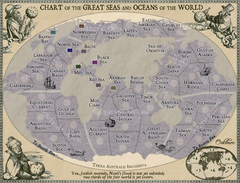
edbeard wrote:well the names of the continents were more readable in the older version. Or, at least I remember them being clearer.
right, they'll need to be moved around, and perhaps the color changed for clarity. I still contend that the continent names aren't really necessary for gameplay - but if I took out the names it might blow people's minds.

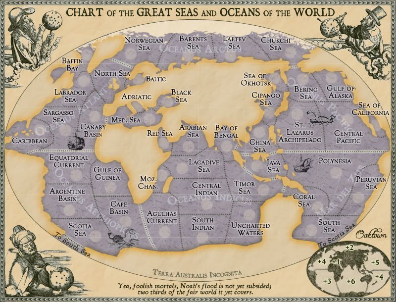
edbeard wrote:The Sea Of California territory doesn't appear to have a border on the west.
there is one, but both borders are with the same territory - the central pacific. In placing the terit name I didn't worry too much about where it went, since the second border was redundant, but I guess it would be more clear if you could see both.
edbeard wrote:The problem with your current setup from a visual p.o.v. is that the continent separation for Mar Del Zur could be confusing. Though, I think you're still working on all the graphics.
Yeah, I don't like the western border there much either. I'll take more liberties with actual geography and make the continent separations more logical. This will actually be a pretty easy fix.
edbeard wrote:One observation, you can hold the Seas continent and Oceanus Atlantic with two territories now.
It does seem a bit strange to have a +6 that only has 3 borders. I'm not sure it's bad since it requires 10 territories to hold and expansion is difficult.
Hmm, we may miss the Red Sea connection after all, since it opened up the two sides of the world to each other. A fix will probably probably mean adding another border territory to Aethiopicus, and bumpingit up to a +4 like Zur. Leaving it alone will mean that one lucky player may be able to build out to hold an eleven territory+5 bonus with two borders (which isn't terrible really), and then a 15 territory +7 with just two borders. Ick. I'll extend the Guinea border north to meet Canary.
As for the 10 terits, 3 borders, +6: I think this is in line with the classic game, in which N. America has 9 terits, 3 borders, an easy expansion, and +5.
edbeard wrote:I hope the land goes back to the previous update look (bottom page

. Those colours meshed well together.
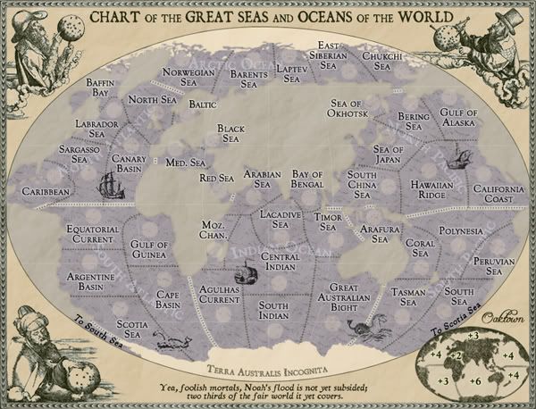
Really? I didn't much like the greyish land - the land is a work in progress, so let's address this later.


