[Abandoned] - Indian Subcontinent
Moderator: Cartographers
Forum rules
Please read the Community Guidelines before posting.
Please read the Community Guidelines before posting.


-
whitestazn88
- Posts: 3128
- Joined: Mon Feb 05, 2007 2:59 pm
- Gender: Male
- Location: behind you
- Contact:

I think it is. Maybe find a font that is wider but not too much taller.
I don't like you army circles. I'd prefer a uniform color form them rather then that effect you did. I guess what I'm saying is I like version 6's circles better.
After next update I'll probably release you into the wild (aka Main Foundry).
I don't like you army circles. I'd prefer a uniform color form them rather then that effect you did. I guess what I'm saying is I like version 6's circles better.
After next update I'll probably release you into the wild (aka Main Foundry).
awesome; I have another update coming up. That photoshop guide in the foundry discussion has helped a lot.
Do you think a bevel effect on the army circles (which I added before you commented) would look good?
I'm also thinking of adding a poll next update to decide on how the army circles should look.
Do you think a bevel effect on the army circles (which I added before you commented) would look good?
I'm also thinking of adding a poll next update to decide on how the army circles should look.

-
Ogrecrusher
- Posts: 250
- Joined: Thu Aug 16, 2007 2:55 pm
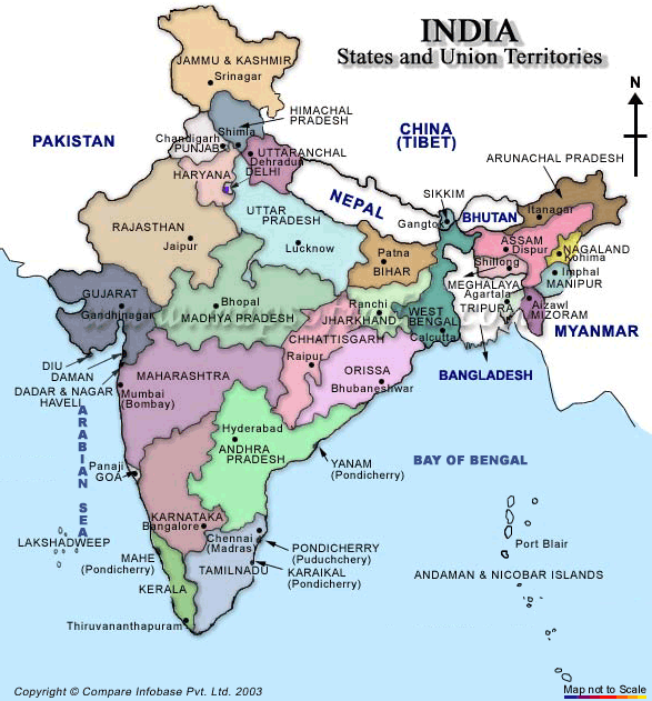
Maybe this issue is for the main foundry, but Delhi is in the wrong place.
http://www.mapsofindia.com/maps/india/map-of-india.gif
You can see on this map, Delhi is a tiny province between Haryana and Uttar Pradesh.
What you have Labelled as Delhi is in fact Uttaranchal.
http://www.mapsofindia.com/maps/india/map-of-india.gif
You can see on this map, Delhi is a tiny province between Haryana and Uttar Pradesh.
What you have Labelled as Delhi is in fact Uttaranchal.
I originally thought Uttaranchal would be too long a name, so I changed it to Delhi. I'm not so sure it's that impossible anymore, but is it honestly such a big deal? Classic is much more inaccurate than this map.Ogrecrusher wrote:Maybe this issue is for the main foundry, but Delhi is in the wrong place.
http://www.mapsofindia.com/maps/india/map-of-india.gif
You can see on this map, Delhi is a tiny province between Haryana and Uttar Pradesh.
What you have Labelled as Delhi is in fact Uttaranchal.

-
whitestazn88
- Posts: 3128
- Joined: Mon Feb 05, 2007 2:59 pm
- Gender: Male
- Location: behind you
- Contact:
-
Ogrecrusher
- Posts: 250
- Joined: Thu Aug 16, 2007 2:55 pm
I think it's a problem when you move the capital city to some random region. I think accuracy is important unless there are good gameplay or other reasons. I don't think laziness to change it or whatever is a good reason, hehInkL0sed wrote:I originally thought Uttaranchal would be too long a name, so I changed it to Delhi. I'm not so sure it's that impossible anymore, but is it honestly such a big deal? Classic is much more inaccurate than this map.Ogrecrusher wrote:Maybe this issue is for the main foundry, but Delhi is in the wrong place.
http://www.mapsofindia.com/maps/india/map-of-india.gif
You can see on this map, Delhi is a tiny province between Haryana and Uttar Pradesh.
What you have Labelled as Delhi is in fact Uttaranchal.
Sure Classic is Inaccurate, but at least the regions are in the right place. Merging 2 regions and then calling it by the name of one is fine, but what you've done is like merging Mongolia and China, calling that China, which is fine, but then renaming Japan as Mongolia, which is not.
If you want Delhi as its own region, why not rename the Haryana one as Delhi, at least that actually covers the land that Delhi is on.
Cheers.
-
Ogrecrusher
- Posts: 250
- Joined: Thu Aug 16, 2007 2:55 pm
Yeah, the link I gave (maybe the same pitcure you used?) is a little misleading on first glace. This map shows it better.InkL0sed wrote:I was under the impression that Delhi was in Uttaranchal, but I guess I was mistaken. I'll find a better name.
http://www.avert.org/media/images/india-map.gif
Version 9:
I know it's been a while, but here it is.

Changes:
-Made the image "pop" a little more, with a little help from the Inner Shadow layer setting
-Set the mini-map to Dissolve, in an attempt to make it look like it is dissolving into the background
-Changed Delhi to Uttaranchal
Comments? Am I moving now?
I know it's been a while, but here it is.
Changes:
-Made the image "pop" a little more, with a little help from the Inner Shadow layer setting
-Set the mini-map to Dissolve, in an attempt to make it look like it is dissolving into the background
-Changed Delhi to Uttaranchal
Comments? Am I moving now?

Gosh, so many complaints about the legend! I don't know how to win with you guys 
Skittles!, Coleman said he preferred the lack of a background. Of course, the one that I had was horrible. Still, I agree with him. Maybe I can change the color of Northern India? The problem is that the colors are a little dulled when I post them...
Skittles!, Coleman said he preferred the lack of a background. Of course, the one that I had was horrible. Still, I agree with him. Maybe I can change the color of Northern India? The problem is that the colors are a little dulled when I post them...
Thanks. I generally don't like images and whatnot, but I'm up for anything that works. What do you suggest? A picture of Ghandi perhaps? I like that idea because he was opposed to the Pakistan-India split.jnd94 wrote:maybe you should put an image where the blue water is. May spice it up. Other than that, looks awesome!
-
Sir. Ricco

- Posts: 4555
- Joined: Tue Oct 02, 2007 2:33 pm
- Gender: Male
- Location: Making kingdoms burn and bloodshed start.
- Contact:


I like the pink and blue best. Colors are going to be a personal preference though.Sir. Ricco wrote:I really don't like the pink. The other colors are great. The area outside the map needs more work. I like the water.
I believe a flag might be in order, as well as a picture of Ghandi.
The rivers could stand a graphical update. I suggest making them thinner and more realistic.
Finally, there seems to be a circle missing in Eastern India. I'm not sure what the name of that territory is either.
Keep up the good work.
LMR
I'm just stating the it's hard to read the blue of Northern India to the brown of the dead-land. It leaves an awful shade behind it which reflects the words so much it's hard to read.InkL0sed wrote:Gosh, so many complaints about the legend! I don't know how to win with you guys
Skittles!, Coleman said he preferred the lack of a background. Of course, the one that I had was horrible. Still, I agree with him. Maybe I can change the color of Northern India? The problem is that the colors are a little dulled when I post them...
KraphtOne wrote:when you sign up a new account one of the check boxes should be "do you want to foe colton24 (it is highly recommended) "
I really hate that river as well, I'll redo it.laci_mae wrote:I like the pink and blue best. Colors are going to be a personal preference though.Sir. Ricco wrote:I really don't like the pink. The other colors are great. The area outside the map needs more work. I like the water.
I believe a flag might be in order, as well as a picture of Ghandi.
The rivers could stand a graphical update. I suggest making them thinner and more realistic.
Finally, there seems to be a circle missing in Eastern India. I'm not sure what the name of that territory is either.
Keep up the good work.
LMR
The problem with a flag and Ghandi is that the totally biases India. This is, after all, more a map of a geographical region than a political one, hence the name Indian Subcontinent. So maybe I could do all the countries' flags, and maybe Ghandi will work despite what I just said, but I'd like others' opinions on that.
The "missing circle" is not in fact missing. That area you see is part of West Bengal. I've been waiting on comments about that. How do you think I can make it clearer that the river does not split the territory in two?
I understand. I'll try to find a solution. The only thing is I don't know how well the colors will translate. They are all much more vibrant on my desktop than on the Internet.Skittles! wrote:Skittles!, Coleman said he preferred the lack of a background. Of course, the one that I had was horrible. Still, I agree with him. Maybe I can change the color of Northern India? The problem is that the colors are a little dulled when I post them...InkL0sed wrote: Gosh, so many complaints about the legend! I don't know how to win with you guys Razz
I'm just stating the it's hard to read the blue of Northern India to the brown of the dead-land. It leaves an awful shade behind it which reflects the words so much it's hard to read.

I've released three versions since you said this, Coleman. Methinks you have not been looking at this thread at all.Coleman wrote:I think it is. Maybe find a font that is wider but not too much taller.
I don't like you army circles. I'd prefer a uniform color form them rather then that effect you did. I guess what I'm saying is I like version 6's circles better.
After next update I'll probably release you into the wild (aka Main Foundry).