Iceland [Quenched]
Moderator: Cartographers
Forum rules
Please read the Community Guidelines before posting.
Please read the Community Guidelines before posting.
-
Mr. Squirrel

- Posts: 157
- Joined: Fri Nov 02, 2007 3:18 pm
- Location: up a tree
Re: Iceland (New Poll for Green/Blue Oceans 1st Post)
The map looks great, but I personally prefer the lighter blue sea. With the green one, it looks like someone puked in the water. 

Re: Iceland (New Poll for Green/Blue Oceans 1st Post)
Hmm... thats not good. I don't want any chunks floating around my map. !Mr. Squirrel wrote:The map looks great, but I personally prefer the lighter blue sea. With the green one, it looks like someone puked in the water.
I've got an update I'll post either tomorrow or Monday. I've toned the green down & mixed with a deeper blue than the original blue. I like it. I've also made all the names consistent with the Icelandic characters. The xml will be a lot harder, but I would prefer to keep it true to the source.


Re: Iceland (New Poll for Green/Blue Oceans 1st Post)
... looking forward to your update RJ!
-
Ruben Cassar

- Posts: 2160
- Joined: Thu Nov 16, 2006 6:04 am
- Gender: Male
- Location: Civitas Invicta, Melita, Evropa
Re: Iceland (New Poll for Green/Blue Oceans 1st Post)
That sounds great RJ. Looking forward to play on this map. I also like the no gimmicks approach you mentioned earlier.RjBeals wrote:Hmm... thats not good. I don't want any chunks floating around my map. !Mr. Squirrel wrote:The map looks great, but I personally prefer the lighter blue sea. With the green one, it looks like someone puked in the water.
I've got an update I'll post either tomorrow or Monday. I've toned the green down & mixed with a deeper blue than the original blue. I like it. I've also made all the names consistent with the Icelandic characters. The xml will be a lot harder, but I would prefer to keep it true to the source.


-
CatfishJohnson

- Posts: 137
- Joined: Tue Feb 19, 2008 3:47 pm
- Location: Michigan
- Contact:
Re: Iceland (New Poll for Green/Blue Oceans 1st Post)
lol thanks rj for liking my idea about the water, sorry i havent posted in awhile life beacons at times for more importent things,
-
btownmeggy

- Posts: 2042
- Joined: Thu Jan 04, 2007 1:43 am
Re: Iceland (New Poll for Green/Blue Oceans 1st Post)
It is SO lovely. Graphically, it's one of the top three most beautiful maps I've seen. I, too, am all about 'standard' map styles, but the ring gives a nice 'twist'. I love both of the water colors.
I'm sorry this isn't a particularly constructive post, I just want to commend you for a job really well done so far.
I'm sorry this isn't a particularly constructive post, I just want to commend you for a job really well done so far.
-
rebelman

- Posts: 2968
- Joined: Thu Aug 02, 2007 5:24 pm
- Gender: Male
- Location: People's Republic of Cork
- Contact:
Re: Iceland (New Poll for Green/Blue Oceans 1st Post)
the greenish blue looks more realistic an in keeping with arctic waters so i voted for that one.
Don't now why people on here don't like being cooks, remember under siege: A former SEAL, now cook, is the only person who can stop a gang of terrorists when they sieze control of a US Navy battleship.

Re: Iceland (New Poll for Green/Blue Oceans 1st Post)
I completely agree with that. I'm looking forward to this map very much.btownmeggy wrote:It is SO lovely. Graphically, it's one of the top three most beautiful maps I've seen. I, too, am all about 'standard' map styles, but the ring gives a nice 'twist'. I love both of the water colors.
I'm sorry this isn't a particularly constructive post, I just want to commend you for a job really well done so far.
I think the old blue water looks much better than the greener one, personally, but perhaps a compromise could be made between the two. Since the poll is so close now, that might have to be done.

Re: Iceland (New Poll for Green/Blue Oceans 1st Post)
First of all, great and fabulous map.
Great artwork and colors
Only thing is that I vote for the wrong version.
The best is in my opinion: NEW GREENISH BLUE OCEAN
But I pushed the wrong button and my vote goes to the Original Deep Blue, but must have been:
NEW GREENISH BLUE OCEAN.
I hope it will be soon playable. I can't wait.
Its one of the greatest artwork (even better then mine)
Grtz
MarVal
 highest score: 2157 (Major) / Verd ori'shya beskar'gam

Re: Iceland (New Poll for Green/Blue Oceans 1st Post)
Thanks for the good words Marval. I've toned down the green a bit & blended it with a deeper blue. I think it looks good - I'll post the update soon.MarVal wrote:But I pushed the wrong button and my vote goes to the Original Deep Blue, but must have been:
NEW GREENISH BLUE OCEAN.MarVal
-
Incandenza

- Posts: 4949
- Joined: Thu Oct 19, 2006 5:34 pm
- Gender: Male
- Location: Playing Eschaton with a bucket of old tennis balls
Re: Iceland (New Poll for Green/Blue Oceans 1st Post)
The new greenish-blue ocean looks incredible...
This map is so damn sexy I want to slip it roofies and have my way with it. Can't wait to dial up some Sigur Ros on my ipod and give it a whirl.
(the names will take some getting used to, and I foresee my roommate and I coming up with some entertaining mispronunciations when we play some doubles, but this is one of those moments where authenticity is key)
THOTA: dingdingdingdingdingdingBOOM
Te Occidere Possunt Sed Te Edere Non Possunt Nefas Est
Te Occidere Possunt Sed Te Edere Non Possunt Nefas Est

Re: Iceland (New Poll for Green/Blue Oceans 1st Post)
Very nice map. And yeah, I vote for classic blue ocean. Please make a note of that folks!
Re: Iceland (New Poll for Green/Blue Oceans 1st Post)
*UPDATE* APRIL-15
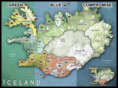
I've also updated all the territ names to be in Icelandic. I'm not sure what the legend translation is for "Northern" and so on... I've posted a question on the Norwegian board, but haven't heard anything yet - so if anyone here knows..
Any more concerns with the map as it is now, including the legend and bonus amounts?
If not, I will start making the small map.
Thanks.
- Click image to enlarge.
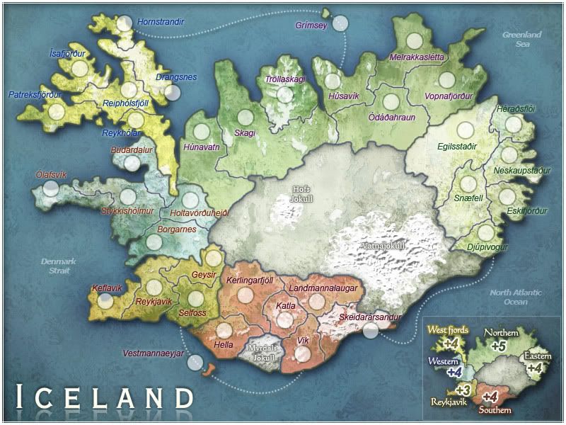
Give my your opinion on the legend map now benny. The overall contrast of the map edges has changed, and I think it looks fine now. I've added more shadow to the edges, which has deepened the legend color in the process.benny profane wrote:
...on the mini map, i think only reykjavik, the glacier, and southern need to be lightened a bit.
Correct Mr. Johnson. You make perfect sense.CatfishJohnson wrote: The thing is man, the colder water is the blue/purple it is, and Iceland is in a very norther region so the ocean surrounding it is extrememly cold, yet the water INSIDE, is super heated by geothermal energy so i think a in between blue green OR maybe a darkblue purplish...
Basically thats what I did. Since the ocean color poll was pretty much evenly divided - i decided to give a little and settle on an in-between shade. Definitely not green, but I think this feels "deeper" like CatfishJohnson stated earlier. Deep Blue Sea !MrBenn wrote: I'm not convinced by the greenyness of the sea in your last update - I preferred the blue. Having said that, perhaps you could try a bluey-green that is somewhere between the 2??
I've also updated all the territ names to be in Icelandic. I'm not sure what the legend translation is for "Northern" and so on... I've posted a question on the Norwegian board, but haven't heard anything yet - so if anyone here knows..
Any more concerns with the map as it is now, including the legend and bonus amounts?
If not, I will start making the small map.
Thanks.
Re: Iceland (April-15 Update 1st Post / Pg.11)
I love this new ocean color!
With the legend, I think most of it looks fine, but the glow around the word West Fjords looks stronger than the glow around any of the other text in the legend. Is that just an illusion because of the contrast to the ocean, or is it actually a pixel or two larger?
With the legend, I think most of it looks fine, but the glow around the word West Fjords looks stronger than the glow around any of the other text in the legend. Is that just an illusion because of the contrast to the ocean, or is it actually a pixel or two larger?
-
BENJIKAT IS DEAD

- Posts: 775
- Joined: Sun Jan 06, 2008 9:47 am
- Location: Waterloo
Re: Iceland (April-15 Update 1st Post / Pg.11)
The compromise colour is beautiful  - as is the whole map

-
AndyDufresne

- Posts: 24919
- Joined: Fri Mar 03, 2006 8:22 pm
- Location: A Banana Palm in Zihuatanejo
- Contact:
Re: Iceland (April-15 Update 1st Post / Pg.11)
Agreed on the compromise.
--Andy
--Andy
Re: Iceland (April-15 Update 1st Post / Pg.11)
Yep. I copied the same layer to each of the regions. They are the same, just the color contrast makes it look more.ZeakCytho wrote: ...but the glow around the word West Fjords looks stronger than the glow around any of the other text in the legend. Is that just an illusion...
Glad you guys like the new blue color. I'm happy with the overall look of the map.
- Click image to enlarge.
Re: Iceland (April-15 Update 1st Post / Pg.11)
I agree. Terrific color balanceBENJIKAT IS DEAD wrote:The compromise colour is beautiful
Grtz
MarVal
highest score: 2157 (Major) / Verd ori'shya beskar'gam-
Mr. Squirrel
- Posts: 157
- Joined: Fri Nov 02, 2007 3:18 pm
- Location: up a tree
Re: Iceland (April-15 Update 1st Post / Pg.11)
I like the new color too. I still think that the older, lighter blue was better, but this darker blue looks good too and if other people like it better, I am not going to argue. I know you have to try to appeal to the masses.
-
protectedbygold

- Posts: 48
- Joined: Sat Dec 08, 2007 9:06 pm
Re: Iceland (April-15 Update 1st Post / Pg.11)
Wow, what a great map. Can't wait to play on it.

Re: Iceland (April-15 Update 1st Post / Pg.11)
I've liked them all. I'd say you're pretty safe to get cracking on the code & small map.

-
gimil

- Posts: 8599
- Joined: Sat Mar 03, 2007 12:42 pm
- Gender: Male
- Location: United Kingdom (Scotland)
Re: Iceland (April-15 Update 1st Post / Pg.11)
RJ mate all your missing is a sig.
What do you know about map making, bitch?
Top Score:2403natty_dread wrote:I was wrong
-
gimil
- Posts: 8599
- Joined: Sat Mar 03, 2007 12:42 pm
- Gender: Male
- Location: United Kingdom (Scotland)
Re: Iceland (April-15 Update 1st Post / Pg.11)
Also RJ could I have a small copy to check there no major issues after resizing.
What do you know about map making, bitch?
Top Score:2403natty_dread wrote:I was wrong
-
The Viking

- Posts: 148
- Joined: Fri Feb 15, 2008 10:58 am
Re: Iceland (April-15 Update 1st Post / Pg.11)
Minor suggestions- change vik to vík (Reykjavík, Keflavík, Vík), Búdardalur to Búðardalur and Skeidarársandur to Skeiðarársandur.
Oh, jokull to jökull too.
Oh, jokull to jökull too.
Re: Iceland (April-15 Update 1st Post / Pg.11)
Will do.The Viking wrote:Minor suggestions- change vik to vík (Reykjavík, Keflavík, Vík), Búdardalur to Búðardalur and Skeidarársandur to Skeiðarársandur. Oh, jokull to jökull too.
I'll be working on the small map soon (and add my signature