San Marino [Quenched]
Moderator: Cartographers
Forum rules
Please read the Community Guidelines before posting.
Please read the Community Guidelines before posting.
-
Lone.prophet
- Posts: 1467
- Joined: Thu Oct 12, 2006 4:37 pm
- Location: Your basement Muahaha
Re: Repubblica di San Marino - Vote in poll - Map on page 1
i think the font is to small and blends in to much with the green color

-
Ruben Cassar

- Posts: 2160
- Joined: Thu Nov 16, 2006 6:04 am
- Gender: Male
- Location: Civitas Invicta, Melita, Evropa
Re: Repubblica di San Marino - Vote in poll - Map on page 1
Coming up in the next update.Ogrecrusher wrote:Balsiefen wrote:Definatly +1, i would also say that a continent with 3 territs and 1 boarder should also only be a +1
Also you should get continent names up, so we know what we're talking about.
Agreed.


-
Ruben Cassar
- Posts: 2160
- Joined: Thu Nov 16, 2006 6:04 am
- Gender: Male
- Location: Civitas Invicta, Melita, Evropa
Re: Repubblica di San Marino - Vote in poll - Map on page 1
Sorry but there was a poll about the fonts and a lengthy discussion where it resulted that people wanted them to blend.Lone.prophet wrote:i think the font is to small and blends in to much with the green color
The fonts are something that is not going to change again at this stage.

Re: Repubblica di San Marino - Vote in poll - Map on page 1
1, its too easy to grab early in the game.

-
Ruben Cassar
- Posts: 2160
- Joined: Thu Nov 16, 2006 6:04 am
- Gender: Male
- Location: Civitas Invicta, Melita, Evropa
Re: Repubblica di San Marino - Vote in poll - Map on page 1
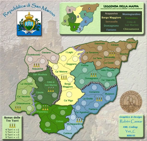
Here's a new update guys. Let me know what you think about it.
Version 1.15 - New rivers, refined regional borders, new mini map, added regions to mini map, moved tre torri bonus to lower left
Version 1.15 - New rivers, refined regional borders, new mini map, added regions to mini map, moved tre torri bonus to lower left
- Click image to enlarge.

Re: Repubblica di San Marino - Vote in poll - Map on page 1
It seems like the river comes out of the map rather than being set into it. I think this should be reversed.
The city emblem thing right by the title looks slightly odd. I can't really put my finger on what it is. I think it might be that it has no bevel/glow (not sure which it is) on the top and left sides like the legend, bonus box, and signature do. This makes it look really flat compared to everything else on the map. But it's still very bright and attention-grabbing, so if you were making it different to be subtle because it's not part of the map, that didn't really work. So I'd either do it in the same style as the other boxes or fade it a bit.
I think the title would look better if it were a few points larger.
I don't like the sharp contrast in the legend box between the regular background and the stuff the region names are on top of. Could you make the transition a bit more gradual, or add bevel or something similar to the continent-names box so it's more clearly a separate entity?
-
Ruben Cassar
- Posts: 2160
- Joined: Thu Nov 16, 2006 6:04 am
- Gender: Male
- Location: Civitas Invicta, Melita, Evropa
Re: Repubblica di San Marino - Vote in poll - Map on page 1
I have started working on all these points and should have already fixed 3 out of 4 for the next update.ZeakCytho wrote:It seems like the river comes out of the map rather than being set into it. I think this should be reversed.
The city emblem thing right by the title looks slightly odd. I can't really put my finger on what it is. I think it might be that it has no bevel/glow (not sure which it is) on the top and left sides like the legend, bonus box, and signature do. This makes it look really flat compared to everything else on the map. But it's still very bright and attention-grabbing, so if you were making it different to be subtle because it's not part of the map, that didn't really work. So I'd either do it in the same style as the other boxes or fade it a bit.
I think the title would look better if it were a few points larger.
I don't like the sharp contrast in the legend box between the regular background and the stuff the region names are on top of. Could you make the transition a bit more gradual, or add bevel or something similar to the continent-names box so it's more clearly a separate entity?
However about the rivers...I gave them exactly the opposite effect that you are describing. Before they had bevel and were coming out of the map, now they have emboss are going into the map. I honestly don't know how to make them look any better in this sense.
-
gimil

- Posts: 8599
- Joined: Sat Mar 03, 2007 12:42 pm
- Gender: Male
- Location: United Kingdom (Scotland)
Re: Repubblica di San Marino - Vote in poll - Map on page 1
I would leave the rivers the way they are, they look awsomeRuben Cassar wrote:I have started working on all these points and should have already fixed 3 out of 4 for the next update.ZeakCytho wrote:It seems like the river comes out of the map rather than being set into it. I think this should be reversed.
The city emblem thing right by the title looks slightly odd. I can't really put my finger on what it is. I think it might be that it has no bevel/glow (not sure which it is) on the top and left sides like the legend, bonus box, and signature do. This makes it look really flat compared to everything else on the map. But it's still very bright and attention-grabbing, so if you were making it different to be subtle because it's not part of the map, that didn't really work. So I'd either do it in the same style as the other boxes or fade it a bit.
I think the title would look better if it were a few points larger.
I don't like the sharp contrast in the legend box between the regular background and the stuff the region names are on top of. Could you make the transition a bit more gradual, or add bevel or something similar to the continent-names box so it's more clearly a separate entity?
However about the rivers...I gave them exactly the opposite effect that you are describing. Before they had bevel and were coming out of the map, now they have emboss are going into the map. I honestly don't know how to make them look any better in this sense.
What do you know about map making, bitch?
Top Score:2403natty_dread wrote:I was wrong
Re: Repubblica di San Marino - Vote in poll - Map on page 1
That's very weird. There's some sort of optical illusion at work, then. The river in the north definitely looks like it's popping out to me. The southern river doesn't seem to have this problem. I guess it's not that big a deal, though.Ruben Cassar wrote:However about the rivers...I gave them exactly the opposite effect that you are describing. Before they had bevel and were coming out of the map, now they have emboss are going into the map. I honestly don't know how to make them look any better in this sense.
-
Ruben Cassar
- Posts: 2160
- Joined: Thu Nov 16, 2006 6:04 am
- Gender: Male
- Location: Civitas Invicta, Melita, Evropa

Re: Repubblica di San Marino - Vote in poll - Map on page 1
my thoughts on this map remain much the same as a week ago, and I see I'm not alone on some points:
• +1 better for the small region
• the little elements on the map - towers, mountains, river - need some work. The shading on the side of the river give the impression that the river is convex, not that the bank of the river is casting a shadow on it. Towers don't look like towers.
• I hear you on the mapmaker being able to take some creative license, but I personally think it should be more subtle than putting mountains where no mountains actually exist. When I play a map I like to believe that it represents its source material at least somewhat accurately. But since nobody else seems to be bothered by this I'll drop it, as it doesn't impact game play at all.
I have no problem with NOT putting the region names on the main map... how important is that information anyway? Somehow we've all managed to play Classic for years without region titles.
The only real gameplay concern seems to be getting the bonuses right. I'd like to see more discussion on this and perhaps on the impassables on the left side of the map.
Power on Ruben!


Re: Repubblica di San Marino - Vote in poll - Map on page 1
Maybe it's just me but I think I still see overlapping colours (maybe no one cares?)
I'm not a fan of the rivers. They look like umm I dunno. Weird pipes. If there aren't really mountains there then I question using them. Though again, if it's just me and Oaktown then don't worry about it.
Is there any order to the legend? I wish it was in west to east and north to south order.
Chiesanuova
Acquaviva
Citia di San Marino
Florentino
Borgo Maggiore
Montegiardino
Serravalle
Domagnano
Faetano
I'm not sure if that'll fit there though. Which I guess is probably a part of how you ordered it.
-
Ruben Cassar
- Posts: 2160
- Joined: Thu Nov 16, 2006 6:04 am
- Gender: Male
- Location: Civitas Invicta, Melita, Evropa
Re: Repubblica di San Marino - Vote in poll - Map on page 1
Hi oaktown. Thanks for popping by.oaktown wrote:my thoughts on this map remain much the same as a week ago, and I see I'm not alone on some points:
• +1 better for the small region
• the little elements on the map - towers, mountains, river - need some work. The shading on the side of the river give the impression that the river is convex, not that the bank of the river is casting a shadow on it. Towers don't look like towers.
• I hear you on the mapmaker being able to take some creative license, but I personally think it should be more subtle than putting mountains where no mountains actually exist. When I play a map I like to believe that it represents its source material at least somewhat accurately. But since nobody else seems to be bothered by this I'll drop it, as it doesn't impact game play at all.
I have no problem with NOT putting the region names on the main map... how important is that information anyway? Somehow we've all managed to play Classic for years without region titles.
The only real gameplay concern seems to be getting the bonuses right. I'd like to see more discussion on this and perhaps on the impassables on the left side of the map.
Power on Ruben!
I am doing a poll on that region (Montegiardino) and +1 is ahead right now. I will change that bonus accordingly.
I have added the region names in the last update since many people requested them although I did not see the relevance of those as well. Still I decided to try and please the people who wanted them.
I am tweaking the graphics with every new update, however I don't think these will affect the gameplay at all at this stage. I will obviously have to make some final decisions in this area since it's impossible to please everyone. I am liking the rivers though...they are the best I've managed to produce and at least gimil likes them! Hehe.
Apart from the poll on Montegiardino are the other bonuses okay or should I run a poll for some others? The others look fine to me but I am always ready to discuss them.
-
Ruben Cassar
- Posts: 2160
- Joined: Thu Nov 16, 2006 6:04 am
- Gender: Male
- Location: Civitas Invicta, Melita, Evropa
Re: Repubblica di San Marino - Vote in poll - Map on page 1
Yes, there is an order actually.edbeard wrote:Is there any order to the legend? I wish it was in west to east and north to south order.
Chiesanuova
Acquaviva
Citia di San Marino
Florentino
Borgo Maggiore
Montegiardino
Serravalle
Domagnano
Faetano
I'm not sure if that'll fit there though. Which I guess is probably a part of how you ordered it.
It starts from Acquaviva and rotates to the right. Basically the regions' names are the same as the regional capitals.
-
AndyDufresne

- Posts: 24919
- Joined: Fri Mar 03, 2006 8:22 pm
- Location: A Banana Palm in Zihuatanejo
- Contact:
Re: Repubblica di San Marino - Vote in poll - Map on page 1
I look forward to seeing an update on this map. It still has yet to win me over I think... 
--Andy
--Andy
-
Ruben Cassar
- Posts: 2160
- Joined: Thu Nov 16, 2006 6:04 am
- Gender: Male
- Location: Civitas Invicta, Melita, Evropa
Re: Repubblica di San Marino - Vote in poll - Map on page 1
Actually I had just posted the 16th update a few minutes before your post Andy! :p I knew I should have used a banana theme to win you over. Remind me which side are you on?AndyDufresne wrote:I look forward to seeing an update on this map. It still has yet to win me over I think...
--Andy
To be honest I was hoping for some more constructive comments from your side Andy after 10 pages. What's wrong with the map exactly?

Re: Repubblica di San Marino - Vote in poll - Map on page 1
Come on now Andy...AndyDufresne wrote:I look forward to seeing an update on this map. It still has yet to win me over I think...
Is it the background?
Is it the rivers?
Is it the gameplay?
Is it the feel?
Is it the colors?

-
wcaclimbing
- Posts: 5598
- Joined: Fri May 12, 2006 10:09 pm
- Location: In your quantum box....Maybe.
- Contact:
Re: Repubblica di San Marino - Vote in poll - Map on page 1
Ruben, what image host were you using before switching to Photobucket?
Because I couldn't see any images hosted through your previous site. but now I can see them.
The map is looking good so far.
the only thing I don't really like is the map title and the flag in the top left corner.
Those two things have really bright, saturated colors, while the rest of the entire map has less saturated, more gentle colors. the difference just isn't working for me.
Could you perhaps fade the title and the flag a bit, so they more fit with the color scheme of the rest of the map?

-
AndyDufresne
- Posts: 24919
- Joined: Fri Mar 03, 2006 8:22 pm
- Location: A Banana Palm in Zihuatanejo
- Contact:
Re: Repubblica di San Marino - Vote in poll - Map on page 1
Yes. I understand the idea behind using it, but it just doesn't feel like it is executed to it's best and fullest potential. Also, I've always been an advocate of maps literally grounded by geographic areas/bodies of water surrounding them. "Floating/Hovering" maps have never been a taste that I've enjoyed.RjBeals wrote:Come on now Andy...AndyDufresne wrote:I look forward to seeing an update on this map. It still has yet to win me over I think...
Is it the background?
The rivers are alright. I'm indifferent on them I suppose, but they don't detract from the map, which is a good thing.Is it the rivers?
You didn't ask this, RJ, but these mountains definitely clash with the style of the map I think. Honestly, they feel a little too reminiscent of your Malta mountains. I'd either consider not using pictures and try for something that is more visually similar to your rivers...perhaps something like China's mountains, or Canada's, etc. Right now, they just seem to contrast too much.Is it the mountains?
You didn't ask this either, but I'm not sold on these images either. They look pasted on...like an after thought, and I know you don't intend to have it look like that.Is it the torri images?
I haven't taken that close of look at the game play, though there seem to be some bottlenecks.Is it the gameplay?
I'm combining these. The seal and the flag and title all see oddly different from each other. I don't get a sense of uniformity. The legends are alright, but I'm not a fan of the green color chosen as the background...I feel as if someone spit mint into my eye!Is it the feel? Is it the colors?
=============================
Overall, I get that this map is of "Repubblica di San Marino" ... but I'm still missing the hook for me to want to play it.
--Andy
-
Ruben Cassar
- Posts: 2160
- Joined: Thu Nov 16, 2006 6:04 am
- Gender: Male
- Location: Civitas Invicta, Melita, Evropa
Re: Repubblica di San Marino - Vote in poll - Map on page 1
San Marino is an enclave. It is surrounded by Italy and only Italy. It's not like my Luxembourg map where the country is surrounded by three neighbouring states. What sense would it make to put a grey patch of land around San Marino and write Italy in it? Think of San Marino as a city. In the city maps we have in CC we do not put the surrounding cities in the map.AndyDufresne wrote:Yes. I understand the idea behind using it, but it just doesn't feel like it is executed to it's best and fullest potential. Also, I've always been an advocate of maps literally grounded by geographic areas/bodies of water surrounding them. "Floating/Hovering" maps have never been a taste that I've enjoyed.
I don't know about the rivers. Some people like them, others don't.AndyDufresne wrote:The rivers are alright. I'm indifferent on them I suppose, but they don't detract from the map, which is a good thing.
I can do that.AndyDufresne wrote:You didn't ask this, RJ, but these mountains definitely clash with the style of the map I think. Honestly, they feel a little too reminiscent of your Malta mountains. I'd either consider not using pictures and try for something that is more visually similar to your rivers...perhaps something like China's mountains, or Canada's, etc. Right now, they just seem to contrast too much.
I might consider doing something else, although personally I like them. It sucks at times though, you try to make a map and end up doing it like people want to, not like you want to make it.AndyDufresne wrote:You didn't ask this either, but I'm not sold on these images either. They look pasted on...like an after thought, and I know you don't intend to have it look like that.
Let me know when you have a look at it.AndyDufresne wrote:I haven't taken that close of look at the game play, though there seem to be some bottlenecks.
I guess these points are all subjective. Everyone has different tastes. I don't play most of the new maps coming out right now because I don't like them and think they're crap, but that does not mean others won't love them and play them. Also changing these things you mentioned in the last part would mean throwing the map away and starting from scratch, something that I will not do at this stage. I will try to work on some of the other points mentioned earlier.AndyDufresne wrote: I'm combining these. The seal and the flag and title all see oddly different from each other. I don't get a sense of uniformity. The legends are alright, but I'm not a fan of the green color chosen as the background...I feel as if someone spit mint into my eye!The color choices for continents...also somewhat repulsive to my eye...but it might just be the center yellowish that draws too much attention to itself.
=============================
Overall, I get that this map is of "Repubblica di San Marino" ... but I'm still missing the hook for me to want to play it.
Re: Repubblica di San Marino - Vote in poll - Map on page 1
This is exactly, almost word for word what Tactix said to me earlier. He's feeling the same about his Citadel map. I'm not sure how to get around this feeling.. just remember the rule..Ruben Cassar wrote:...although personally I like them. It sucks at times though, you try to make a map and end up doing it like people want to, not like you want to make it.
If you like the torri images, just let us know why. Most comments made in the foundry are subjective anyway. You've got a unique style to your maps and I like it. Sometimes it doesn't hurt to sit down and start ripping the map apart. It usually gets better when you put it back together again.How to make a map handbook wrote:4. All sound advice must be followed unless a logical rebuttal by the cartographer or another member of the community is provided.
And sometimes is better when Andy leaves 1 line comments

Re: Repubblica di San Marino - Vote in poll - Map on page 1 [I]
Ruben - comments on V1.16...sorry if others have said similar.
1. I really like the creative style you given the background image, i think that castle looks great on that ridge with the village below.
and the overall colour is very pleasing design wise....my personal opinion
2. mountains....sorry but they definitely need improving.
3. della Tre Torri icons look almost like teepees
4. the large legend rectangle and the "credits" rectangle appear to have more rounded edges that the bonus rectangle
5. the green line outline around the entire region appears pixelated to me
6. and sorry but the rivers are like plasticine tubes
7. Also the legend continent names are a bit blurry on my eyes....can you enlarge them a little bit.
Otherwise, like your Luxembourg map, doing very well....i'm liking this map.

* Pearl Harbour * Waterloo * Forbidden City * Jamaica * Pot Mosbi
-
Ruben Cassar
- Posts: 2160
- Joined: Thu Nov 16, 2006 6:04 am
- Gender: Male
- Location: Civitas Invicta, Melita, Evropa
Re: Repubblica di San Marino - Vote in poll - Map on page 1 [I]
Thanks for your comments cairns.cairnswk wrote:Ruben - comments on V1.16...sorry if others have said similar.
1. I really like the creative style you given the background image, i think that castle looks great on that ridge with the village below.
and the overall colour is very pleasing design wise....my personal opinion
2. mountains....sorry but they definitely need improving.
3. della Tre Torri icons look almost like teepees
4. the large legend rectangle and the "credits" rectangle appear to have more rounded edges that the bonus rectangle
5. the green line outline around the entire region appears pixelated to me
6. and sorry but the rivers are like plasticine tubes
7. Also the legend continent names are a bit blurry on my eyes....can you enlarge them a little bit.
Otherwise, like your Luxembourg map, doing very well....i'm liking this map.
Anyway I decided I am changing the rivers and mountains since most people don't like them.
I will also be changing the tre torri icons.
I will be looking into other ways how to further refine this map in the next update.
-
gimil
- Posts: 8599
- Joined: Sat Mar 03, 2007 12:42 pm
- Gender: Male
- Location: United Kingdom (Scotland)
Re: Repubblica di San Marino - Vote in poll - Map on page 1 [I]
How much should the Montegiardino region bonus be?
Poll ended at Fri May 02, 2008 9:24 am
+1
8
61%
+2
5
38%
Total votes : 13
What do you know about map making, bitch?
Top Score:2403natty_dread wrote:I was wrong
Re: Repubblica di San Marino - Vote in poll - Map on page 1 [I]
dropping the montegiardino bonus to +1 looks like a winner of an idea. I would encourage the same for chiesanuova.
Or better yet, you could put a bridge across the river from the chiesa and fiorentino territories; this would
1) add a border for the region to defend and makes it a more reasonable +2,
2) make starting in that corner a bit less of an advantage because you can't expand out quite as easily,
3) eliminate what is now a three-territory dead-end, and
4) eliminate the bottlenecks at both La Venezia and Casole.
As for the graphics, i agree that it's annoying when you like something as a mapmaker yet everybody else is pushing you to change it. But I encourage you to think about what the comments will be when the map is quenched and goes up for live play... for every voice now telling you that the rivers or towers look off there will be 1,000 users saying the same thing in a month or two.