Iceland [Quenched]
Moderator: Cartographers
Forum rules
Please read the Community Guidelines before posting.
Please read the Community Guidelines before posting.

Re: Iceland [I, Gp, Gr] (Pg.14)
noted viking. If I don't update tomorrow, then for sure it will be friday.

Re: Iceland [I, Gp, Gr] (Pg.14)
The Viking wrote:I just noticed Langjökull isn't mentioned
I'm not sure why I left this 4th glacier out, but it bothers me - so I'm reworking the glaciers and the inner ring border.
Re: Iceland
- Added the 4th Glacier Langjökull (far left area of center dead space).
- Removed Glacier names. I know, I know - geographically they are important to the country, but they are not needed on my map, especially since as Viking noted, they are not 2 words, but all 1 word. I would have a hard time fitting Myrdalsjokull in that southern space. Plus when I reduce the size, the map is very busy looking.
- Altered Glacier style. They were too intrusive before. I want them to be on the map, but not distractive from playable areas. Glaciers are in fact very flat, and not mountainous as I had them before. I think the new look is better (not exactly like a glacier, it would look like a white blob if I made it too realistic).
- Changed Glacier Shapes. The shapes now represent the exact size and placements of the real glaciers. The previous glaciers I drew in with a brush, in the approx areas. Where they are now means I had to adjust the southern dead space borders in Southern Iceland. It's not effecting gameplay, just visuls. And now it's accurate.
- Added slight bevel to entire playable land area. I'm not sure about this move. If you look at the playable map (not center dead space), there is now a slight bevel to the whole thing. If you look at the previous map, it looks more flat. I'll have to look at this a bit more. If anyone wants to comment, please do.
- Fixed spelling based on Vikings comments.
- Fixed bonus values in legend
- Click image to enlarge.
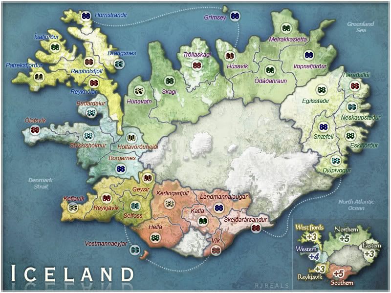
- Click image to enlarge.
Re: Iceland [I, Gp, Gr] (New Glaciers Pg.16)
I dont object, start (edit: rework) the small
map looks great rj
map looks great rj
Re: Iceland [I, Gp, Gr] (New Glaciers Pg.16)
I like the names of the glaciers, but tsince the small will look a bit busy, is it possible to include it only on the large?
me have no sig
Re: Iceland [I, Gp, Gr] (New Glaciers Pg.16)
hmm.... perhaps.fireedud wrote:I like the names of the glaciers, but tsince the small will look a bit busy, is it possible to include it only on the large?

Re: Iceland [I, Gp, Gr] (New Glaciers Pg.16)
I liked the glacier names too, but the map isn't significantly hurt without them.
Love the new glacier texture and shapes.
I think the bevel looks good on the large version, but I'd like to see it on the small before deciding if it should be on the map or not.
Love the new glacier texture and shapes.
I think the bevel looks good on the large version, but I'd like to see it on the small before deciding if it should be on the map or not.
-
Ruben Cassar

- Posts: 2160
- Joined: Thu Nov 16, 2006 6:04 am
- Gender: Male
- Location: Civitas Invicta, Melita, Evropa
Re: Iceland [I, Gp, Gr] (New Glaciers Pg.16)
I like everything new in this update RJ.
The only thing that I am still not 100% happy about is the legibility of the territory names in some regions.
The only thing that I am still not 100% happy about is the legibility of the territory names in some regions.


Re: Iceland [I, Gp, Gr] (New Glaciers Pg.16)
Same here, and i was thinking exactly the same.fireedud wrote:I like the names of the glaciers, but tsince the small will look a bit busy, is it possible to include it only on the large?
Is it really a problem to have them in 2 words instead of one? Or maybe use hyphens?
I love the look of this map!
-
Incandenza

- Posts: 4949
- Joined: Thu Oct 19, 2006 5:34 pm
- Gender: Male
- Location: Playing Eschaton with a bucket of old tennis balls
Re: Iceland [I, Gp, Gr] (New Glaciers Pg.16)
I concur. All of a sudden some of the terit names are hard to read (esp skykkisholmir)Ruben Cassar wrote:I like everything new in this update RJ.
The only thing that I am still not 100% happy about is the legibility of the territory names in some regions.
THOTA: dingdingdingdingdingdingBOOM
Te Occidere Possunt Sed Te Edere Non Possunt Nefas Est
Te Occidere Possunt Sed Te Edere Non Possunt Nefas Est
Re: Iceland [I, Gp, Gr] (New Glaciers Pg.16)
Most likely the bevel i added put just enough darkness behind some of the words to make them a bit hard to read. I'll work on trying to fix.

Re: Iceland [I, Gp, Gr] (New Glaciers Pg.16)
tell me to shut up if you disagree, but I don't think that it's entirely necessary to use different colors for the territory titles... some of the colors become very hard to read against the sea color, especially (for my eyes) the western titles. I applaud the attempt to make the different regions unique, but it would certainly be simpler for you to find one color that was easy to read and stick with it.

-
Ruben Cassar
- Posts: 2160
- Joined: Thu Nov 16, 2006 6:04 am
- Gender: Male
- Location: Civitas Invicta, Melita, Evropa
Re: Iceland [I, Gp, Gr] (New Glaciers Pg.16)
I agree with this as well.oaktown wrote:tell me to shut up if you disagree, but I don't think that it's entirely necessary to use different colors for the territory titles... some of the colors become very hard to read against the sea color, especially (for my eyes) the western titles. I applaud the attempt to make the different regions unique, but it would certainly be simpler for you to find one color that was easy to read and stick with it.
Re: Iceland [I, Gp, Gr] (New Glaciers Pg.16)
was the previous version easier to read than this most recent update?
I'll look into a common color for all the text, but I'm still thinking I had just enough bevel to make it hard to read.
I'll look into a common color for all the text, but I'm still thinking I had just enough bevel to make it hard to read.

Re: Iceland [I, Gp, Gr] (New Glaciers Pg.16)
I can read it, and like the different colors for each continent. Maybe you can make it bolder or something like that.RjBeals wrote:was the previous version easier to read than this most recent update?
I'll look into a common color for all the text, but I'm still thinking I had just enough bevel to make it hard to read.
Grtz
MarVal
 highest score: 2157 (Major) / Verd ori'shya beskar'gam

-
waseemalim
- Posts: 520
- Joined: Mon May 21, 2007 11:24 pm
Re: Iceland [I, Gp, Gr] (New Glaciers Pg.16)
I sort of liked the glacier names as well 
-
Fireside Poet

- Posts: 2671
- Joined: Mon Apr 24, 2006 1:49 pm
Re: Iceland [I, Gp, Gr] (New Glaciers Pg.16)
Woohoo! Circus Maximus on ice!  Very nice work Beals.

Click this logo for more information on joining!
-
hahaha3hahaha
- Posts: 715
- Joined: Fri Oct 12, 2007 10:30 pm
- Gender: Male
Re: Iceland [I, Gp, Gr] (New Glaciers Pg.16)
....
Last edited by hahaha3hahaha on Thu Jun 21, 2018 8:34 pm, edited 1 time in total.
Re: Iceland [I, Gp, Gr] (New Glaciers Pg.16)
I can read it just fine tooMarVal wrote:I can read it, and like the different colors for each continent. Maybe you can make it bolder or something like that.RjBeals wrote:was the previous version easier to read than this most recent update?
I'll look into a common color for all the text, but I'm still thinking I had just enough bevel to make it hard to read.
Isn´t this one of the reasons why there are small and large versions of every map..
so that those with small or badly calibrated monitors or poor eyesight can use the large version?
The comet cometh!

Re: Iceland [I, Gp, Gr] (New Glaciers Pg.16)
Another nice update 
1. The new glacier region looks better.
2. I'm not entirely convinced by the bevel... I can't really put my finger on anything specific, I just preferred the map without it.
3. The blue text is slightly hard to read, but I'm not certain you need to change ALL the territory names; I'd just try fiddling around with the blue ones 1st.
Re: Iceland [I, Gp, Gr] (New Glaciers Pg.16)
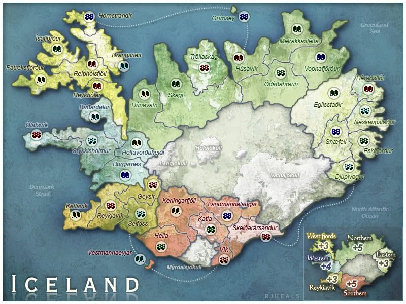
NEW (R11)
PREVIOUS (R10)
http://img.photobucket.com/albums/v450/ ... ge_R10.jpg
I see that some of the accent / dots above the Icelandic characters are almost blurred away, but that's just the nature of the font. Sorry. It's as clear as I could get it and still keep the unique map visual style.
I also removed the land bevel that I added on the last revise. I didn't like it. Plus it was causing too much darkening under some of the names, which made them harder to read. I think this works.
Added Glacier names. I'm not sure if I'll keep them in small version. I like this font / style now though. It's very subtle and looks good on this large map.
I'll start reworking the small map in the next very soon. (Maybe today).
Amiina
- Click image to enlarge.
http://img.photobucket.com/albums/v450/ ... ge_R10.jpg
Instead of this suggestion, I adjusted the colors (and blending / outer glows) of the territory names. Now the names are a shade of the bonus region they are in. I've added enough flare to them so they don't blend into the oceans or the land colors. I'm happy with it this way. Hope you guys are too.Ruben Cassar wrote:I agree with this as well.oaktown wrote:tell me to shut up if you disagree, but I don't think that it's entirely necessary to use different colors for the territory titles... some of the colors become very hard to read against the sea color, especially (for my eyes) the western titles. I applaud the attempt to make the different regions unique, but it would certainly be simpler for you to find one color that was easy to read and stick with it.
I see that some of the accent / dots above the Icelandic characters are almost blurred away, but that's just the nature of the font. Sorry. It's as clear as I could get it and still keep the unique map visual style.
I also removed the land bevel that I added on the last revise. I didn't like it. Plus it was causing too much darkening under some of the names, which made them harder to read. I think this works.
Added Glacier names. I'm not sure if I'll keep them in small version. I like this font / style now though. It's very subtle and looks good on this large map.
I'll start reworking the small map in the next very soon. (Maybe today).
Amiina
Last edited by RjBeals on Wed May 07, 2008 3:22 pm, edited 1 time in total.

Re: Iceland [I, Gp, Gr] (New Font ColoUrs Pg.17)
Wherever a territory name crosses the land/sea border, it goes completely unreadable. This IS fixable without changing colors, fonts, or effects, only where names are placed.
E.G.,
Isafjordur can move to the left a bit (into the sea, but there's nothing else there to confuse with)
Drangsnes can move a little right
Trollaskagi can move left onto the land
Stykkisholmur can move slightly right so it isn't coinciding with the Olafsvik border
Djupivogur can go right and down, same with Eskifjordur
Heraosfloi can go up and right
Neskaupstaour can move slightly to the left
Holtavorduheidi can move slightly left toward the territory border
Budaradalur can move slightly to the left onto the sea
And that should resolve any text readability issues in their entirety. Or at least, that's my thinking.
-
Ruben Cassar
- Posts: 2160
- Joined: Thu Nov 16, 2006 6:04 am
- Gender: Male
- Location: Civitas Invicta, Melita, Evropa
Re: Iceland [I, Gp, Gr] (New Font ColoUrs Pg.17)
I think tacktix is right on this one.TaCktiX wrote:Wherever a territory name crosses the land/sea border, it goes completely unreadable. This IS fixable without changing colors, fonts, or effects, only where names are placed.
E.G.,
Isafjordur can move to the left a bit (into the sea, but there's nothing else there to confuse with)
Drangsnes can move a little right
Trollaskagi can move left onto the land
Stykkisholmur can move slightly right so it isn't coinciding with the Olafsvik border
Djupivogur can go right and down, same with Eskifjordur
Heraosfloi can go up and right
Neskaupstaour can move slightly to the left
Holtavorduheidi can move slightly left toward the territory border
Budaradalur can move slightly to the left onto the sea
And that should resolve any text readability issues in their entirety. Or at least, that's my thinking.
Just placing the names somewhere else would solve the problem.
Re: Iceland [I, Gp, Gr] (New Font ColoUrs Pg.17)
come on now guys. I really do not want to move text around. It took me a while to place the territ names where they are. Are they that hard to read? I know they are not as clear as some maps, but they were chosen for the style. I'll add a poll.
Edit.. Poll's don't work.
So I'll just wait for comments.
Edit.. Poll's don't work.
So I'll just wait for comments.
-
Ruben Cassar
- Posts: 2160
- Joined: Thu Nov 16, 2006 6:04 am
- Gender: Male
- Location: Civitas Invicta, Melita, Evropa
Re: Iceland [I, Gp, Gr] (New Font ColoUrs Pg.17)
Actually I was looking at version 10 when I posted that comment. I just realised that there were two versions.RjBeals wrote:come on now guys. I really do not want to move text around. It took me a while to place the territ names where they are. Are they that hard to read? I know they are not as clear as some maps, but they were chosen for the style. I'll add a poll.
Edit.. Poll's don't work.
So I'll just wait for comments.
Version 11 is much better. I think it's fine now.