Sooo, anyone have an opinion on darker water? Should I change it back ASAP? Should I make it darker yet?
And any more votes on mountains? I'm thinking of starting a new topic elsewheres with a poll, just so we can get better turnout...
Archipelago [Quenched]
Moderator: Cartographers
Forum rules
Please read the Community Guidelines before posting.
Please read the Community Guidelines before posting.
Re: Archipelago v12 (Pg. 1&19) [I, Gp] - June 17
Reputation cleared.  Never let it be said that Team CC don't investigate fairly.
Although they take bloody forever to do it...
Although they take bloody forever to do it...
-
Mr. Squirrel

- Posts: 157
- Joined: Fri Nov 02, 2007 3:18 pm
- Location: up a tree
Re: Archipelago v12 (Pg. 1&19) [I, Gp] - June 17
the water looks good the way it is now. I had no problem with it before, but the darker color does look better.
What is with the big black dots in the 88's version of the map. They are located on either coast of thres. I know they are probably just mistakes, but be sure to take them out of the final map.
What is with the big black dots in the 88's version of the map. They are located on either coast of thres. I know they are probably just mistakes, but be sure to take them out of the final map.

Re: Archipelago v12 (Pg. 1&19) [I, Gp] - June 17
Oh, that was me accidentally clicking on it with the brush tool selected without realizing it. I thought I got rid of them all...guess not. They'll be gone for the next version.Mr. Squirrel wrote:What is with the big black dots in the 88's version of the map. They are located on either coast of thres. I know they are probably just mistakes, but be sure to take them out of the final map.
-
AndyDufresne

- Posts: 24919
- Joined: Fri Mar 03, 2006 8:22 pm
- Location: A Banana Palm in Zihuatanejo
- Contact:
Re: Archipelago v12 (Pg. 1&19) [I, Gp] - June 17
I still think sky and clouds, but it looks better. 
--Andy
--Andy
Re: Archipelago v12 (Pg. 1&19) [I, Gp] - June 17
Mr. Squirrel: Yes, when I do the 88s, they won't be there. 
Andy: Any way to fix that? Should I make it darker?
Or then again, maybe they are floating continents! Like the lands in the sky in FFXII...
Andy: Any way to fix that? Should I make it darker?
Or then again, maybe they are floating continents! Like the lands in the sky in FFXII...
Reputation cleared. Never let it be said that Team CC don't investigate fairly.
Although they take bloody forever to do it...
Although they take bloody forever to do it...
Re: Archipelago v12 (Pg. 1&19) [I, Gp] - June 17
Yeah, that's why I don't do the graphicsMjinga wrote:Mr. Squirrel: Yes, when I do the 88s, they won't be there.
I think we should make one image where the sea is divided into five rectangles, each the entire height of the image and 1/5 the width, each with a different shade a blue. And then vote on the best. Make sense?Mjinga wrote:Andy: Any way to fix that? Should I make it darker?
I'm gonna shoot down this idea before anyone takes it seriouslyMjinga wrote:Or then again, maybe they are floating continents! Like the lands in the sky in FFXII...
Any other thoughts on the mountains?
Re: Archipelago v12 (Pg. 1&19) [I, Gp] - June 17
I am not convinced i like the darker blue background; It seems duller now.
I think the light blue brought the Island colours out better, they seemed more vivid..
And actually i quite liked the dreamy sky-like floating islands; it made it all seem somehow magical!
Anyone else agree?
I think the light blue brought the Island colours out better, they seemed more vivid..
And actually i quite liked the dreamy sky-like floating islands; it made it all seem somehow magical!
Anyone else agree?


Re: Archipelago v12 (Pg. 1&19) [I, Gp] - June 17
I'm not sure I like the word "Legend"... as strictly it's not a Legend - it's a mini map...
Therefore "Bonus" or "Bonuses" might be better?
C.
Therefore "Bonus" or "Bonuses" might be better?
C.

Highest score : 2297
Re: Archipelago v12 (Pg. 1&19) [I, Gp] - June 17
I sort of see your point, but I think the darker ocean is ultimately a better choice. Mjinga is working on some poll options now for mountains and water colors, so we'll resolve it that way.jiminski wrote:I am not convinced i like the darker blue background; It seems duller now.
I think the light blue brought the Island colours out better, they seemed more vivid..
And actually i quite liked the dreamy sky-like floating islands; it made it all seem somehow magical!
Anyone else agree?
I think I agree. We'll change it to "Bonuses."yeti_c wrote:I'm not sure I like the word "Legend"... as strictly it's not a Legend - it's a mini map...
Therefore "Bonus" or "Bonuses" might be better?
C.

Re: Archipelago v12 (Pg. 1&19) [I, Gp] - June 17
i agree with andy, i got even more disorientated on the new version.
i think that looked more like sky, maybe add a very subtle texture/waves?
i think that looked more like sky, maybe add a very subtle texture/waves?
-
AndyDufresne
- Posts: 24919
- Joined: Fri Mar 03, 2006 8:22 pm
- Location: A Banana Palm in Zihuatanejo
- Contact:
Re: Archipelago v12 (Pg. 1&19) [I, Gp] - June 17
However, if you really want it to be a sky map... (which is fine, just make sure it is clear that it is!) that would be interesting.
--Andy
--Andy
Re: Archipelago v12 (Pg. 1&19) [I, Gp] - June 17
My personal desire is for the old light-Ocean hue.
Personally and that is what we are doing after-all; building the best map from a plethora of vying interests and tastes... personally i do not care if the ocean looks a 'little' sky-like but is still Ocean.* (until it was mentioned i had not even considered it)
Some of the Islands are flipping bright-purple!... so i think we can assume aesthetics is more important than being slaves to reality
And on that note, the old hue gives me no disorientation at all.
It does however accentuate the beautiful island colours and gives a mystical, glorious and engaging vibrancy.
So for me, although i truly respect Andys very reasonable position, i do not concur:- In the darkened version we lose all the above in a dulled down version and get nothing in return.
In my oppinion.
*saying that- a Sky map would be a lovely thing indeed! but if people are worried about archipelago's in archipelago's!... how will we ever get through archipelago's in skies?
Last edited by jiminski on Sat Jun 21, 2008 4:02 pm, edited 1 time in total.
Re: Archipelago v12 (Pg. 1&19) [I, Gp] - June 17
jiminski wrote:*saying that- a Sky map would be a lovely thing indeed! but if people are worried about archipelago's in archipelago's!... how will we ever get through archipelago's in skies?
I was about to say something like that!
I really see no reason to put these islands in the sky. I mean, there's no change in gameplay if we do it. And it'd confuse the hell out of a lot of players to have islands randomly floating. And I think we'd need to change the name if we did that. No, I'd like to keep them in the ocean.
As soon as Mjinga rears her (ugly?) head, we'll put up a poll on ocean colors with 4-5 options and see what people like best.
We'll also try adding a slight wave pattern like Tom suggested.
Re: Archipelago v12 (Pg. 1&19) [I, Gp] - June 17
My head is not ugly. 
Ocean thingies are up for votes.
EDIT: They were until we discovered the poll is still not working. Better, but still not working. We'll have it up in a little bit.
Ocean thingies are up for votes.
EDIT: They were until we discovered the poll is still not working. Better, but still not working. We'll have it up in a little bit.
Reputation cleared. Never let it be said that Team CC don't investigate fairly.
Although they take bloody forever to do it...
Although they take bloody forever to do it...
Re: Archipelago v12 (Pg. 1&19) [I, Gp] - June 17
well your Avi is certainly of a confident ladyMjinga wrote:My head is not ugly.
Ocean thingies are up for votes.

Re: Archipelago v12 (Pg. 1&19) [I, Gp] - June 17
No 2. I definitely like it very much, but I'm not sure of the effect on the wohle map.
De gueules à la tour d'argent ouverte, crénelée de trois pièces, sommée d'un donjon ajouré, crénelé de deux pièces
Gules an open tower silver, crenellated three parts, topped by a apertured turret, crenellated two parts
Gules an open tower silver, crenellated three parts, topped by a apertured turret, crenellated two parts
Re: Archipelago v12 (Pg. 1&19) [I, Gp] - June 17
pamoa wrote:No 2. I definitely like it very much, but I'm not sure of the effect on the wohle map.
Yes i think i agree with Number 2 and that sometimes it is tricky to understand how the whole picture will feel.
Re: Archipelago v12 (Pg. 1&19) [I, Gp] - June 17
Well, we posted the poll issue in suggs&bugs a few days ago, and Andy came and fixed it. We did a test run and the poll worked fine. When I went to put up this current poll, though, it broke again. I PMed Andy, hopefully he can fix it again. In the meantime, your votes have been added to my manual tally.
How do you guys feel about "bonuses" vs. "legend" for the area in the bottom left's title. It's not technically a legend, so I'm leaning towards titling it "bonuses", but that doesn't sound as good as "legend." We tried removing that title-island altogether, but the dead space that was left looked awful. So, "bonuses" or "legend"?
How do you guys feel about "bonuses" vs. "legend" for the area in the bottom left's title. It's not technically a legend, so I'm leaning towards titling it "bonuses", but that doesn't sound as good as "legend." We tried removing that title-island altogether, but the dead space that was left looked awful. So, "bonuses" or "legend"?
-
Mr. Squirrel
- Posts: 157
- Joined: Fri Nov 02, 2007 3:18 pm
- Location: up a tree
Re: Archipelago v12 (Pg. 1&19) [I, Gp] - June 17
I like version 5 the best. I think that with any sort of texture added to the water, it will make the map look too busy. Besides, it will look funny to have textured water and untextured land. Normally it is the other way around.
Re: Archipelago v12 (Pg. 1&19) [I, Gp] - June 17
Poll's working, guys. Thanks Andy!
Re: Archipelago v12 (Pg. 1&19) [I, Gp] - June 17 - New Poll

Last edited by jiminski on Thu Jun 26, 2008 8:03 am, edited 1 time in total.
-
wcaclimbing
- Posts: 5598
- Joined: Fri May 12, 2006 10:09 pm
- Location: In your quantum box....Maybe.
- Contact:
Re: Archipelago v12 (Pg. 1&19) [I, Gp] - June 17 - New Poll
I like oceans 1, 2, and 5. the others are all textured-looking and don't work well with the graphics at all.
All the land is really smooth coloring. the rough style of the water in ocean 3 and 4 would kill the feeling of the map, i think.
I'm just one opinion, though. Listen to what everyone else is saying.
All the land is really smooth coloring. the rough style of the water in ocean 3 and 4 would kill the feeling of the map, i think.
I'm just one opinion, though. Listen to what everyone else is saying.

Re: Archipelago v12 (Pg. 1&19) [I, Gp] - June 17 - New Poll
Jiminski - what are the pictures for, exactly? More ocean ideas?
Hmm...I think you mean you like 1, 4, and 5? 2 and 3 are the textured ones. I agree with you, though. I prefer the smoother ones myself. Once the poll finishes, we'll see what's what and post a new version based on that.wcaclimbing wrote:I like oceans 1, 2, and 5. the others are all textured-looking and don't work well with the graphics at all.
All the land is really smooth coloring. the rough style of the water in ocean 3 and 4 would kill the feeling of the map, i think.
I'm just one opinion, though. Listen to what everyone else is saying.

Re: Archipelago v12 (Pg. 1&19) [I, Gp] - June 17 - New Poll
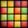
Can we just keep it as squares? That looks cool... 
But seriously i think id like a darker version of 2.
But seriously i think id like a darker version of 2.
