Conquer 4 [Quenched]
Moderator: Cartographers
Forum rules
Please read the Community Guidelines before posting.
Please read the Community Guidelines before posting.
-
Ditocoaf
- Posts: 1054
- Joined: Wed Feb 27, 2008 9:17 pm
- Location: Being eaten by the worms and weird fishes
Re: Conquer 4. Page 1 + 8 [I]
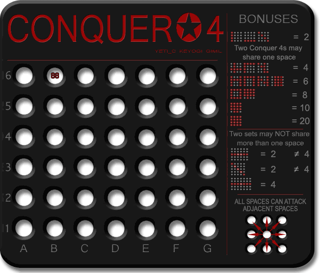
I have to say... that is some of the most subtle animation I have seen in a long time. Looking at the version at the top of page 8, I had to practically glue my eyeballs to my laptop to figure out what was going on there. Perhaps there's a slightly more contrasting way you can highlight those dots? Actually, now that I think about it, the problem would probably be solved if they were lit for a longer period of time; long enough for me to figure out exactly which ones are lit and which aren't.

>----------✪ Try to take down the champion in the continuous IPW/GIL tournament! ✪----------<
Note to self: THINK LESS LIVE MORE
-
gimil

- Posts: 8599
- Joined: Sat Mar 03, 2007 12:42 pm
- Gender: Male
- Location: United Kingdom (Scotland)
Re: Conquer 4. Page 1 + 8 [I]
My idea was that if you where to read the legends you would see it while scanning over that area. Your not looking for the animation but you see it it the first time you read it. This means you know its their and can look back to it if you need to, without it annoying you while playing.Ditocoaf wrote:I have to say... that is some of the most subtle animation I have seen in a long time. Looking at the version at the top of page 8, I had to practically glue my eyeballs to my laptop to figure out what was going on there. Perhaps there's a slightly more contrasting way you can highlight those dots? Actually, now that I think about it, the problem would probably be solved if they were lit for a longer period of time; long enough for me to figure out exactly which ones are lit and which aren't.
any else agree with me?
What do you know about map making, bitch?
Top Score:2403natty_dread wrote:I was wrong

Re: Conquer 4. Page 1 + 8 [I]
thanks gimil...much bettergimil wrote:Here you go cairns hope your happy now

* Pearl Harbour * Waterloo * Forbidden City * Jamaica * Pot Mosbi
Re: Conquer 4. Page 1 + 8 [I]
not only that it emphasises that there is somehting special tht players need to take notice of.gimil wrote:
My idea was that if you where to read the legends you would see it while scanning over that area. Your not looking for the animation but you see it it the first time you read it. This means you know its their and can look back to it if you need to, without it annoying you while playing.
any else agree with me?
I agree with you.
* Pearl Harbour * Waterloo * Forbidden City * Jamaica * Pot Mosbi

Re: Conquer 4. Page 1 + 8 [I]
Yeah I agree - you don't want it animated so that it jumps out at you when you know the rules.cairnswk wrote:not only that it emphasises that there is somehting special tht players need to take notice of.gimil wrote:
My idea was that if you where to read the legends you would see it while scanning over that area. Your not looking for the animation but you see it it the first time you read it. This means you know its their and can look back to it if you need to, without it annoying you while playing.
any else agree with me?
I agree with you.
C.

Highest score : 2297
-
gimil
- Posts: 8599
- Joined: Sat Mar 03, 2007 12:42 pm
- Gender: Male
- Location: United Kingdom (Scotland)
Re: Conquer 4. Page 1 + 8 [I]
tidy up of the legends before I reinstate the animation.
What do you know about map making, bitch?
Top Score:2403natty_dread wrote:I was wrong
-
Ditocoaf
- Posts: 1054
- Joined: Wed Feb 27, 2008 9:17 pm
- Location: Being eaten by the worms and weird fishes
Re: Conquer 4. Page 1 + 8 [I]
Perhaps you could draw it out so that they glow more slowly then? (so that they stay lit longer, and fade in and out more slowly) It would even be less distracting, but easier to see which dots are lit.gimil wrote:My idea was that if you where to read the legends you would see it while scanning over that area. Your not looking for the animation but you see it it the first time you read it. This means you know its their and can look back to it if you need to, without it annoying you while playing.Ditocoaf wrote:I have to say... that is some of the most subtle animation I have seen in a long time. Looking at the version at the top of page 8, I had to practically glue my eyeballs to my laptop to figure out what was going on there. Perhaps there's a slightly more contrasting way you can highlight those dots? Actually, now that I think about it, the problem would probably be solved if they were lit for a longer period of time; long enough for me to figure out exactly which ones are lit and which aren't.
any else agree with me?
>----------✪ Try to take down the champion in the continuous IPW/GIL tournament! ✪----------<
Note to self: THINK LESS LIVE MORE
-
gimil
- Posts: 8599
- Joined: Sat Mar 03, 2007 12:42 pm
- Gender: Male
- Location: United Kingdom (Scotland)
Re: Conquer 4. Page 1 + 8 [I]
Sure thing! why notDitocoaf wrote:Perhaps you could draw it out so that they glow more slowly then? (so that they stay lit longer, and fade in and out more slowly) It would even be less distracting, but easier to see which dots are lit.gimil wrote:My idea was that if you where to read the legends you would see it while scanning over that area. Your not looking for the animation but you see it it the first time you read it. This means you know its their and can look back to it if you need to, without it annoying you while playing.Ditocoaf wrote:I have to say... that is some of the most subtle animation I have seen in a long time. Looking at the version at the top of page 8, I had to practically glue my eyeballs to my laptop to figure out what was going on there. Perhaps there's a slightly more contrasting way you can highlight those dots? Actually, now that I think about it, the problem would probably be solved if they were lit for a longer period of time; long enough for me to figure out exactly which ones are lit and which aren't.
any else agree with me?
What do you know about map making, bitch?
Top Score:2403natty_dread wrote:I was wrong
-
gimil
- Posts: 8599
- Joined: Sat Mar 03, 2007 12:42 pm
- Gender: Male
- Location: United Kingdom (Scotland)
Re: Conquer 4. Page 1 + 9 [I]

with animation reinstalled
What do you know about map making, bitch?
Top Score:2403natty_dread wrote:I was wrong
-
cicero

- Posts: 1358
- Joined: Wed Mar 07, 2007 1:51 pm
- Location: with the infected neutrals ... handing out maps to help them find their way to CC
Re: Conquer 4. Page 1 + 8 [I]
It seems to me that this is the only issue remaining ...gimil wrote:hoo hum.yeti_c wrote:It's a shame the new wording knocks the layout off what was previously spot on.
C.
Perhaps this could be addressed by reconsidering which/how many of the 'rule 1' examples to include.
At the moment we, somewhat arbitrarily, include one or more example of 2, 4, 6, 8, 10 & 20.
We already exclude 12, 14 & 16.
If we were to exclude one further row of examples the layout could be restored to its former glory.
Perhaps exclude the 20?
Or combine the 10 and the 20 on one line?
FREE M-E-Mbership and simple rules. Conquer Club - it's not complicated.
random me statistic @ 13 December 2008 - 1336 posts : 232nd most public posts (not counting Tower of Babble) of all time.
random me statistic @ 13 December 2008 - 1336 posts : 232nd most public posts (not counting Tower of Babble) of all time.
Re: Conquer 4. Page 1 + 8 [I]
It's OK Cic - we already adjusted it to fit pixel perfectly - see image above!!!cicero wrote:It seems to me that this is the only issue remaining ...gimil wrote:hoo hum.yeti_c wrote:It's a shame the new wording knocks the layout off what was previously spot on.
C.
Perhaps this could be addressed by reconsidering which/how many of the 'rule 1' examples to include.
At the moment we, somewhat arbitrarily, include one or more example of 2, 4, 6, 8, 10 & 20.
We already exclude 12, 14 & 16.
If we were to exclude one further row of examples the layout could be restored to its former glory.
Perhaps exclude the 20?
Or combine the 10 and the 20 on one line?
C.
Highest score : 2297
-
cicero
- Posts: 1358
- Joined: Wed Mar 07, 2007 1:51 pm
- Location: with the infected neutrals ... handing out maps to help them find their way to CC
Re: Conquer 4. Page 1 + 9 [I]
Seems to me it's still a little cramped, but that's fine as long as everyone else is happy.
Does that mean we're just waiting for stamps now?
Does that mean we're just waiting for stamps now?
FREE M-E-Mbership and simple rules. Conquer Club - it's not complicated.
random me statistic @ 13 December 2008 - 1336 posts : 232nd most public posts (not counting Tower of Babble) of all time.
random me statistic @ 13 December 2008 - 1336 posts : 232nd most public posts (not counting Tower of Babble) of all time.
-
gimil
- Posts: 8599
- Joined: Sat Mar 03, 2007 12:42 pm
- Gender: Male
- Location: United Kingdom (Scotland)
Re: Conquer 4. Page 1 + 9 [I]
Oaktowns away for the weekend (again) for a job interview. Wish him luck everyonecicero wrote:Seems to me it's still a little cramped, but that's fine as long as everyone else is happy.
Does that mean we're just waiting for stamps now?
What do you know about map making, bitch?
Top Score:2403natty_dread wrote:I was wrong
-
Blitzaholic

- Posts: 23050
- Joined: Wed Aug 09, 2006 11:57 pm
- Location: Apocalyptic Area


Re: Conquer 4. Page 1 + 9 [I]
I got me a job for next year, so now I can relax and stamp maps... I'll have a long look at this one tomorrow.gimil wrote:Oaktowns away for the weekend (again) for a job interview. Wish him luck everyone
Re: Conquer 4. Page 1 + 9 [I]
I've looked, and i liked. The only thing I would want to see changed is in the legend text, change the working to "Spaces can attack all adjacent spaces" because that's really what you mean.
Hmm, and I see you are calling a Conquer 4 a "Row" - maybe sets is better? Anyway, that's ticky-tack stuff...

Hmm, and I see you are calling a Conquer 4 a "Row" - maybe sets is better? Anyway, that's ticky-tack stuff...
Re: Conquer 4. Page 1 + 9 [I]
Cheers Oaktown...
(first usage of row works though)
C.
"Set "or "Line" could work.oaktown wrote:Hmm, and I see you are calling a Conquer 4 a "Row" - maybe sets is better? Anyway, that's ticky-tack stuff...
(first usage of row works though)
C.
Last edited by yeti_c on Tue Jun 24, 2008 1:39 pm, edited 1 time in total.
Highest score : 2297
Re: Conquer 4. Page 1 + 9 [I] [GP]

Gimil, could you just indulge me with a slight adjustment as suggested in the above graphic and space that bonus area out a fraction just so the whole thing doesn't look quite so squashed...each section squashed on top of each other.
Then I can recommend stamping. Thanks.
* Pearl Harbour * Waterloo * Forbidden City * Jamaica * Pot Mosbi
Re: Conquer 4. Page 1 + 9 [I] [GP]
You're a hard man to please Cairns... you were asking for those to be aligned with the other bits earlier on in the thread!!?!cairnswk wrote:
Gimil, could you just indulge me with a slight adjustment as suggested in the above graphic and space that bonus area out a fraction just so the whole thing doesn't look quite so squashed...each section squashed on top of each other.
Then I can recommend stamping. Thanks.
C.
Highest score : 2297
Re: Conquer 4. Page 1 + 9 [I] [GP]
Yes and i feel this hasn't quite accomplished it and can be bettered. It's only a small movement change and would make it look so much better.yeti_c wrote:.....
You're a hard man to please Cairns... you were asking for those to be aligned with the other bits earlier on in the thread!!?!
C.
And beside, Gimil does it to me.....Revenge is sweat Hahahaha! JK.
* Pearl Harbour * Waterloo * Forbidden City * Jamaica * Pot Mosbi
Re: Conquer 4. Page 1 + 9 [I] [GP]
Fair doos!!cairnswk wrote:Yes and i feel this hasn't quite accomplished it and can be bettered. It's only a small movement change and would make it look so much better.yeti_c wrote:.....
You're a hard man to please Cairns... you were asking for those to be aligned with the other bits earlier on in the thread!!?!
C.
And beside, Gimil does it to me.....Revenge is sweat Hahahaha! JK.
C.
(PS I'd rather be not having sweat tasting revenge... I prefer sweet versions!)
Highest score : 2297

Re: Conquer 4. Page 1 + 9 [I] [GP]
And I prefer sweet ice creamyeti_c wrote:Fair doos!!cairnswk wrote:Yes and i feel this hasn't quite accomplished it and can be bettered. It's only a small movement change and would make it look so much better.yeti_c wrote:.....
You're a hard man to please Cairns... you were asking for those to be aligned with the other bits earlier on in the thread!!?!
C.
And beside, Gimil does it to me.....Revenge is sweat Hahahaha! JK.
C.
(PS I'd rather be not having sweat tasting revenge... I prefer sweet versions!)
I agree with what Cairns is suggesting, though.
Re: Conquer 4. Page 1 + 9 [I] [GP]
Oh did i make a typo. Silly me.yeti_c wrote: Fair doos!!
C.
(PS I'd rather be not having sweat tasting revenge... I prefer sweet versions!)
* Pearl Harbour * Waterloo * Forbidden City * Jamaica * Pot Mosbi
Re: Conquer 4. Page 1 + 9 [I] [GP]
Gimil....just one other request before stamping this....could we also have the large version please. 
* Pearl Harbour * Waterloo * Forbidden City * Jamaica * Pot Mosbi
-
gimil
- Posts: 8599
- Joined: Sat Mar 03, 2007 12:42 pm
- Gender: Male
- Location: United Kingdom (Scotland)
Re: Conquer 4. Page 1 + 9 [I] [GP]
What do you know about map making, bitch?
Top Score:2403natty_dread wrote:I was wrong