[Official] Germany Revamp
Moderator: Cartographers
Forum rules
Please read the Community Guidelines before posting.
Please read the Community Guidelines before posting.

Re: [Official] Germany REVAMP - New DRAFT of Borders Pgs. 1&7
i would also go with koblenz. it seems all the umlauts have disappeared... are you aware that they are missing and will add them back in? do you know where, or should i write you a list?
-
pepperonibread

- Posts: 954
- Joined: Sun Jan 28, 2007 4:33 pm
- Location: The Former Confederacy
Re: [Official] Germany REVAMP - New DRAFT of Borders Pgs. 1&7
It's fine, someone made a list a few pages back. I wanted to get the draft on this page up quick, so I didn't add them. You can be sure that they'll be in the final version.daydream wrote:i would also go with koblenz. it seems all the umlauts have disappeared... are you aware that they are missing and will add them back in? do you know where, or should i write you a list?

-
multiplayertim
- Posts: 339
- Joined: Sat May 12, 2007 5:11 pm
- Location: Munster
Re: [Official] Germany REVAMP - New DRAFT of Borders Pgs. 1&7
what the deuce it says image has been moved or deleted
Winner: Tournament of the Minds
-
pepperonibread
- Posts: 954
- Joined: Sun Jan 28, 2007 4:33 pm
- Location: The Former Confederacy
Re: [Official] Germany REVAMP - New DRAFT of Borders Pgs. 1&7
Which one? They all seem to work fine for me 
-
gimil

- Posts: 8599
- Joined: Sat Mar 03, 2007 12:42 pm
- Gender: Male
- Location: United Kingdom (Scotland)
Re: [Official] Germany REVAMP - New DRAFT of Borders Pgs. 1&7
*yawns*
*waits for super cool graphics*
*waits for super cool graphics*
What do you know about map making, bitch?
Top Score:2403natty_dread wrote:I was wrong
-
pepperonibread
- Posts: 954
- Joined: Sun Jan 28, 2007 4:33 pm
- Location: The Former Confederacy
Re: [Official] Germany REVAMP - New DRAFT of Borders Pgs. 1&7
Just a progress report here. Since it looks like most of the borders have been settled on, I'll begin working on the better graphics version. This'll take a while most likely, as I'll have to remake almost all of the map. Should speed up though after school gets out in a few weeks.
Patience, gimil
Patience, gimil
-
gimil
- Posts: 8599
- Joined: Sat Mar 03, 2007 12:42 pm
- Gender: Male
- Location: United Kingdom (Scotland)
Re: [Official] Germany REVAMP - New DRAFT of Borders Pgs. 1&7
*humph*
What do you know about map making, bitch?
Top Score:2403natty_dread wrote:I was wrong
-
pepperonibread
- Posts: 954
- Joined: Sun Jan 28, 2007 4:33 pm
- Location: The Former Confederacy
Re: [Official] Germany REVAMP - New DRAFT of Borders Pgs. 1&7
Hey guys. Finally got a new update here, it's been long enough :
Large:
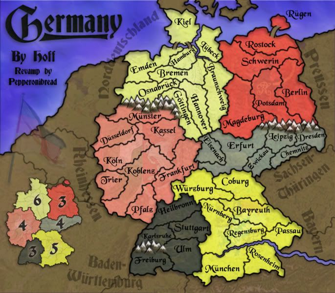
Large w/ #'s:
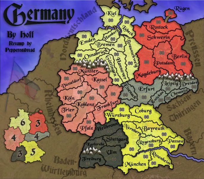
Ok, I basically redid the whole map from scratch, though it still looks pretty similar. Here's a list of all the changes:
-Shrunk map's width from 800 to 685 pixels.
-Made all the name/border changes needed to make the map more accurate (gameplay remains the same).
-Because of mibi's suggestion to reintroduce the German black, red, and gold, I recolored the continents as shown.
-Due to the color change, I replaced the legend with a mini-map, as some continents have similar colors. The continent names can still be seen around the map, as I thought they should still be viewable somewhere.
-Lowered the opacity or visibility of the coats of arms on the continents. This is still up for debate.
-With the island Rugen and the new river arrangement, I added some bridges.
-Names of countries in the dead land (Polen, Frankreich, Niederlande) crowded the map too much, so they were removed.
-All the borders are now more detailed, because I think it looks cooler.
-Some of the territory names were more tilted than they needed to be, I tried to lessen this in the new map.
-I made the background "pop" a little less.
To do:
-I'm not sure how much I like the new mini-map; I'd like some comments on this.
-I changed all the names to German and added umlauts, but I'm sure I missed at least one. Anyone see one I forgot?
-Do you guys like the bridges? Any comments on these are welcome.
-Any comments/suggestions on the continent names around the map?
Large:
Large w/ #'s:
Ok, I basically redid the whole map from scratch, though it still looks pretty similar. Here's a list of all the changes:
-Shrunk map's width from 800 to 685 pixels.
-Made all the name/border changes needed to make the map more accurate (gameplay remains the same).
-Because of mibi's suggestion to reintroduce the German black, red, and gold, I recolored the continents as shown.
-Due to the color change, I replaced the legend with a mini-map, as some continents have similar colors. The continent names can still be seen around the map, as I thought they should still be viewable somewhere.
-Lowered the opacity or visibility of the coats of arms on the continents. This is still up for debate.
-With the island Rugen and the new river arrangement, I added some bridges.
-Names of countries in the dead land (Polen, Frankreich, Niederlande) crowded the map too much, so they were removed.
-All the borders are now more detailed, because I think it looks cooler.
-Some of the territory names were more tilted than they needed to be, I tried to lessen this in the new map.
-I made the background "pop" a little less.
To do:
-I'm not sure how much I like the new mini-map; I'd like some comments on this.
-I changed all the names to German and added umlauts, but I'm sure I missed at least one. Anyone see one I forgot?
-Do you guys like the bridges? Any comments on these are welcome.
-Any comments/suggestions on the continent names around the map?
Last edited by pepperonibread on Sat Jul 12, 2008 12:08 am, edited 2 times in total.
-
gimil
- Posts: 8599
- Joined: Sat Mar 03, 2007 12:42 pm
- Gender: Male
- Location: United Kingdom (Scotland)
Re: [Official] Germany REVAMP - New DRAFT of Borders Pgs. 1&7
Beautiful 
Ill get a run down on this one probably tomorrow. It'll give me something to look forward to.
Ill get a run down on this one probably tomorrow. It'll give me something to look forward to.
What do you know about map making, bitch?
Top Score:2403natty_dread wrote:I was wrong

Re: [Official] Germany REVAMP - New DRAFT of Borders Pgs. 1&7
Excuse me while I drool for a little while.
I think the only thing I don't like are the mountains. I like the style, just, some of them are at really wacky angles. Mostly the ones with two peaks on the same "triangle." Also, the continent names being at crazy angles is a bit distracting. Is there any way to fit them in straight, or at less of an angle than...almost vertical, like Rheinhessen and Preussen are?
I think the only thing I don't like are the mountains. I like the style, just, some of them are at really wacky angles. Mostly the ones with two peaks on the same "triangle." Also, the continent names being at crazy angles is a bit distracting. Is there any way to fit them in straight, or at less of an angle than...almost vertical, like Rheinhessen and Preussen are?

Re: [Official] Germany REVAMP - Back on Track/New Update Pg. 1&8
any chance of you 'stealing' fudowhatever's concept of having the colours of the continents match the flag of the country? (mexico map).
what I mean is you have all the colours, but you have them somewhat randomly in there. Instead you could have black at the top two regions, red in the middle and yellow on the bottom

what I mean is you have all the colours, but you have them somewhat randomly in there. Instead you could have black at the top two regions, red in the middle and yellow on the bottom
-
pepperonibread
- Posts: 954
- Joined: Sun Jan 28, 2007 4:33 pm
- Location: The Former Confederacy
Re: [Official] Germany REVAMP - New DRAFT of Borders Pgs. 1&7
k, thanks gimilgimil wrote:Beautiful
Ill get a run down on this one probably tomorrow. It'll give me something to look forward to.
For the mountains, would "dulling" down the peaks help at all? I personally like them, but I'll see what I can do.ZeakCytho wrote:Excuse me while I drool for a little while.
I think the only thing I don't like are the mountains. I like the style, just, some of them are at really wacky angles. Mostly the ones with two peaks on the same "triangle." Also, the continent names being at crazy angles is a bit distracting. Is there any way to fit them in straight, or at less of an angle than...almost vertical, like Rheinhessen and Preussen are?
As for the continent names, I'm a little confused about what you mean. Are you saying you like Preussen and Rheinhessen, or you don't like them?
Sounds good. I'll try this out and see how it looks.edbeard wrote:any chance of you 'stealing' fudowhatever's concept of having the colours of the continents match the flag of the country? (mexico map).
what I mean is you have all the colours, but you have them somewhat randomly in there. Instead you could have black at the top two regions, red in the middle and yellow on the bottom
Re: [Official] Germany REVAMP - New DRAFT of Borders Pgs. 1&7
I don't like them. I'd prefer them to be more horizontal, if you have room to do that. Alternatively, you could make them smaller and put them in the minimap instead of on the big map. Or something like that.pepperonibread wrote:For the mountains, would "dulling" down the peaks help at all? I personally like them, but I'll see what I can do.ZeakCytho wrote:Excuse me while I drool for a little while.
I think the only thing I don't like are the mountains. I like the style, just, some of them are at really wacky angles. Mostly the ones with two peaks on the same "triangle." Also, the continent names being at crazy angles is a bit distracting. Is there any way to fit them in straight, or at less of an angle than...almost vertical, like Rheinhessen and Preussen are?
As for the continent names, I'm a little confused about what you mean. Are you saying you like Preussen and Rheinhessen, or you don't like them?
-
AndyDufresne

- Posts: 24919
- Joined: Fri Mar 03, 2006 8:22 pm
- Location: A Banana Palm in Zihuatanejo
- Contact:
Re: [Official] Germany REVAMP - Back on Track/New Update Pg. 1&8
I was just thinking about this earlier today...glad to see an update! I'll take a look soon.
--Andy
--Andy

Re: [Official] Germany REVAMP - Back on Track/New Update Pg. 1&8
i'd like to see the map with a randomization of the 88 digit armies all over it as it would appear in the start of a game...not just the yellow....and the small version as i fear that some of those areas will be very difficult to read on the small version, with that font.
and i agree with the mountains...IMHO they look too "Andy Cap style" and i have to be questioning the "snow on matterhorns" appearance in the middle of Germany...down near Swisse and Austria I could understand....but middle Germany (and yes i know that it snows in Germany) wouldn't they be more like rolling large mountains/hills rather than "Matterhorn peaks"
also...is that the Danube in there...what about the Rhine?
EDIT**
Pepperonibread...i forgot to say before I had to rush out to town, that the map is looking very good...just those couple of things caught my eye, but if they're of no consequence then i understand.
Last edited by cairnswk on Mon Jun 23, 2008 3:18 am, edited 2 times in total.

* Pearl Harbour * Waterloo * Forbidden City * Jamaica * Pot Mosbi
-
lord voldemort

- Posts: 9596
- Joined: Sat Oct 20, 2007 4:39 am
- Gender: Male
- Location: Launceston, Australia
- Contact:
Re: [Official] Germany REVAMP - Back on Track/New Update Pg. 1&8
nice update...one thing i see strait up (thats not mentioned) the inlet river between Lubeck and Bremen is a lil hard to see i agree with wat cairns said about mountains..and the continent names thing that Zeak said..maybe smaller and added to mini map instead.
looks wicked though!!
looks wicked though!!

-
pepperonibread
- Posts: 954
- Joined: Sun Jan 28, 2007 4:33 pm
- Location: The Former Confederacy
Re: [Official] Germany REVAMP - Back on Track/New Update Pg. 1&8
Thanks cairns... I'll work on this stuff, my only concern is having different types of mountains, I think it might seem a bit inconsistent. But I'll dull them down a little and remove the snow, see how it lookscairnswk wrote:i'd like to see the map with a randomization of the 88 digit armies all over it as it would appear in the start of a game...not just the yellow....and the small version as i fear that some of those areas will be very difficult to read on the small version, with that font.
and i agree with the mountains...IMHO they look too "Andy Cap style" and i have to be questioning the "snow on matterhorns" appearance in the middle of Germany...down near Swisse and Austria I could understand....but middle Germany (and yes i know that it snows in Germany) wouldn't they be more like rolling large mountains/hills rather than "Matterhorn peaks"
also...is that the Danube in there...what about the Rhine?
EDIT**
Pepperonibread...i forgot to say before I had to rush out to town, that the map is looking very good...just those couple of things caught my eye, but if they're of no consequence then i understand.
Was that a deliberate pun with strait (as a strait is a thin body of water)? Anyway, I chuckledlord voldemort wrote:nice update...one thing i see strait up (thats not mentioned) the inlet river between Lubeck and Bremen is a lil hard to see i agree with wat cairns said about mountains..and the continent names thing that Zeak said..maybe smaller and added to mini map instead.
looks wicked though!!
But I'll try to thicken this a bit. I also might try to add an effect on the river like a glow or shadow.

Re: [Official] Germany REVAMP - Back on Track/New Update Pg. 1&8
I dont like that random flag on the left...i think it should be straight. It just looks awkward..

-
Blitzaholic

- Posts: 23050
- Joined: Wed Aug 09, 2006 11:57 pm
- Location: Apocalyptic Area
Re: [Official] Germany REVAMP - Back on Track/New Update Pg. 1&8
now I like this revamp of germany, its much better than the germany we have now


Re: [Official] Germany REVAMP - Back on Track/New Update Pg. 1&8
amazingly, it appears that the long thin territories in norddeutschland are not too tight for the names to fit! nothing wrong with the bridges. good work on those and the colours too, although it does look odd that kiel and peninsular denmark are now an island. should we change the look of the canal between kiel and lübeck to make it much thinner and slightly different from the river, with a legend to say that rivers and the kiel canal are impassable (similar to the legend on the soviet union map)?
by the way, it's baden-württemberg, not baden-württemburg. can we also have mainz instead of pfalz, since every other mainland territory on the map is a city, whereas pfalz is a region?
ian.
by the way, it's baden-württemberg, not baden-württemburg. can we also have mainz instead of pfalz, since every other mainland territory on the map is a city, whereas pfalz is a region?
ian.
-
pepperonibread
- Posts: 954
- Joined: Sun Jan 28, 2007 4:33 pm
- Location: The Former Confederacy
Re: [Official] Germany REVAMP - Back on Track/New Update Pg. 1&8
Yeah, I was surprised that all those territories fit too. I pushed the eastern border of norddeutschland over a few pixels to help it, but nothing major.iancanton wrote:amazingly, it appears that the long thin territories in norddeutschland are not too tight for the names to fit! nothing wrong with the bridges. good work on those and the colours too, although it does look odd that kiel and peninsular denmark are now an island. should we change the look of the canal between kiel and lübeck to make it much thinner and slightly different from the river, with a legend to say that rivers and the kiel canal are impassable (similar to the legend on the soviet union map)?
by the way, it's baden-württemberg, not baden-württemburg. can we also have mainz instead of pfalz, since every other mainland territory on the map is a city, whereas pfalz is a region?
ian.
All your suggestions sound good, this weekend is basically free for me so I'll be working on everything mentioned.
Re: [Official] Germany REVAMP - Back on Track/New Update Pg. 1&8
You might want to consider redoing your sig...it doesn't do the graphical quality of this map justice!
-
pepperonibread
- Posts: 954
- Joined: Sun Jan 28, 2007 4:33 pm
- Location: The Former Confederacy
Re: [Official] Germany REVAMP - Back on Track/New Update Pg. 1&8
YeahZeakCytho wrote:You might want to consider redoing your sig...it doesn't do the graphical quality of this map justice!

Re: [Official] Germany REVAMP - Back on Track/New Update Pg. 1&8
my only issue is I though the continent names were part of the outlying map or something. I figured it out quickly, but its still seems off on an otherwise lovely revamp.
-
gimil
- Posts: 8599
- Joined: Sat Mar 03, 2007 12:42 pm
- Gender: Male
- Location: United Kingdom (Scotland)
Re: [Official] Germany REVAMP - Back on Track/New Update Pg. 1&8
Pep im assuming this is the large map your currently working on?
What do you know about map making, bitch?
Top Score:2403natty_dread wrote:I was wrong