Conquer 4 [Quenched]
Moderator: Cartographers
Forum rules
Please read the Community Guidelines before posting.
Please read the Community Guidelines before posting.

Re: Conquer 4. Page 1 + 10 [I] [GP]
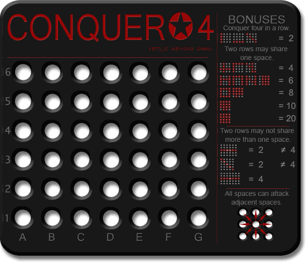
The inner circles of a lot of the holes on the large look pixely.

Re: Conquer 4. Page 1 + 9 [I] [GP]
I still don't think the small legend section has been attended to as the tops of each of these maps are now at different levels, as are the bottoms
But here's your stamp
But here's your stamp

gimil wrote:
- Click image to enlarge.

* Pearl Harbour * Waterloo * Forbidden City * Jamaica * Pot Mosbi
-
Ditocoaf
- Posts: 1054
- Joined: Wed Feb 27, 2008 9:17 pm
- Location: Being eaten by the worms and weird fishes
Re: Conquer 4. Page 1 + 10 [I] [GP]
The vertical line... in the large map... it moves! 

>----------✪ Try to take down the champion in the continuous IPW/GIL tournament! ✪----------<
Note to self: THINK LESS LIVE MORE

Re: Conquer 4. Page 1 + 9 [I] [GP]
He's rightcairnswk wrote:I still don't think the small legend section has been attended to as the tops of each of these maps are now at different levels, as are the bottoms
Small = the legend is 1 pixel low at the top and 1 pixel low at the bottom - so the entire thing needs moving 1 pixel up.
Large = top is 1 pixel high - and bottom is 3 pixels low.
C.

Highest score : 2297
Re: Conquer 4. Page 1 + 10 [I] [GP]
That's really quite disturbing!!Ditocoaf wrote:The vertical line... in the large map... it moves!
C.
Highest score : 2297
Re: Conquer 4. Page 1 + 10 [I] [GP]
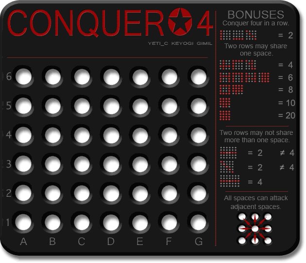
Could someone fix the [Gr] graphics stamp in the title thanks.
* Pearl Harbour * Waterloo * Forbidden City * Jamaica * Pot Mosbi
Re: Conquer 4. Page 1 + 10 [I] [GP]
Done.cairnswk wrote:Could someone fix the [Gr] graphics stamp in the title thanks.
C.
Highest score : 2297
-
gimil

- Posts: 8599
- Joined: Sat Mar 03, 2007 12:42 pm
- Gender: Male
- Location: United Kingdom (Scotland)
Re: Conquer 4. Page 1 + 10 [I] [GP] [GR]
- Click image to enlarge.

What do you know about map making, bitch?
Top Score:2403natty_dread wrote:I was wrong
Re: Conquer 4. Page 1 + 11 [I, GP, GR]
Gimil...animation on the vertical dividing line on small map..is that meant to be there?
* Pearl Harbour * Waterloo * Forbidden City * Jamaica * Pot Mosbi
-
gimil
- Posts: 8599
- Joined: Sat Mar 03, 2007 12:42 pm
- Gender: Male
- Location: United Kingdom (Scotland)
Re: Conquer 4. Page 1 + 11 [I, GP, GR]
nocairnswk wrote:Gimil...animation on the vertical dividing line on small map..is that meant to be there?
What do you know about map making, bitch?
Top Score:2403natty_dread wrote:I was wrong
-
cicero

- Posts: 1358
- Joined: Wed Mar 07, 2007 1:51 pm
- Location: with the infected neutrals ... handing out maps to help them find their way to CC
Re: Conquer 4. Page 1 + 11 [I, GP, GR]
On both sizes.
Of the two horizontal lines dividing up the legend the lower of the two seems to be a few pixels too high in that it is not equidistant from the two elements of legend it separates.
The higher of the two does appear to be equidistant from the two elements of legend it separates. And is more satisfying for that I think?
FREE M-E-Mbership and simple rules. Conquer Club - it's not complicated.
random me statistic @ 13 December 2008 - 1336 posts : 232nd most public posts (not counting Tower of Babble) of all time.
random me statistic @ 13 December 2008 - 1336 posts : 232nd most public posts (not counting Tower of Babble) of all time.
-
gimil
- Posts: 8599
- Joined: Sat Mar 03, 2007 12:42 pm
- Gender: Male
- Location: United Kingdom (Scotland)
Re: Conquer 4. Page 1 + 11 [I, GP, GR]
Yeti can you translate that to non geek?cicero wrote:On both sizes.
Of the two horizontal lines dividing up the legend the lower of the two seems to be a few pixels too high in that it is not equidistant from the two elements of legend it separates.
The higher of the two does appear to be equidistant from the two elements of legend it separates. And is more satisfying for that I think?
What do you know about map making, bitch?
Top Score:2403natty_dread wrote:I was wrong

Re: Conquer 4. Page 1 + 11 [I, GP, GR]
I don't like the title much, and the signatures below the title are kinda hard to read.
--lanyards
--lanyards
Last edited by lanyards on Sat Jun 28, 2008 8:23 am, edited 1 time in total.

WANT AN ADVANTAGE WHILE WORKING TOWARDS MEDALS?
https://www.conquerclub.com/forum/viewt ... 9&t=226714
Re: Conquer 4. Page 1 + 11 [I, GP, GR]
gimil wrote:Yeti can you translate that to non geek?cicero wrote:On both sizes.
Of the two horizontal lines dividing up the legend the lower of the two seems to be a few pixels too high in that it is not equidistant from the two elements of legend it separates.
The higher of the two does appear to be equidistant from the two elements of legend it separates. And is more satisfying for that I think?
I can do it.
He's saying that the line between All spaces can attack adjacent spaces and Two rows may not share more than one space is too high.
me have no sig
-
gimil
- Posts: 8599
- Joined: Sat Mar 03, 2007 12:42 pm
- Gender: Male
- Location: United Kingdom (Scotland)
Re: Conquer 4. Page 1 + 11 [I, GP, GR]
fireedud wrote:gimil wrote:Yeti can you translate that to non geek?cicero wrote:On both sizes.
Of the two horizontal lines dividing up the legend the lower of the two seems to be a few pixels too high in that it is not equidistant from the two elements of legend it separates.
The higher of the two does appear to be equidistant from the two elements of legend it separates. And is more satisfying for that I think?
I can do it.
He's saying that the line between All spaces can attack adjacent spaces and Two rows may not share more than one space is too high.
Thanks
Lanyards what do you not like about it?
What do you know about map making, bitch?
Top Score:2403natty_dread wrote:I was wrong
Re: Conquer 4. Page 1 + 11 [I, GP, GR]
Well, maybe the font, and the star looks stretched a little. It doesn't look that bad actually now. But the names under are hard to read.
--lanyards
--lanyards
WANT AN ADVANTAGE WHILE WORKING TOWARDS MEDALS?
https://www.conquerclub.com/forum/viewt ... 9&t=226714
-
gimil
- Posts: 8599
- Joined: Sat Mar 03, 2007 12:42 pm
- Gender: Male
- Location: United Kingdom (Scotland)
Re: Conquer 4. Page 1 + 11 [I, GP, GR]
Cheers ill see what I can do.lanyards wrote:Well, maybe the font, and the star looks stretched a little. It doesn't look that bad actually now. But the names under are hard to read.
--lanyards
What do you know about map making, bitch?
Top Score:2403natty_dread wrote:I was wrong
-
cicero
- Posts: 1358
- Joined: Wed Mar 07, 2007 1:51 pm
- Location: with the infected neutrals ... handing out maps to help them find their way to CC
Re: Conquer 4. Page 1 + 11 [I, GP, GR]
LOLgimil wrote:Thanksfireedud wrote:He's saying that the line between All spaces can attack adjacent spaces and Two rows may not share more than one space is too high.gimil wrote:Yeti can you translate that to non geek?cicero wrote:On both sizes.
Of the two horizontal lines dividing up the legend the lower of the two seems to be a few pixels too high in that it is not equidistant from the two elements of legend it separates.
The higher of the two does appear to be equidistant from the two elements of legend it separates. And is more satisfying for that I think?
[And of course fireedud was right.]
FREE M-E-Mbership and simple rules. Conquer Club - it's not complicated.
random me statistic @ 13 December 2008 - 1336 posts : 232nd most public posts (not counting Tower of Babble) of all time.
random me statistic @ 13 December 2008 - 1336 posts : 232nd most public posts (not counting Tower of Babble) of all time.
-
gimil
- Posts: 8599
- Joined: Sat Mar 03, 2007 12:42 pm
- Gender: Male
- Location: United Kingdom (Scotland)
Re: Conquer 4. Page 1 + 11 [I, GP, GR]

What do you know about map making, bitch?
Top Score:2403natty_dread wrote:I was wrong


-
AndyDufresne

- Posts: 24932
- Joined: Fri Mar 03, 2006 8:22 pm
- Location: A Banana Palm in Zihuatanejo
- Contact:
Re: Conquer 4. Page 1 + 11 [I, GP, GR]
- Final Forge
Post questions and concerns if any.

-
gimil
- Posts: 8599
- Joined: Sat Mar 03, 2007 12:42 pm
- Gender: Male
- Location: United Kingdom (Scotland)
Re: Conquer 4. Page 1 + 11 [Final Forge]
What do you know about map making, bitch?
Top Score:2403natty_dread wrote:I was wrong
Re: Conquer 4. Page 1 + 11 [Final Forge]
congratz on ff!
wow i havent checked in on this since map ideas... i gotta clear up my RL schedule so i can catch up on everything in the foundry again....
1) what are those small gray circles in the lower right... uh... corner??... or each circle? are they like holes in the white? cause i notice the color of the holes matches the forum background stuff
2) when the circles for the example for the rules light up, the lit up areas look pixely to me. like rough around the edges, but only when they are lit up. You dont need to fix it if you dont want to
3) could you make the veritcal line the sam color/colour as the horizontal lines? it seems right now that it is much darker to me
4) could you make the circle that contains the star in the title more circular? right now its an oval/egg shape with a star cut out
looking good! again, congratz on ff!!
-
rocky mountain

- Posts: 415
- Joined: Thu Jul 12, 2007 7:08 pm
Re: Conquer 4. Page 1 + 11 [Final Forge]
can you explain something?
under where it says "two rows may not share more than one space" what does it mean by the = and not = signs? why is 4 good and 2 bad? i thought 1 was good and 2 or 3 was bad... i don't understand what it's trying to say... its kind of confusing...
for the bonuses, does it have to be those exact shapes, or is it like 1 row for 2, 2 rows for 4, 3 rows for 6, 4 rows for 8, and 5 rows for 10? i'm asuming its the last one, but not sure...
by the way, this might be an even quicker forge than luxembourg... good job.

best: place 2349; points 1617; GP 216; GW 102(47%); Lieutenant