[Abandoned] - Official Feudal War Revamp
Forum rules
Please read the Community Guidelines before posting.
Please read the Community Guidelines before posting.
-
gimil

- Posts: 8599
- Joined: Sat Mar 03, 2007 12:42 pm
- Gender: Male
- Location: United Kingdom (Scotland)
Re: [Official] Feudal War REVAMP p.1+18[I,Gp]
Thanks guys for all the comments. Im going to put this back on vacation for a little while again. Got other projects and limited time still. So ill just get on with the other ones im enjoying more just now 
What do you know about map making, bitch?
Top Score:2403natty_dread wrote:I was wrong

Re: [Official] Feudal War REVAMP[I,Gp][VACATION]
how about making it so that Rebel 7 doesn't border two "6" territories... I just blew a game because I went the wrong way and boxed myself in.
of course, this begs the larger question of how players know what is what without BoB.
of course, this begs the larger question of how players know what is what without BoB.
-
gimil
- Posts: 8599
- Joined: Sat Mar 03, 2007 12:42 pm
- Gender: Male
- Location: United Kingdom (Scotland)
Re: [Official] Feudal War REVAMP[I,Gp][VACATION]
Shoot. Ive got a change for that and I forgot about itoaktown wrote:how about making it so that Rebel 7 doesn't border two "6" territories... I just blew a game because I went the wrong way and boxed myself in.
of course, this begs the larger question of how players know what is what without BoB.
What do you know about map making, bitch?
Top Score:2403natty_dread wrote:I was wrong
Re: [Official] Feudal War REVAMP[I,Gp][VACATION]
its called skill and strategyoaktown wrote:how about making it so that Rebel 7 doesn't border two "6" territories... I just blew a game because I went the wrong way and boxed myself in.
of course, this begs the larger question of how players know what is what without BoB.
and a large magnifying glass
-
thrillomania

- Posts: 40
- Joined: Wed Dec 26, 2007 2:18 pm
Feudal Map suggestion
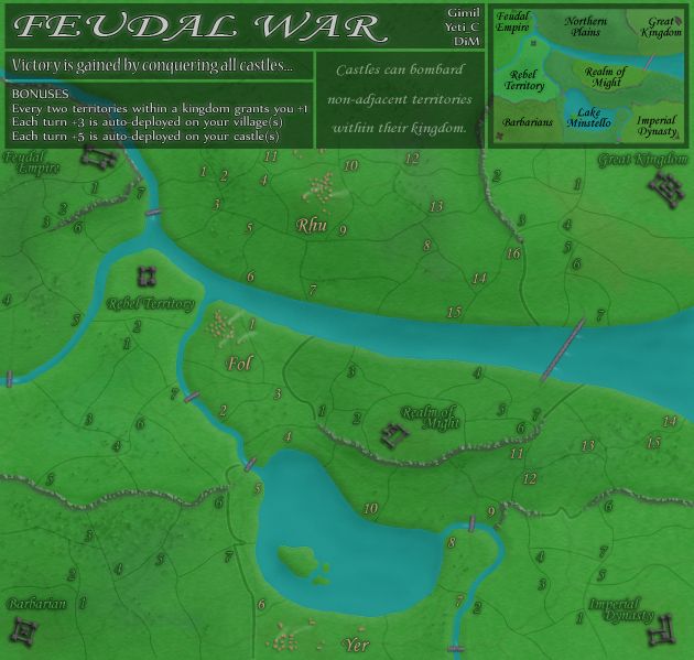
a little pet peeve of mine others may share but in the feudal war map people who are placed at great kingdom or feudal plains have a bit of an advantage because Northern plains is so isolated. makes A BIG DIFFERENCE OVER TIME as they can control more land easily, gather more armies ect.
suggestion
A bridge from Lake Minstello 1 to Northern plains 7. maybe move ryu villiage to where northern plains 11 is to make it harder to get to from lake minstello. this gives everyone a pathway to northern plains and norther plains access to lake minstello. particularly usefull in assasin games but in general will help balance the power of people who control north while not drastically changing the game.
-
cicero

- Posts: 1358
- Joined: Wed Mar 07, 2007 1:51 pm
- Location: with the infected neutrals ... handing out maps to help them find their way to CC
Re: Feudal Map suggestion
FREE M-E-Mbership and simple rules. Conquer Club - it's not complicated.
random me statistic @ 13 December 2008 - 1336 posts : 232nd most public posts (not counting Tower of Babble) of all time.
random me statistic @ 13 December 2008 - 1336 posts : 232nd most public posts (not counting Tower of Babble) of all time.
Re: [Official] Feudal War REVAMP[I,Gp][VACATION]
thanks cic... seems foundry work is taking over the fourms! 

Re: [Official] Feudal War REVAMP[I,Gp][VACATION]
now im being awfully picky. Maybe the Towns need to be a bit better?

-
gimil
- Posts: 8599
- Joined: Sat Mar 03, 2007 12:42 pm
- Gender: Male
- Location: United Kingdom (Scotland)
Re: [Official] Feudal War REVAMP[I,Gp][VACATION]
Its also on vacation for now guys so leave it be
What do you know about map making, bitch?
Top Score:2403natty_dread wrote:I was wrong
Re: [Official] Feudal War REVAMP[I,Gp][VACATION]
My issue with the map was that Realm of might castle cant bombard any territories apart from the 10s...that would be good to fix.
PERSONAL BEST...
Rank: Colonel
Score: 2802
Place: 120
Date: 16 / 2 / 2009
Rank: Colonel
Score: 2802
Place: 120
Date: 16 / 2 / 2009
Re: [Official] Feudal War REVAMP[I,Gp][VACATION]
Hmm still on vactation. Anway can you write: Lake Minstello on the lake since you have named the empire why shouldent you name the lake in writeing to?
And the empire where the Rhu is.
And the empire where the Rhu is.

Re: [Official] Feudal War REVAMP[I,Gp][VACATION]
rhu is a village not an empire, and that is called northern plains, where it is located.Androidz wrote:Hmm still on vactation. Anway can you write: Lake Minstello on the lake since you have named the empire why shouldent you name the lake in writeing to?
And the empire where the Rhu is.
Re: [Official] Feudal War REVAMP[I,Gp][VACATION]
'I know rhu is the village, i just didint remmember what the empire was called;)t-o-m wrote:rhu is a village not an empire, and that is called northern plains, where it is located.Androidz wrote:Hmm still on vactation. Anway can you write: Lake Minstello on the lake since you have named the empire why shouldent you name the lake in writeing to?
And the empire where the Rhu is.

Re: [Official] Feudal War REVAMP[I,Gp][VACATION]
I do not like this revamp at all.
One of the interesting game play elements on this map is the blocking position in the center. The new boundry river will change that gameplay, and not for the better I'm afraid.
There is no good reason to be replacing the walls on Imperial Realm with a river, putting in backdrop "bushes" overlaid on the territories, or to make the 7 territory in the NE section so small.
There is really only one problem with this map the way it currently exists on the site... and that is the fact that you have to look at the little legend to figure out which realm you want to deploy in, and IN MANY CASES, a territory is bordering two other territories that have the same number. This could be fixed by just renumbering the territories, and by shading with just a little bit of color - or using a distinct font if you like the monocrhomatic look, to tie together territories of the same realm.
My ever constant two last games seem to have no end in sight!

Re: [Official] Feudal War REVAMP[I,Gp][VACATION]
What are you referring to? All the same choke points are still there.gdeangel wrote:I do not like this revamp at all.
One of the interesting game play elements on this map is the blocking position in the center. The new boundry river will change that gameplay, and not for the better I'm afraid.
-
gimil
- Posts: 8599
- Joined: Sat Mar 03, 2007 12:42 pm
- Gender: Male
- Location: United Kingdom (Scotland)
Re: [Official] Feudal War REVAMP[I,Gp][VACATION]
Moving this on over!
What do you know about map making, bitch?
Top Score:2403natty_dread wrote:I was wrong
Re: [Official] Feudal War REVAMP[I,Gp][VACATION]
It was suggested back on page 1, but the 3's and 5's are very easy to confuse if youre not paying attention or have a small screen. granted, once you know to look for it, you dont miss it again; still, it shouldnt be too hard to fix.
-
gimil
- Posts: 8599
- Joined: Sat Mar 03, 2007 12:42 pm
- Gender: Male
- Location: United Kingdom (Scotland)
Re: [Official] Feudal War REVAMP[I,Gp][VACATION]
REVAMP take 2!
I have took the graphical style from Feudal Epic and applied it to the original feudal war because I would like something consistant between the two maps.
Tell me what you think.
I have took the graphical style from Feudal Epic and applied it to the original feudal war because I would like something consistant between the two maps.
Tell me what you think.
- Click image to enlarge.
What do you know about map making, bitch?
Top Score:2403natty_dread wrote:I was wrong

Re: [Official] Feudal War REVAMP[I,Gp] p.20
The new banners up top are cramptastic on the top of the actual map. Feudal Empire's castle is slightly overshadowed by the bonus box. Removing those borders would help a lot. Also, due to the land visible underneath the banners, I had the feeling at first glance "hey, how am I supposed to see my army counts on those northern territories", then reminded myself that the original Feudal War isn't that big.
Overall, the new style looks good, though.
Overall, the new style looks good, though.
-
The Fuzzy Pengui

- Posts: 2271
- Joined: Mon Nov 27, 2006 6:52 pm
- Gender: Male
- Location: Ohio
Re: [Official] Feudal War REVAMP[I,Gp] p.20
Rhu, Fol, and Yer fonts look fine, but the fonts by the castles are way too dark IMO...pretty hard to read.
Also, I don't really like the banner at the top of this one, the original banner fits the map better, I think.
I like the rest of it, though
Also, I don't really like the banner at the top of this one, the original banner fits the map better, I think.
I like the rest of it, though
Gilligan wrote:I'M SO GOOD AT THIS GAME
My stepmom locked the bathroom door
So I opened the lock with my shoelace
Re: [Official] Feudal War REVAMP[I,Gp][VACATION]
secondedYanarix wrote:It was suggested back on page 1, but the 3's and 5's are very easy to confuse if youre not paying attention or have a small screen. granted, once you know to look for it, you dont miss it again; still, it shouldnt be too hard to fix.
-
e_i_pi

- Posts: 1775
- Joined: Tue Feb 12, 2008 2:19 pm
- Location: Corruption Capital of the world
- Contact:
Re: [Official] Feudal War REVAMP[I,Gp] p.20
How have I only just noticed this?!
Positive notes:
The level of detail is beautiful, things like the whitewash at the bridge pylons - sweet.
A part of me wishes there were murloc villages on Lake Minstellos island haha. But seriously, the Lake islands may benefit from a little texture (copse of trees, or some such), but are otherwise nicely shaped and shaded.
The villages look nice, and the smoke is a nice touch.
The style of the original is retained and built on, it really is very nice.
Critical Notes:
The tops and bottoms of the cliffs don't feel right. it would be nice if the tops of the cliffs melded with the grass more, and the bottom of the cliffs had shadows cast, though I understand this is fiddly work.
The castle fonts need something, I'm guessing (if you're using PS) change the font type from whatever it is to Strong or possibly Crisp(Sharp?) - it looks like it's on Normal at the moment. Giving the layer a Colour Overlay of mint-white, and then setting that overlay to Colour Dodge/Colour Burn of about 10-15% may give it just that tiniest amount of bright contrast it needs to secure clarity.
The green is great. Too great methinks. I like the saturation, but the entire map is some shade of green aside from the villages, which for me just makes it seem a little too awash. Maybe make the roads a little more brown, or perhaps desaturate/recolour the title panel. Maybe even look into changing the province numbers of the castles to a blacker or less saturated hue. The borders and the river are the perfect hue though, I wouldn't dream of touching them
Overall:
Gorgeous. I've never been great at this map, but this revamp may be just what it needs to get me playing it more often
-
gimil
- Posts: 8599
- Joined: Sat Mar 03, 2007 12:42 pm
- Gender: Male
- Location: United Kingdom (Scotland)
Re: [Official] Feudal War REVAMP[I,Gp] p.20
Thanks you your post PI I will playing around with what you suggested and see what comes of it. Expect an update sometime today.
What do you know about map making, bitch?
Top Score:2403natty_dread wrote:I was wrong
-
wcaclimbing

- Posts: 5598
- Joined: Fri May 12, 2006 10:09 pm
- Location: In your quantum box....Maybe.
- Contact:
Re: [Official] Feudal War REVAMP[I,Gp] p.20
Could you move Lake Minstello 5 and 6 away from the Barbarians territory, please? Just switch a few territory names around.
I've had tons of attacks go bad because I accidentally attack Barbarians 6 instead of minstello 6. It'd be much easier if those were separated from eachother a bit...
I've had tons of attacks go bad because I accidentally attack Barbarians 6 instead of minstello 6. It'd be much easier if those were separated from eachother a bit...

-
hecter

- Posts: 14632
- Joined: Tue Jan 09, 2007 6:27 pm
- Gender: Female
- Location: Tying somebody up on the third floor
- Contact:
Re: [Official] Feudal War REVAMP[I,Gp] p.20
I find the territory borders and paths to be so similar that they almost run together, and it's pretty hard on the eyes to differentiate them.
In heaven... Everything is fine, in heaven... Everything is fine, in heaven... Everything is fine... You got your things, and I've got mine.
