could the top box be grey like the bottom one? Its too similar to the blue continent next to it.
Its looking better, though. nice fast updates.
[Abandoned] - Switzerland
Moderator: Cartographers
Forum rules
Please read the Community Guidelines before posting.
Please read the Community Guidelines before posting.
-
wcaclimbing
- Posts: 5598
- Joined: Fri May 12, 2006 10:09 pm
- Location: In your quantum box....Maybe.
- Contact:


-
wcaclimbing
- Posts: 5598
- Joined: Fri May 12, 2006 10:09 pm
- Location: In your quantum box....Maybe.
- Contact:
Re: Switzerland v38--Sep. 14--PAGE 1+32 [I,GP]
- Click image to enlarge.


Re: Switzerland v38--Sep. 14--PAGE 1+32 [I,GP]
What happened to the cool mountains? Your new ones look shit in comparison!?
C.
C.

Highest score : 2297
Re: Switzerland v38--Sep. 14--PAGE 1+32 [I,GP]
Ya know, I liked the old ones better too... maybe we should have a poll.

Re: Switzerland v38--Sep. 14--PAGE 1+32 [I,GP]
yeti_c wrote:What happened to the cool mountains? Your new ones look shit in comparison!?
C.
Your crazy! The old mountains were shit. The new ones are a huge improvement, although it is the Alps Kalp, you should make some of them bigger, have a size variance in there.
-
gimil

- Posts: 8599
- Joined: Sat Mar 03, 2007 12:42 pm
- Gender: Male
- Location: United Kingdom (Scotland)
Re: Switzerland v38--Sep. 14--PAGE 1+32 [I,GP]
Hi Kap,
Just a few minor issues I have today. Been a while since I popped in here and I have noticed some great improvments! Well done you
1. THe white borders you have just now are pretty inconsistant. Some are thicker than others, some are sharper than others etc. I think a quick redraw should do them some good.
2. I may be the only one, but I don't think the swiss flag next to the title (as good as it looks) suits the style of the map.
After those issues kap we shouldn't be far from your next milestone
What do you know about map making, bitch?
Top Score:2403natty_dread wrote:I was wrong
Re: Switzerland v38--Sep. 14--PAGE 1+32 [I,GP]
WHAT? You call a couple of "Greater Than" signs better than the other ones?!?!mibi wrote:yeti_c wrote:What happened to the cool mountains? Your new ones look shit in comparison!?
C.
Your crazy! The old mountains were shit. The new ones are a huge improvement, although it is the Alps Kalp, you should make some of them bigger, have a size variance in there.
Christ! - the new ones don't fit the map whatsoever - the other ones were so much better defined and actually looked like mountains.
C.
Highest score : 2297
Re: Switzerland v38--Sep. 14--PAGE 1+32 [I,GP]
Yeti, your a codenerd, you see mathematical signs in everything. Leave the pixels to the prose.yeti_c wrote:WHAT? You call a couple of "Greater Than" signs better than the other ones?!?!mibi wrote:yeti_c wrote:What happened to the cool mountains? Your new ones look shit in comparison!?
C.
Your crazy! The old mountains were shit. The new ones are a huge improvement, although it is the Alps Kalp, you should make some of them bigger, have a size variance in there.
Christ! - the new ones don't fit the map whatsoever - the other ones were so much better defined and actually looked like mountains.
C.
Kalp just needs to enlarge them a bit, and fill them in some...then you will see their glorious detail. The other mountains looks like a strain of ebola or something, very ugly. The new ones are proper.
Re: Switzerland v38--Sep. 14--PAGE 1+32 [I,GP]
Completely disagree - these...

Actually look like mountains.
Not some Copy and Paste Arrows.
I also think that they compliment the look a lot better too.
C.
Actually look like mountains.
Not some Copy and Paste Arrows.
I also think that they compliment the look a lot better too.
C.
Highest score : 2297
Re: Switzerland v38--Sep. 14--PAGE 1+32 [I,GP]
No see, that looks like mountains, if you cross them with ebola.
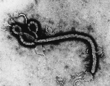
Don't tell me you can't see resemblance.
Don't tell me you can't see resemblance.

-
gimil
- Posts: 8599
- Joined: Sat Mar 03, 2007 12:42 pm
- Gender: Male
- Location: United Kingdom (Scotland)
Re: Switzerland v38--Sep. 14--PAGE 1+32 [I,GP]
I think we should let kap decide what mountains to use. Seems either set are acceptable.
What do you know about map making, bitch?
Top Score:2403natty_dread wrote:I was wrong
Re: Switzerland v38--Sep. 14--PAGE 1+32 [I,GP]
Mountain Poll!
1)
2)
3)
4)
(gimil: i didnt fix the borders yet)
1)
- Click image to enlarge.

- Click image to enlarge.

- Click image to enlarge.

- Click image to enlarge.
Re: Switzerland v39--Mountain Poll--Sep. 19--PAGE 1+33 [I,GP]
The first two have a different flag also 
-
wcaclimbing
- Posts: 5598
- Joined: Fri May 12, 2006 10:09 pm
- Location: In your quantum box....Maybe.
- Contact:
Re: Switzerland v39--Mountain Poll--Sep. 19--PAGE 1+33 [I,GP]
Definitely mountains #1. I don't like the stamped mountains, they don't fit the style of the map. And the new grey mountains look much better than the mountains you used to have.
EDIT: but I'd prefer if they were a little less bold. They have too much black/white contrast and contrast with the rest of the image, I think.
EDIT: but I'd prefer if they were a little less bold. They have too much black/white contrast and contrast with the rest of the image, I think.

-
The Neon Peon

- Posts: 2342
- Joined: Sat Jun 14, 2008 12:49 pm
- Gender: Male
Re: Switzerland v39--Mountain Poll--Sep. 19--PAGE 1+33 [I,GP]
Well, looks like 1 and 2 are tied right now. I would say the exact opposite. Mountains 2 fit better with the style.wcaclimbing wrote:Definitely mountains #1. I don't like the stamped mountains, they don't fit the style of the map.
Re: Switzerland v39--Mountain Poll--Sep. 19--PAGE 1+33 [I,GP]
looks like 1 is gonna win...Im gonna wait a couple of more days for more votes
Re: Switzerland v39--Mountain Poll--Sep. 19--PAGE 1+33 [I,GP]
#1 all the way.
C.
C.
Highest score : 2297
Re: Switzerland v39--Mountain Poll--Sep. 19--PAGE 1+33 [I,GP]
Regardless of what the poll and that code monkey says, option #2 is by far the best.
Re: Switzerland v39--Mountain Poll--Sep. 19--PAGE 1+33 [I,GP]
voted for #2, but it could be made a little darker -i would have gone for #1 but it looks more like someone sneezed rather than a mountain

-
e_i_pi

- Posts: 1775
- Joined: Tue Feb 12, 2008 2:19 pm
- Location: Corruption Capital of the world
- Contact:
Re: Switzerland v39--Mountain Poll--Sep. 19--PAGE 1+33 [I,GP]
#3 looks great, but with #2 and #3 I would kill the dots at the centre of the base of the mountain stamps