[Official] Germany Revamp
Moderator: Cartographers
Forum rules
Please read the Community Guidelines before posting.
Please read the Community Guidelines before posting.
- pepperonibread
- Posts: 954
- Joined: Sun Jan 28, 2007 4:33 pm
- Location: The Former Confederacy
Re: [Official] Germany REVAMP 8/13 Update Pgs. 1&13 [I, Gp]
No - just massive heaps of schoolwork. If I can wade through a lot this week though, I might get a chance to update Saturday or Sunday.
- pepperonibread
- Posts: 954
- Joined: Sun Jan 28, 2007 4:33 pm
- Location: The Former Confederacy
Re: [Official] Germany REVAMP 10/7 Update Pg. 14 [I, Gp]
It's beautiful (and done)!
L
L
Re: [Official] Germany REVAMP 10/7 Update Pg. 14 [I, Gp]
Agreed - this bad boy is worthy of a stamp.
C.
C.

Highest score : 2297
- gimil
- Posts: 8599
- Joined: Sat Mar 03, 2007 12:42 pm
- Gender: Male
- Location: United Kingdom (Scotland)
Re: [Official] Germany REVAMP 10/7 Update Pg. 14 [I, Gp]
Can I get a sample of the small version please pep? To ensure their is no resize issues>?
What do you know about map making, bitch?
Top Score:2403natty_dread wrote:I was wrong
Re: [Official] Germany REVAMP 10/7 Update Pg. 14 [I, Gp]
looks good to me
Re: [Official] Germany REVAMP 10/7 Update Pg. 14 [I, Gp]
What he means, is "Post a small image. If that looks fine, I'll give you a stamp"gimil wrote:Can I get a sample of the small version please pep? To ensure their is no resize issues>?

PB: 2661 | He's blue... If he were green he would die | No mod would be stupid enough to do that
- The Neon Peon
- Posts: 2342
- Joined: Sat Jun 14, 2008 12:49 pm
- Gender: Male
Re: [Official] Germany REVAMP 10/7 Update Pg. 14 [I, Gp]
You need to start thinking about army circles. These impact the graphics a lot, and you might need to move one or two territory names to fit one in nicely. You will be fine on most territories but I doubt that something like Karlsruhe will do well with one the way it is now.
Nice work on it so far.
Nice work on it so far.
Re: [Official] Germany REVAMP 10/7 Update Pg. 14 [I, Gp]
The 88 tests done earlier show that circles are not necessary and that everything fits fine and is legible.The Neon Peon wrote:You need to start thinking about army circles. These impact the graphics a lot, and you might need to move one or two territory names to fit one in nicely. You will be fine on most territories but I doubt that something like Karlsruhe will do well with one the way it is now.
- DiM
- Posts: 10415
- Joined: Wed Feb 14, 2007 6:20 pm
- Gender: Male
- Location: making maps for scooby snacks
Re: [Official] Germany REVAMP 10/7 Update Pg. 14 [I, Gp]
i see everyone is yelling quench so i hate to be the party pooper but i think the borders need to be redrawn. i mean they're to damn wobbly and from what i've seen on other maps they shouldn't be.
check this out:
http://www.mapsofworld.com/germany/germany-map.jpg
the borders are much more fluid much more cursive.
other than that i'd love to see the background flags be a bit more visible but that may impair the legibility of the map.
anyway i think there will be sorious problems with the army numbers on the small map in regions like Osnabruck or Munster.
btw does the rule with the small being 33% smaller than large still exist? cause that would make the small map on this one really frickin tiny. it would be something like 460*400
“In the beginning God said, the four-dimensional divergence of an antisymmetric, second rank tensor equals zero, and there was light, and it was good. And on the seventh day he rested.”- Michio Kaku
- pepperonibread
- Posts: 954
- Joined: Sun Jan 28, 2007 4:33 pm
- Location: The Former Confederacy
Re: [Official] Germany REVAMP 10/7 Update Pg. 14 [I, Gp]
I don't think army circles will be necessary on this map... I didn't put one on this page, but take a look at page 13 and you can see an example of army #'s on the map. I tried to make the continent colors not too saturated so circles wouldn't be needed. But any suggestions on the colors are still appreciated.The Neon Peon wrote:You need to start thinking about army circles. These impact the graphics a lot, and you might need to move one or two territory names to fit one in nicely. You will be fine on most territories but I doubt that something like Karlsruhe will do well with one the way it is now.
Nice work on it so far.
You'll need some others' support if you want me to change the borders. I purposely made them so ahh... detailed; I'd call it more of a unique style I tried. Which I think works well for this map.DiM wrote:i see everyone is yelling quench so i hate to be the party pooper but i think the borders need to be redrawn. i mean they're to damn wobbly and from what i've seen on other maps they shouldn't be.
check this out:
http://www.mapsofworld.com/germany/germany-map.jpg
the borders are much more fluid much more cursive.
other than that i'd love to see the background flags be a bit more visible but that may impair the legibility of the map.
anyway i think there will be sorious problems with the army numbers on the small map in regions like Osnabruck or Munster.
btw does the rule with the small being 33% smaller than large still exist? cause that would make the small map on this one really frickin tiny. it would be something like 460*400

You're right about the small map though, I wanted to keep the 33% limit which will warrant a few border adjustments.
- pepperonibread
- Posts: 954
- Joined: Sun Jan 28, 2007 4:33 pm
- Location: The Former Confederacy
Re: [Official] Germany REVAMP 10/7 Update Pg. 14 [I, Gp]
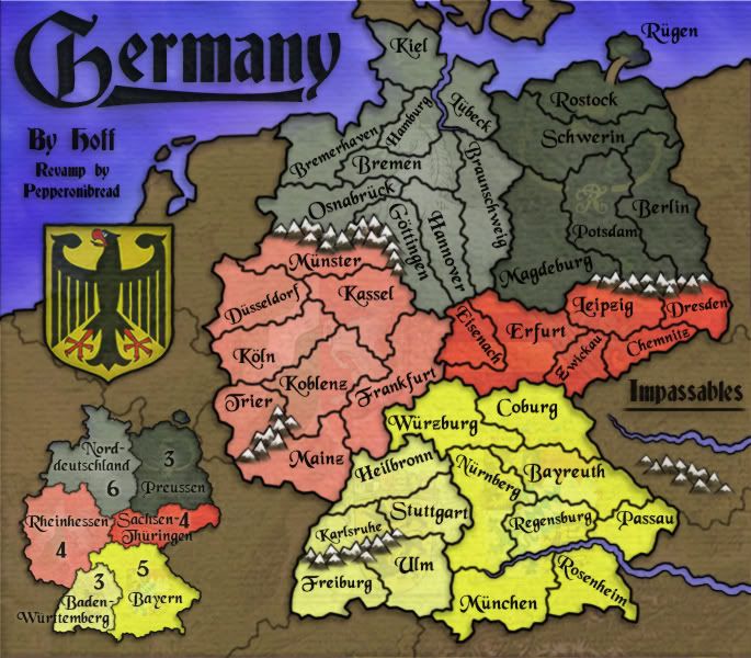
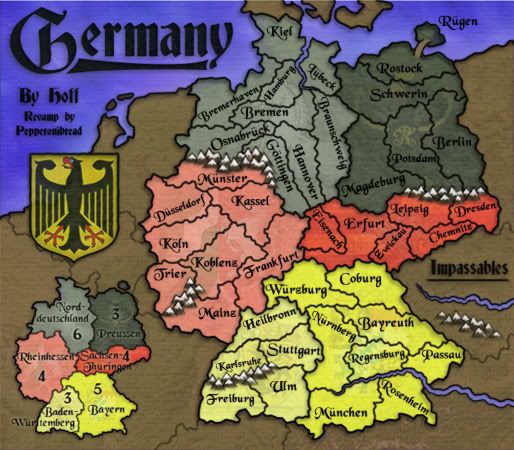
New update, all official-like this time:
Large:

Small:
Large w/ Army #'s:
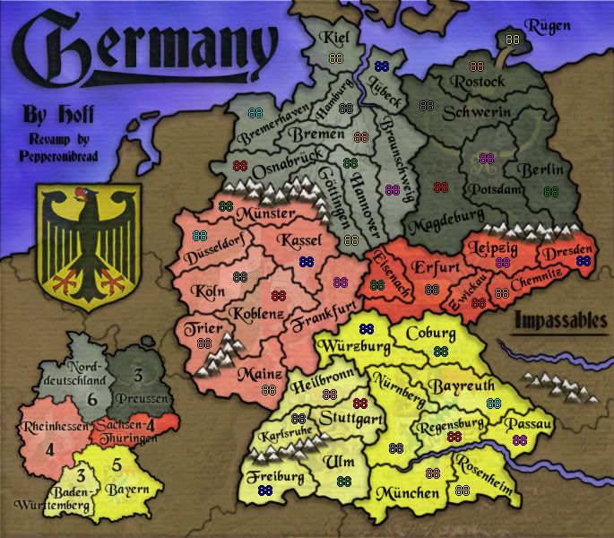
Small w/ Army #'s:
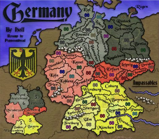
Changes (all edits since the update a few months ago):
-Emden is now Bremerhaven.
-The opacity of the coats of arms in the continents has been slightly increased.
-Added mountains between Trier and Mainz so Koblenz is not so oddly shaped.
-Erased the individual territory borders on the minimap.
-We now have a small map
-Moved a few borders and territory names to get some numbers to fit into the small version.
To-do:
-Small map problems?
-Comments?
Large:

Small:

Large w/ Army #'s:

Small w/ Army #'s:

Changes (all edits since the update a few months ago):
-Emden is now Bremerhaven.
-The opacity of the coats of arms in the continents has been slightly increased.
-Added mountains between Trier and Mainz so Koblenz is not so oddly shaped.
-Erased the individual territory borders on the minimap.
-We now have a small map
-Moved a few borders and territory names to get some numbers to fit into the small version.
To-do:
-Small map problems?
-Comments?
Re: [Official] Germany REVAMP 10/7 Update Pg. 14 [I, Gp]
i'd maybe like the water to be a bit more blue and a bit less purple and the emblem of baden-wurttemberg to be slightly more obvious on the small version but, even if u change nothing, it's a great-looking map!
ian.
ian.
Re: [Official] Germany REVAMP Update w/ Small Map Pg. 15 [I, Gp]
Sorry if this has been discussed already but just an idea... Why not make the emblems way more proeminent on the bonus map and remove them from the play map? It seems still barely visible and making them more apparent might impair playability, showing them well but only on the bonus map would make more sense IMO.
Anarkistsdream wrote:If you guys can't tell that Doom is being forced to post this drivel, you are fools...
- pepperonibread
- Posts: 954
- Joined: Sun Jan 28, 2007 4:33 pm
- Location: The Former Confederacy
Re: [Official] Germany REVAMP 10/7 Update Pg. 14 [I, Gp]
Ok thanks, I'll work on this stuff a bit more.iancanton wrote:i'd maybe like the water to be a bit more blue and a bit less purple and the emblem of baden-wurttemberg to be slightly more obvious on the small version but, even if u change nothing, it's a great-looking map!
ian.
I may pronounce the coats of arms on the minimap a bit more, I'll see how it looks.ga7 wrote:Sorry if this has been discussed already but just an idea... Why not make the emblems way more proeminent on the bonus map and remove them from the play map? It seems still barely visible and making them more apparent might impair playability, showing them well but only on the bonus map would make more sense IMO.
However, I still like the emblems on the map, and I don't think I'll be removing them unless there are enough people in opposition to them.
- gimil
- Posts: 8599
- Joined: Sat Mar 03, 2007 12:42 pm
- Gender: Male
- Location: United Kingdom (Scotland)
Re: [Official] Germany REVAMP Update w/ Small Map Pg. 15 [I, Gp]
I am thinking pep this one is just about ready for stamping. After you next update it we will see where we are 
What do you know about map making, bitch?
Top Score:2403natty_dread wrote:I was wrong
-
Arachnophobia
- Posts: 43
- Joined: Fri Feb 23, 2007 8:23 pm
- Location: Berlin, Germany
Re: [Official] Germany REVAMP Update w/ Small Map Pg. 15 [I, Gp]
may I propose that the army numbers are placed on those round fields so that the background is less influential on readability?
- Optimus Prime
- Posts: 9665
- Joined: Mon Mar 12, 2007 9:33 pm
- Gender: Male
Re: [Official] Germany REVAMP Update w/ Small Map Pg. 15 [I, Gp]
I'm not sure what everyone else thinks, but you might think of making the contrast between the two yellow continents a little more apparent. They blend together pretty easy at the moment.
Re: [Official] Germany REVAMP Update w/ Small Map Pg. 15 [I, Gp]
I agree that the yellows have the least contrast, and could do with some more.Optimus Prime wrote:I'm not sure what everyone else thinks, but you might think of making the contrast between the two yellow continents a little more apparent. They blend together pretty easy at the moment.
Laci
- pepperonibread
- Posts: 954
- Joined: Sun Jan 28, 2007 4:33 pm
- Location: The Former Confederacy
Re: [Official] Germany REVAMP Update w/ Small Map Pg. 15 [I, Gp]
Sounds good - thanks guys.laci_mae wrote:I agree that the yellows have the least contrast, and could do with some more.Optimus Prime wrote:I'm not sure what everyone else thinks, but you might think of making the contrast between the two yellow continents a little more apparent. They blend together pretty easy at the moment.
Laci
Re: [Official] Germany REVAMP Update w/ Small Map Pg. 15 [I, Gp]
Anymore news Pep?
C.
C.

Highest score : 2297
- pepperonibread
- Posts: 954
- Joined: Sun Jan 28, 2007 4:33 pm
- Location: The Former Confederacy
Re: [Official] Germany REVAMP Update w/ Small Map Pg. 15 [I, Gp]
Not til at least Thanksgiving weekend.
Re: [Official] Germany REVAMP Update w/ Small Map Pg. 15 [I, Gp]
I'm bumping this up because we're at the time pep thinks he might be able to work on this so we should try to give him comments to help him finish this
I personally have no problems with the graphics sooooooooo yeeeaaaaaa.
well actually maybe put those mountains right at the edge of those borders (even hiding the outside borders). each range seemingly leaves a slight gap which just looks kinda weird.
possibly put a glow on some of the legend text which is black text crossing over black borders. Sachsen-Thuringen and Baden-Wuritemberg are the "problem areas". I can't totally tell what they say but I'm not sure how much that matters.
Like I said I'd be fine with a graphics stamp but these are a couple possible improvements.
- pepperonibread
- Posts: 954
- Joined: Sun Jan 28, 2007 4:33 pm
- Location: The Former Confederacy
Re: [Official] Germany REVAMP Update w/ Small Map Pg. 15 [I, Gp]
New update - yall miss me? 
Large:
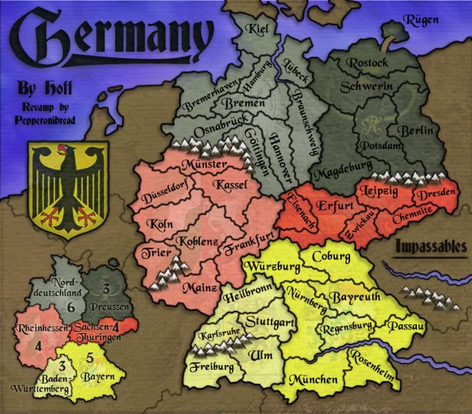
Small:

Large w/ Army #'s:

Small w/ Army #'s:
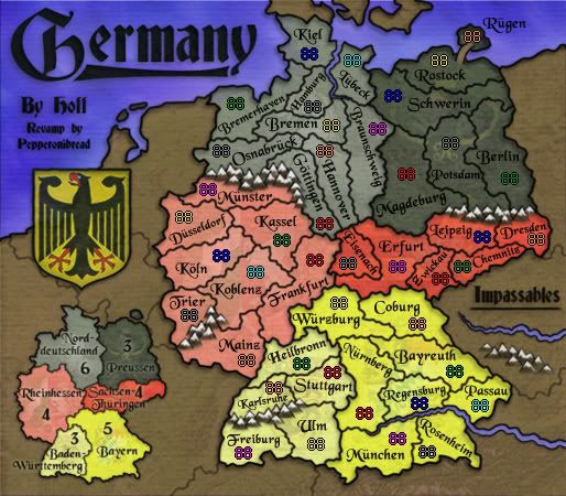
Changes:
-Made the arms on the minimap a bit more prominent - and on the cont. Baden-Wurttemberg as well.
-Increased the color difference between Baden-Wurttemberg and Bayern.
-Made some text on the minimap a bit easier to read.
-Pushed the mountain range next to Trier closer to the map's edge.
-Played around with the sea color, it ended up being about the same when I finished though. I'll keep working with it.
To-do:
-Small map problems?
-Comments?
Large:

Small:

Large w/ Army #'s:

Small w/ Army #'s:

Changes:
-Made the arms on the minimap a bit more prominent - and on the cont. Baden-Wurttemberg as well.
-Increased the color difference between Baden-Wurttemberg and Bayern.
-Made some text on the minimap a bit easier to read.
-Pushed the mountain range next to Trier closer to the map's edge.
-Played around with the sea color, it ended up being about the same when I finished though. I'll keep working with it.
To-do:
-Small map problems?
-Comments?

