WWI EUROPE 1914[ABANDONED]
Moderator: Cartographers
Forum rules
Please read the Community Guidelines before posting.
Please read the Community Guidelines before posting.


Those suggestion was my point of view to improve playability, I wasn't thinking on map context.qwert wrote:You sugestion dont make sense with map,if i change these what you say these map can no longer call EUROPE 1914.
Add the west part of Austria (Tyrol) to Bavaria. Add impassible borders between Austria and Bavaria, open borders North Italy and Austria. But if you don't divide West Europe, it isn't necessary.qwert wrote: 2.Location
Do you want to change borders of germany and austro hungary, these can be posible, he can be biger,if you know have these country must look,please tell me.
In theory if you are weak in a game, you should go to a bigger continent to in order to build an army and fight for a small or median continent.qwert wrote: I do not understand these
Big Continet will be the place for the weak player to get stronger.
What hepend with stronger player?
Yes, that is how I like to play. The bigger the continent the bigger is a chance of the continent be less disputable. This means if you start weak (last to play, attacked and with bad distribution) you can still go to a "sanctuary" and get stronger, before rolling the dice.qwert wrote: 4.bonuses
In you way you create 1 to bigest and strongest country russia whit to huge bonus 7.
You don't have to apply my 2 cent's if you don't like it.


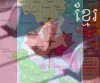
I personally think that looks a lot better. I'm not sure yellow is the way to go though. Is it possible to swap some colours around so neutral is grey? Otherwise, could you maybe try something like a brown colour? Also, I would remove the "N" from the neutral territories and add neutral to your legend.
Could you also remove the bevel and emboss look you've applied to the outer edges of the map.
Could you also remove the bevel and emboss look you've applied to the outer edges of the map.
Last edited by KEYOGI on Fri Dec 22, 2006 2:26 pm, edited 1 time in total.
What do you think of changing Germany in to brown, and doing the neutral in light gray(allmost white)?
Also I think is best to remove letter N from neutral.
Also the red from Ottoman Empire could be a little lighter.
In the way tha map is, Balkans should recive 3 bonus
Also I think is best to remove letter N from neutral.
Also the red from Ottoman Empire could be a little lighter.
In the way tha map is, Balkans should recive 3 bonus
Last edited by dafranca on Fri Dec 22, 2006 3:08 pm, edited 1 time in total.
-
sfhbballnut
- Posts: 1687
- Joined: Fri May 05, 2006 3:01 pm
I think that looks alot better, but maybe not that colour. I think quite a pale colour is needed. Grey is a good Colour.
I dont think the N needs to be in them though.
The army shadows look alot better now. Im not sure if there is a standard size for them but to me they maybe look a tad small.
I think The grey continent is a bit dark. It would be hard to read some numbers in that, mainly the 2 western territories. It is also quite hard to see the unpassable border in there as well.
But if you change the colour of that continent and use grey as neutral it should be fine.
I also noticed that 2 of the army shadows in Western Europe need moving: Naples/Sicily and Corsica/Sardinia. Maybe move Naples/Sicily up a bit and Corsica/Sardinia down a bit.
-
happysadfun

- Posts: 1251
- Joined: Mon Jul 10, 2006 9:06 pm
- Location: Haundin at DotSco, Being Sad that Mark Green Lost in Suburban Wisconsin
 Children, this is what happens to hockey players, druggies, and Hillary Clinton.
-
AndyDufresne

- Posts: 24919
- Joined: Fri Mar 03, 2006 8:22 pm
- Location: A Banana Palm in Zihuatanejo
- Contact:

-
cowshrptrn

- Posts: 838
- Joined: Thu Aug 17, 2006 1:15 pm
- Location: wouldn't YOU like to know....

-
Sargentgeneral
- Posts: 379
- Joined: Thu Nov 16, 2006 11:55 pm
- Location: On Conquerclub, duh!
-
cowshrptrn
- Posts: 838
- Joined: Thu Aug 17, 2006 1:15 pm
- Location: wouldn't YOU like to know....
-
happysadfun
- Posts: 1251
- Joined: Mon Jul 10, 2006 9:06 pm
- Location: Haundin at DotSco, Being Sad that Mark Green Lost in Suburban Wisconsin

-
reverend_kyle

- Posts: 9250
- Joined: Tue Mar 21, 2006 4:08 pm
- Location: 1000 post club
- Contact:
-
Bad Speler
- Posts: 1027
- Joined: Fri Jun 02, 2006 8:16 pm
- Gender: Male
- Location: Ottawa
- Contact:
-
for dummies

- Posts: 549
- Joined: Fri Sep 22, 2006 2:14 pm