
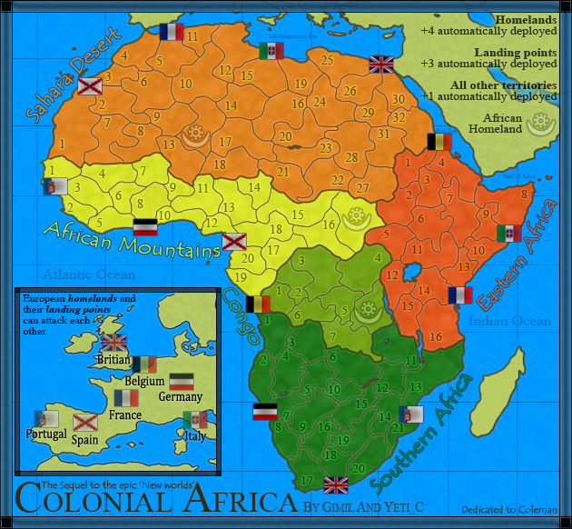
are those territory shapes relevant to anything, or are they arbitrary.
I agree that the black version looks better, but it also carries racial overtones. I think it would be cool to have only the outer territories around the landing points to have "light" and the interior be dark. This would give the mood you should be looking for without wholly classified Africa as the "Sark Continent" If you don't know what I am talking about I can whip up a draft.
[Abandoned] - Colonial Africa!
Moderator: Cartographers
Forum rules
Please read the Community Guidelines before posting.
Please read the Community Guidelines before posting.


Re: Colonial Africa! Update p.4
no, it doesn't! europe is a lot darker than africa, so the racial overtones disappear.mibi wrote:I agree that the black version looks better, but it also carries racial overtones.
gimil, can u change round some of the territory numbers in such a way that one territory is not adjacent to two others that have the same number? an example is congo 7, which can attack both congo 6 and southern africa 6. u'll know all about this problem from feudal war!
ian.
-
gimil

- Posts: 8599
- Joined: Sat Mar 03, 2007 12:42 pm
- Gender: Male
- Location: United Kingdom (Scotland)
Re: Colonial Africa! Update p.4
I will look for into this at some point ian, right now the numbers are quickly put on for athetic purposes.iancanton wrote:no, it doesn't! europe is a lot darker than africa, so the racial overtones disappear.mibi wrote:I agree that the black version looks better, but it also carries racial overtones.
gimil, can u change round some of the territory numbers in such a way that one territory is not adjacent to two others that have the same number? an example is congo 7, which can attack both congo 6 and southern africa 6. u'll know all about this problem from feudal war!
ian.
What do you know about map making, bitch?
Top Score:2403natty_dread wrote:I was wrong
-
gimil
- Posts: 8599
- Joined: Sat Mar 03, 2007 12:42 pm
- Gender: Male
- Location: United Kingdom (Scotland)
Re: Colonial Africa! Update p.4
I think I understand what you mean. Something like an inner glow or radial gradient that makes the heart of africa darker than the coast? Or rather than a gradient/glow do you mean making outer terrs light with each individual terr getting darker as you move closer to the center?mibi wrote:are those territory shapes relevant to anything, or are they arbitrary.
I agree that the black version looks better, but it also carries racial overtones. I think it would be cool to have only the outer territories around the landing points to have "light" and the interior be dark. This would give the mood you should be looking for without wholly classified Africa as the "Sark Continent" If you don't know what I am talking about I can whip up a draft.
For the record thou, I don't think the darkness gives racisal overtone.
What do you know about map making, bitch?
Top Score:2403natty_dread wrote:I was wrong

Re: Colonial Africa! Update p.4
I like the dark style, please let it on the map. Its fantastic around all the brightness maps on CC.
Grtz
MarVal
Grtz
MarVal
 highest score: 2157 (Major) / Verd ori'shya beskar'gam

Re: Colonial Africa! Update p.4
this wouldn't be gimil's map without his homeland being misspelt.
ian.
ian.
Re: Colonial Africa! Update p.4
unfortunately, in these situations, it raelly doesn't matter what you think. It matters what someone else thinks.gimil wrote:
For the record thou, I don't think the darkness gives racisal overtone.

Re: Colonial Africa! Update p.4
Racial overtones....i don't think so. Anyone who goes that far lives in fear of living itself, and watching either too much TV or reading too many blogs.
I would be very interested to see the 888 army digit test on some of those terts. Do you think they would all fit Gimil? Have you checked?
BTW, the latest V3 is a lot more legible as it's not so dark although orange could do with some work.
Is Coleman dead?
I would be very interested to see the 888 army digit test on some of those terts. Do you think they would all fit Gimil? Have you checked?
BTW, the latest V3 is a lot more legible as it's not so dark although orange could do with some work.
Is Coleman dead?

* Pearl Harbour * Waterloo * Forbidden City * Jamaica * Pot Mosbi
-
gimil
- Posts: 8599
- Joined: Sat Mar 03, 2007 12:42 pm
- Gender: Male
- Location: United Kingdom (Scotland)
Re: Colonial Africa! Update p.4
Im working through territories just now. Many of them will need reworked. I just put everything together so that I would start getting feedback.cairnswk wrote:I would be very interested to see the 888 army digit test on some of those terts. Do you think they would all fit Gimil? Have you checked?
I hope not!Is Coleman dead?
What do you know about map making, bitch?
Top Score:2403natty_dread wrote:I was wrong
Re: Colonial Africa! Update p.4
Then why the dedication?gimil wrote:cairnswk wrote:...I hope not!Is Coleman dead?
* Pearl Harbour * Waterloo * Forbidden City * Jamaica * Pot Mosbi
-
gimil
- Posts: 8599
- Joined: Sat Mar 03, 2007 12:42 pm
- Gender: Male
- Location: United Kingdom (Scotland)
Re: Colonial Africa! Update p.4
Why not? This is an evolution of his idea, its just a shame he isn't here.cairnswk wrote:Then why the dedication?gimil wrote:cairnswk wrote:...I hope not!Is Coleman dead?
What do you know about map making, bitch?
Top Score:2403natty_dread wrote:I was wrong

Re: Colonial Africa! Update p.4
colours are a lot better for visibility issues
I don't particularly like the orange or the teal
I suggest putting red where green is. put green where teal is. put purple where orange is. put something else where red is. maybe teal would work there since it's a smaller spot.
I agree with mibi on the whole "Dark Continent" thing. that's very 1700s. colourizing it like this seems fine.
this all might be a "moo point" if your other idea works
the blue legend text on the top right is slightly unreadable in some spots. maybe it's the blue on blue.
-
The Neon Peon

- Posts: 2342
- Joined: Sat Jun 14, 2008 12:49 pm
- Gender: Male
Re: Colonial Africa! Update p.4
I like it, I think it is a bit dark for a map, but it is visible and adds a nice feel to it, so no complains there.
It is hard for me to tell where some of the flags (landing points) are. (like the British one).
I like that all territories have an autodeploy, makes expansion much ore appealing.
It is hard for me to tell where some of the flags (landing points) are. (like the British one).
I like that all territories have an autodeploy, makes expansion much ore appealing.
-
LED ZEPPELINER
- Posts: 1088
- Joined: Tue Nov 25, 2008 10:09 pm
Re: Colonial Africa! Update p.4
oh i thought that each of the flags on africa were seperate territories, not part of any other, and that they were the landing points and they connected to the other territories they touch, but i may be wrongThe Neon Peon wrote:It is hard for me to tell where some of the flags (landing points) are. (like the British one).
sailorseal wrote:My big boy banana was out the whole time
AndyDufresne wrote:Forever linked at the hip's-banana! (That sounds strange, don't quote me.)AndyDufresne wrote:Many Happy Bananas to everyone, lets party...with Bananas.
--Andy

Re: Colonial Africa! Update p.4
Urg... You put up a map and get five pages of comments before I've had a proper look at it!
Personally, I am not a fan of numbering systems for territories - especially when they are of real-world places.
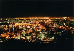
The darkness of this map seems to be a bit like marmite - you either love it or hate it... sadly, I'm in the 'hate it' camp... Africa to me, is a country full of colour and vitality. If you are going to proceed with the darker version, then I'd love to see some bright, tribal art creeping into the map somewhere...
Personally, I am not a fan of numbering systems for territories - especially when they are of real-world places.
The darkness of this map seems to be a bit like marmite - you either love it or hate it... sadly, I'm in the 'hate it' camp... Africa to me, is a country full of colour and vitality. If you are going to proceed with the darker version, then I'd love to see some bright, tribal art creeping into the map somewhere...

PB: 2661 | He's blue... If he were green he would die | No mod would be stupid enough to do that
-
gimil
- Posts: 8599
- Joined: Sat Mar 03, 2007 12:42 pm
- Gender: Male
- Location: United Kingdom (Scotland)
Re: Colonial Africa! Update p.4
I just had an image of what this map could look like. I may, may not try it.MrBenn wrote: The darkness of this map seems to be a bit like marmite - you either love it or hate it... sadly, I'm in the 'hate it' camp... Africa to me, is a country full of colour and vitality. If you are going to proceed with the darker version, then I'd love to see some bright, tribal art creeping into the map somewhere...
What do you know about map making, bitch?
Top Score:2403natty_dread wrote:I was wrong

Re: Colonial Africa! Update p.4
I love the darkness, its unique.
For those saying Africa is vibrant colors, Africa has night too...


What I really dont like are the flags...they look so out of place!
Maybe have them desaturated, or in circles or something...idk : / i just dont like them
For those saying Africa is vibrant colors, Africa has night too...
What I really dont like are the flags...they look so out of place!
Maybe have them desaturated, or in circles or something...idk : / i just dont like them

-
gimil
- Posts: 8599
- Joined: Sat Mar 03, 2007 12:42 pm
- Gender: Male
- Location: United Kingdom (Scotland)
Re: Colonial Africa! Update p.4
What about this as an alternative? I like both dark and bright but right now I am leaning towards the lighter one.
What do you know about map making, bitch?
Top Score:2403natty_dread wrote:I was wrong

Re: Colonial Africa! Update p.4 (alternative pg.5)
I prefer the darker one.
-
captainwalrus
- Posts: 1018
- Joined: Sun Nov 11, 2007 3:19 pm
- Location: Finnmark
Re: Colonial Africa! Update p.4 (alternative pg.5)
I like the dark one better but, if you do take the bright one then you should swithch the two greens around, it will look better.


-
The Neon Peon
- Posts: 2342
- Joined: Sat Jun 14, 2008 12:49 pm
- Gender: Male
Re: Colonial Africa! Update p.4 (alternative pg.5)
I like the darker one more.
Re: Colonial Africa! Update p.4 (alternative pg.5)
I think the colour choices themselves might be off a bit: land (playable and non-playable); the sea might be better darker
but I think this might be more interesting a look than the other one
but I think this might be more interesting a look than the other one

Re: Colonial Africa! Update p.4 (alternative pg.5)
I think you should desaturate the bright map a little.
Re: Colonial Africa! Update p.4 (alternative pg.5)
one thing I've just thought about
if you continue with this lighter path...
I think either the colours should all fit one theme
you have two oranges and a yellow. add more that fit this spectrum. A deeper red and another yellow maybe.
or
there should be more colours represented (red, green (upper one), orange (upper one), yellow, purple)
one thing I've noticed is that the right orange and the lower green are a lot more solid or hotter or deep than the others. they don't fit with the other colours and with the rest of the map