Ancient Egypt Map [Abandoned]
Moderator: Cartographers
Forum rules
Please read the Community Guidelines before posting.
Please read the Community Guidelines before posting.
-
reverend_kyle

- Posts: 9250
- Joined: Tue Mar 21, 2006 4:08 pm
- Location: 1000 post club
- Contact:
-
reverend_kyle
- Posts: 9250
- Joined: Tue Mar 21, 2006 4:08 pm
- Location: 1000 post club
- Contact:

How much historically accurate is this game? Maybe its better also make some historical research...reverend_kyle wrote:The borders are pretty historically accurate, and I was planning on re continenting it though my continents made alot more sense with the across river borders that I havent put back in yet.
But I agree, this map of that game is ugly.

-
Sargentgeneral

- Posts: 379
- Joined: Thu Nov 16, 2006 11:55 pm
- Location: On Conquerclub, duh!
wow, this map is very impressive. You sure put this together in a hurry, but it looks like a very cool map.
Question: is there going to be some purpose to the waterfall in the gameplay, or is it just simply to be visually pleasing?
Question: is there going to be some purpose to the waterfall in the gameplay, or is it just simply to be visually pleasing?
Highest score: 1910
Highest rank: 188
Battle of the bands #1 champion: ACDC
Highest rank: 188
Battle of the bands #1 champion: ACDC
-
reverend_kyle
- Posts: 9250
- Joined: Tue Mar 21, 2006 4:08 pm
- Location: 1000 post club
- Contact:
Sargentgeneral wrote:wow, this map is very impressive. You sure put this together in a hurry, but it looks like a very cool map.
Question: is there going to be some purpose to the waterfall in the gameplay, or is it just simply to be visually pleasing?
that map is not mine or the one I intend to put on cc.. I dont like that map, which is why I'm making my own. They were just wondering on my base image..
DANCING MUSTARD FOR POOP IN '08!
-
Lone.prophet
- Posts: 1467
- Joined: Thu Oct 12, 2006 4:37 pm
- Location: Your basement Muahaha


-
reverend_kyle
- Posts: 9250
- Joined: Tue Mar 21, 2006 4:08 pm
- Location: 1000 post club
- Contact:
-
reverend_kyle
- Posts: 9250
- Joined: Tue Mar 21, 2006 4:08 pm
- Location: 1000 post club
- Contact:

-
reverend_kyle
- Posts: 9250
- Joined: Tue Mar 21, 2006 4:08 pm
- Location: 1000 post club
- Contact:


-
Lone.prophet
- Posts: 1467
- Joined: Thu Oct 12, 2006 4:37 pm
- Location: Your basement Muahaha

-
reverend_kyle
- Posts: 9250
- Joined: Tue Mar 21, 2006 4:08 pm
- Location: 1000 post club
- Contact:
-
Lone.prophet
- Posts: 1467
- Joined: Thu Oct 12, 2006 4:37 pm
- Location: Your basement Muahaha
-
reverend_kyle
- Posts: 9250
- Joined: Tue Mar 21, 2006 4:08 pm
- Location: 1000 post club
- Contact:

reverend kyle asked me to post this for him because he's been band.
I've been spending my ban time making maps so I figured i'd resurrect this one and try and make it work. Things i've been working on.

Trying to give it a deserty feel.
Title.
things I have questions about
Colors
Fonts there are 3 which one is best liked.
Legend, what is thought?
I've been spending my ban time making maps so I figured i'd resurrect this one and try and make it work. Things i've been working on.
Trying to give it a deserty feel.
Title.
things I have questions about
Colors
Fonts there are 3 which one is best liked.
Legend, what is thought?
-
misterman10

- Posts: 9412
- Joined: Thu May 24, 2007 1:48 pm
- Location: Out on the Pitch.
- Contact:
-
AndyDufresne

- Posts: 24919
- Joined: Fri Mar 03, 2006 8:22 pm
- Location: A Banana Palm in Zihuatanejo
- Contact:
Hehe, well I think he's at least putting his ban time to good use!
The font on the map, I like the white. The others just seem to look bad.
Regarding the title area, that picture of the pyramids isn't working well...it's just too realistic looking, you know? Out of place. I'd work with a different image or perhaps look for ways to tone down that image slightly.
--Andy
-
Bad Speler
- Posts: 1027
- Joined: Fri Jun 02, 2006 8:16 pm
- Gender: Male
- Location: Ottawa
- Contact:
Colors: Personally, I like the light colours used on this map, as well as the textures
Fonts: I agree with Andy, the white font does look best, but keep the papyrus font for the title and legend. Nice job with the title by the way.
As for the legend, I just feel something more creative can be done with it, to give it a more egyptian/desert feel.
And finally, even though the Nile is the longest river in the world, it is not the widest, and if it is, its certainly not that wide, reduce its width a bit.
Highest Score: 2532
Highest Position: 69 (a long time ago)
Highest Position: 69 (a long time ago)
RK's messenger here again. I'm being punished for laughing at his teeny weiner at the last stache bang. 
This post is going to have to tide you guys over for like a week as I am in Spokane for a week partying it up and won't have photoshop, or the necessary files.
I worked with the pyramids more and made them look better I think.
I made the font as overwelming response suggested and I think it looks good.
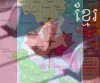
I added a parchment legend to replace the ugly black one.. I think this looks very good. Any input from others
And yes andy, although I would prefer to be unband, as I was unjustly band(see my appeal)

This post is going to have to tide you guys over for like a week as I am in Spokane for a week partying it up and won't have photoshop, or the necessary files.
I worked with the pyramids more and made them look better I think.
I made the font as overwelming response suggested and I think it looks good.
I added a parchment legend to replace the ugly black one.. I think this looks very good. Any input from others
And yes andy, although I would prefer to be unband, as I was unjustly band(see my appeal)
-
Bad Speler
- Posts: 1027
- Joined: Fri Jun 02, 2006 8:16 pm
- Gender: Male
- Location: Ottawa
- Contact:

Wicked...on you for taking this challenge 
Things i like:
*Title and the pyramids
* Tert text
Not too crash hot on the tert colours, nor the sea colour, and i really think the Nile needs narrowing to look more like a river rather than the egyptian sea in the desert.
Also not enjoying the bonus legend parchement.
a suggestion might be for a cartouche that will fit with the style of ancient egypt.
Also, if you look here, there is plenty of info on colours used in ancient egypt, if you want to go there.

* Pearl Harbour * Waterloo * Forbidden City * Jamaica * Pot Mosbi