- -ports and boats: 3 neutrals
-middle island docks: 2 neutrals
-other middle island terts: 1 neutral
-other Ys terts: 2 neutrals
-temple entrances: 3 neutrals
-temples: 5 neutrals
Atlantis - v43 - BETA - P32[D,Gp,Gr,FF,XML,BETA]
Moderator: Cartographers
Forum rules
Please read the Community Guidelines before posting.
Please read the Community Guidelines before posting.
-
theButterfly

- Posts: 13
- Joined: Thu Jul 03, 2008 7:13 pm
- Location: Austin, Texas
Re: Atlantis v14!!! Update p12 [D]
Hey, thanks for letting me help. I suppose my feelings on the game system and the bridges should be clear enough by now. Here's what I think about the neutrals:
-
NemesisChild

- Posts: 147
- Joined: Tue Oct 02, 2007 7:39 am
- Gender: Male
- Location: Wiltshire
- Contact:
Re: Atlantis v14!!! Update p12 [D]
theButterfly wrote:Hey, thanks for letting me help. I suppose my feelings on the game system and the bridges should be clear enough by now. Here's what I think about the neutrals:
Nothing outside of temple island should have more than three neutrals, and most territories should have less than that. Some of my numbers may even be too high.
- -ports and boats: 3 neutrals
-middle island docks: 2 neutrals
-other middle island terts: 1 neutral
-other Ys terts: 2 neutrals
-temple entrances: 3 neutrals
-temples: 5 neutrals
Butterfly
I like the way you think.. mostly 'cos it matches the opinion I don't have
I was thinking of the boats being 4 though!
Last edited by NemesisChild on Fri Feb 13, 2009 6:37 am, edited 1 time in total.
Blackadder: Awh, God, God, God. What on earth was I drinking last night? My head feels like there's a Frenchman living in it. Where am I?
Click here to discover the lost islands of Atlantis...

Click here to discover the lost islands of Atlantis...
-
sailorseal
- Posts: 2735
- Joined: Sun May 25, 2008 1:49 pm
- Gender: Male
- Location: conquerclub.com
Re: Atlantis v14!!! Update p12 [D]
Could you bold the text in the legend to make it easier to read? Make the bridges look nicer, make the center circle look nice and make the numbers not look so bulky. Make each island have it's own texture, each island have the same texture or create a scheme. Make the boats numbers on the left or on the right. Change the look of the water.
Love the idea and the map!
Love the idea and the map!
-
NemesisChild
- Posts: 147
- Joined: Tue Oct 02, 2007 7:39 am
- Gender: Male
- Location: Wiltshire
- Contact:
Re: Atlantis v14!!! Update p12 [D]
- The Text is in Bold!!, I am looking at other fonts for this text as a few people have mentioned it being hard to read, I personally like it as it is so unless I find something I like more then I am not inclined to change it.. we have identified that there is a reading issue dependant on resolution.sailorseal wrote:Could you bold the text in the legend to make it easier to read? Make the bridges look nicer, make the center circle look nice and make the numbers not look so bulky. Make each island have it's own texture, each island have the same texture or create a scheme. Make the boats numbers on the left or on the right. Change the look of the water.
Love the idea and the map!
- The bridges have been through quite a few versions now and the general consensus up to now is that the ones that are included are ok
- Center Circle? whats not nice about it, explaination please
- Numbers are bulky as they are bold, they are hard to read when they are not, also believe the bold font Conveys importance
- Island texture, why would each island have the same texture.. that is not even slightly realistic and in fact IMO would look pretty dreadful
- the boat numbers I can move but I really don't see what difference that makes.. I will look at it
- The sea effect stays... this is no longer open to discussion
Glad you like the map
Blackadder: Awh, God, God, God. What on earth was I drinking last night? My head feels like there's a Frenchman living in it. Where am I?
Click here to discover the lost islands of Atlantis...
Click here to discover the lost islands of Atlantis...
-
sailorseal
- Posts: 2735
- Joined: Sun May 25, 2008 1:49 pm
- Gender: Male
- Location: conquerclub.com
Re: Atlantis v14!!! Update p12 [D]
Everything is off center, it seems out of place and I do not understand why TOP has dots after each letterNemesisChild wrote: - Center Circle? whats not nice about it, explaination please
-
the.killing.44

- Posts: 4724
- Joined: Thu Oct 23, 2008 7:43 pm
- Gender: Male
- Location: now tell me what got two gums and knows how to spit rhymes
- Contact:
Re: Atlantis v14!!! Update p12 [D]
sailorseal wrote:I do not understand why TOP has dots after each letter
.44
-
NemesisChild
- Posts: 147
- Joined: Tue Oct 02, 2007 7:39 am
- Gender: Male
- Location: Wiltshire
- Contact:
Re: Atlantis v14!!! Update p12 [D]
sailorseal wrote: Everything is off center, it seems out of place and I do not understand why TOP has dots after each letter
I looked at the center circle and yes you are right the borders seem to be a little off, I have no idea when or how this happened but I will rectify it
as for the Dots I'm with killing on that One!
I was actually considering removing that text {T.O.P.} from there now as the other temples don't have text so it looks a little out of place.
Blackadder: Awh, God, God, God. What on earth was I drinking last night? My head feels like there's a Frenchman living in it. Where am I?
Click here to discover the lost islands of Atlantis...
Click here to discover the lost islands of Atlantis...
-
the.killing.44
- Posts: 4724
- Joined: Thu Oct 23, 2008 7:43 pm
- Gender: Male
- Location: now tell me what got two gums and knows how to spit rhymes
- Contact:
Re: Atlantis v14!!! Update p12 [D]
Try blurring the black outlines a bit and see how it looks … atm they are very sharp and stand out. This is just an idea, mind you 
.44
.44
-
NemesisChild
- Posts: 147
- Joined: Tue Oct 02, 2007 7:39 am
- Gender: Male
- Location: Wiltshire
- Contact:
Re: Atlantis v14!!! Update p12 [D]
I had had that idea a while back too, unfortunately it makes it look like there's been some sort of Oil Spill around the islands... not very attractive I'm afraid..the.killing.44 wrote:Try blurring the black outlines a bit and see how it looks … atm they are very sharp and stand out. This is just an idea, mind you
.44
Should have aversion up with a few tweaks on it in the next day or so
Nem
Blackadder: Awh, God, God, God. What on earth was I drinking last night? My head feels like there's a Frenchman living in it. Where am I?
Click here to discover the lost islands of Atlantis...
Click here to discover the lost islands of Atlantis...

Re: Atlantis v16!!! Update p13 [D]
Version 16 is up!
The font on the scroll has been changed to make for easier reading at different resolutions.
In the next couple of days, I will post an updated version on Gameplay as it stands. Hopefully we can get this nailed down now.
The complete map!

Premier2k
The font on the scroll has been changed to make for easier reading at different resolutions.
In the next couple of days, I will post an updated version on Gameplay as it stands. Hopefully we can get this nailed down now.
The complete map!
- Click image to enlarge.

Premier2k
Re: Atlantis v16!!! Update p13 [D]
Version 17!
Changes made:

Changes made:
- Continent names moved
Army Circles and numbers on boats
Signatures
- Click image to enlarge.

Re: Atlantis v17 Update p13 [D]
GAMEPLAY
Starting Positions
All outer islands/territories are divided up amongst the starting players:
These would be broken down as such;
2 players = 26 each and 1 random neutral
3 players = 17 each and 2 random neutrals
4 players = 13 each and 1 random neutral
5 players = 10 each and 3 random neutrals
6 players = 8 each and 5 random neutrals
7 players = 7 each and 4 random neutrals
8 players = 6 each and 5 random neutrals
Starting Neutrals
All non outer island territories will start neutral and values start as;
Normal territories start at neutral 1
Docks start at neutral 2
Ports start at neutral 3
Boats start at neutral 3
Ys territories start at neutral 2 (ports are overidden as above)
Temple entrances start at neutral 3
Temple of Life/Temple of Zeus start at neutral 4
Temple of Poseidon start at neutral 5
Attack Routes
Any dock can only attack it's connected counterpart (as displayed by the dotted lines)
Any port can attack any boat but not attack other ports
Any boat can attack any port but not attack other boats
Special Features
There are 3 special features on this map, these are explained below;
Temple of Zeus (as identified by lightening symbol) can bombard all boats
Temple of Life (as identified by the Ankh symbol) can bombard all ports
Temple of Poseidon (as identified by the trident symbol) can bombard all docks
Win Objectives
The only win objective on this map is to destroy all other players.
BONUS STRUCTURE
The bonuses are set as;
Kumari Kandam
Holding all these islands will be worth +5 armies
Lemuria
Holding all these island will be worth +5 armies
Mariny
Holding this continent will be worth +4 armies
Thule
Holding this continent will be worth +4 armies
Lyonesse
Holding all these islands will be worth +4 armies
Meropis
Holding all parts of this island will be worth +3 armies
Mu
Holding all parts of this island will be worth +3 armies
Vineta
Holding all parts of the blue island will be worth +4 armies
Númenor
Holding all parts of the brown island will be worth +4 armies
Ys
Holding all parts of the outer temple will be worth +6 armies
Temple Island (Temple Entrances 1&2 and God Temples)
Holding all of the temple island will be worth +3 armies
Boats
Holding all the boats will be worth +4 armies
Continents
There are 89 territories on 12 continents.
* Kumari Kandam
* Lemuria
* Lyonesse
* Meropis
* Mu
* Mariny
* Thule
* Vineta
* Númenor
* Ys
* Temple Islands
* Boats
Comments please everyone!!
Premier2k & Nemesischild
Re: Atlantis v17 with GAMEPLAY UPDATE p13 [D]
ok, it seems people are liking the gameplay. I'll finish off the XML and get it posted up. It has changed rather a lot with the gameplay changes. Then we can start looking at the army circle tests.
Premier2k
Premier2k
-
The Neon Peon
- Posts: 2342
- Joined: Sat Jun 14, 2008 12:49 pm
- Gender: Male
Re: Atlantis v17 with GAMEPLAY UPDATE p13 [D]
No, 2 player games are way off. About 1/3 of the map should be neutral to make it balanced.Premier2k wrote:ok, it seems people are liking the gameplay. I'll finish off the XML and get it posted up. It has changed rather a lot with the gameplay changes. Then we can start looking at the army circle tests.
Premier2k
Re: Atlantis v17 with GAMEPLAY UPDATE p13 [D]
I disagree, We cannot reduce the number of territories that 2 players start with or 8 player games will start with 1 territ each.The Neon Peon wrote:No, 2 player games are way off. About 1/3 of the map should be neutral to make it balanced.Premier2k wrote:ok, it seems people are liking the gameplay. I'll finish off the XML and get it posted up. It has changed rather a lot with the gameplay changes. Then we can start looking at the army circle tests.
Premier2k
Remember, all inner islands and temples, dock etc... start as neutral.
Premier2k
-
The Neon Peon
- Posts: 2342
- Joined: Sat Jun 14, 2008 12:49 pm
- Gender: Male
Re: Atlantis v17 with GAMEPLAY UPDATE p13 [D]
No, you only reduce the number of territories people start out with in 2 player games.Premier2k wrote:I disagree, We cannot reduce the number of territories that 2 players start with or 8 player games will start with 1 territ each.The Neon Peon wrote:No, 2 player games are way off. About 1/3 of the map should be neutral to make it balanced.Premier2k wrote:ok, it seems people are liking the gameplay. I'll finish off the XML and get it posted up. It has changed rather a lot with the gameplay changes. Then we can start looking at the army circle tests.
Premier2k
Remember, all inner islands and temples, dock etc... start as neutral.
Premier2k
Re: Atlantis v17 with GAMEPLAY UPDATE p13 [D]
Can you do that in the XML? I'm not sure how...The Neon Peon wrote:No, you only reduce the number of territories people start out with in 2 player games.
Premier2k
-
NemesisChild
- Posts: 147
- Joined: Tue Oct 02, 2007 7:39 am
- Gender: Male
- Location: Wiltshire
- Contact:
Re: Atlantis v17 with GAMEPLAY UPDATE p13 [D]
Blackadder: Awh, God, God, God. What on earth was I drinking last night? My head feels like there's a Frenchman living in it. Where am I?
Click here to discover the lost islands of Atlantis...
Click here to discover the lost islands of Atlantis...

Re: Atlantis v17 with GAMEPLAY UPDATE p13 [D]
the bonusses are imbalanced, for example, kamuri kandam has 12 territories and only 2 places to defend, and gives 5 bonus (and 12 territories give an aditional 4 armies) while meropis has 3 territories, which ALL can be attacked from other continents (which means you need to defend them all) and they only get a bonus of 3.
normally the harder some place is to defend, the more troops they should get.
normally the harder some place is to defend, the more troops they should get.
- Click image to enlarge.

Re: Atlantis v17 with GAMEPLAY UPDATE p13 [D]
Ok, thanks Zimmah.
I'll have another look at the bonuses and see what I can come up with.
Premier2k
I'll have another look at the bonuses and see what I can come up with.
Premier2k
Re: Atlantis v17 with GAMEPLAY UPDATE p13 [D]
OK, I have run the bonuses through Widowmakers bonus calculator and yes they were well off!
Here is what I have now:
Kamuri Kandam: +5
Lyonesse: +4
Mariny: +5
Thule: +5
Lemuria: +6
Vineta: +5
Meropis: +4
Numenor: +5
Mu: +4
Boats: +6
Ys: +8
Temples: +3
I'll get Nemesischild to update the map and we'll post version 18 as soon as we can.
Premier2k
Here is what I have now:
Kamuri Kandam: +5
Lyonesse: +4
Mariny: +5
Thule: +5
Lemuria: +6
Vineta: +5
Meropis: +4
Numenor: +5
Mu: +4
Boats: +6
Ys: +8
Temples: +3
I'll get Nemesischild to update the map and we'll post version 18 as soon as we can.
Premier2k

Re: Atlantis v16!!! Update p13 [D]
- Click image to enlarge.
GFX:
* I think the territory colors could be better. There's a kind of brownish feeling all over. And the center 2 islands don't fit with the rest of the map. Your textures underneath the islands could also be improved upon. They are sort of blurred. The inner green one looks cool though.
* I think you should try something different for the outer water. The dark blue embossed thing looks more like leather, or tree bark or an orange peel - not like the ocean. There's so many other better textures you could use.
* The outer glow along the outer ring should blend a litter better. It's not uniform around the whole map - some places it looks lighter than others, some places it looks smudged.
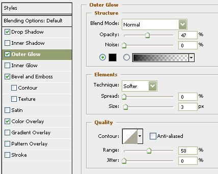
* The symbols look good - but try a little black outer glow. It does wonders to make the icons stand out. See image below. The only difference between the right from left is outer glow.


-
NemesisChild
- Posts: 147
- Joined: Tue Oct 02, 2007 7:39 am
- Gender: Male
- Location: Wiltshire
- Contact:
Re: Atlantis v17 with GAMEPLAY UPDATE p13 [D]
I like the colors. I tried variations accross a vew versions but it either looked to bright or to dull, these give the sort of balance I was looking for.RjBeals wrote:
* I think the territory colors could be better. There's a kind of brownish feeling all over. And the center 2 islands don't fit with the rest of the map. Your textures underneath the islands could also be improved upon. They are sort of blurred. The inner green one looks cool though.
I have tried all sorts with the terrain and it always looked worse, the blurryness is pretty much on purpose as as I didn't want the terrain to be overpowering but as subtle as i could get away with.. I like the results!
I assume you mean Ys when you say the inner green one.. and Thank you
I like the sea texture, I had missed the blurry buits at the top (right under the title.) I will look at fixing these .. and seeing as I am the I will (under duress mind ) look at possible othere textures.. But I will state I really like the one thats there and its going to take a lot to change my mind!! what other textures are there and where can i get them?RjBeals wrote: * I think you should try something different for the outer water. The dark blue embossed thing looks more like leather, or tree bark or an orange peel - not like the ocean. There's so many other better textures you could use.
Erm.. there is no outer glow on those islands!!! there is an effect in the backround tho, maybe thats causing the issue.. seeing as I need to look at the sea then I will look at this tooRjBeals wrote: * The outer glow along the outer ring should blend a litter better. It's not uniform around the whole map - some places it looks lighter than others, some places it looks smudged.
Thanks for the tip on the symbols, this is a definite addition for the next version..RjBeals wrote: * The symbols look good - but try a little black outer glow. It does wonders to make the icons stand out. See image below. The only difference between the right from left is outer glow.
Now thats the kinda feedbak I like!!
Nem.
Blackadder: Awh, God, God, God. What on earth was I drinking last night? My head feels like there's a Frenchman living in it. Where am I?
Click here to discover the lost islands of Atlantis...
Click here to discover the lost islands of Atlantis...
Re: Atlantis v17 with GAMEPLAY UPDATE p13 [D]
http://www.conquerclub.com/forum/viewto ... 27&t=76649NemesisChild wrote: what other textures are there and where can i get them?
Look through that post / thread for some ideas on textures. I think if you do, it will greatly improve this map. Good Luck.
Re: Atlantis v17 with GAMEPLAY UPDATE p13 [D]
As I figured I cannot alter the number of territories based on the number of starting players. Which means if I reduce it then if an 8 player game starts everybody would potentially end up with 1 territory! It's gonna have to stay as it is. As this is a larger map then I think the majority of ganes will be 5-8 players anyway and probably team games.The Neon Peon wrote:No, you only reduce the number of territories people start out with in 2 player games.
Premier2k