Netherlands [Quenched]
Moderator: Cartographers
Forum rules
Please read the Community Guidelines before posting.
Please read the Community Guidelines before posting.
-
Ruben Cassar

- Posts: 2160
- Joined: Thu Nov 16, 2006 6:04 am
- Gender: Male
- Location: Civitas Invicta, Melita, Evropa


-
Ruben Cassar
- Posts: 2160
- Joined: Thu Nov 16, 2006 6:04 am
- Gender: Male
- Location: Civitas Invicta, Melita, Evropa
-
Lone.prophet
- Posts: 1467
- Joined: Thu Oct 12, 2006 4:37 pm
- Location: Your basement Muahaha
the actual suggestions to improve seem to be quite thin on the ground now i feel that this is a sign either everybody has lost interest or it is very near completion i think the latter, so keep up the good work for a little longer and it must be done. Personally i dont see anything wrong at all and just wanted to show that i am veryinterested in playing this map.
-
Lone.prophet
- Posts: 1467
- Joined: Thu Oct 12, 2006 4:37 pm
- Location: Your basement Muahaha
-
Lone.prophet
- Posts: 1467
- Joined: Thu Oct 12, 2006 4:37 pm
- Location: Your basement Muahaha
-
bonobo`s son
- Posts: 420
- Joined: Thu Jan 04, 2007 11:27 am
- Location: Amsterdam - Artis
-
spinwizard
- Posts: 5016
- Joined: Sun Dec 10, 2006 9:52 am
very good
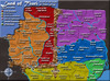
it looks gr8...the green bit in the bottom left corner looks a bit confusing. 

-
Lone.prophet
- Posts: 1467
- Joined: Thu Oct 12, 2006 4:37 pm
- Location: Your basement Muahaha
Re: very good
what u mean, u dont like the color?spinwizard wrote:it looks gr8...the green bit in the bottom left corner looks a bit confusing.


-
Lone.prophet
- Posts: 1467
- Joined: Thu Oct 12, 2006 4:37 pm
- Location: Your basement Muahaha


Does Tholen connect to Beveland? Make it clear...
The map is a bit light... the orange of the title doesnt fit well with the light ocean (my opinion), and some areas are too bright, mainly light green and red.
The flag with the legend is a bit pixelated yet.
Beyond that, we need check the whole map with numbers, so check if all colours are readable in all areas.


-
Ruben Cassar
- Posts: 2160
- Joined: Thu Nov 16, 2006 6:04 am
- Gender: Male
- Location: Civitas Invicta, Melita, Evropa
-
Lone.prophet
- Posts: 1467
- Joined: Thu Oct 12, 2006 4:37 pm
- Location: Your basement Muahaha

-
Guiscard

- Posts: 4103
- Joined: Fri Dec 08, 2006 7:27 pm
- Location: In the bar... With my head on the bar
Did people decide as a whole that they liked the legend font? To me its a bit cartoony. If it was decided way back then ignore this comment 
Good work, looking complete to me.
Good work, looking complete to me.
qwert wrote:Can i ask you something?What is porpose for you to open these Political topic in ConquerClub? Why you mix politic with Risk? Why you not open topic like HOT AND SEXY,or something like that.