Netherlands [Quenched]
Moderator: Cartographers
Forum rules
Please read the Community Guidelines before posting.
Please read the Community Guidelines before posting.
-
Lone.prophet
- Posts: 1467
- Joined: Thu Oct 12, 2006 4:37 pm
- Location: Your basement Muahaha

-
Lone.prophet
- Posts: 1467
- Joined: Thu Oct 12, 2006 4:37 pm
- Location: Your basement Muahaha

-
Lone.prophet
- Posts: 1467
- Joined: Thu Oct 12, 2006 4:37 pm
- Location: Your basement Muahaha


-
AndyDufresne

- Posts: 24919
- Joined: Fri Mar 03, 2006 8:22 pm
- Location: A Banana Palm in Zihuatanejo
- Contact:
So, lets take a look!
--Andy
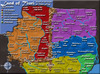
- First, I'm going to say shorten down those names. There isn't necessarily a limit on names, but I think you have a few that are excessively long. Either look for a shorter name or abbreviate them, so they don't push the attack/fort buttons off the screen. For instance, Goeree, Schouwen, Baronie, Land Van, Zeeuws, Haarlem, Schiermon.
- The title looks better, but now it almost seems likt there is too much black with the orange. Your name is still hard to read, and perhaps slightly too big. Maybe seeing more orange would be better.
- The bonus numbers in the legend look a little weird, and are harder to see. Honestly, I think that might be better without the flag. Why not think about putting a flag in the South, where you have some open space in the non-gameboard area.
- I like the current bridges you have, they are unique and a different style. I like them a lot. But I am not a fan of your dotted sea route lines. Clean those up a little, or look into using a different idea.
- A few of the country division lines look a little different. For instance, those in the blue continent seem faded almost, but those in the red are thicker and stronger. Keep things uniform. Also, in Midden, a few of the lines look odd and fuzzy as do a few in Holland. Look into fixing those up.
- And your river, could use some help to make it look more like a river, and not say a termite line in a piece of wood.
--Andy
Well, I think you know a lot about this.
But my opionion is, that shortening names gives a weird feeling.
Cause what you cut off the names is just the name.
What I mean:
Breda, not Baronie.
Heusden, not Land Van.
Cause that are the real names on the map.
Wish you succes, hope I can play this map in a short time.
But my opionion is, that shortening names gives a weird feeling.
Cause what you cut off the names is just the name.
What I mean:
Breda, not Baronie.
Heusden, not Land Van.
Cause that are the real names on the map.
Wish you succes, hope I can play this map in a short time.
-
Lone.prophet
- Posts: 1467
- Joined: Thu Oct 12, 2006 4:37 pm
- Location: Your basement Muahaha
-
Lone.prophet
- Posts: 1467
- Joined: Thu Oct 12, 2006 4:37 pm
- Location: Your basement Muahaha


-
Lanceyboyuk
- Posts: 259
- Joined: Thu Nov 02, 2006 8:34 am
- Gender: Male
- Location: Cheshunt, Herts, UK

um. r u trying to ignore andy? it seems the names need to be smaller for gameplay issues- dont want to knock the "attack" button off the screen...that would kindof defeat the purpose.  the numbers in the legend are a little awkward. i personally like the flag, but something does need to change. the title is too dark- maybe remove the shadows or make the font wider? and as some1 said earlier, do the neutral armies show up on all your army circles?
oh, and i really like your river as is. it looks like a rip in textured paper, pretty cool.
oh, and i really like your river as is. it looks like a rip in textured paper, pretty cool.
Do you need an excuse to have a war? I mean, who for? Can't you just say "You got lots of cash and land, but I've got a big sword, so divy up right now, chop chop."
Terry Pratchet
Terry Pratchet
-
Lone.prophet
- Posts: 1467
- Joined: Thu Oct 12, 2006 4:37 pm
- Location: Your basement Muahaha
-
Lone.prophet
- Posts: 1467
- Joined: Thu Oct 12, 2006 4:37 pm
- Location: Your basement Muahaha
-
Lone.prophet
- Posts: 1467
- Joined: Thu Oct 12, 2006 4:37 pm
- Location: Your basement Muahaha
-
Guiscard
- Posts: 4103
- Joined: Fri Dec 08, 2006 7:27 pm
- Location: In the bar... With my head on the bar
Can we see a version without the flag in the background for comparison? Not to make the numbers better but just because it could look better that way.AndyDufresne wrote: Honestly, I think that might be better without the flag. Why not think about putting a flag in the South, where you have some open space in the non-gameboard area.
qwert wrote:Can i ask you something?What is porpose for you to open these Political topic in ConquerClub? Why you mix politic with Risk? Why you not open topic like HOT AND SEXY,or something like that.
i think their point is that it might be a distraction to the eyeLone.prophet wrote:the flag is under the nubers so there should be no differnece
Do you need an excuse to have a war? I mean, who for? Can't you just say "You got lots of cash and land, but I've got a big sword, so divy up right now, chop chop."
Terry Pratchet
Terry Pratchet
-
Guiscard
- Posts: 4103
- Joined: Fri Dec 08, 2006 7:27 pm
- Location: In the bar... With my head on the bar
Or you could try a square flag graphic instead, that may look better than the wavey version which, as enigma said, is a bit distracting.
qwert wrote:Can i ask you something?What is porpose for you to open these Political topic in ConquerClub? Why you mix politic with Risk? Why you not open topic like HOT AND SEXY,or something like that.
-
Lone.prophet
- Posts: 1467
- Joined: Thu Oct 12, 2006 4:37 pm
- Location: Your basement Muahaha
