Updated: 4th February: Korean war map (Vacation)
Moderator: Cartographers
Forum rules
Please read the Community Guidelines before posting.
Please read the Community Guidelines before posting.


which bit? 
This is the only lux map of korea I can find and I didn't use it....
I must admit, some of the cities I have used are in similar places, but I looked at a map on wiki....

Edit, Oh and the sea route is the same...
but seriously I never saw this map before, I read about the korean war on wiki, and it said they made a landing at Inchon...
I am really shocked at how similar this is...
This is the only lux map of korea I can find and I didn't use it....
I must admit, some of the cities I have used are in similar places, but I looked at a map on wiki....
Edit, Oh and the sea route is the same...
but seriously I never saw this map before, I read about the korean war on wiki, and it said they made a landing at Inchon...
I am really shocked at how similar this is...
"It is fatal to enter any war without the will to win it."
- General Douglas MacArthur
- General Douglas MacArthur

Right ok, update will be tomorrow night.
I will, adjust the height...
Get rid of the textures in countries,
Adjust some sea lines, add a new one from japan to russia (represent Russian and American airfighting, MiG alley) [this will hopefully make it less linear, the two long sea lines act like the loop round the world in original map]
Make changes to some of the army shadows and text
Redo borders, some are very very messy.
rethink layout, trying to make it more square... maybe squash the land a tiny bit (unnoticably)
One Question I must ask though, I stole the image for the sea, and for the ship, Is this acceptable? I'll try and find alternatives that are copyright free....
I could possibly make an image similar to the current sea (or ask a friend who is an ace at photshop to do it) , do people like it lighter or darker?
are the bonuses and borders ok? I don't think the map needs any impassable borders, (I don't like them, at first glance they normally confuse me and I try and attack through them) what do you think.
I'll be focusing on this map most as the other map isn't to everyones tastes...
one last thing, the coulours, possibly too bright? I want them light, (not dark and gloomy) but also not too eye hurting.
Feedback needed please!
"It is fatal to enter any war without the will to win it."
- General Douglas MacArthur
- General Douglas MacArthur


Here is a map with the original colour sea, and original colours without textures/ borders.
I want to know what you think about the colous used.
the 1st version of my map has really messy(and much too wide) borders. I've altered them to 5px for continents 3px for countries, do you think this is sufficient?
I desperately need feedback on how to improve the map. I'll include all 3 of my versions. please give feedback on the best aspects of each 1. Detailed feedback would be greatly appreciated.
If you were, it would be good if you could include:
Layout
amt. of countries/continents
border asthetics
colours
general asthetics
textures, sea and countries
Favourite aspects of all 3 designs, and what needs to be changed
Please don't comment on the image size, that can be changed later, at any time!!!


-bedplay
I want to know what you think about the colous used.
the 1st version of my map has really messy(and much too wide) borders. I've altered them to 5px for continents 3px for countries, do you think this is sufficient?
I desperately need feedback on how to improve the map. I'll include all 3 of my versions. please give feedback on the best aspects of each 1. Detailed feedback would be greatly appreciated.
If you were, it would be good if you could include:
Layout
amt. of countries/continents
border asthetics
colours
general asthetics
textures, sea and countries
Favourite aspects of all 3 designs, and what needs to be changed
Please don't comment on the image size, that can be changed later, at any time!!!
-bedplay
"It is fatal to enter any war without the will to win it."
- General Douglas MacArthur
- General Douglas MacArthur
-
Guiscard
- Posts: 4103
- Joined: Fri Dec 08, 2006 7:27 pm
- Location: In the bar... With my head on the bar
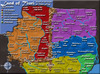
Its a nice map, and an interesting visual style. The top version (I only see two) is the best, and you should defiitely keep going with this, but theres still a lot of work to do.
One major point is that you need to size down your map significantly...
Other than that, its no problem that you;ve nicked a couple images for the sea. I do think that its still a very dark map, however, and would benefit from either lighter territories or sea.
Try lightening either area and post one version which is 800px wide and one which is 500px.
After that I'll give a more detailed assessment.
Good work though its a really good concept.
qwert wrote:Can i ask you something?What is porpose for you to open these Political topic in ConquerClub? Why you mix politic with Risk? Why you not open topic like HOT AND SEXY,or something like that.
Update

here are the big and small versions of my map.

Large, 700px wide

Small 500px wide
I want to know what you think about the colous used.
the 1st version of my map has really messy(and much too wide) borders.
I've altered them do you think this is good?
I desperately need feedback on how to improve the map.
Detailed feedback would be greatly appreciated.
If you were, it would be good if you could include:
Layout
amt. of countries/continents
border asthetics
colours
general asthetics
textures, sea and countries
Favourite aspects of all, and what needs to be changed
Last of all, here are three examples of sea colour, which is your favourite,
light, medium, dark, personally I prefer dark (better contrast to the land)

Thanks!!! -bedplay
here are the big and small versions of my map.
Large, 700px wide
Small 500px wide
I want to know what you think about the colous used.
the 1st version of my map has really messy(and much too wide) borders.
I've altered them do you think this is good?
I desperately need feedback on how to improve the map.
Detailed feedback would be greatly appreciated.
If you were, it would be good if you could include:
Layout
amt. of countries/continents
border asthetics
colours
general asthetics
textures, sea and countries
Favourite aspects of all, and what needs to be changed
Last of all, here are three examples of sea colour, which is your favourite,
light, medium, dark, personally I prefer dark (better contrast to the land)
Thanks!!! -bedplay
"It is fatal to enter any war without the will to win it."
- General Douglas MacArthur
- General Douglas MacArthur
-
AndyDufresne

- Posts: 24919
- Joined: Fri Mar 03, 2006 8:22 pm
- Location: A Banana Palm in Zihuatanejo
- Contact:
-
Guiscard
- Posts: 4103
- Joined: Fri Dec 08, 2006 7:27 pm
- Location: In the bar... With my head on the bar
Keep the old sea routes, the new ship and plane icons are confusing.
To be honest I like the borders and colours. Layout is pretty good but It is a vertically long map, perhaps too much so. I;m not sure what Andy will say but it may well need to be re-oriented as small maps are meant so you can see the buttons without scrolling down.
To be honest I like the borders and colours. Layout is pretty good but It is a vertically long map, perhaps too much so. I;m not sure what Andy will say but it may well need to be re-oriented as small maps are meant so you can see the buttons without scrolling down.
qwert wrote:Can i ask you something?What is porpose for you to open these Political topic in ConquerClub? Why you mix politic with Risk? Why you not open topic like HOT AND SEXY,or something like that.

ah yes, about the mokpo, it is the coast line, and you are absolutely right.Wisse wrote:try the lightes one (sea)
and mayby you can add a drop shadow to the flag, and legend's
the colors are good
can you try to make the boats and aircraft better to see? it cost me about 3 minuts to fnd them, and whats that in mokpo some people would think its a aircraft
I was thinking about adding glow to the icons to make them stand out it's too hard to fit the lines in with all the boxes without it looking cluttered.
So I'll get on to that, also yeah, I'll add a shadow and see how it looks
I'll try on the small map to make it as short as possible (without it looking stupidAK_iceman wrote:Even on the updated pictures of your map, it still is WAYYY too big.
You shouldnt have to scroll down to see the rest of the small map.
Also, try making the edges of the territories not so rounded, right now it reminds me of a puzzle. Real territories have some straight lines too.
for the sea, so far two people vs 1 have said the darkest 1, so next update I'll post a version of the map with both (darkest & medium)
and I'll change some of the lines if they are too rounded, I'll do one version with, one without, thanks for the quick feedback all of you, and Andy, what is the absolute maximum for height of the map?
-bedplay
"It is fatal to enter any war without the will to win it."
- General Douglas MacArthur
- General Douglas MacArthur
lol ok, andy, anyone? what is the largest the image can be height wise?
Edit: The small version of the Philippines is 620px height and world 2.0 is 610px height so can I have mine 650 pr possibly 700?
With Discworld, Philippines, CCU, World 2.0 and africa most people have to scroll down, I could not get the map below 650, and even at 650, it wouldn't look great....
So, is 700 possible?
"It is fatal to enter any war without the will to win it."
- General Douglas MacArthur
- General Douglas MacArthur
-
gavin_sidhu

- Posts: 1428
- Joined: Mon May 22, 2006 6:16 am
- Location: Brisbane, Australia
I think Russia should not connect to any continent, as it makes China rather unholdable. If you git rid of Cho'ngjins border, hamgyong is a nice continent. Pyong is also a nice continent and having both green and purple bordering each other will make some interesting battles. Connect Kyushu to Chej-do instead of mokpo and i think all your continents will be well designed. My only problem is that you can hold half the map and only have 2 borders to defend, thus this map is not well designed for 3-4 player games. Also like the third map in the previous previous post.
Right I've had a lot of work to do for GCSE so I've not been doing any over the last few days, I'll try and complete the suggestions ASAP.
here's what I'm going to do:
-post pictures with all three seas.
-add glow to icons making them noticable.
-put in impassable river (yalu river) from hyesan to dang dong(with bridges from over each city.
-alter some borders, making some straighter
-Increase text size on smaller image
-reduce size of smaller image
-Increase ways to attack from north too south (.eg. move CHUNG CHONG NAM DO border so it can attack/ be attacked by KYONGGI DO)
-Put in army shadows & draft basic xml
anything else?
update should be ready sunday sometime...
"It is fatal to enter any war without the will to win it."
- General Douglas MacArthur
- General Douglas MacArthur
Here is my new update.
I have added army circles, redone borders.
added river yalu, making russia more holdable (7 countries 4 borders)
put army circles in it
resized small to 700 px (height)
note that the largest playable map at the moment is 630px therefore I think 700px is acceptable
Plus I have to scroll down to attack on most maps anyway
fixed glow, you should now be able to locate the icons easily (plus it says which countries they are in on the legends)
Large

Small

Lighter sea - (I know it's not the right size)

Lightest sea - (I know it's not the right size)

-Please comment on everything, from borders, to bonuses to SEA COLOUR
(I have included three shades)
-thanks bedplay
I have added army circles, redone borders.
added river yalu, making russia more holdable (7 countries 4 borders)
put army circles in it
resized small to 700 px (height)
note that the largest playable map at the moment is 630px therefore I think 700px is acceptable
Plus I have to scroll down to attack on most maps anyway
fixed glow, you should now be able to locate the icons easily (plus it says which countries they are in on the legends)
Large
Small
Lighter sea - (I know it's not the right size)
Lightest sea - (I know it's not the right size)
-Please comment on everything, from borders, to bonuses to SEA COLOUR
(I have included three shades)
-thanks bedplay
"It is fatal to enter any war without the will to win it."
- General Douglas MacArthur
- General Douglas MacArthur
-
Ruben Cassar

- Posts: 2160
- Joined: Thu Nov 16, 2006 6:04 am
- Gender: Male
- Location: Civitas Invicta, Melita, Evropa
Looking fantastic. I am going to love this map.
The sea looks good in all of them but I prefer the last version.
Now, one thing that you must change for sure. That airplane seems to be an F-22. It entered service with the USAF in 2006 I think. The Korean War took place at around 1950. The planes that were used were the American F-86 Sabre and the Russian MiG-15. It would look great if you could put a picture of both to simulate a dogfight instead of the F-22.


from "How To Make A Map"
"You must design two versions of the map: a small (up to 600 px wide), and a large (up to 800 px wide). Height is flexible, but it is recommended that you do not exceed 350 px on small maps and 600 px on large maps so that users will not need to scroll down to attack."
Certainly not all maps follow the height suggestions, but this small map is bigger than the specified size for large maps. Not being able to see the entire map on one screen would keep me from playing it.
